

How to Easily Reuse React Components
source link: https://javascript.plainenglish.io/how-to-easily-reuse-react-components-e9c8a9466038
Go to the source link to view the article. You can view the picture content, updated content and better typesetting reading experience. If the link is broken, please click the button below to view the snapshot at that time.
How to Easily Reuse React Components
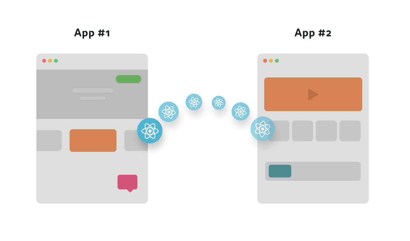
Reuse React components across projects and applications in a simple, fast, and scalable way.
can be easier and more scalable than you think
Sharing reusable React components between projects and applications is a very powerful way to speed up development and build consistent experiences. However, in the past it used to require a lot of work and overhead to design and separate components that you can reuse, customize, and manage.
In this tutorial, based on this wonderful example, I’m going to walk you through a very simple yet scalable way to reuse React components across projects in a managed way. Our stack for this tutorial will be just a few open-source tools React, Bit, MDX and more.
By the end of this tutorial, you’ll have a component created in one project versioned, exported, then consumed and used in another project.
You will also have the first components in your toolbox of reusable React components, which you can use in any new project and share with others to speed up and improve the development of your entire team.
Let’s dive in.
1. Setup a workspace
To start we’re going to install Bit.
npx @teambit/bvm install
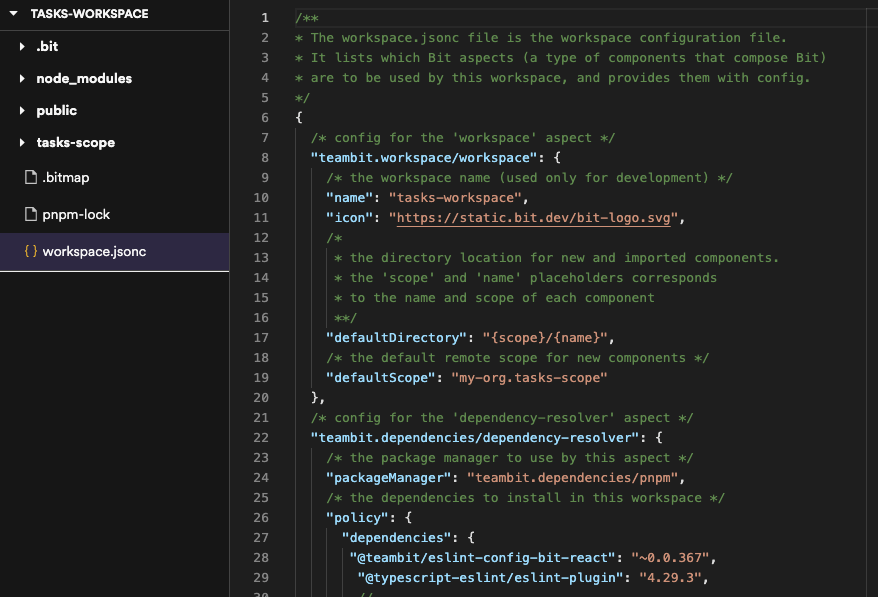
The next thing we’re going to do is create a Bit workspace.
Workspaces serve as development and staging areas for components. We create new components, retrieve and modify existing ones, and compose them. It’s basically a place for you to build and compose components.
Every component is “independent” — meaning it has its own dev environment, version, dependencies, package and so on. The workspace makes this possible and automates most of the configs and overhead around it.
As you guessed, by making components “indepndent” — Bit makes them reusable “out of the box” and just like Lego they can be than consumed and used in any number of projects with little to no extra effort.
To avoid the need to config it later, we’ll add the remote’s details to our workspace creation command to let Bit know it should be the default.
You can create a remote scope to host components on any remote server, but for this tutorial -to keep it simple- let’s use bit.cloud. It’s free for all developers and for open-source so we can just create an account and a scope.
At the root of your project, initialize a Bit Workspace with a React template:
bit new react reusing-react-components --empty --skip-git --default-scope [your-bit.cloud-user-name].[your-scope-name]cd reusing-react-components
- Take a second to look into the workspace here.
2. Create a React component
Let’s make our first Reusable React component!
In a workspace we can create components, and even use templates -or create our own templates- to create components.
Let’s create a component using the bit create command and add the flag “react” to tell Bit to use the react-environment for this component and also add a namespace/name for the component. In this case, an input:
bit create react ui/input
You can either copy the files from this folder into the generated folder (UI/input) follow this guide and copy the snippets into the files.
Here is the source code for the input implementation:
import React from 'react';
import { Button } from '@nitsan770/reuse-components.ui.button';
import classNames from 'classnames';
import styles from './input.module.scss';export type InputProps = {
  buttonText: string;
} & React.InputHTMLAttributes<HTMLInputElement>;export function Input({ buttonText, className, ...rest }: InputProps) {
  return (
    <div className={classNames(styles.inputContainer, className)}>
      <input {...rest} className={styles.inputText}></input>
      <Button className={styles.button} children={buttonText} />
    </div>
  );
}
Since we have Button and classNames as dependencies, we'll have to install them in our Workspace:
bit install @nitsan770/reuse-components.ui.button classnames
In the generated folder, create a file called input.moudle.scss and insert this CSS:
.inputContainer {
  height: 56px;
  min-width: 320px;
  display: flex;
  flex-direction: column;
  justify-content: stretch;
  align-items: stretch;
  position: relative;
  .button {
    position: absolute;
    width: 103px;
    height: 40px;
    right: 8px;
    top: 8px;
    width: 30%;
  }
  .inputText {
    border: none;
    background-color: var(--bit-bg-dent, #f6f6f6) !important;
    color: var(--bit-text-color-heavy, #2b2b2b);
    height: 100%;
    width: 100%;
    border-radius: 8px;
    &.error {
      border: var(--bit-error-color, #e62e5c) 1px solid;
      background-color: var(--bit-error-color, #e62e5c);
    }
    &:focus,
    &:active,
    &:hover {
      border: var(--bit-accent-color, #6c5ce7) 1px solid;
    }
  }
}.disabled {
  opacity: 0.5;
}
Note that the component will be added to the .bitmap file in the workspace. Open it and take a look:
"ui/input": {
  "scope": "",
  "version": "",
  "defaultScope": "nitsan770.reuse-components",
  "mainFile": "index.ts",
  "rootDir": "ui/input",
},
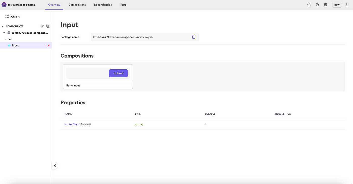
Next let’s have a look at the lovely independent component in the Workspace UI:
bit start
The development server is up and running! However, we are unable to see anything 😔 . This is because we have not created any compositions for our newly created component.
Compositions allow components to be simulated in different variations. These can then be used for testing, visualization, and discoverability.
Let’s create a composition for our component:
import React from 'react';import { Input } from './Input';export const BasicInput = () => <Input buttonText="Submit" />;
Now we can see the component in the Workspace UI:
Now, being responsible developers, let’s add some documentation.
Bit components’ documentation is written in MDX. You can embed anything you want to make your component more visually appealing and easy to use.
Let’s try this:
---
description: An input element with a built-in button.labels: ["input", "submit form"]
---import { Input } from "./input";### Modify the text on the button'''js live<Input buttonText="Go" />'''
It looks much better now, and consumers can try out the component before installing:
Last but not least, a good component is well-tested. With Bit, each component is tested independently and literally outside of any specific context. This is very useful because you can easily learn what breaks with every change.
You can use any tool you like to test components, like Jest for example.
Here’s the test added for the component.
import React from 'react';
import { screen, render } from '@testing-library/react';
import { BasicInput } from './input.composition';it('Renders the input', () => {
  render(<BasicInput />);
  const input = screen.getByRole('textbox');
  expect(input).toBeInTheDocument();
});it('Renders the button', () => {
  render(<BasicInput />);
  const button = screen.getByRole('button');
  expect(button).toBeInTheDocument();
});it('Renders the button text', () => {
  render(<BasicInput />);
  const button = screen.getByRole('button');
  expect(button).toHaveTextContent('Submit');
});
Let’s run the tests:
bit test
All tests have passed. 🎉
PASS src/input/input.spec.tsx
  ✓ Renders the input (67 ms)
  ✓ Renders the button (19 ms)
  ✓ Renders the button text (12 ms)Test Suites: 1 passed, 1 total
Tests: 3 passed, 3 total
Snapshots: 0 total
Time: 5.549 s
Ran all test suites.
test has been completed in 13.718 seconds.
3. Version and ‘export’ components to a remote
Our component is now up and running in the workspace. Thanks to Bit we can now give it a version and export it to a remote like bit.cloud or a locally hosted remote scope, then install or ‘bit import’ it into new projects.
Let’s tag the component with its first version.
bit tag -m "first version"
When a component is tagged, it will also go through a build process in addition to locking the current state of the source files.
Note that if you now run bit start and look at the local UI you can view the component’s version history — which will come in very handy later, and even use component-compare to compare versions.
In this process, the component will be compiled to a distributable format and packed into a tar file.
Once the component has been tagged, it’s time to publish it:
bit loginbit export
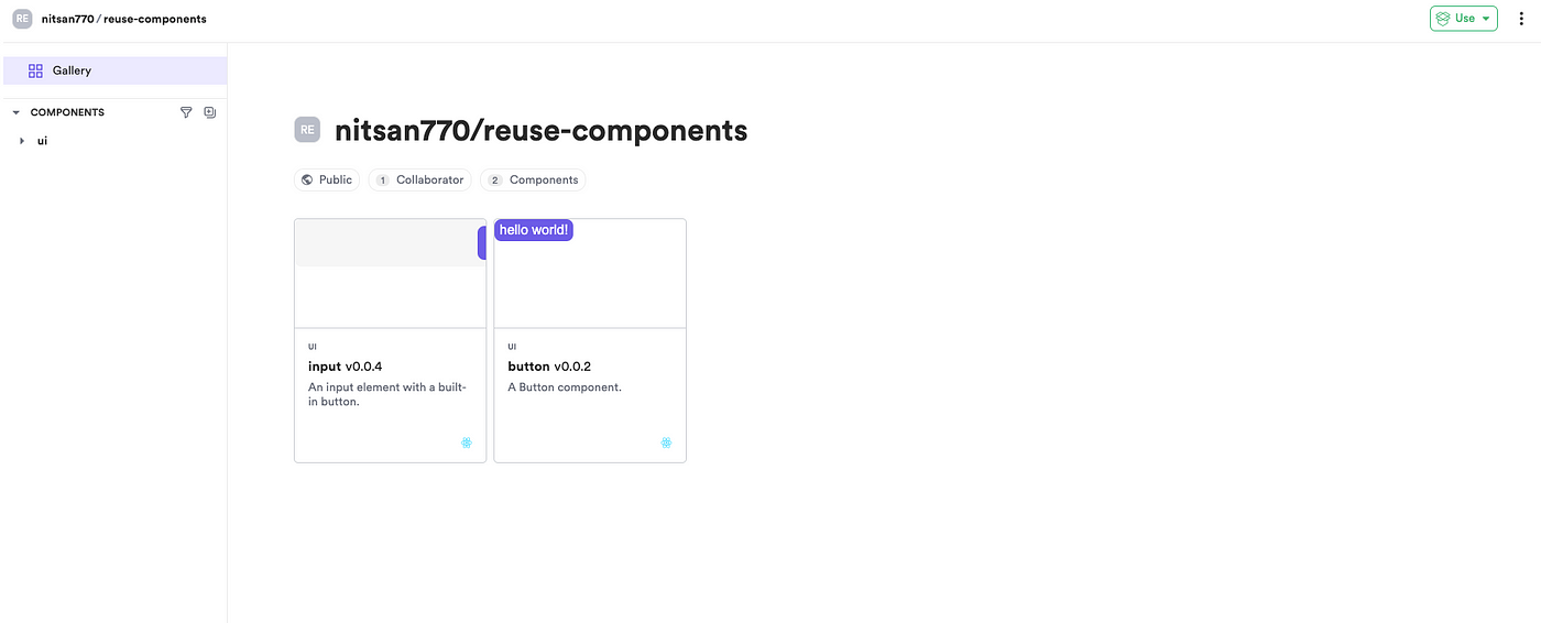
The component will be exported to the remote scope on bit.cloud like in this example here.
4. Install and reuse components
Now that our component has been exported we can consume it in a number of ways, including as a package using the npm/yarn/pnpm clients.
Let’s try it out!
Open another React project:
npx create-react-app another-project
Let’s use pnpm which is often the fastest:
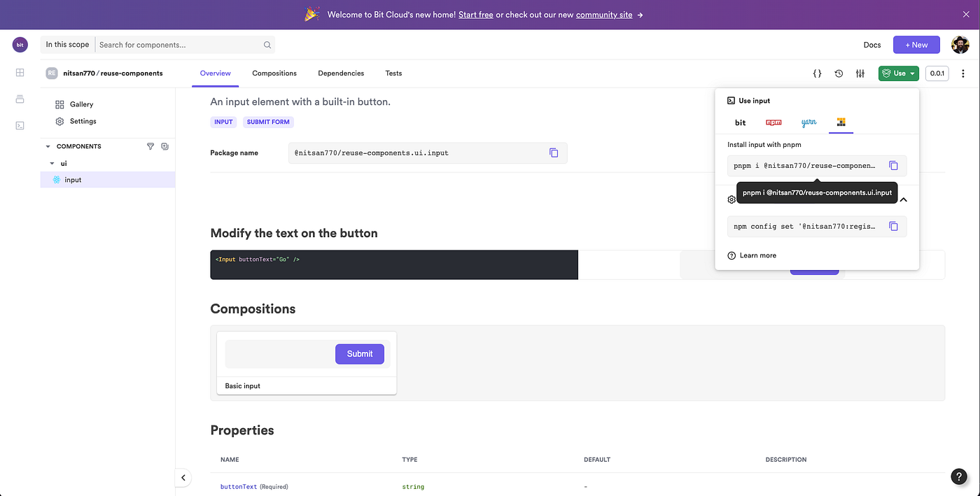
pnpm i @nitsan770/reuse-components.ui.input
## if you haven't yet, remember to add your bit.cloud account as a scoped registry:
# npm config set '@nitsan770:registry' https://node.bit.cloud
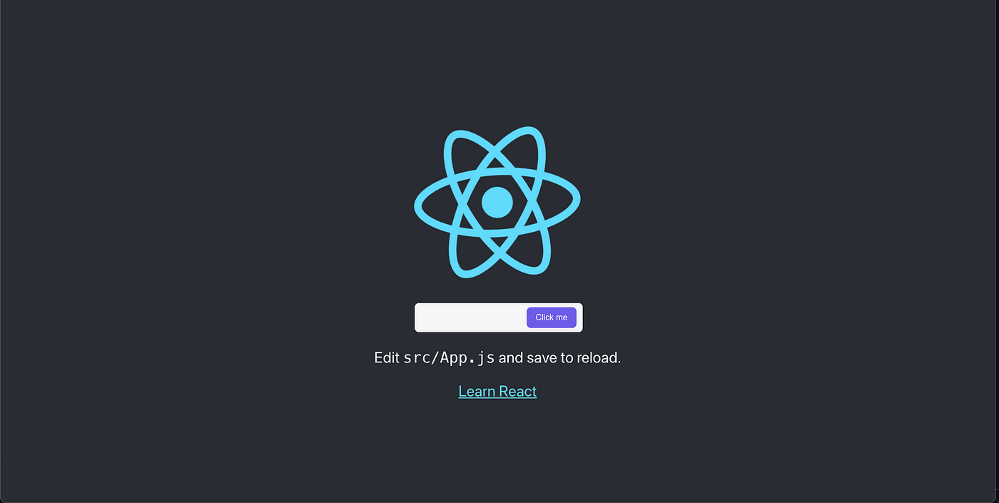
We can now use the component in the app.js file:
import logo from './logo.svg';
import { Input } from '@nitsan770/reuse-components.ui.input';
import './App.css';function App() {
  return (
    <div className="App">
      <header className="App-header">
        <img src={logo} className="App-logo" alt="logo" />
        <Input buttonText="Submit" />
        <p>
          Edit <code>src/App.js</code> and save to reload.
        </p>
        <a
          className="App-link"
          href="https://reactjs.org"
          target="_blank"
          rel="noopener noreferrer"
        >
          Learn React
        </a>
      </header>
    </div>
  );
}export default App;
Let’s run the dev server:
npm start
It’s a perfect match!
In most cases, this is enough — you can use this method to create all your components as reusable Lego pieces like this and collect them in your remote scope, which you can also share with your team.
5. Import and edit a component from a new context
What happens when you want to use a component in a new context — a project or an app — but you need to make some changes and perhaps create a new version of the component?
Bit makes it very easy to edit components and version them directly in new contexts — using the ‘bit import’ command.
`bit Import` lets us retrieve any component into our local workspace, edit it, and then tag and export it with a new version. Imagine you can now just edit any node module’s dependencies….
Let’s create a new workspace, import a component into it, and start working.
bit new react new-workspace --empty --skip-git --default-scope [your-cloud-user-name].[your-scope-name]cd new-workspace
Retrieving the component into our newly created Workspace is only a matter of running one single command:
bit import nitsan770.reuse-components/ui/inpu
Using Bit Import, we can retrieve any component into our local workspace, edit it and the tag, and export it with a new version.
Let’s add a new prop to our Input component (in the TSX file):
import React from 'react';
import { Button } from '@nitsan770/reuse-components.ui.button';
import classNames from 'classnames';
import styles from './input.module.scss';export type InputProps = {
  buttonText: string;
  disabled?: boolean;
} & React.InputHTMLAttributes<HTMLInputElement>;export function Input({
  buttonText,
  disabled,
  className,
  ...rest
}: InputProps) {
  return (
    <div className={classNames(styles.inputContainer, className)}>
      <input {...rest} disabled={disabled} className={styles.inputText}></input>
      <Button className={styles.button} children={buttonText} />
    </div>
  );
}
Now we have the modified component working in our workspace and we decide we just love it and want to add this new version to our toolbox. Let’s tag these changes with a new version:
bit tag -m "added the disabled prop"
Of course, we must export it so that everyone can experience this wonderful change:
bit export
But wait… what if now we want the new version in the original workspace?
Once we’re back in our original workspace, we can update usingbit import :
cd reusing-react-components
bit import
To see the changes in the source files, we will also need to checkout the latest version:
bit checkout latest -a
Now we’re in sync with new update :D
We can now also update the component in the React project we installed it in because Bit publishes a new package every time we tag our component:
cd another-project
pnpm update @nitsan770/reuse-components.ui.input
We now have our updated button in the original React project :)
6. Share and add to your reusable component toolbox
Over time, every component you create in your different applications or even a design system will be versioned and added to your reusable toolbox.
You can create components, compose them with each other to build applications and experiences, and get compounding value on everything you make — just like building with modular and reusable Lego.
This means you -and your team- will be able to build faster, share components and collaborate, and stay in sync. Problems like Design Systems or Micro Frontends also become considerably easier to solve.
By the way, this workflow isn’t limited to React or even Frontend components at all. You can do the same with any JS code, and even build entire microservices in components.
Thanks for reading 🍻
More content at PlainEnglish.io. Sign up for our free weekly newsletter. Follow us on Twitterand LinkedIn. Check out our Community Discord and join our Talent Collective.
Recommend
About Joyk
Aggregate valuable and interesting links.
Joyk means Joy of geeK