

Navigation patterns in VR: how to help users jump between scenes
source link: https://uxdesign.cc/ux-navigation-patterns-in-vr-jumping-between-scenes-3a1fd8df0151
Go to the source link to view the article. You can view the picture content, updated content and better typesetting reading experience. If the link is broken, please click the button below to view the snapshot at that time.
Navigation patterns in VR: how to help users jump between scenes
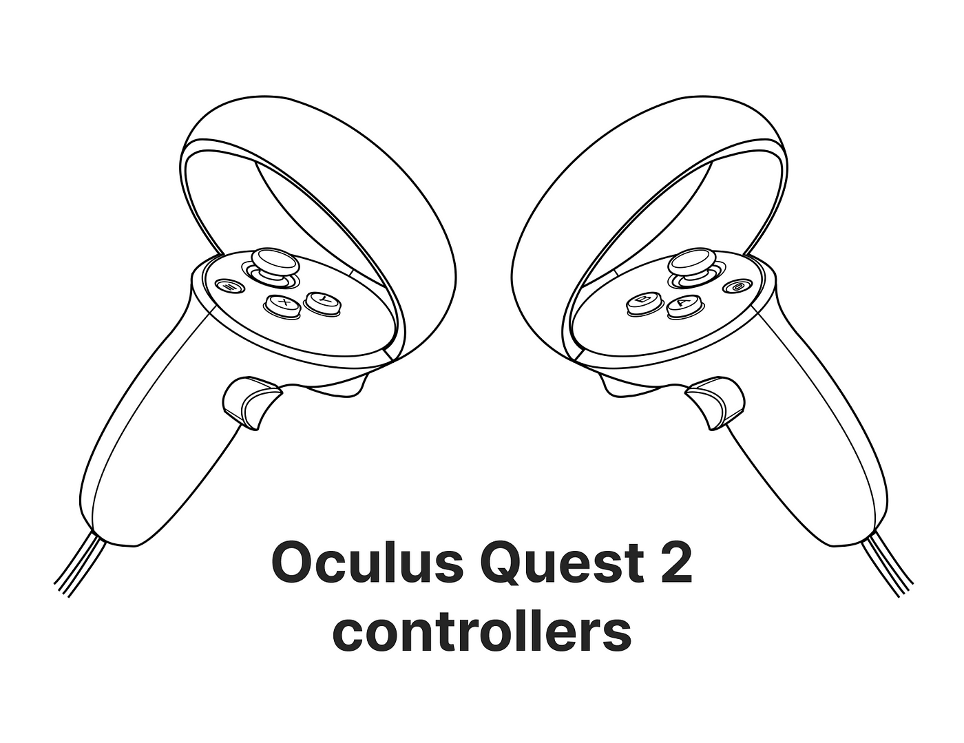
Navigation is a key part of any digital product, a simple and consistent navigation is the first step towards a delightful experience. There are a lot of ways that navigation can be understood in VR. When we talk about navigating through a 3D scene, when we talk about navigating the app itself through scenes, when we talk about navigating within the UI panels and so on. This study intends to identify navigation patterns when it comes to navigate from the Home Scene to another scene and come back using the Oculus Quest 2 controllers. How easy is coming back to the Home Scene?
I’ve analysed 5 of the main VR apps in the market in order to get a better understanding of which options are out there and which ones we can use depending on which problem we are trying to solve, and why not, which ones we can get inspired from.
Common concepts throughout the study
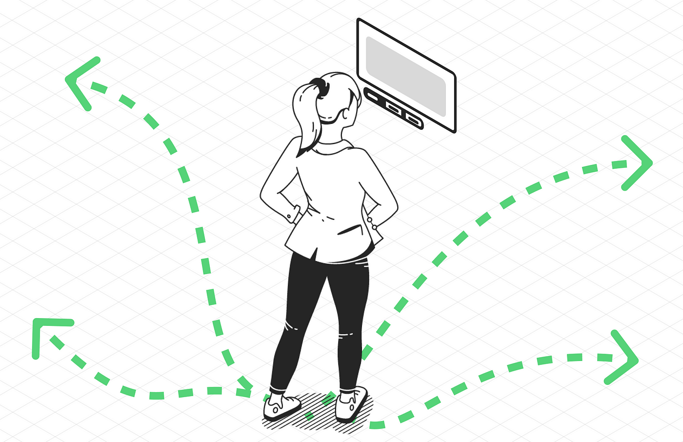
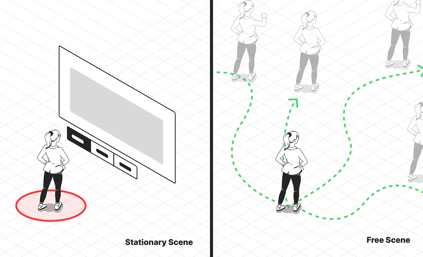
- Scene: 3D space where the user is placed
- Stationary scene: A scene where the user cannot move around the virtual world.
- Free scene: A scene where the user can move around the virtual world.
- Navigation system: The system the user uses to go and back to scenes.
- Main menu: The starting point of the experience
What have been analysed?
User journey
From Home Scene to a new Scene and come back
Scene transition
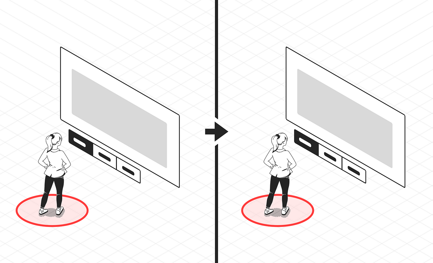
- From stationary scene to free scene
- From stationary scene to stationary scene
- From free scene to free scene
Navigation system interaction
How exactly the users come back to the Home Scene. Is it through a button on the controller? Through a button on the UI?
Samples
- FitXR
- Mondly
- Altspace
- RecRoom
- Within
Study
FitXR
User flow: From Home Scene to a new Scene and come back.
Watch the video bellow to see the flow in action ⬇️
Scene transition: From a Stationary Scene to Stationary Scene
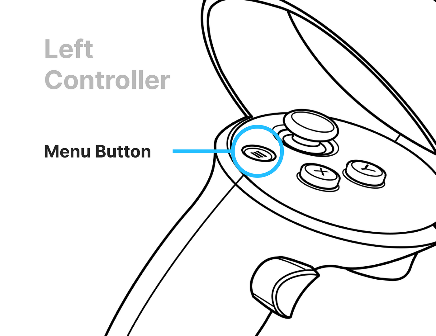
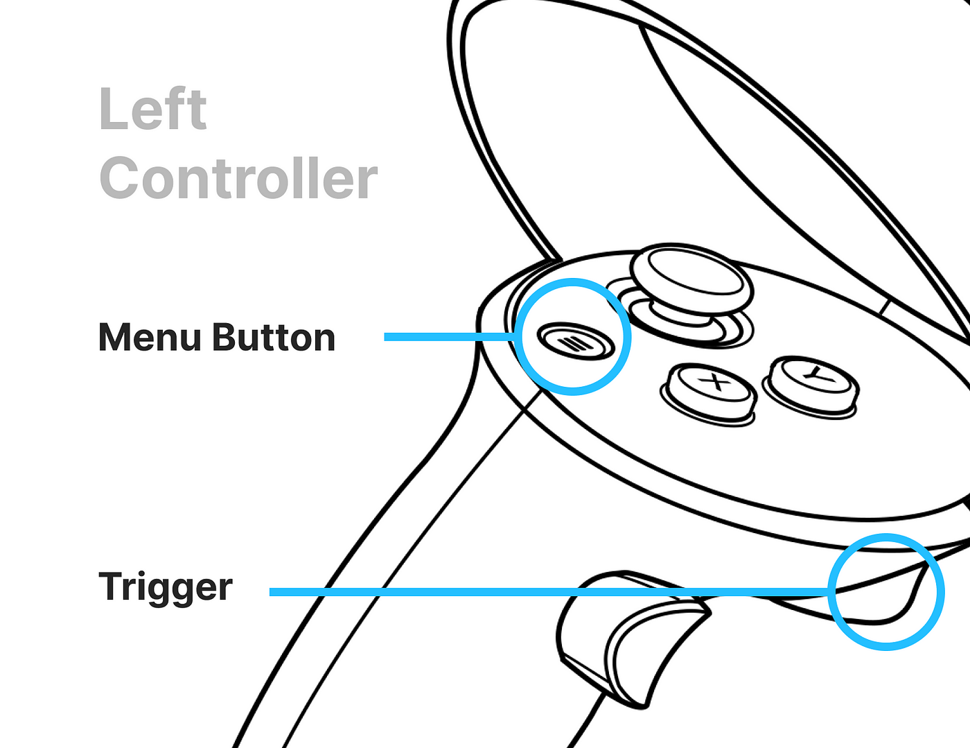
Navigation system interaction: FitXR uses the Menu Button to display the UI panel that gives the option to come back to the homepage.
Mondly
User flow: From Home Scene to a new Scene and come back.
Watch the video bellow to see the flow in action ⬇️
Scene transition: From a Stationary Scene to Stationary Scene
Navigation system interaction: Mondly uses the Menu Button to display the UI panel that gives the option to come back to the homepage. You need to know it in order to be able to navigate, otherwise there is no hint on the screen to let you know it.
Once you know this interaction it feels very comfortable to use. Would help adding a label in the controller itself?
AltSpace
User flow: From Home Scene to a new Scene and come back.
Watch the video bellow to see the flow in action ⬇️
Scene transition: From a Stationary Scene to Free Scene
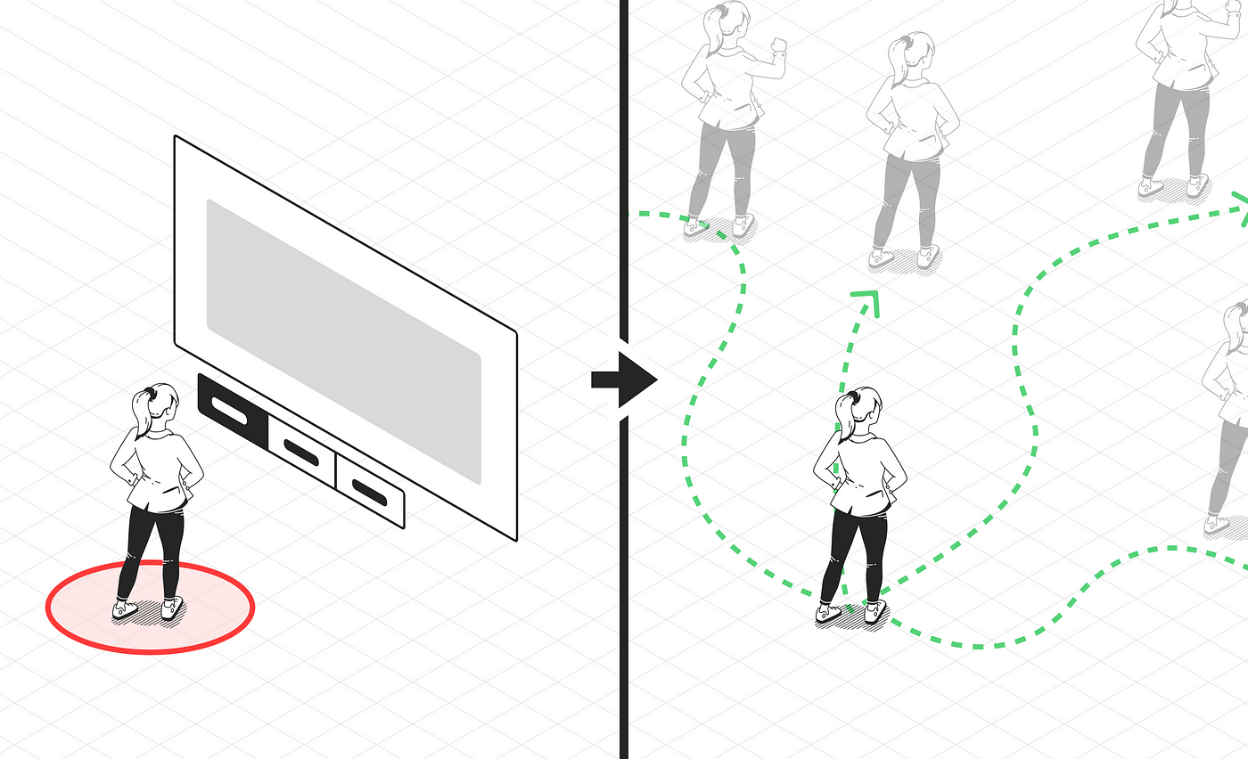
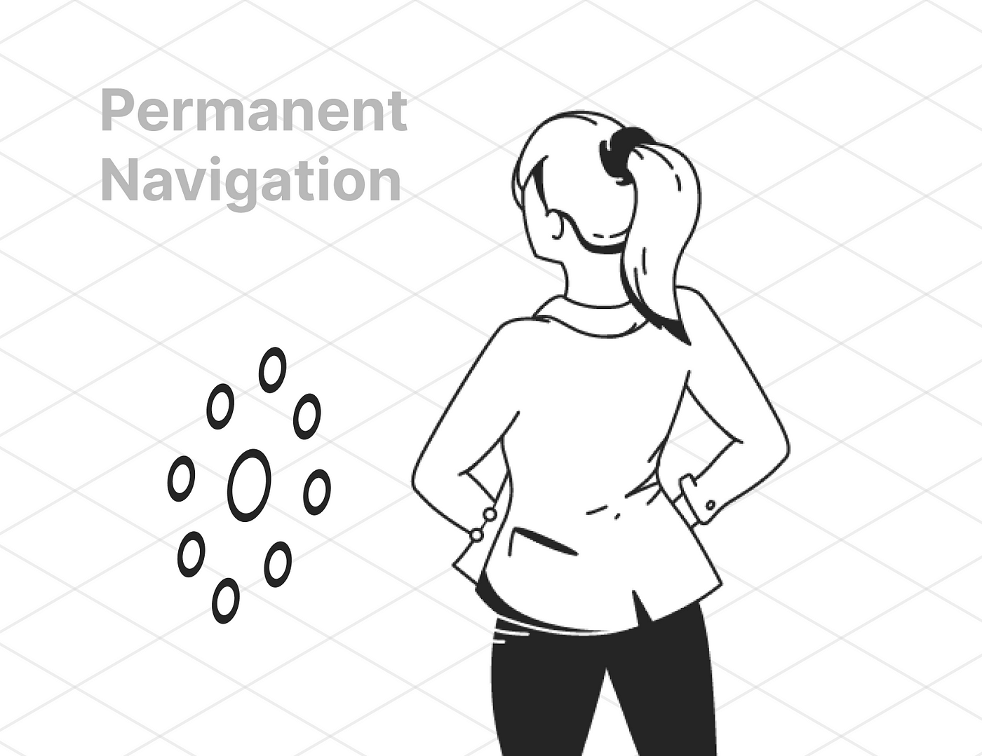
Navigation system interaction: Altspace places permanently the navigation system at the left of the user. It follows the user all the time and it is not possible to hide it. It’d be interesting figuring out what made Altspace take this decision, just for guessing it might be because of the social interactions that are placed in that menu. Take a selfie, take a photo, mute yourself, etc. Are these interactions that the users want to use quickly and on the fly?
RecRoom
User flow: From Home Scene to a new Scene and come back.
Watch the video bellow to see the flow in action ⬇️
Scene transition: From a Free Scene to Free Scene
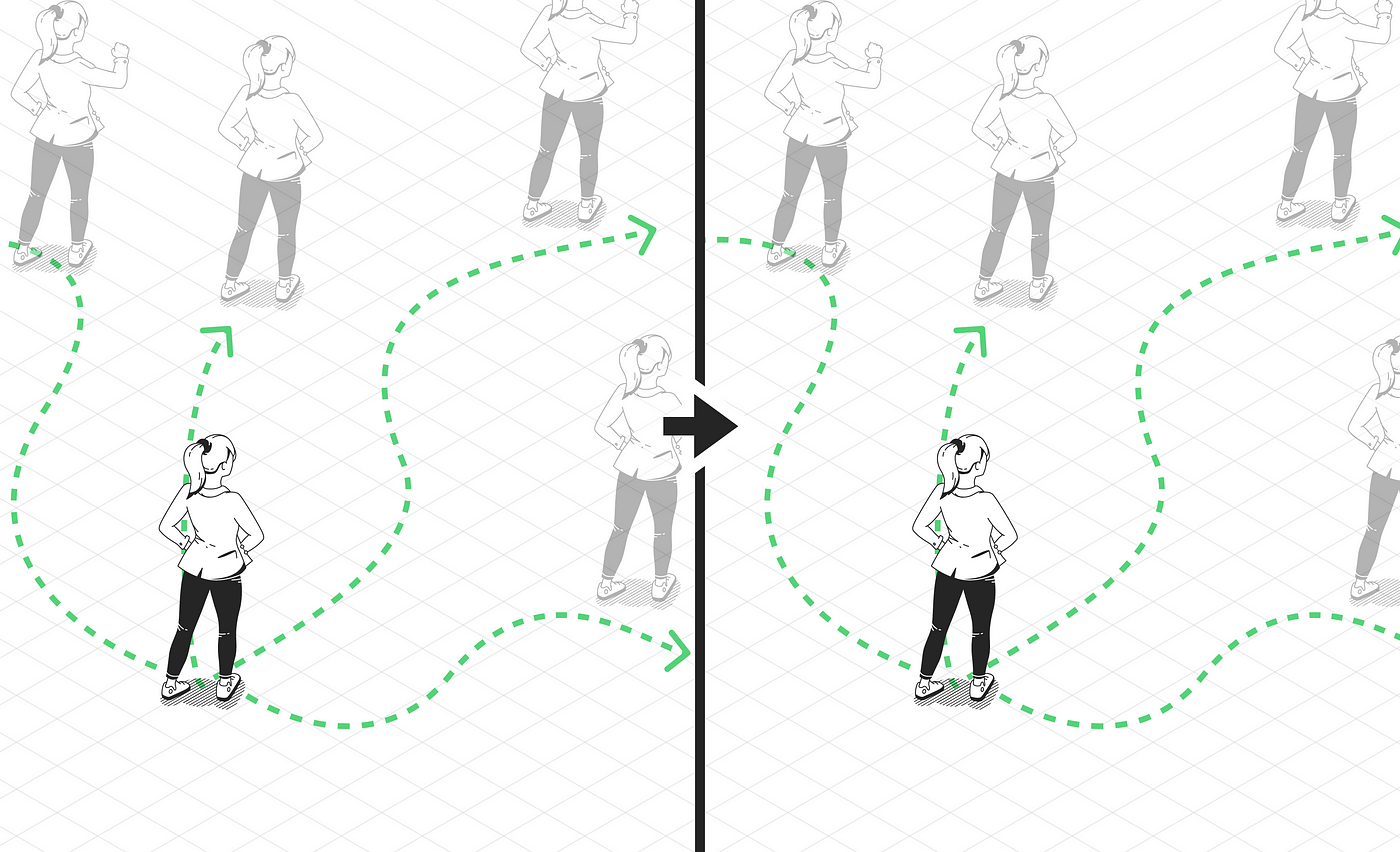
Navigation system interaction: RecRoom uses a navigation system that is always with the user. Is the user who has to trigger the menu to be displayed. This way, the users is able to walk around the worlds and coming back to the Home at any moment.
The navigation system is displayed either by pressing the Menu Button in the controller or by looking at the virtual clock, the menu is displayed by looking at it, not by the gesture of spinning the wrist.
Within
User flow: From Home Scene to a new Scene and come back.
Watch the video bellow to see the flow in action ⬇️
Scene transition: From a Stationary Scene to Stationary Scene
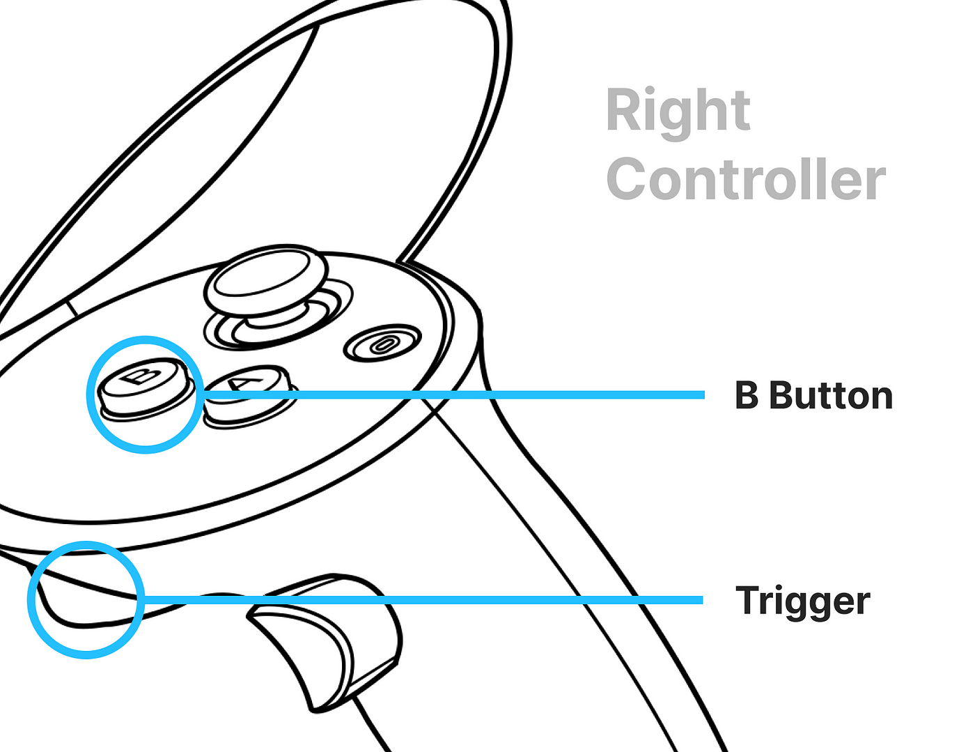
Navigation system interaction: Within uses the Menu Button and the triggers to display the UI that allows the user to navigate. It also uses the B button to go back directly.
Conclusions
- 4 out of 5 use Menu Button to display the navigation system. It seems obvious that Oculus has thought about that and developers are following this guideline. For console players, this behavior seems logical and intuitive, but what about no gamers? Do they need visual hints to understand navigation?
- 1 out of 5 shows the navigation system permanently. This can be a way to be sure that some interactions are easy to find and easy to complete. This could be a good navigation system for apps with a high social interaction load.
- 4 out of 5 start with a Stationary Scene. This is an important decision since it is going to define the way the users navigate around the whole app. Is starting with a Stationary Scene a more conservative way to start? Is it easier for non gamers users?
Assessment
Definitely navigating through scenes in VR is a great challenge, even though there are clear standards the challenge comes when we need to teach the user these new ways of interaction. You can launch a mobile app being sure that the users already know how to use a mobile phone, that is still not happening in VR, it’ll be fascinating seeing how these standards are created and which ones got adopted massively.
On the other hand, there are hand tracking interactions, where Oculus has already created standards to open menus, click on content or scrolling, all just using our hands. It’ll be also fascinating seeing which standards got adopted, having in mind that there are several big players (Microsoft with Hololens, HTC with Vive, Pico…) creating these kinds of interactions.
Thank you for reading! 💚
Recommend
About Joyk
Aggregate valuable and interesting links.
Joyk means Joy of geeK