

10 Google Fonts Every Web Designer Needs To Know
source link: https://uxplanet.org/10-google-fonts-every-web-designer-needs-to-know-de7dc3352d2c
Go to the source link to view the article. You can view the picture content, updated content and better typesetting reading experience. If the link is broken, please click the button below to view the snapshot at that time.

10 Google Fonts Every Web Designer Needs To Know
Create modern designs with the most popular fonts on the web
Google Fonts is one of the most popular places on the web to find high-quality fonts. It is a great resource to find curated fonts free for personal and commercial use. With over 900 to choose from, finding the perfect font for your design can sometimes be challenging and time-consuming. Luckily, with Google Fonts Analytics, we can see the most popular fonts on the platform by their total number of views. By looking at the most viewed fonts over the past year, we can discover the latest trends in typography and select tried and tested fonts for our own projects. Here we will look at the top ten Google Fonts and each one’s different styles. Each font has maintained its popularity by being accessible and versatile across many domains. So, keep reading to discover a timeless font for your next project, whatever it might be.
Roboto
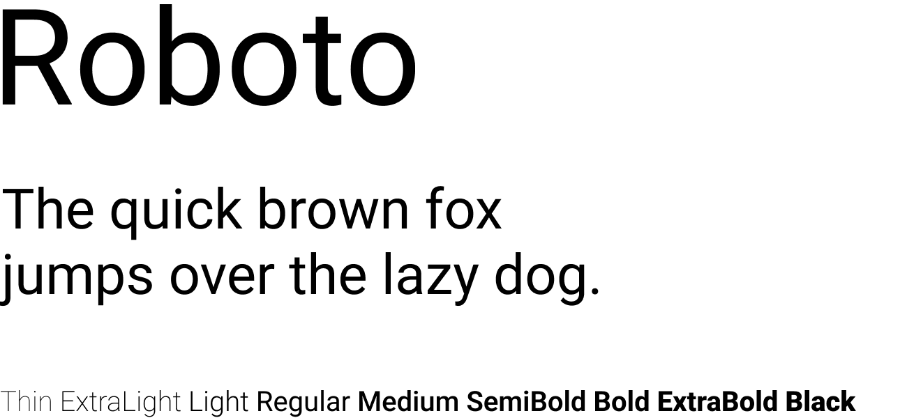
Designer: Christian Robertson
Description: Roboto has a dual nature. It has a mechanical skeleton and the forms are largely geometric. At the same time, the font features friendly and open curves. While some grotesks distort their letterforms to force a rigid rhythm, Roboto doesn’t compromise, allowing letters to be settled into their natural width. This makes for a more natural reading rhythm more commonly found in humanist and serif types.
This is the regular family, which can be used alongside the Roboto Condensed family and the Roboto Slab family.
Open Sans
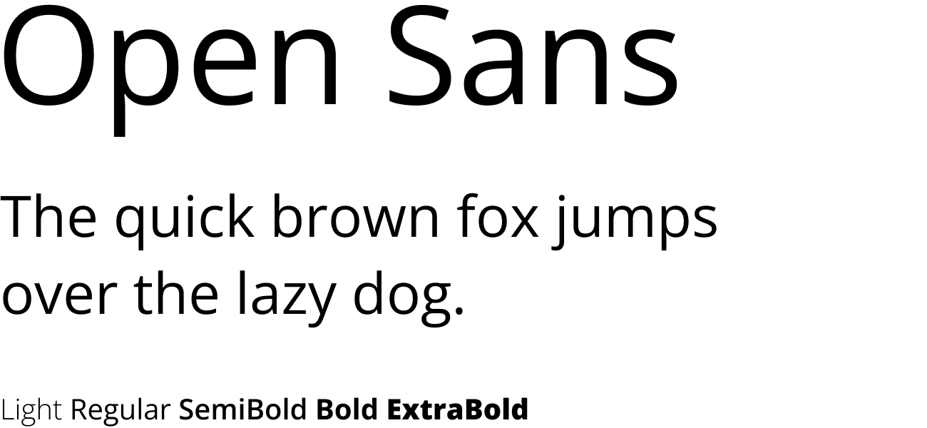
Designer: Steve Matteson
Description: Open Sans is a humanist sans serif typeface designed by Steve Matteson, Type Director of Ascender Corp. This version contains the complete 897 character set, which includes the standard ISO Latin 1, Latin CE, Greek and Cyrillic character sets. Open Sans was designed with an upright stress, open forms and a neutral, yet friendly appearance. It was optimized for print, web, and mobile interfaces, and has excellent legibility characteristics in its letterforms.
Lato
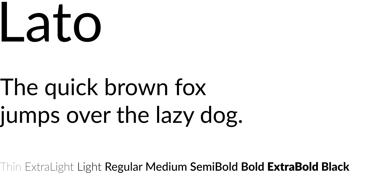
Designer: Łukasz Dziedzic
Description: Lato is a sans serif typeface family started in the summer of 2010 by Warsaw-based designer Łukasz Dziedzic (“Lato” means “Summer” in Polish). In December 2010 the Lato family was published under the Open Font License by his foundry tyPoland, with support from Google.
In the last ten or so years, during which Łukasz has been designing type, most of his projects were rooted in a particular design task that he needed to solve. With Lato, it was no different. Originally, the family was conceived as a set of corporate fonts for a large client — who in the end decided to go in different stylistic direction, so the family became available for a public release.
When working on Lato, Łukasz tried to carefully balance some potentially conflicting priorities. He wanted to create a typeface that would seem quite “transparent” when used in body text but would display some original traits when used in larger sizes. He used classical proportions (particularly visible in the uppercase) to give the letterforms familiar harmony and elegance. At the same time, he created a sleek sans serif look, which makes evident the fact that Lato was designed in 2010 — even though it does not follow any current trend.
The semi-rounded details of the letters give Lato a feeling of warmth, while the strong structure provides stability and seriousness. “Male and female, serious but friendly. With the feeling of the Summer,” says Łukasz. Learn more at www.latofonts.com
Montserrat
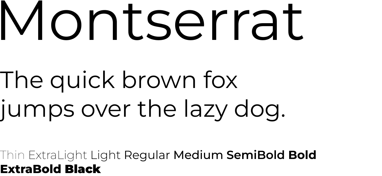
Designer: Julieta Ulanovsky
Description: The old posters and signs in the traditional Montserrat neighborhood of Buenos Aires inspired Julieta Ulanovsky to design this typeface and rescue the beauty of urban typography that emerged in the first half of the twentieth century. As urban development changes that place, it will never return to its original form and loses forever the designs that are so special and unique. The letters that inspired this project have work, dedication, care, color, contrast, light and life, day and night! These are the types that make the city look so beautiful. The Montserrat Project began with the idea to rescue what is in Montserrat and set it free under a libre license, the SIL Open Font License.
This is the normal family, and it has two sister families so far, Alternates and Subrayada. Many of the letterforms are special in the Alternates family, while ‘Subrayada’ means ‘Underlined’ in Spanish and celebrates a special style of underline that is integrated into the letterforms found in the Montserrat neighborhood.
Roboto Condensed
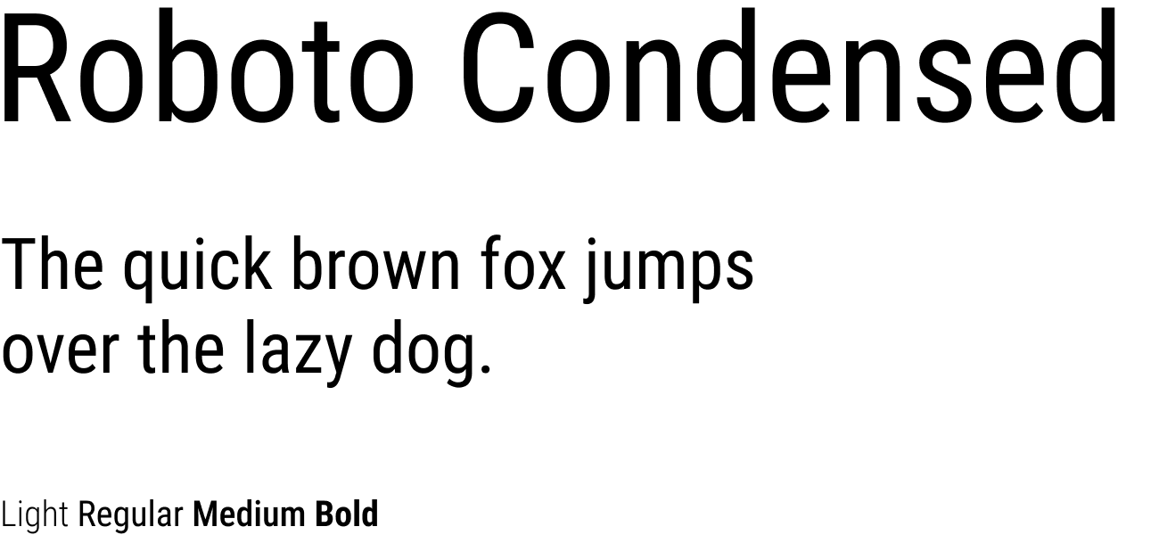
Designer: Christian Robertson
Description: Roboto has a dual nature. It has a mechanical skeleton and the forms are largely geometric. At the same time, the font features friendly and open curves. While some grotesks distort their letterforms to force a rigid rhythm, Roboto doesn’t compromise, allowing letters to be settled into their natural width. This makes for a more natural reading rhythm more commonly found in humanist and serif types.
This is the Condensed family, which can be used alongside the normal Roboto family and the Roboto Slab family.
Oswald
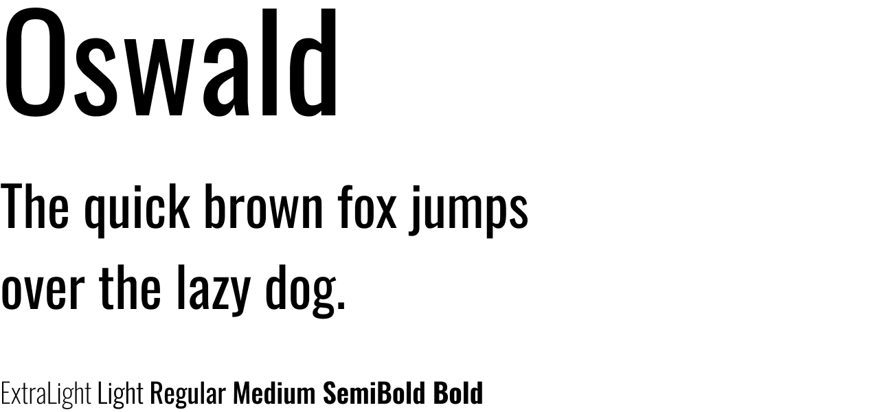
Designer: Vernon Adams
Description: Oswald is a reworking of the classic style historically represented by the ‘Alternate Gothic’ sans serif typefaces. The characters of Oswald were initially re-drawn and reformed to better fit the pixel grid of standard digital screens. Oswald is designed to be used freely across the internet by web browsers on desktop computers, laptops and mobile devices.
Since the initial launch in 2011, Oswald was updated continually by Vernon Adams until 2014. Vernon added Light and Bold weights, support for more Latin and Cyrillic languages, tightened the spacing and kerning and made many glyph refinements throughout the family based on hundreds of users’ feedback. In 2016 the Latin part of the family was updated by Kalapi Gajjar to complete the work started by Vernon. In January 2019, it was updated with a variable font Weight axis.
Source Sans Pro
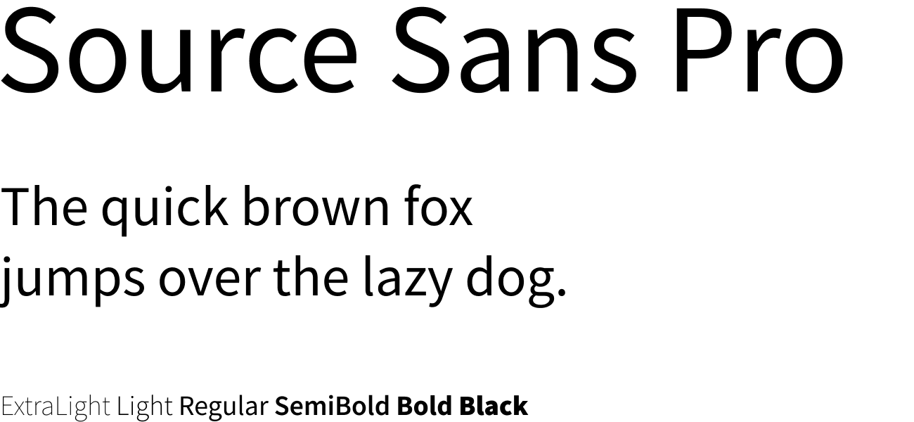
Designer: Paul D. Hunt
Description: Source® Sans Pro, Adobe’s first open source typeface family, was designed by Paul D. Hunt. It is a sans serif typeface intended to work well in user interfaces.
Slabo 27px
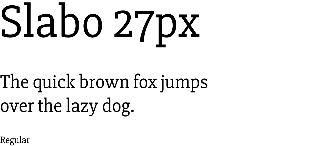
Designer: John Hudson
Description: Slabo is a collection of size-specific fonts for use in online advertising and other web uses. The collection currently includes this font, Slabo 27px, and Slabo 13px. Each font in the collection is fine-tuned for use at the pixel size in its name.
Raleway
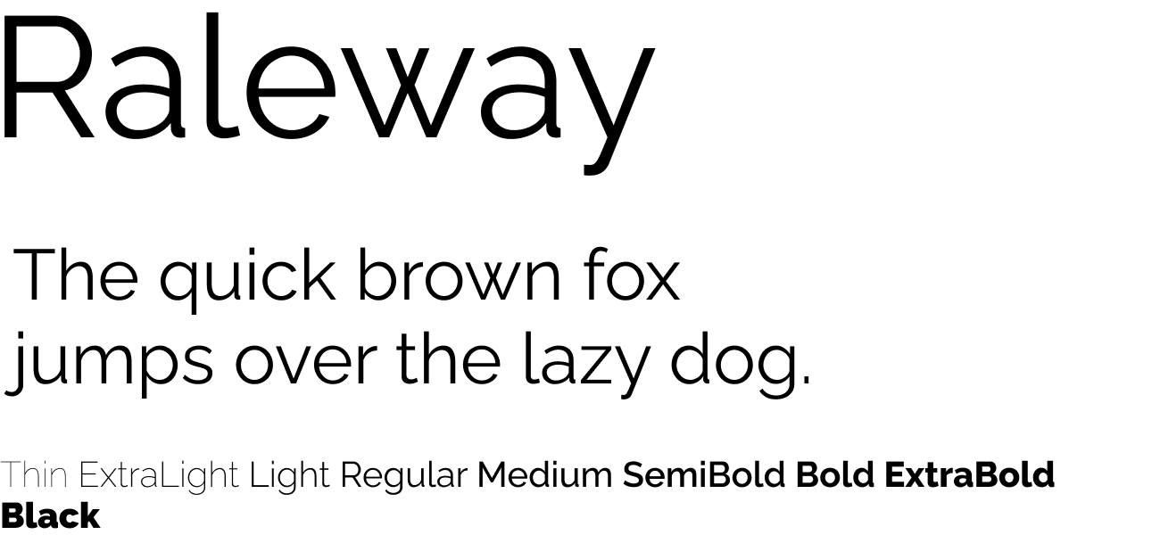
Designers: Matt McInerney, Pablo Impallari and Rodrigo Fuenzalida
Description: Raleway is an elegant sans-serif typeface family. Initially designed by Matt McInerney as a single thin weight, it was expanded into a 9 weight family by Pablo Impallari and Rodrigo Fuenzalida in 2012 and iKerned by Igino Marini. A thorough review and italic was added in 2016.
It is a display face and the download features both old style and lining numerals, standard and discretionary ligatures, a pretty complete set of diacritics, as well as a stylistic alternate inspired by more geometric sans-serif typefaces than its neo-grotesque inspired default character set.
It also has a sister family, Raleway Dots.
PT Sans
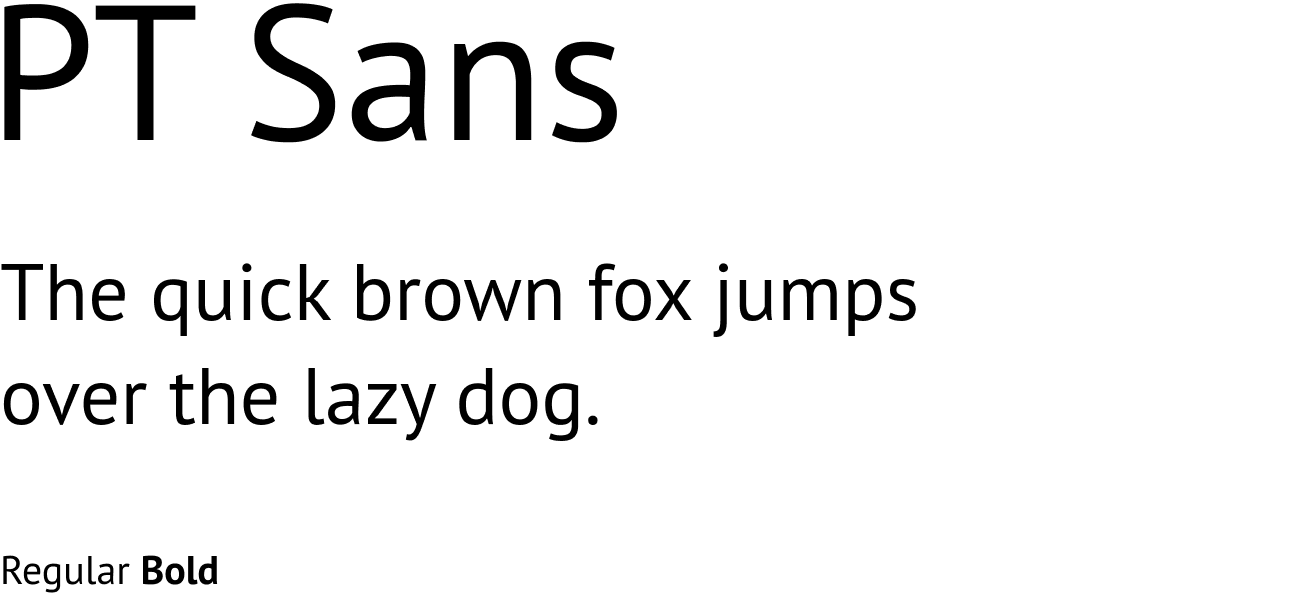
Designer: ParaType
Description: PT Sans was developed for the project “Public Types of Russian Federation.” The second family of the project, PT Serif, is also available.
The fonts are released with a libre license and can be freely redistributed: The main aim of the project is to give possibility to the people of Russia to read and write in their native languages.
The project is dedicated to the 300 year anniversary of the civil type invented by Peter the Great in 1708–1710. It was given financial support from the Russian Federal Agency for Press and Mass Communications.
The fonts include standard Western, Central European and Cyrillic code pages, plus the characters of every title language in the Russian Federation. This makes them a unique and very important tool for modern digital communications.
PT Sans is based on Russian sans serif types of the second part of the 20th century, but at the same time has distinctive features of contemporary humanistic designs. The family consists of 8 styles: 4 basic styles, 2 captions styles for small sizes, and 2 narrows styles for economic type setting.
I hope you discovered at least one new font to incorporate into your future projects. From Roboto to PT Sans, all of the above fonts are widely popular across the web. Remember to visit Google Fonts if you want to explore an even more expansive collection of Google-curated fonts. Here you can easily add their 900+ fonts and styles into your HTML, CSS, or design tool of your choice. I highly recommend their Fonts Knowledge page to develop a better understanding of typography and how to choose fonts with purpose.
</div
Recommend
About Joyk
Aggregate valuable and interesting links.
Joyk means Joy of geeK