

Streaming Platform UX Review: AppleTV+
source link: https://uxplanet.org/streaming-platform-ux-review-appletv-6610cc0d86f3
Go to the source link to view the article. You can view the picture content, updated content and better typesetting reading experience. If the link is broken, please click the button below to view the snapshot at that time.
USER EXPERIENCE
Streaming Platform UX Review: AppleTV+
Apple may be great at designing phones and laptops, but they’ve got some bugs with their streaming service.
Photo by James Yarema on Unsplash
Intro
As a filmmaker and storyteller, I’ve got several subscriptions to streaming platforms. However, I’ve never before had AppleTV+…until recently, that is.
We bought new iPhones to replace our dying models, and with them came a free three month trial of AppleTV+. Not bad!
However, as a UX professional I’ve found the user experience to be smoewhat cumbersome. Since Apple is such a tech juggernaut, you’d think they’d be the king of the hill when it comes to their streaming service.
…So what went wrong?
Before we get to that, let’s see what I do like.
Photo by Glenn Carstens-Peters on Unsplash
UX Wins
Sleek Interface Aesthetic
It’s better than the typical “colored squares on black background” schema that’s ubiquitous on many other streaming platforms. By now it’s normative and even brand-related for Netflix, but can be derivative for other streamers.
Here’s what the interfacelooks like on AppleTV+:
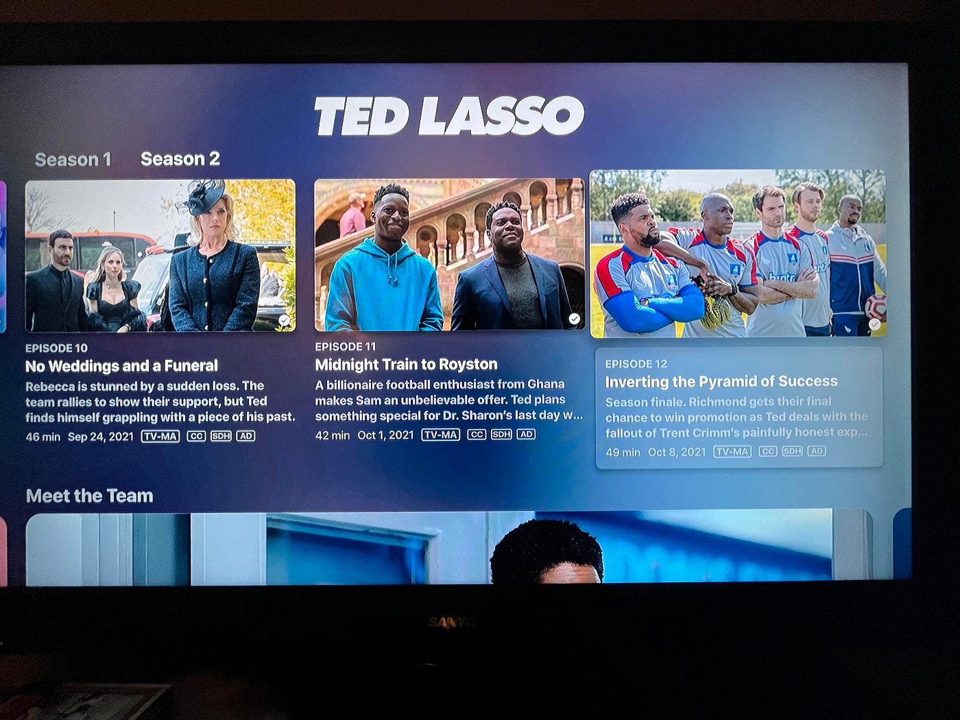
Slick, polished, and colorful in a tasteful way. Nice.
Excellent Content
I dug being able to finally see Tom Hanks’ Greyhound and finish “Ted Lasso.”
Side note: Hanks’ film is titled Greyhound afer the German submarine hunting Allied vessels. Ted Lasso’s underdog soccer team is called AFC Richmond, and their mascot is…a greyhound!
Coincidence? I think not!
Photo by Markus Winkler on Unsplash
Still, I found the rest of the catalogue lackluster, to be honest. Not that it was bad—just that there’s not a ton of unique content.
Since AppleTV+ has a model similar to Amazon Prime in which exclusive content is included for subscribers and other content can be bought and rented, I expected there to be more exclusive content to entice viewers.
If I want to rent a random film, I can just do that on Prime. No need to do that on a different platform, even if it is connected to my iTunes account. This is the main reason I won’t be extending my AppleTV+ membership past the free trial—the content just ain’t there to warrant the cost.
This is a huge business issue for Apple: No matter how good the UX and UI are, if the unique selling point isn’t enticing enough, customers won’t buy. End of story.
UX Fails
A caveat: My analysis is directed only at the AppleTV+ experience on Roku. I’ve not used the iOS app or accessed AppleTV+ on my laptop. It’s possible some of the issues I’ll mention only apply to the Roku and other third-party interface systems.
Confusing Info Architecture
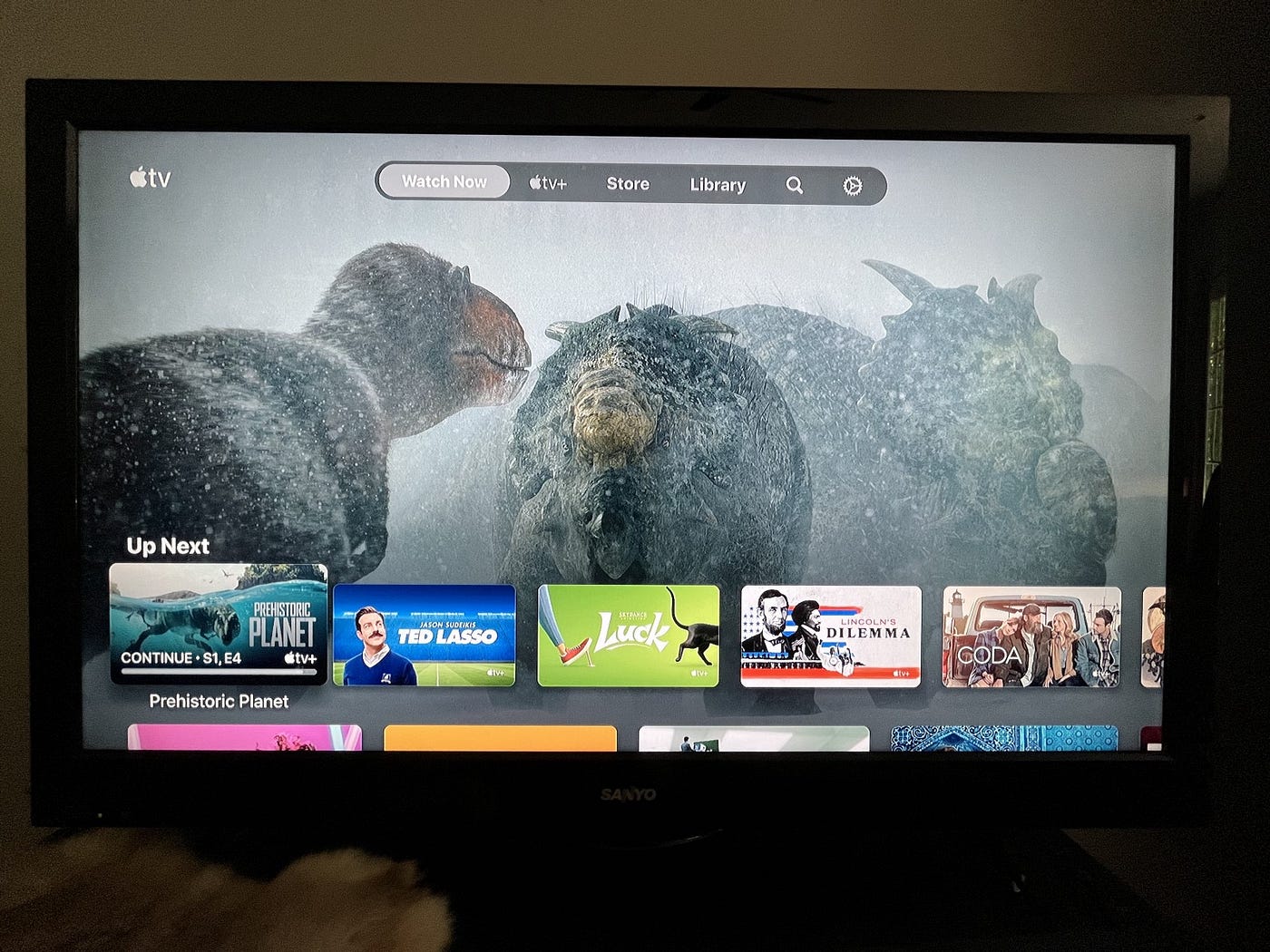
So, this is what the “home” screen looks like. Am I on the menu? Or am I on the row of titles below it?
I should be able to tell at first glance, but even after using the app for weeks, I still got confused sometimes. My wife did it too. The interaction model was a bit too sleek and unobtrusive to be difficult to use.
This confusing hierarchy also presented issues when selecting an item. That’s because depending on where you are in the menu, the same button will unexpectedly perform distinct actions.
So, If I’m on this home page and I click on “Ted Lasso,” it doesn’t take me to (as I expected) more information about the show. Instead, it starts to play the show!
Photo by Omar Rodriguez on Unsplash
Wait! I just want to see who else is in it besides Jason Sudekis and how long each episode is— Don’t start yet!
I didn’t even use the “play” button, either. This is the digital equivalent of some irksome DVD and Blu-ray players that automatically play the film when the disc is inserted (said the grumpy old man).
Perhaps I was more confused than the average user since I don’t have a “hover” ability on the Roku like on a laptop, but the interaction and architecture I expected is based on years of experience with other streamers like Netflix and Amazon Prime. Apple should know this, and adjust accordingly instead of trying to reinvent the wheel.
Now, I’m not done with information architecture issues. Even when you are finally able to select a show to see more about it and not play it, there’s yet another dearth of important details.
The UX of Mobile App Onboarding: Rosetta Stone vs. Duolingo
While app onboarding might feel like an unimportant, one-time process, my comparison of two popular language learning…
Notice I said lack of important details. There are lots of details there, just not what I was looking for. For example, the resolution and audio options—such as Dolby 5.1—are listed. But most viewers don’t care about these; they should be buried in the “See more” section as nuanced metadata.
So what was I looking for? With another show we’d just started, we wanted to know how many episodes were included — a common task for the average viewer.
Photo by Jens Kreuter on Unsplash
In fact, many users take the number of episodes into account when deciding if they’ll even try a series. Because of this, I should be able to easily see at a glance how many episodes are in a particular show.
Not on AppleTV+! I had to manually count the number of episodes. Click on the tile. Click to the right, one-by-one. Oh, so this “Prehistoric Planet” docuseries has five episodes. Finally figured it out.
In addition to the common UX maxim “don’t make me think,” there should be another: “don’t make me work hard when it’s unnecessary!”
No Scrubbing
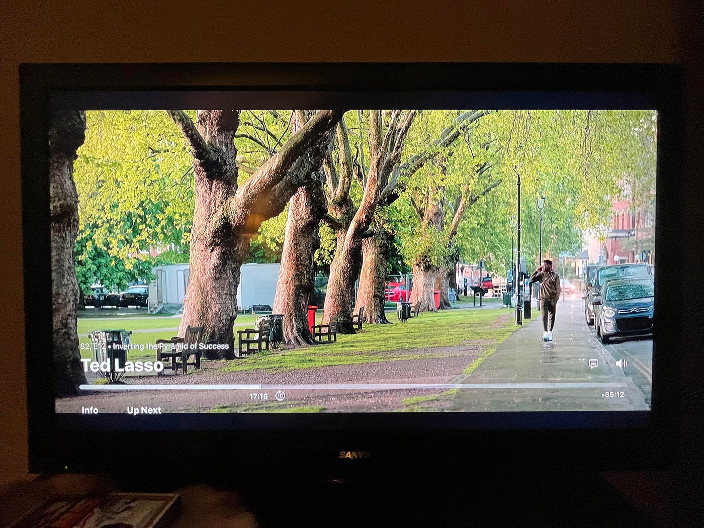
Let’s say I wanted to pick up on an episode of a show my wife had already watched—hence my spot wasn’t saved. No big deal, right? I remember roughly where I was. I’ll just skip to that part.
But no…AppleTV+ doesn’t let you scrub. You can only skip forward in ten second bites. Talk about annoying. Imagine how frustrated you’d be if you had to go forward fifteen minutes in only ten second increments!
Worse still is that AppleTV+ doesn’t show you a preview of the film while you’re skipping ahead—even though that’s a standard feature in Netflix, Paramount+ (though they were late to the game), and YouTube:

Screenshot by the author via InspiringPhilosophy
See? No matter how long the video or how old it is, I can quickly see what’s coming next in the preview window on YouTube. It’s even better on other streaming platforms where you see multiple previews including moments before, the current moment, and moments later.
Do better, AppleTV+. This should be easy.
Looped Episode
At the end of a season, you expect the next season to be a click away—or even to passively start. Netflix has been doing this for years. But AppleTV+?
They stuck me in an endless loop.
Here’s what happened: My wife and I completed “Ted Lasso” season one. Cool. Time to start season 2!
I let the credits play, expecting to see a button or a countdown timer until S2:E1. However, no such prompt appears. Instead, the next tile under the player is…the same episode I just finished. Weird.
Well, maybe it’s just a glitch. Surely that’s how I start season 2. (I can’t recall if I clicked or if the app simply played this next tile.) Either way, the last episode—which I just watched—then starts again in the middle of the closing credits where I just was!

© CBS Studios / Paramount
This happens several times.
I’m flabbergasted—or as the British would say, “absolutely gobsmacked.”
Oh, and remember how I couldn’t click easily to get info about a show? A similar thing then happened when I tried to click on the “Ted Lasso” tile and find season 2. It just starts to play S1:E1!
I have to exit, go to the menu, and manually search “Ted Lasso” in order to find season 2. I half-expected it to not even show up.
Apple—other streamers make it effortless to keep watching a show, new season or not. Netflix even asks if you’re still watching because a user can passively binge without even clicking. Y’all got some catching up to do, AppleTV+. You’re not intuitive at all.
To Summarize
AppleTV+, it was fun, but y’all just don’t have a good enough catalogue or user experience to justify adding you to my list of other subscriptions. You look sleek and shiny, but your confounding information architecture, unexpected interface model, and lack of intuitive actions makes you less-than-stellar. Free trial canceled.
Recommend
About Joyk
Aggregate valuable and interesting links.
Joyk means Joy of geeK