

基于OpenHarmony3.1的购物车应用的实现
source link: https://os.51cto.com/article/712603.html
Go to the source link to view the article. You can view the picture content, updated content and better typesetting reading experience. If the link is broken, please click the button below to view the snapshot at that time.

1、创建商品列表页面
在这一节,我们将完成主页界面以及商品列表页签的设计,效果图如下:
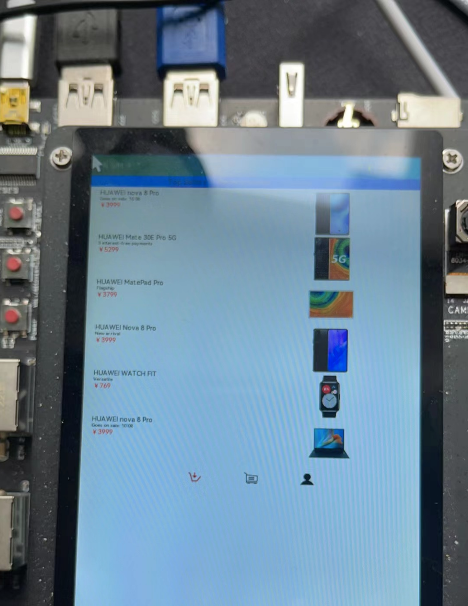
从上面效果图可以看出,主界面商品列表页签主要由下面三个部分组成:
(1)顶部的Tabs组件。
(2)中间TabContent组件内包含List组件。其中List组件的item是一个水平布局,由一个垂直布局和一个Image组件组成;item中的垂直布局由3个Text组件组成。
(3)底部的页签导航。
下面来一起创建第一个页面,第一个页面的文件是pages/HomePage.ets,现在先创建该文件。
在与pages文件夹同级目录创建一个model文件夹,并在model目录下新建ArsData.ets、GoodsData.ets、Menu.ets和GoodsDataModels.ets文件,其中ArsData.ets、GoodsData.ets、Menu.ets是数据实体类,GoodsDataModels.ets是存放这三种实体数据集合,并定义了获取各种数据集合的方法。数据实体包含实体的属性和构造方法,可通过new ArsData(string,string) 来获取ArsData对象,ArsData.ets内容如下:
let NextId = 0;
export class ArsData {
  id: string;
  title: string;
  content: string;

  constructor(title: string, content: string) {
    this.id = `${NextId++}`;
    this.title = title;
    this.content = content;
  }
}
GoodsData.ets代码如下:
let NextId = 0;
export class GoodsData {
  id: string;
  title: string;
  content: string;
  price: number;
  imgSrc: Resource;
  constructor(title: string, content: string, price: number, imgSrc: Resource) {
    this.id = `${NextId++}`;
    this.title = title;
    this.content = content;
    this.price = price;
    this.imgSrc = imgSrc;
  }
}
一个文件中可以包含多个class ,Menu.ets中就包含了Menu类和ImageItem类,Menu.ets代码如下:
let NextId = 0;
export class Menu {
id: string;
title: string;
num: number;
constructor(title: string, num: number) {
this.id = `${NextId++}`;
this.title = title;
this.num = num;
}
}
export class ImageItem {
id: string;
title: string;
imageSrc: Resource;
constructor(title: string, imageSrc: Resource) {
this.id = `${NextId++}`;
this.title = title;
this.imageSrc = imageSrc;
}
}
GoodsDataModels.ets代码如下:
import {GoodsData} from './GoodsData'
import {Menu, ImageItem} from './Menu'
import {ArsData} from './ArsData'
// 获取商品列表数据
export function initializeOnStartup(): Array<GoodsData> {
let GoodsDataArray: Array<GoodsData> = []
GoodsComposition.forEach(item => {
console.log(item.title);
GoodsDataArray.push(new GoodsData(item.title, item.content, item.price, item.imgSrc));
})
return GoodsDataArray;
}
// 获取底部默认图片列表数据
export function getIconPath(): Array<string> {
let IconPath: Array<string> = ['nav/icon-buy.png','nav/icon-shopping-cart.png','nav/icon-my.png']
return IconPath;
}
// 获取选中后图片列表数据
export function getIconPathSelect(): Array<string> {
let IconPathSelect: Array<string> = ['nav/icon-home.png','nav/icon-shopping-cart-select.png','nav/icon-my-select.png']
return IconPathSelect;
}
// 获取商品详情页图片详情列表
export function getDetailImages(): Array<string> {
let detailImages: Array<string> = ['computer/computer1.png','computer/computer2.png','computer/computer3.png','computer/computer4.png','computer/computer5.png','computer/computer6.png']
return detailImages;
}
// 获取菜单数据列表
export function getMenu(): Array<Menu> {
let MenuArray: Array<Menu> = []
MyMenu.forEach(item => {
MenuArray.push(new Menu(item.title,item.num));
})
return MenuArray;
}
// 获取MyTrans数据列表
export function getTrans(): Array<ImageItem> {
let ImageItemArray: Array<ImageItem> = []
MyTrans.forEach(item => {
ImageItemArray.push(new ImageItem(item.title,item.imageSrc));
})
return ImageItemArray;
}
// 获取More数据列表
export function getMore(): Array<ImageItem> {
let ImageItemArray: Array<ImageItem> = []
MyMore.forEach(item => {
ImageItemArray.push(new ImageItem(item.title,item.imageSrc));
})
return ImageItemArray;
}
// 获取参数列表
export function getArs(): Array<ArsData> {
let ArsItemArray: Array<ArsData> = []
ArsList.forEach(item => {
ArsItemArray.push(new ArsData(item.title,item.content));
})
return ArsItemArray;
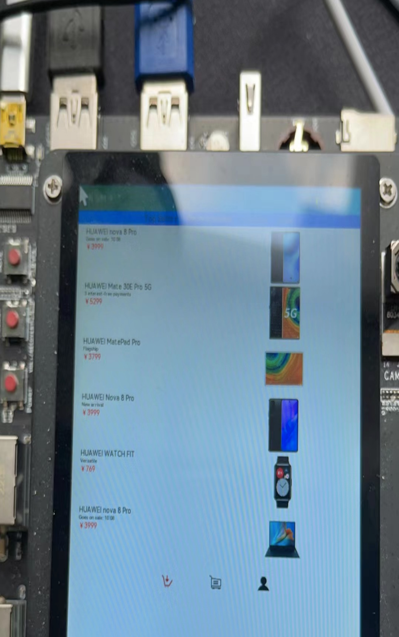
}在HomePage.ets文件中创建商品列表页签相关的组件,其中GoodsHome效果图如下:
代码如下:
@Component
struct GoodsHome {
  private goodsItems: GoodsData[]
  build() {
    Column() {
      Tabs() {
        TabContent() {
          GoodsList({ goodsItems: this.goodsItems });
        }
        .tabBar("Top Sellers")
        .backgroundColor(Color.White)
        TabContent() {
          GoodsList({ goodsItems: this.goodsItems });
        }
        .tabBar("Recommended")
        .backgroundColor(Color.White)
        TabContent() {
          GoodsList({ goodsItems: this.goodsItems });
        }
        .tabBar("Lifestyle")
        .backgroundColor(Color.White)
        TabContent() {
          GoodsList({ goodsItems: this.goodsItems });
        }
        .tabBar("Deals")
        .backgroundColor(Color.White)
      }
      .barWidth(500)
      .barHeight(25)
      .scrollable(true)
      .barMode(BarMode.Scrollable)
      .backgroundColor('#007DFF')
      .height(630)

    }
    .alignItems(HorizontalAlign.Start)
    .width('100%')
  }
}
在GoodsHome中使用Tabs组件,在Tabs组件中设置4个TabContent,给每个TabContent设置tabBar属性,并设置TabContent容器中的内容GoodsList组件,GoodsList组件的代码如下:
@Component
struct GoodsList {
  private goodsItems: GoodsData[]
  build() {
    Column() {
      List() {
        ForEach(this.goodsItems, item => {
          ListItem() {
            GoodsListItem({ goodsItem: item })
          }
        }, item => item.id.toString())
      }
      .height('100%')
      .width('100%')
      .align(Alignment.Top)
      .margin({top: 5})
    }
  }
}
2、创建购物车页面
购物车主界面如下:
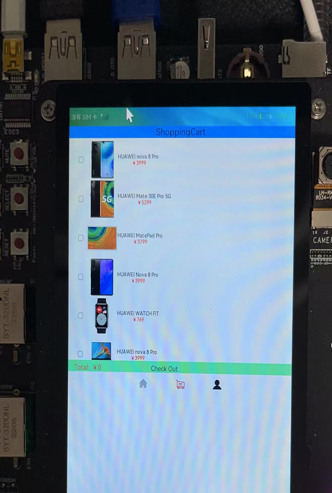
从上面效果图可以看出,主界面购物车页签主要由下面三部分组成:
(1)顶部的Text组件。
(2)中间的List组件,其中List组件的item是一个水平的布局内包含一个toggle组件,一个Image组件和一个垂直布局,其item中的垂直布局是由2个Text组件组成。
(3)底部一个水平布局包含两个Text组件。
import {GoodsData} from '../model/GoodsData'
import {initializeOnStartup} from '../model/GoodsDataModels'
import prompt from '@system.prompt';
@Entry
@Component
export struct ShoppingCart {
  @Provide totalPrice : number =0
  private goodsItems: GoodsData[] = initializeOnStartup()
  build() {
    Column() {
      Column() {
        Text('ShoppingCart')
          .fontColor(Color.Black)
          .fontSize(25)
          .margin({ left: 60,right:60 })
          .align(Alignment.Center)
      }
      .backgroundColor('#FF00BFFF')
      .width('100%')
      .height(30)
      ShopCartList({ goodsItems: this.goodsItems });
      ShopCartBottom()
    }
    .alignItems(HorizontalAlign.Start)
 }
}
新建ShopCartList组件用于存放购物车商品列表,ShopCartList组件的代码如下:
@Component
struct ShopCartList {
private goodsItems: GoodsData[]
build() {
Column() {
List() {
ForEach(this.goodsItems, item => {
ListItem() {
ShopCartListItem({ goodsItem: item })
}
}, item => item.id.toString())
}
.height('100%')
.width('100%')
.align(Alignment.Top)
.margin({top: 5})
}
.height(570)
}
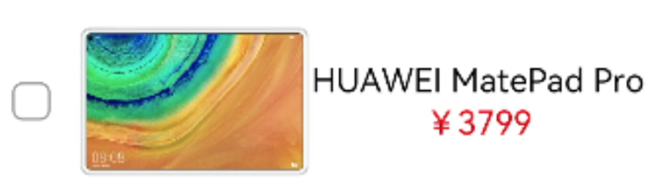
}ShopCartListItem组件效果图如下:
代码如下:
@Component
struct ShopCartListItem {
  @Consume totalPrice: number
  private goodsItem: GoodsData
  build() {
      Row() {
          Toggle({type: ToggleType.Checkbox})
            .width(10)
            .height(10)
            .onChange((isOn:boolean) => {
              if(isOn){
                this.totalPrice +=parseInt(this.goodsItem.price+'',0)
              }else{
                this.totalPrice -= parseInt(this.goodsItem.price+'',0)
              }
             })
          Image(this.goodsItem.imgSrc)
            .objectFit(ImageFit.ScaleDown)
            .height(100)
            .width(100)
            .renderMode(ImageRenderMode.Original)
          Column() {
            Text(this.goodsItem.title)
              .fontSize(14)
            Text('¥' + this.goodsItem.price)
              .fontSize(14)
              .fontColor(Color.Red)
          }
        }
        .height(100)
        .width(180)
        .margin({left: 20})
        .alignItems(VerticalAlign.Center)
        .backgroundColor(Color.White)
  }
}
新建ShopCartBottom组件,ShopCartBottom组件效果图如下:

@Component
struct ShopCartBottom {
  @Consume totalPrice: number
  build() {
    Row() {
      Text('Total:  ¥'+this.totalPrice)
         .fontColor(Color.Red)
         .fontSize(18)

          .margin({left:20})
          .width(150)
      Text('Check Out')
        .fontColor(Color.Black)
        .fontSize(18)
        .margin({right:20,left:100})
        .onClick(()=>{
        prompt.showToast({
          message: 'Checking Out',
          duration: 10,
          bottom:100
        })
        })
    }
    .height(30)
    .width('100%')
    .backgroundColor('#FF7FFFD4')
    .alignItems(VerticalAlign.Bottom)
  }
}
3、构建商品详情页
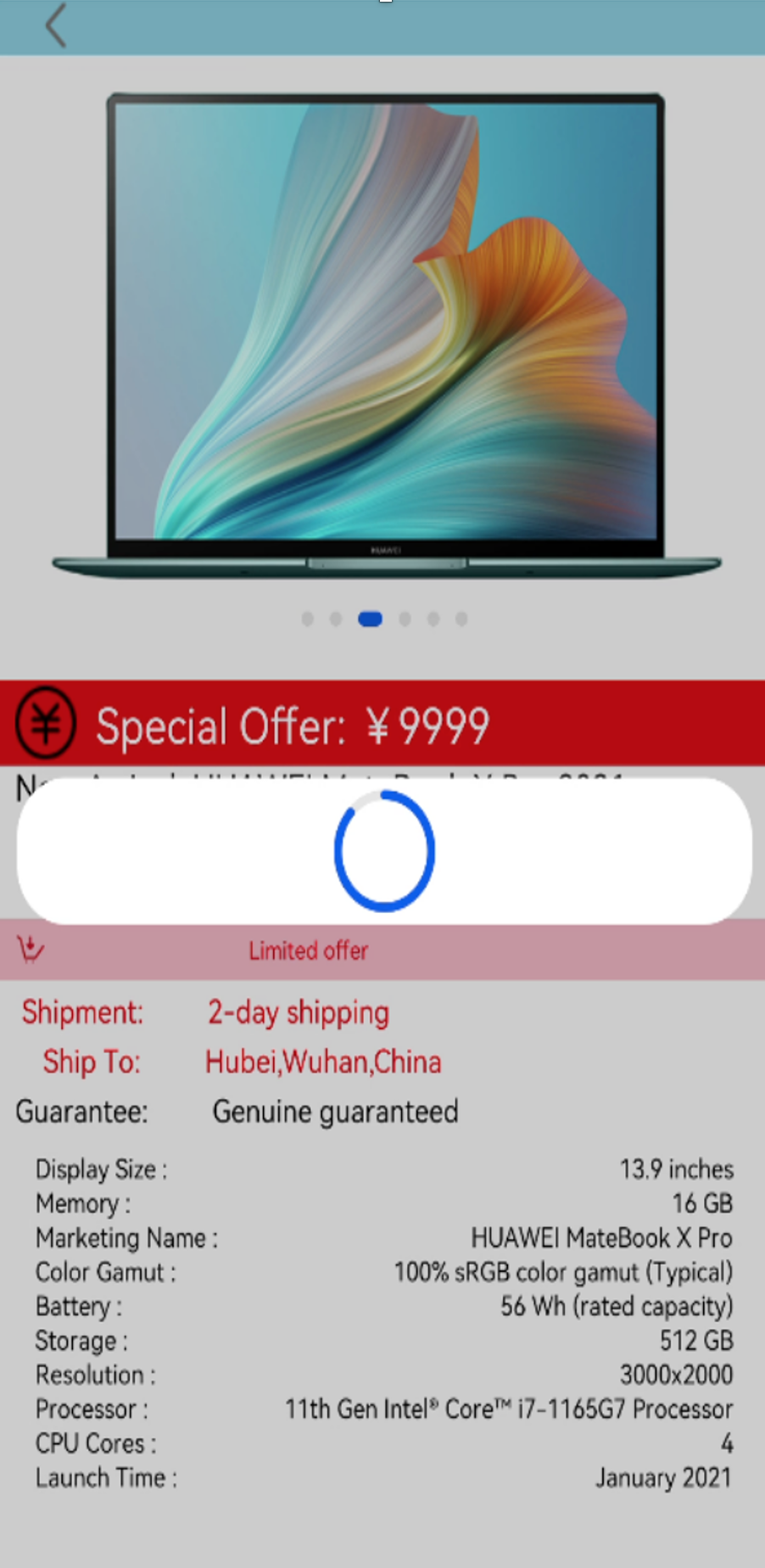
商品详情页的效果如下图所示:
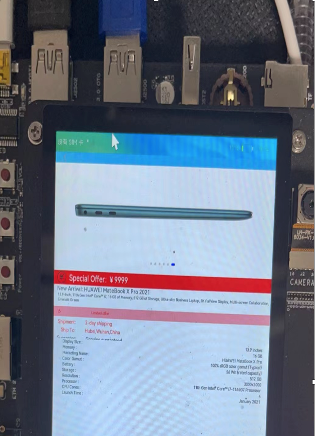
从上面效果图可以看出,商品详情页面主要由下面五部分组成:
(1)顶部的返回栏。
(2)Swiper组件。
(3)中间多个Text组件组成的布局。
(4)参数列表。
(5)底部的Buy。
在本节中,把上面每一部分都封装成一个组件,然后再放到入口组件内,当点击顶部返回图标时返回到主页面的商品列表页签,点击底部Buy时,会触发进度条弹窗。
1.在pages目录下面新建一个eTS Page, 命名为ShoppingDetail.ets,config.json文件pages属性中也会自动添加"pages/ShoppingDetail"页面路由。
2. 在ShoppingDetail.ets文件中创建入口组件,组件内容如下:
@Entry
@Component
struct ShoppingDetail {
  private arsItems: ArsData[] =  getArs()
  private detailImages: string[] = getDetailImages()
  build() {
      Column() {
        DetailTop()
          Scroll() {
            Column() {
              SwiperTop()
              DetailText()
              DetailArsList({ arsItems: this.arsItems })
              Image($rawfile('computer/computer1.png'))
                .height(220)
                .width('100%')
                .margin({top:30})
              Image($rawfile('computer/computer2.png'))
                .height(220)
                .width('100%')
                .margin({top:30})
              Image($rawfile('computer/computer3.png'))
                .height(220)
                .width('100%')
                .margin({top:30})
              Image($rawfile('computer/computer4.png'))
                .height(220)
                .width('100%')
                .margin({top:30})
              Image($rawfile('computer/computer5.png'))
                .height(220)
                .width('100%')
                .margin({top:30})
              Image($rawfile('computer/computer6.png'))
                .height(220)
                .width('100%')
                .margin({top:30})
            }
            .width('100%')
            .flexGrow(1)
          }
          .scrollable(ScrollDirection.Vertical)
          DetailBottom()
        }
        .height(630)
  }
}
其中顶部DetailTop组件效果图如下:

代码如下:
@Component
struct DetailTop{
  build(){
    Column(){
      Row(){
        Image($rawfile('detail/icon-return.png'))
          .height(20)
          .width(20)
          .margin({ left: 20, right: 250 })
          .onClick(() => {
              router.push({
                uri: "pages/HomePage"
              })
        })
      }
      .width('100%')
      .height(25)
      .backgroundColor('#FF87CEEB')
    }
    .width('100%')
    .height(30)
  }
}
SwiperTop组件效果图如下:
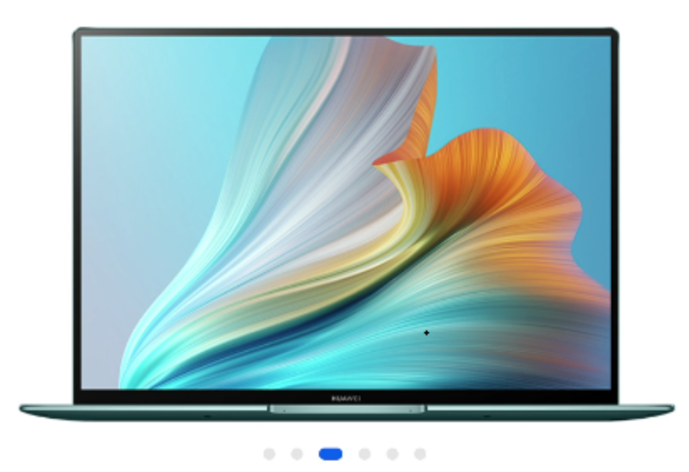
代码如下:
@Component
struct SwiperTop{
build() {
Column() {
Swiper() {
Image($rawfile('computer/computer1.png'))
.height(220)
.width('100%')
Image($rawfile('computer/computer2.png'))
.height(220)
.width('100%')
Image($rawfile('computer/computer3.png'))
.height(220)
.width('100%')
Image($rawfile('computer/computer4.png'))
.height(220)
.width('100%')
Image($rawfile('computer/computer5.png'))
.height(220)
.width('100%')
Image($rawfile('computer/computer6.png'))
.height(220)
.width('100%')
}
.index(0)
.autoPlay(true)
.interval(3000)
.indicator(true)
.loop(true)
.height(250)
.width('100%')
}
.height(250)
.width('100%')
}
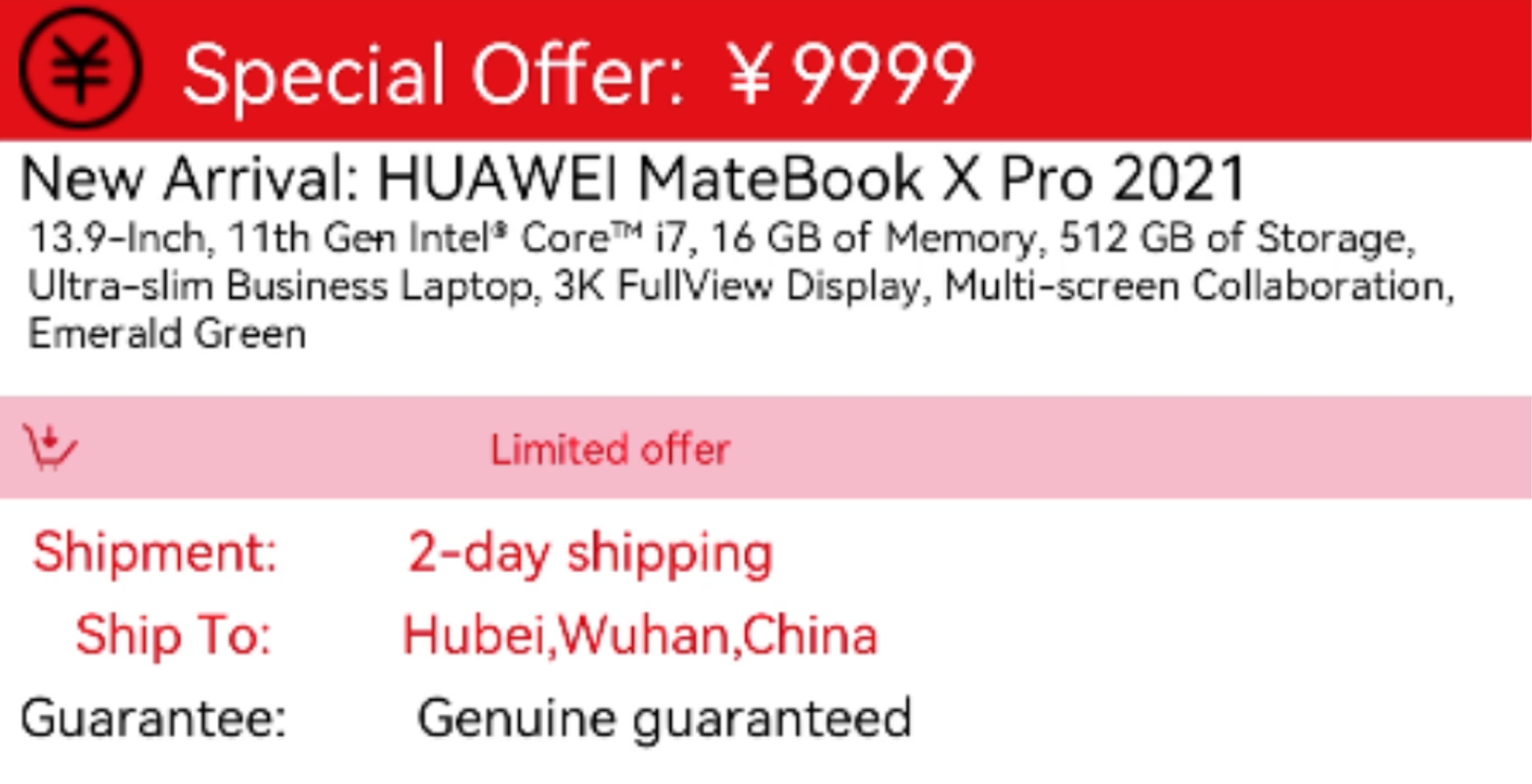
}DetailText组件效果图如下:
代码如下:
@Component
struct DetailText{
  build() {
    Column() {
      Row(){
        Image($rawfile('computer/icon-promotion.png'))
        .height(30)
        .width(30)
        .margin({left:10})
        Text('Special Offer: ¥9999')
        .fontColor(Color.White)
        .fontSize(20)
        .margin({left:10})
      }
      .width('100%')
      .height(35)
      .backgroundColor(Color.Red)
      Column(){
        Text('New Arrival: HUAWEI MateBook X Pro 2021')
        .fontSize(15)
        .margin({left:10})
        .alignSelf(ItemAlign.Start)
        Text('13.9-Inch, 11th Gen Intel® Core™ i7, 16 GB of Memory, 512 GB of Storage, Ultra-slim Business Laptop, 3K FullView Display, Multi-screen Collaboration, Emerald Green')
        .fontSize(10)
        .margin({left:10})
        Row(){
          Image($rawfile('nav/icon-buy.png'))
            .height(15)
            .width(15)
            .margin({left:10})
          Text('Limited offer')
            .fontSize(10)
            .fontColor(Color.Red)
            .margin({left:100})
        }
        .backgroundColor(Color.Pink)
        .width('100%')
        .height(25)
        .margin({top:10})
        Text(' Shipment:         2-day shipping')
          .fontSize(13)
          .fontColor(Color.Red)
          .margin({left:10,top:5})
          .alignSelf(ItemAlign.Start)
        Text('    Ship To:         Hubei,Wuhan,China')
          .fontSize(13)
          .fontColor(Color.Red)
          .margin({left:10,top:5})
          .alignSelf(ItemAlign.Start)
          .onClick(()=>{
            prompt.showDialog({title:'Location Select',})
          TextPicker()
          })
        Text('Guarantee:         Genuine guaranteed')
          .fontSize(13)
          .margin({left:10,top:5})
          .alignSelf(ItemAlign.Start)
      }
      .height(150)
      .width('100%')
    }
    .height(160)
    .width('100%')
  }
}
DetailArsList组件效果图如下:
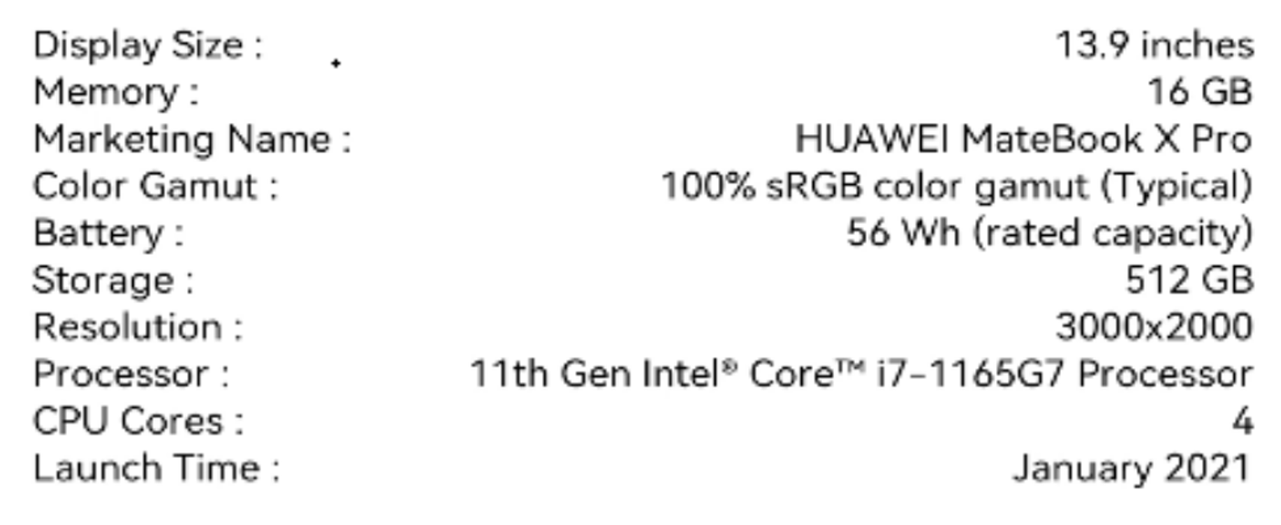
代码如下:
@Component
struct DetailArsList{
  private arsItems: ArsData[]
  build() {
    Scroll() {
      Column() {
        List() {
          ForEach(this.arsItems, item => {
            ListItem() {
              ArsListItem({ arsItem: item })
            }
          }, item => item.id.toString())
        }
        .height('100%')
        .width('100%')
        .margin({ top: 5 })
        .listDirection(Axis.Vertical)
      }
      .height(200)
    }
  }
}
ArsListItem组件代码如下:
@Component
struct ArsListItem {
  private arsItem: ArsData
  build() {
    Row() {
      Text(this.arsItem.title+" :")
        .fontSize(11)
        .margin({left:20})
      Blank(20)
      Text( this.arsItem.content)
        .fontSize(11)
        .margin({left:40,right:20})
    }
    .height(14)
    .width('100%')
    .backgroundColor(Color.White)
  }
}
DetailBottom组件效果图如下:

代码如下:
@Component
struct DetailBottom{
  @Provide
  private value : number=1
  dialogController : CustomDialogController = new CustomDialogController({
    builder: DialogExample({action: this.onAccept}),
    cancel: this.existApp,
    autoCancel: true
  });
  onAccept() {
  }
  existApp() {
  }
  build(){
    Column(){
      Text('Buy')
      .width(40)
      .height(25)
      .fontSize(20)
      .fontColor(Color.White)
      .onClick(()=>{
        this.value=1
        this.dialogController.open()
      })
    }
    .alignItems(HorizontalAlign.Center)
    .backgroundColor(Color.Red)
    .width('100%')
    .height(40)
  }
}
DialogExample自定义弹窗组件效果图如下:
代码如下:
@CustomDialog
@Component
struct DialogExample {
  @Consume
  private value : number
  controller: CustomDialogController;
  action: () => void;
  build() {
    Column() {
      Progress({value: this.value++ >=100?100:this.value, total: 100, style: ProgressStyle.Capsule})
        .height(50)
        .width(100)
        .margin({top:5})
    }
    .height(60)
    .width(100)
  }
}Recommend
About Joyk
Aggregate valuable and interesting links.
Joyk means Joy of geeK