

Laundry symbols make no sense
source link: https://uxdesign.cc/laundry-symbols-make-no-sense-154a0c10dbe0
Go to the source link to view the article. You can view the picture content, updated content and better typesetting reading experience. If the link is broken, please click the button below to view the snapshot at that time.
Laundry symbols make no sense
So I redesigned them, with all due respect.
Never paid attention to those laundry symbols? You should. Not only do they save clothes, but they are also elegant and beautiful. The design (at least a version of it) is produced by GINETEX, a France-based association in the 70s. Thanks to the superior craftsmanship that goes into each icon, it aesthetically holds up half a century later.

The problem with the current laundry symbols
Despite the fact that we literally carry these symbols with us every day, they fail to educate us on what they stand for and that is the one and only job symbols have. Researcher Joni Browne showed four basic laundry symbols to the respondents, but only 1 out of 15 people got the symbols right. Almost half respondents got every symbol wrong.
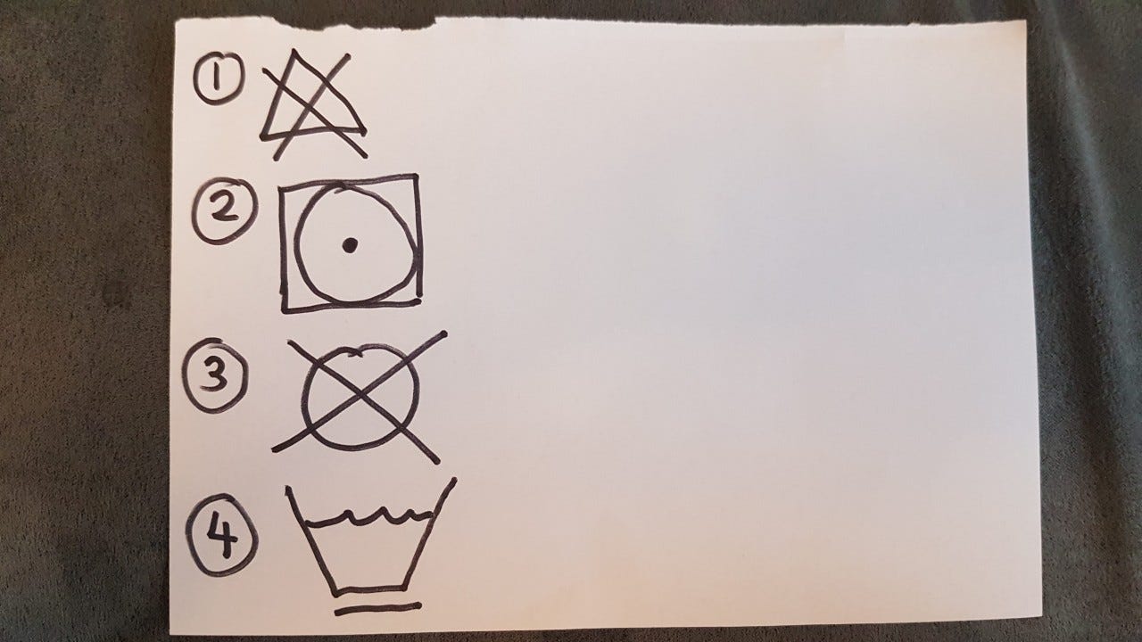
Almost half respondents got every symbol wrong (via)
The problem is that these symbols are designed to be memorized or looked up. In reality, people rarely memorize them, nor do they look up the symbols before doing laundry. Furthermore, these are not error codes where you can Google to get a quick corresponding answer. These are abstract icons, sometimes with subtle differences in between, that require a user to pull up a chart to compare and identify. Laundry itself is a hassle, the symbols should help save work and not do the opposite.
A redesign can fix this!
Unlike many unsolvable things in life, these symbols are so abstract that even the smallest modification can be the improvement needed to save thousands of innocent clothes. For the redesign to make sense, we need to understand and define the goal and constraints.
- The laundry symbols should be as understandable as possible
- The laundry symbols should work universally
- The laundry symbols should be easy to print and make economical sense to produce
- The laundry symbols should be readable when small
- Each laundry symbol should make sense when used as a standalone
Listing these out allows us to see the advantages and shortcomings of the current design. In plain English, we need icons that provide visual cues for users to make a fair guess of their meanings (understandable), work without captions (universal), are composed of simple, one-color strokes (printable, economical, readable when small), and avoid the use of systematic visual language that requires multiple symbols to place together to be meaningful (standalone).
This means no matter how much you love Squid Games, a circle (“Dry Clean Only”) or a triangle (“Bleaching Allowed”) cannot be used as a symbol. Simple shapes as such may make sense to the manufacturers or the laundry shops for various reasons, but in this article we are viewing things based on what would benefit the end-users.
A redesign example
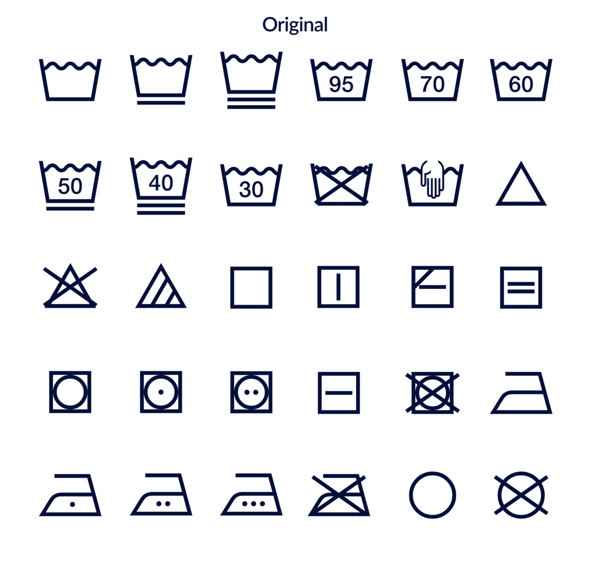
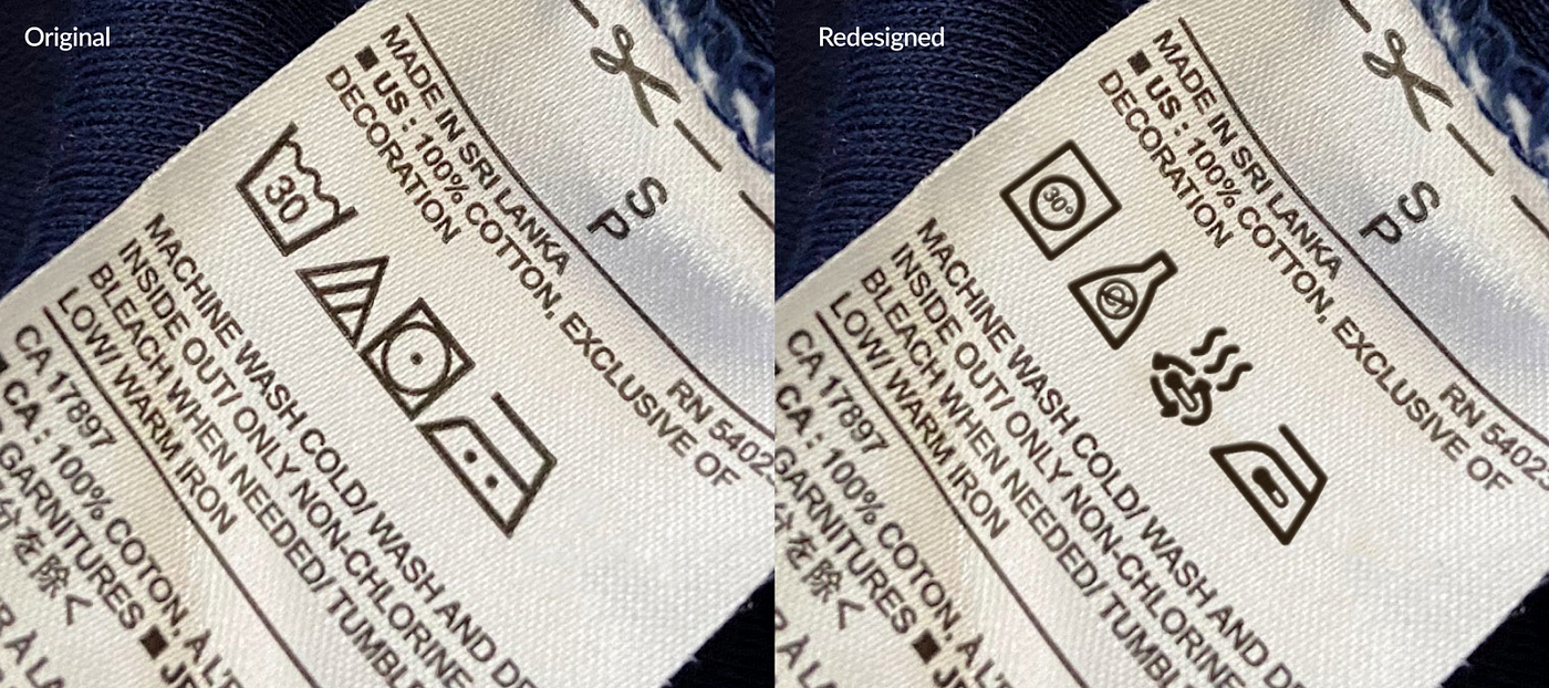
It goes without saying that it is not at all a simple task to create symbols that work for everyone and every piece of clothing everywhere since “universal” icons are rare. Below is just a quick and dirty redesign to hopefully show improvement is possible and to inspire a movement to replace the original symbols. Not all symbols are included.
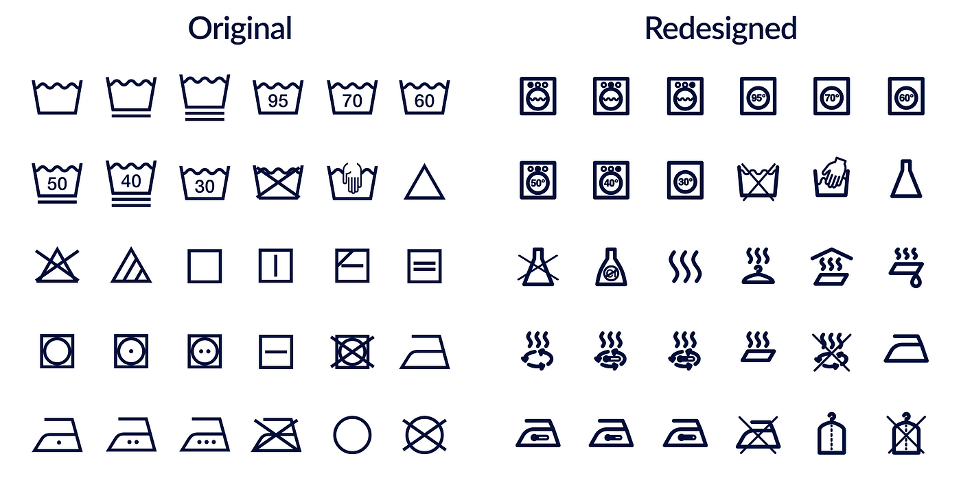
Due to the increased complicity in the redesigned version, stroke width was increased so the overall shapes can still be read when details are lost to the viewing distance or blurred visions. Machine wash and hand wash are now visually distinguished. Bleach is now a lab flask in an attempt to be associated with the bleaching chemicals. Dry now shows evaporation and is modular enough to mix and match with other attributes. Dry Clean shows a plastic clothes cover used for the process.
I could go on and on about the design thinking behind the redesign but again, this design exercise is more of an example of how symbols could look like when usability is put in front of beauty. Sure, these are not perfect and not as visually pleasing but they are visual cues that help users make informed guesses.
Summary
Hopefully through this article, we can bring more awareness to the cost of confusing laundry symbols. This cost happens in every household and it is more than the wasted time and money but also the countless clothes that got ruined. Share this article and we may find a silver lining in this dark, faded, shrunk, bleach-stained cloud.
Recommend
About Joyk
Aggregate valuable and interesting links.
Joyk means Joy of geeK