

Futura: grace under pressure
source link: https://uxdesign.cc/futura-the-winter-soldier-of-typefaces-4ad2a4a2d69f
Go to the source link to view the article. You can view the picture content, updated content and better typesetting reading experience. If the link is broken, please click the button below to view the snapshot at that time.

Futura: grace under pressure
Paul Renner’s quest for “sachlich” created a typeface that is as technically astute as it is elegant

Sengai’s The Universe
Futura was born alongside a rash of German grotesque typefaces that were created in the late 1920s.
These typefaces had their roots in the progressive, modernist zeitgeist of the period. At one point, after some initial resistance, Futura was co-opted to serve Nazi propaganda. Its huge popularity with American printers led to it being banned in the USA during the war. Subsequently, after the cessation of hostilities, however, the typeface’s highly efficient legibility on instrument panels made it a go-to for designers at the United States Air Force (who even used it for the NASA sign on the moon).For a period, perhaps overtaken by the mania for Helvetica, it fell out of favour. Post the 1970s, Futura was once again resurrected as ideal for the branding of punky outsider labels (like Nike, Red Bull or Supreme).

From: https://www.grapheine.com/en/history-of-graphic-design/typography-futura-paul-renner
From its initial cutting in 1927 to various revisions, updates, clones and font variants over the years, Futura has led an extraordinary life comparable to a dark comic book character like Marvel’s Bucky Barnes. As Ellen Lupton puts it in the introduction to Douglas Thomas’ Never Use Futura (2017):
“every typeface has its own DNA, its own voice, and its own hidden history of intrigue and excess.”


So, like Bucky Barnes, Futura too is trying to live each day as it comes, dealing with its troublesome past, and coming to terms with an immortal body that doesn’t age. It is the closest a typeface can come to being a rock star.
The grandiose impracticality of Fraktur

Excerpt from a 19th century German newspaper in Fraktur: https://readcoop.eu/model/german-19th-century-newspaper-fraktur/
The German language is perhaps singular in that it was once also synonymous with a distinct typographic style. Today, blackletter gothic typefaces are commonly associated with death metal but, in the 1920s, it was the identity of the German language itself (described as ‘Duetsche schrift’). Germanic blackletter was a distinct branch in the evolution of European letters. While all European languages share the same basic skeleton, the Fraktur family was distinguished by their elaborate serifs (some even look like horns and tails) from the much cleaner chisel-carved type found on Italian monuments (hence, called “Roman”). Roman style letter-forms were increasingly thought by designers across the anglophone world to be aesthetically more pleasing, cognitively more efficient and suited to the times.
Of the ornate heavily-serifed blackletter styles, the most commonly preferred was a family called Fraktur. German meant Fraktur and Fraktur meant German. It increasingly became a matter of pride and principle, like guns and abortion, for ultra-nationalists that German was written, read and printed only in Fraktur’s instantly recognisable typographic style. After all, printing, it was believed, had been invented in Germany and this was what Gutenberg himself had intended.
For modernists, however, Fraktur was a pain in the ass. Gutenberg’s design choice was arbitrary — he was simply simulating the penmanship of calligraphy without thought to the relationship between how print technology, freed from the wrist, could innovate new styles of legibility and communication. Fraktur was completely out of touch with the mechanical age. It was brutal on children to learn for their primary education (especially, compared to the simple joined-up scripts based on the Carolingian minuscule). It was far too ornate for body copy and wasn’t particularly as legible as a Roman counterpart in a tiny size or tightly packed blocks of text. This was essential for the mass printing formats that were proliferating on an unprecedented scale (such as the newspaper, the penny paperback novel or on instrument panels).
At the top of the 1920s, as Christopher Burke mentions in his biography of Paul Renner, many politicians were amenable to the idea that German orthography needed to be updated. However, in line with the extreme hardening of politics over the decade, by the time the 1930s came about, no politician could dare even think about progressive reform. There was to be no questioning of Fraktur. Any attempt to modify or re-design, in line with the new ideas of the age, was immediately interpreted as an affront to history, tradition and the greatness of Germany.
“Where is the good modern art?”
In 1928, a widely admired painter, architect, and taste-maker for the middle-classes, Paul Schultze-Naumburg published a book called Kunst and Rasse(Art and Race). The Nazis imagined themselves as vigilantes out to protect German culture and, therefore, Fraktur — and, would come to treat modernist design with almost the same irrational rage, hatred and vengeance that they ordinarily reserved for Jews. According to Berthold Hinz, the author of Art in the Third Reich (1979): “This issue became a touchstone for determining who were the friends and who were the foes of the Third Reich”.
In Art and Race, Schultze-Naumburg codified the common and popular eugenist, anti-Semitic, and basic ideas amongst conservatives about art. The ideas promoted in the book were warmly received by functionaries of the Nazi party. Schultze-Naumburg’s opinion on the genetic degeneracy of modern art went right to the top. As the art resource Spartacus-Educational describes it, Hitler hated anti-war, leftist artists like Käthe Kollwitz, John Heartfield, George Grosz and Otto Dix. In complete agreement with Schultze-Naumburg, Hitler screamed in his classic hyperbolic, exaggeration:
“A life-and-death struggle is taking place in art, just as it is in the realm of politics. And the battle for art has to be fought with the same seriousness and determination as the battle for political power.”
In his book and talks, Schultze-Naumburg relied on a comparative analysis of photos of people with genetic abnormalities, tribal art and modern avant-garde Western art. By showing their obvious similarity, Shultze-Naumburg argued that this kind of art was the product of primitive, perverse minds rooted in bad genes.

Paul Schultze-Naumburg, Kunst und Rasse. Munich: J. F. Lehmanns Verlag, 1928, pp. 98–99:
Schultze-Naumburg’s Munich book talk, hosted under the rubric of the “Kampfbundes für deutsche Kultur” (“League of struggle for German culture”) was sold out. A second one was organised. At that talk, he was interrupted by protestors from members of an art collective who called themselves the Juryfreie — Christian Hess, Adolf Hartmann, Wolf Panizza and Günther Grassmann. Panizza demanded of Schultze-Naumburg: “Where is the good modern art?”.
In response, the Nazi guards present administered a savage beating to the artists, pushing them to the ground with knuckle-dusters. Panizza was kicked in the stomach with boots and left covered in blood with a broken cheek-bone and a ripped ear. He had to be taken to the hospital. Alfred Rosenberg, one of the most extremist of Hitler’s core advisers and a key Nazi functionary, present at the talk, remarked that Panizza would now have time to reflect on his question and the answer he received.
The Neue Sachlichkeit revolution
In the audience of that Munich lecture was an artist and professor of typography with a particular interest in architecture (which he saw as a sister form of type design). His name was Paul Renner.
Renner, born in 1878, was approaching the middle of a respectable career as a typographer and book design instructor. A gifted and skilled artist, he had once wanted to be purely a fine art painter. However, he found it impossible to support his family through art alone, and started to supplement his income doing illustrations and spine designs of the thick, ornate leather-bound volumes of Goethe and Fitche that elites liked to show off in their parlours.
The ‘cult of the book’ (as described in my post Constructing Adolf Hitler From His Library), included several thugs turned politicians who liked to use their ill-gotten wealth by amassing huge collections of ultra-expensive fat leather-bound books to show off to dimwit admirers in the receiving rooms of their mansions. Hitler talked a big game on history and culture but actually only possessed the mental bandwidth to comprehend cowboy YA novels. Renner, coming from a Protestant background and the son of a priest, disliked this ostentation. Even though he made his living from designing these expensive ornate books, he considered them a kind of intellectual illness. He favoured a more mass reading culture, where books were cheaper and smaller, tools for the education of self-made men, and actually read instead of displayed as curios.
According to art historians, the major revolution in European painting that had began with the Impressionists and Post-Impressionists, along with Pointilism and Fauvism, found their conclusion and summation in the work of the law student turned painter, Paul Cézanne. Cézanne is considered by many to be the founder of modern art painting. It is common to hear art historians say that in Britain, Cézanne is treated as the culmination of this movement, while in the United States, he is treated as the beginning of modern art.
Rosalind McKever, Harry M Weinrebe Curatorial Fellow at the National Gallery (UK), lecture on Cèzanne is a must watch.
In 1925, the curator Gustav Hartlaub held an exhibition in Mannheim titled ‘Neue Sachlichkeit: Deutsche Malerei seit dem Expressionismus’ (New Objectivity: German Painting Since Expressionism). The exhibition focused in particular on the work of two phenomenal artists, George Grosz and Otto Dix (they are described by the Tate as “two of the greatest realist painters of the twentieth century”). Grosz and Dix, in a digression from Expressionism, wanted to return art to its more technical roots and social purpose. In particular, they wanted to criticise the corruption of the Weimar Republic’s incompetent politicians for creating avoidable human suffering. This sparked a major wave of questioning and criticism of people in authority through various art forms, especially, painting and photography. In my opinion, even today, contemporary political cartooning across the world borrows the idiom innovated by Neue Sachlichkeit.
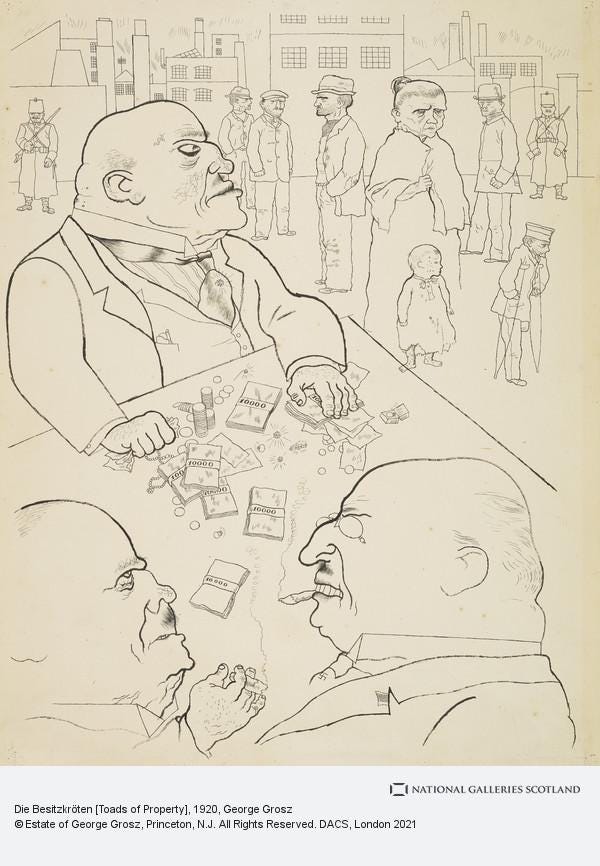
Toads of Property by George Grosz (1920). Image from the National Galleries of Scotland.
The impact of Neue Sachlichkeit on typography
Futura is a geometric typeface. In fact, it could be said that it is the most geometric of typefaces amongst the major and popular fonts that are in use today. What this means is that the proportions of the typeface are constrained to the circle, the (equilateral) triangle and the square (rather than ovals, the isosceles triangle and the rectangle). It is generally assumed that the inspiration to develop such a typeface came from the Bauhaus school to Paul Renner. While there is no doubt that Renner was in regular correspondence with and admired the radical experiments with reducing design to basic forms and primary colours that were taking place at Bauhaus, the influence is slightly more… abstract.
George Grosz and Otto Dix’s painting reflected a major trend (perhaps the more appropriate term is: “zeitgeist”?) in the German arts and one major theatre of this innovation was architecture. Architecture isn’t a discipline well-suited to satire or direct political criticism. However, the focus of Neue Sachlichkeit on creating something beautiful with a universal application for the common betterment of human beings through technical mastery of basic forms resonated deeply with some architects. In fact, this ideal was instrumental in inspiring Walter Gropius to found Bauhaus in the first place. As Tanja Poppelreuter summarises this influence:
Architecture and design was created in order to fulfill objective functions and not along the lines of personal taste, preexisting historical, national, or regional styles. The Sache–the object, subject matter–was scrutinized in order to fulfill its function and serve its user best as possible.
Despite condemnation from fusty conservatives who couldn’t imagine what was wrong with Fraktur, it was clear to those without bias in the 1920s, that typography, like architecture and many other technical crafts, needed a radical overhaul. Even switching to Roman typefaces wasn’t sufficient, the Roman typefaces themselves needed updating. Like developing the nuclear bomb, the race was on to develop a commercially successful san serif. Already, from across the pond, there was talk of the grand maestro of typography, Edward Johnston, creating something special for the London Transport Corporation. At Bauhaus, artist-typographers like Herbert Bayer, László Moholy-Nagy, and Josef Albers all worked on san serif typefaces pushing modern typography in new directions.
Renner, in his personal correspondence, noted that good ‘sachlich’ design, apart from being logical and of its technological milieu, needed to adhere to some eternal rules concerning aesthetics. These eternal rules Renner quotes verbatim from the famous Cézanne’s letter to Emile Bernard:
“everything in nature models itself on the sphere, cone and cylinder; it is necessary to learn to paint along these simple lines, then one can do what one wants.”
Paul Renner and the Munich Miesterchule
There was a key difference between Renner and the Bauhaus designers.
While the Bauhaus school was focused on architecture, art and crafts like furniture, glass and fabric, Renner was principally a book designer. Additionally, his love for academic theorisation, public engagement, organisation and forthrightness also made him a more practical and technical-minded practitioner. He was eventually appointed the head of the Meisterschule für Deutschlands Buchdrucker. This was a trade school closely allied with the Werkbund of Munich, where apprentices were trained in the demanding and precision-based profession of print. This rooted Renner’s practice heavily in printing and meant that his ideas and concepts concerning letter-form design were heavily stress-tested in a way that ornamental typefaces, such as those oriented towards posters and architectural plans, were not.
Looking to grow the institution and find teachers to join the faculty, Renner entered into a correspondence and eventually hired for the school the prodigy of German typography, Jan Tschichold.


Tschichold, no shrinking violet about his own greatness, would go on to enjoy a stellar career (in his own estimation, amongst 20th century typographers, only Edward Johnston was in the same bracket as him). The most recalled of his work today is the classic design of the original Penguin paperbacks with their prominent use of Gill Sans. A prolific writer on typography, he published over 150 articles on the subject. Tschichold was the author of a bold book that is still considered a classic statement of modernist typography, The New Typography.
Apart from German modern art, Renner and Tschichold were huge fans of what was being achieved within Russian Constructivism. Cézanne’s painting had a major influence on the Russian-Ukranian-Polish master, Kazimir Malevich. Malevich’s own brand of abstract painting would be known as Suprematism. His vision and philosophy of art was summarised in the Black Square, which became his motif. Malevich is seen as the founder of Russian abstract art. In turn, his work provoked a response in the next generation of Russian artists, who then went to a further radical extreme.

Kazimir MalevichBlack Square 1913© State Tretyakov Gallery, Moscow
Let by Alexander Rodchenko, El Lissitzky, and the Stenberg Brothers, Russian Constructivism, like Neue Sachlichkeit, rejected art for purely romantic and ornamental reasons, and attempted to reformulate it as a vehicle for radical politics. Ilene Strizver summarises the major characteristics of this style:
Russian Constructivism characteristically used minimal color palettes, often just red, black and sometimes yellow. These works frequently had diagonal elements with circular and angled type and images. The resulting work was extremely dramatic, containing layered images coupled with powerful type treatments.

Beat the Whites with the Red Wedge, El Lissitzky, 1919.
It would become one of the most dynamic and influential movements within typography. One doesn’t need to a be radical Marxist to appreciate the beauty of Russian typography from this period. When Stalin, like the Nazis, banned abstract modern art (in favour of Socialist Realism) the ideas about the power of abstract symbols and stepping away from a rigid grid survived. Banished from painting, they disguised themselves and hid in plain sight — in the clothes of Communist propaganda posters.
Inspired by Russian Constructivism, Jan Tschichold condemned all typefaces except for sans-serif types, advocated standardised sizes of paper (the ISO international paper size system was developed around this period) and favoured guidelines for establishing a typographic hierarchy when using type in design.
Renner approved of all these ideas.

The A series paper size system
Kulturbolschewismus?
Renner authored several books on the craft and theory of typography, including: Typographie als Kunst (Typography as Art) in 1922; Mechanisierte Grafik. Schrift, Typo, Foto, Film, Farbe (Mechanised graphics: Writing, Typography, Photo, Film, Colour) in 1930; Die Kunst der Typographie (The Art of Typography), in 1939; Das moderne Buch (The Modern Book), 1946; Ordnung und Harmonie der Farben. Eine Farbenlehre für Künstler und Handwerker (Order and Harmony of Colors: A theory of colours for artists and craftsmen) in 1947; and, Vom Geheimnis der Darstellung (On the Mystery of Representation) in 1955.
However, it would be the book written as a response to the evening when Paul Schultze-Naumburg delivered his lecture in Munich on race and art that would have fateful consequences for his life in Germany.
Renner had been outraged by the shameless and open celebration of thuggery at Schultze-Naumburg’s talk. He could not believe that a German cultural event could result in the merciless beating and hospitalisation of a painter like Wolf Panizza. He moved to organise and participate in a protest against the brutality. Alarmed by the popularity and influence of Nazism taking root in the trade guilds of Munich, his warnings completely ignored about the threat to German culture, and the frustration with growing, direct political intervention in cultural, educational and intellectual matters culminated in a booklet titled, Kulturbolschewismus?


The book could only be published via a publisher in Zurich (no German publisher would touch the manuscript) in 1932 and it would single Paul Renner out for some special attention from the Nazis.
It was an anti-Nazi polemic, and it challenged the idea of “cultural Bolshevism”. He argued the anti-semitism and anti-communism of the Nazis was also discriminatory of the humanistic and trade guild traditions of East Germans. In his opinion, art had nothing to do with blood or genes, and that German culture had been enriched by a mixture of races and influences. He warned that those Germans who jealously blamed the lack of their own success on accomplished Jews would bring disrepute to what it mean to be German. Memorably, he used the metaphor of a dirty sleeve for wiping spreading a mess to describe the effect of Nazism on culture.
Renner and Tschichold were eventually charged and arrested for being communists. Tschichold was in hotter water because of Russian ancestry and more radical views on art. Their protests that they were unaffiliated political moderates with no history of activism and not marxists fell on deaf ears. To the authorities, modernim and communism looked and felt the same.
The legal system was so Kakfaesque by this point that writing a book protesting the paranoia about cultural marxism was seen as proof that the author was a cultural marxist. Renner’s certificate of character for Tschichold was then introduced in his own trial as evidence of Renner’s anti-German sympathies. When Renner was away, organising the German stall at a prestigious print craft fair in Italy, his offices at the school were raided. They found *gasp* Russian posters (that he kept as a resource for his personal work and teaching) and *double gasp* not enough Deutsche schrift typefaces.
Renner was fired from his job at the Miesterschule, his pension cancelled, and not allowed to earn an income. Facing being sent to a concentration camp, both men fled the country.
I used to think that typography was a genteel pastime with zero health hazards, and that the worst it could get was an ill-tempered debate about Comic Sans.
A reversal of positions

Iconic Hilter poster utilising a san serif typeface (not Futura) and photograph by Heinrich Hoffman. Source: https://www.ushmm.org/propaganda/archive/poster-hitler-photo/
On the 3rd of January, 1941, in an astounding hair-pin turn, the Nazis declared Fraktur was degenerate.
As Typeroom describes it:
“On January 3, 1941, the Nazi Party ended this controversy in favour of the modern scripts including Antiqua. Martin Bormann issued a circular to all public offices which declared Fraktur (and its corollary, the Sütterlin-based handwriting) to be Judenlettern (Jewish letters) and prohibited their further use.”

After singing hymns of praise for Fraktur as the sina qua non of the German identity, they now felt it was too Jewish. This about-turn was a reflection on how Paul Schultze-Naumburg’s love of classical clean lines and proportions in design had taken root over time in the Nazi party. Dr. Lara Day, notes in a doctoral thesis summary on Schultze-Naumburg :
“Beyond the fine arts, Schultze-Naumburg helped formulate the conceptions of the anti-Semitic, pro Heimat and anti-urban, völkisch mind frame that would be transformed into the blood and soil rhetoric of the emerging National Socialist ideology.”
After capturing the state, and launching expansionist wars, intellectuals like Schultze-Naumburg encouraged the Third Reich to see themselves as a continuation of classic European empires of the Greek and the Romans. Through entirely different working method and logic, the German imperialists and the German modernists, had arrived at the same conclusion: the cleaner Roman typefaces were better for communication. The confusion was entirely on the part of the imperialists, who due to their unscientific and fantastical notions about history, accurately understood the challenge presented to authority by modern art painting but mischaracterised its motivation.
In the end, all the trouble, heated argument, accusations of treason, trials, snitching, persecution, stress, impoverishment, near execution and banishment had been over absolutely nothing. A large part of Renner and Tschichold’s harassment was caused by jealous colleagues who didn’t have their talent and wanted their jobs. What they couldn’t manage through talent and effort, they tried to obtain through political influence, connections and based on a false sense of injustice and entitlement.
For Jan Tschichold and Paul Renner, however, the acceptance of their concepts concerning typography was not just motivated by bad faith, it was too late.
Like many of the best German typographers of that generation, and the Germans tended to the best of the best, Tschichold and the all the Bauhaus typographers moved on to better and bigger things outside Germany.
Renner, however, the stoic, middle of the road German, couldn’t leave his homeland. After things had cooled down, especially after Futura’s popularity and his growing celebrity as a type designer, he was able to return and live in obscurity in a small town. His pension still suspended, and no one allowed to employ him, his only income were royalties from Futura. It took him a long time to be sure of the ground under his feet in Germany again and filled his days painting. When French trucks started to roll past their home, chasing the Nazis back to Berlin, his wife threw the flowers she had over the kitchen sill before their wheels to welcome their liberators.
Futura’s immortal charm
Over time, both Tschichold and Renner gave up their ideological ideas about modernist design. Tschichold dismisses his radical modernist phase as hot-headed immaturity and disavowed the beliefs expressed in The New Typography now favouring classical book design and the grid. These were the ideas he used when working for Penguin in 1950s London. Renner even tried to develop his own versions of serif and ornamental typefaces. In his old age, when he saw people wrongly persecuted through the old snitching system, this time erroneously identified as being Nazi collaborators, he spoke out against that too.
If one had to hazard a guess as to why it is Futura, more than any of the other geometric san serif typeface of this period, manages to be both aesthetically pleasing and technically efficiency, then the clue to its beauty lies in the graft, talent, and steel of its creator’s character, Paul Renner.
When we say Renner designed Futura, what we mean is that Renner laid a foundation that many others have come in and tinkered with. Right at the beginning, at the Bauer type foundry, the process of developing Futura was highly collaborative and the latest technology in mechanical drawing (such as a pantograph) was used to design the letters. Renner’s writings even seem to anticipate computer-aided design. Notwithstanding this process, Futura’s letters seem very close the basic round letters that students of calligraphy are recommended to start their learning with. Renner began his career as an instructor teaching a foundational course in drawing letters.


Futura
As I write these pieces of type history on Medium, I’ve learned to visually identify many typefaces but the pleasure of encountering Futura in the myriad and diverse ways it is used, from posters, logos, instrument panels to council bin bags, is a pleasure like no other. It is arguably the most ubiquitous typeface. You can always tell it from the small ‘a’ or the points on the letters A, W, N and M. They’re exhilarating. The small ‘t’, nothing more than a cross, is communion without a church and a Sunday service.

The most unique small ‘a’ in the business
As I slip my feet into a pair of Nikes or classic adidas kicks marked with Futura, I am now always reminded about what Renner endured for his idealism, talent and rationality. Futura declares that anyone who works hard, who focuses on “sachlich”, can make good art — not just those with the appropriate ancestry. It stiffens my spine and makes me walk a few inches taller.
Not all heroes wear capes. One created Futura.
His name was Paul Renner.

Paul Renner</div
Recommend
About Joyk
Aggregate valuable and interesting links.
Joyk means Joy of geeK