

Implementing a fully-custom Design Language System with Jetpack Compose — Part 2...
source link: https://medium.com/volvo-cars-engineering/implementing-a-fully-custom-design-language-system-with-jetpack-compose-part-two-components-4954a8096ec0
Go to the source link to view the article. You can view the picture content, updated content and better typesetting reading experience. If the link is broken, please click the button below to view the snapshot at that time.
Implementing a fully-custom Design Language System with Jetpack Compose — Part 2/2: Components
In part one, we went through creating the foundation of a fully-custom design language system. We called it Tiara Elm and added our very own typography and colors. We also created our theme, holding our design language foundation using StaticProvidableCompositionLocal.
Implementing a fully-custom Design Language System with Jetpack Compose — Part one: Foundation
When Jetpack Compose found its way to the Android community, it brought so many possibilities and new areas to explore…
In this article, we’re going to see how it works in action. To do that, we’re going to create a sample Jetpack Compose application and use the Tiara Elm theme to create a sample screen with some UI components that are bound to our custom theme foundations. Let’s jump into that to see how it can be done.
Creating a sample app
Let’s say that we want to have a simple sample app that looks like the following design:
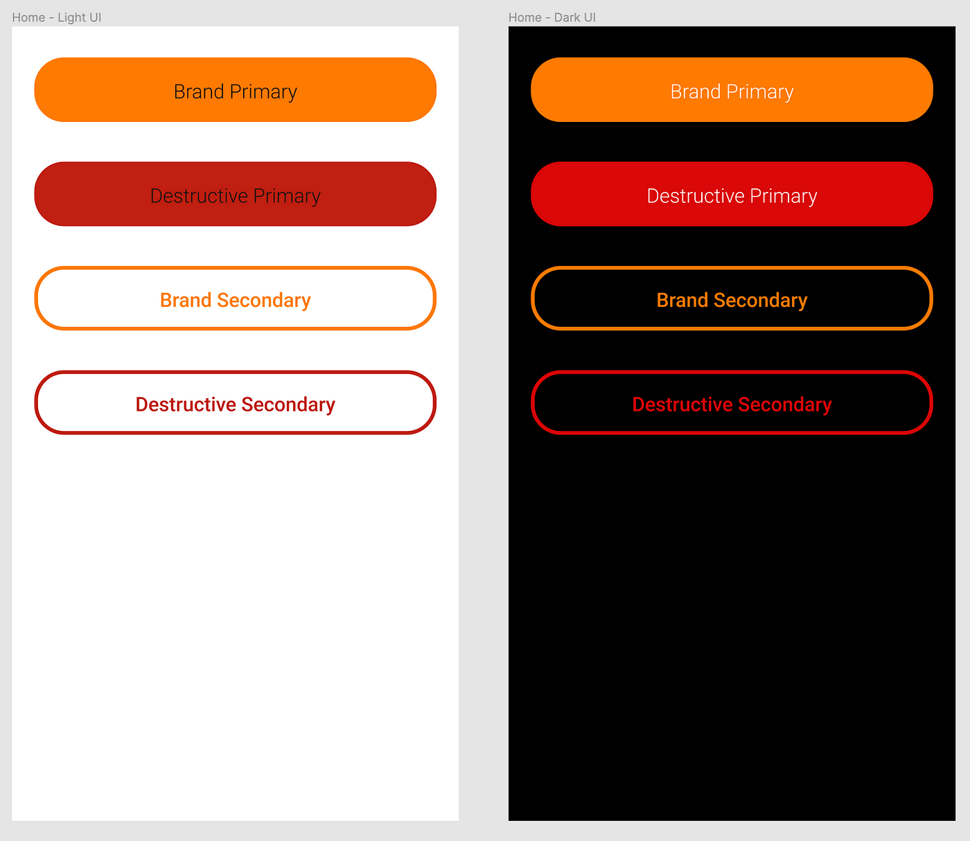
It is a simple screen with four different buttons that is compatible with both light and dark theme. If we dig into the design materials, we could see that the colors and typographies are driven by the Tiara Elm theme.
Also, our design team has made them as UI components. UI components are part of our app UI and they are meant to be consistent all over the app. When we add a second screen, the button on that screen should look the same as the button we have on other screens. This results in our app having a consistent user experience. Think about buttons, input fields, switches, and other UI elements that are following the same patterns and specifications within the app.
The best approach is to make the UI components reusable and configurable when it comes to implementation. In that case, we can implement our UI components once and let the rest of the developers use and configure them on other screens based on the design definitions. Let’s see how we can take that approach.
Creating UI components
First off, let us create a sample project and take it from there. I’ve created a repository in which you can find the app module and another Gradle module called tiara-elm-compose. In that module, we’re going to keep the Tiara Elm foundations we implemented in the first article as well as Tiara Elm UI components. Then, this module can be imported into other projects if need be. You can check out the main branch of the repository.
GitHub - ehsunshine/tiara-elm-dls: Implementing a fully-custom Design Language System with Jetpack…
You can't perform that action at this time. You signed in with another tab or window. You signed out in another tab or…
I would create a new package called components in the tiara-elm-compose module to add our button component. Let’s take a look at the definition of the button component to see exactly what shall be implemented.
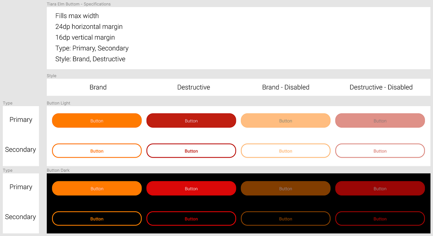
From the specification, we can see that the button size and spacing are clearly defined. Also, we could have two types of buttons, Primary and Secondary and each type can have two different styles, Brand and Destructive which basically changes the color of the button. There is also a disabled state that makes the button a bit transparent. Based on the specifications, the API could be like the below:
That’s pretty much everything we need to configure our button. There are also constant specifications like button width and spacing. Since it should be the same value for all instances of TiaraElmButton and the caller should get them for free without passing any parameters, we’re going to hard-code it in the composable function body.
We can take different approaches to implement the button. It really depends on your use case, and the complexity of the component you’re implementing.
Approach 1: Wrap Material components
In this approach, we can wrap a Material component (in our case Button) and configure it based on the parameters we get from our composable function. By doing so, we’re abstracting the logic needed for applying the specifications to the Material component.
Approach 2: Build it from scratch
In this approach, instead of relying on Material components and just wrapping them to achieve what we need, we are going to build the component from scratch. To do so, we need to play with Jetpack Compose basic layouts like Box, Column, Row, … or even a Layout and set our own measure and placement policy if need be. Or maybe drawing on canvas? Below you can see a sample code snippet showing the approach:
The first approach might be the easier way to implement a UI component and might work for most of the components, but there could be some cases where we really need to go our own way. As I mentioned before, it depends on the component. Consider the design specifications and try to choose the best options that suit your case.
For the TiaraElmButton, we’re going to take the first approach. We can achieve what we need by just playing with Material button parameters. So we don’t really need to invent the wheel again 😬👉🛞
TiaraElmButton implementation
First, we hard-code our constant specifications and pass the API parameters that don’t need any modification to the Material button.
As you can see, the width, height, padding, and shape of the button are the same for different types and styles. We can also pass enabled and onClick directly to the Button function without any modification.
Now let us fix the colors. We need to fetch our theme colors and apply them to the Material Button. It has a parameter type of ButtonColors by which you can set backgroundColor, contentColot, disabledBackgroundColor, and disabledContentColor. We can create a private composable function that returns ButtonColors and takes ButtonType and ButtonStyle. Based on the type and style, we can return the corresponding colors. The custom color palette values can be accessed from the TiaraElmTheme as you can see in the following code:
Fact: A composable function that returns, should be named in camelCase, not PascalCase.
Now the typography should be fixed. A composable function should be passed to the content parameter of the Button function. We just need to take care of the typography since the color is handled at the previous step by setting contentColor.
maxLines and overflow are set to be sure that if the text parameter is too long, we overflow it with Ellipsis options instead of having it in multiple lines.
This is how it looks so far. Not too bad, right? 😃
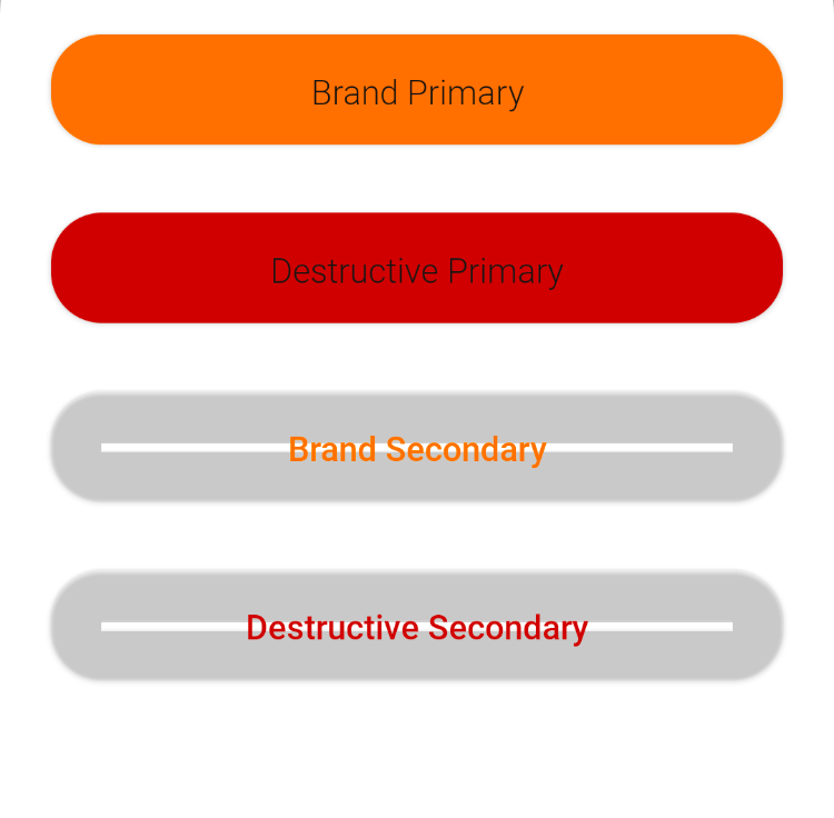
Some more modifications are still needed to be done for the secondary type. That grey area is because of button elevation. It’s visible due to the transparent background that’s set for the secondary button. This can easily be fixed by setting the elevation to zero and fortunately, it is what we have in the design specification. After that, a border should be set for the secondary button. It’s also an easy fix by setting the border parameter of the Button component. The final code should be something like the below:
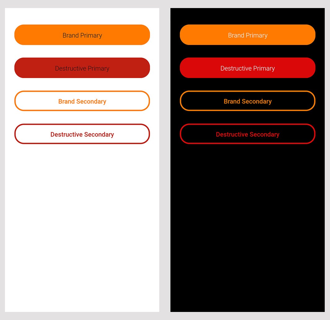
Our app looks like the following screenshot after making those changes. It works for both dark and light themes.
The first Tiara Elm component is in place and ready to be used on different screens. But wait… Is it possible to use it on every screen? Even if the screen is not in Jetpack Compose? Of course not, but we can make it work 😎
“Aut inveniam viam aut faciam.“
Making the component backward compatible is straightforward, thanks to our boon companion, Jetpack Compose. To do that, we need to create a custom Android View but extend a new base class called AbstractComposeView. This class is part of the compose UI platform and lets the subclass implement the Content composable function and call any compose functions within it. We use it to call TiaraElmButton wrapped in our theme. Then we can provide its parameters using some public variables, types of MutableStateFlow. Now we have an inflatable custom view, compatible with the AndroidView system but under the hood, it’s all in Jetpack Compose. Isn’t it adorable? 🤩
The usage of the TiaraElmButtonCompat with data-binding could be like the below:
Other components can be implemented in the same way and over time, your project can have a library, including your custom theme and custom UI components. Also, smaller components can be placed together to make product-specific components or templates. You can check out the feature branch to see the complete code:
GitHub - ehsunshine/tiara-elm-dls at feature/button-component
You can't perform that action at this time. You signed in with another tab or window. You signed out in another tab or…
Hope you enjoyed reading the article and I hope it helps you make consistent, beautiful applications and also makes the relationship between engineers and designers even sweeter 😃
Please let me know in the comments if you have any feedback or if you think this can be done in a better way.
Recommend
About Joyk
Aggregate valuable and interesting links.
Joyk means Joy of geeK