

7 Laws of UX that Headspace Follows
source link: https://uxplanet.org/7-laws-of-ux-that-headspace-follows-6fbdeba333ac
Go to the source link to view the article. You can view the picture content, updated content and better typesetting reading experience. If the link is broken, please click the button below to view the snapshot at that time.
7 Laws of UX that Headspace Follows
How Headspace Uses Laws of UX to Design better Interface.
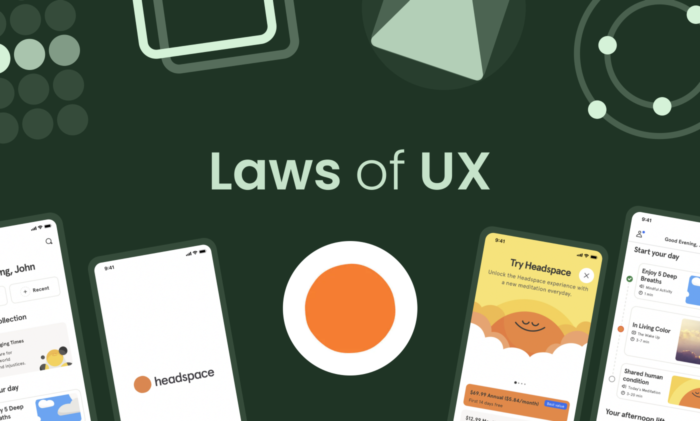
Today in this article I’m going to share some of the laws of UX design that Headspace follows, basically who doesn’t know about headspace it is a meditation app that has millions of users worldwide.
It is one of the best-designed apps that I used, it follows several laws of UX which you can learn and implement in your design.
So without wasting time, let’s check them out.
#1 Aesthetic-Usability Effect
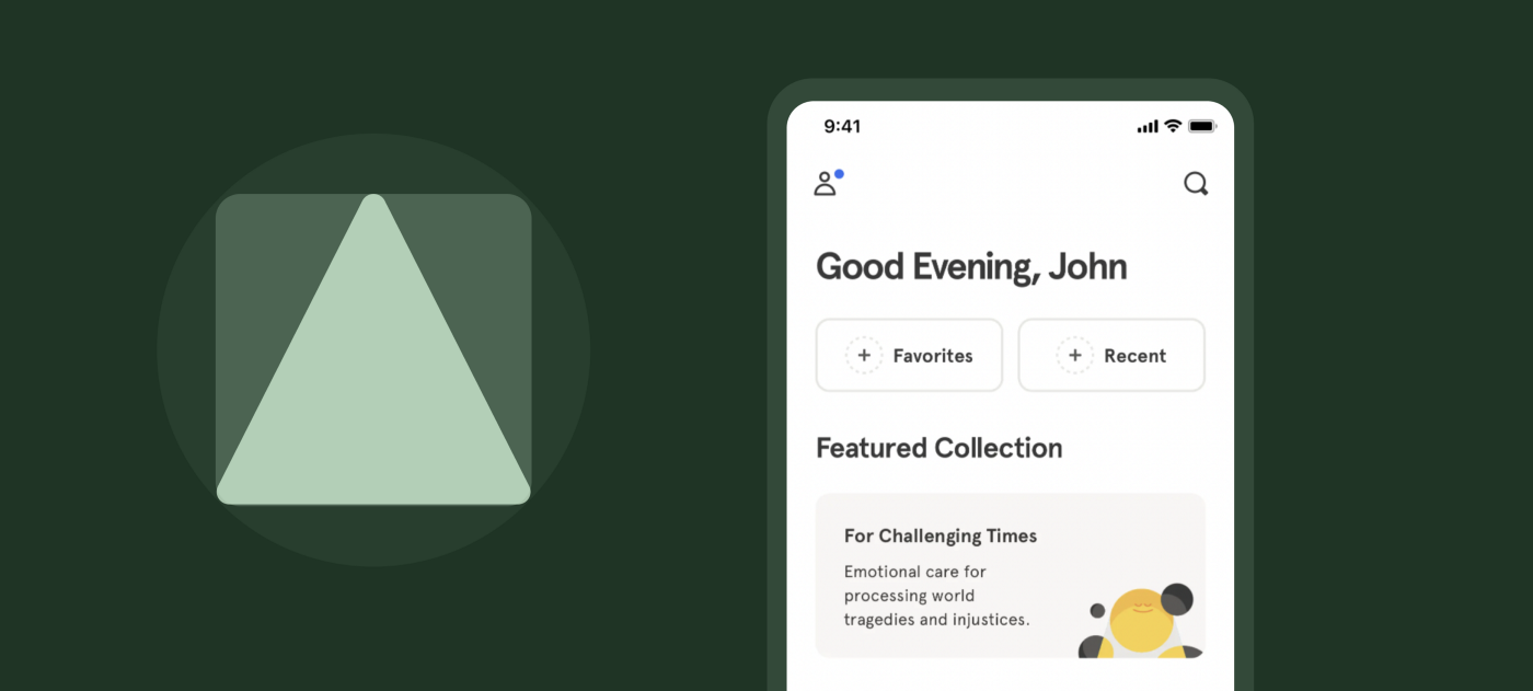
“Users often perceive aesthetically pleasing design as design that’s more usable.”
These companies know that therefore they make their product tasty, but designers use it more ethically, they trick the user’s minds to make them like the app and provide great feedback to them.
How Headspace uses the Asthetic-usability Effect:
- Designing the app with vibrant colors makes the user get attracted to the design with its beautiful color, and simplicity of design.
- By making the corners rounded which give a cute look to the app.
- By adding cool cartoonish illustrations which make you feel calm.
- Cool animations during the initial phase of setup.
- Rounded typography, which is cute and feels good to the eyes.
#2 Hick’s Laws
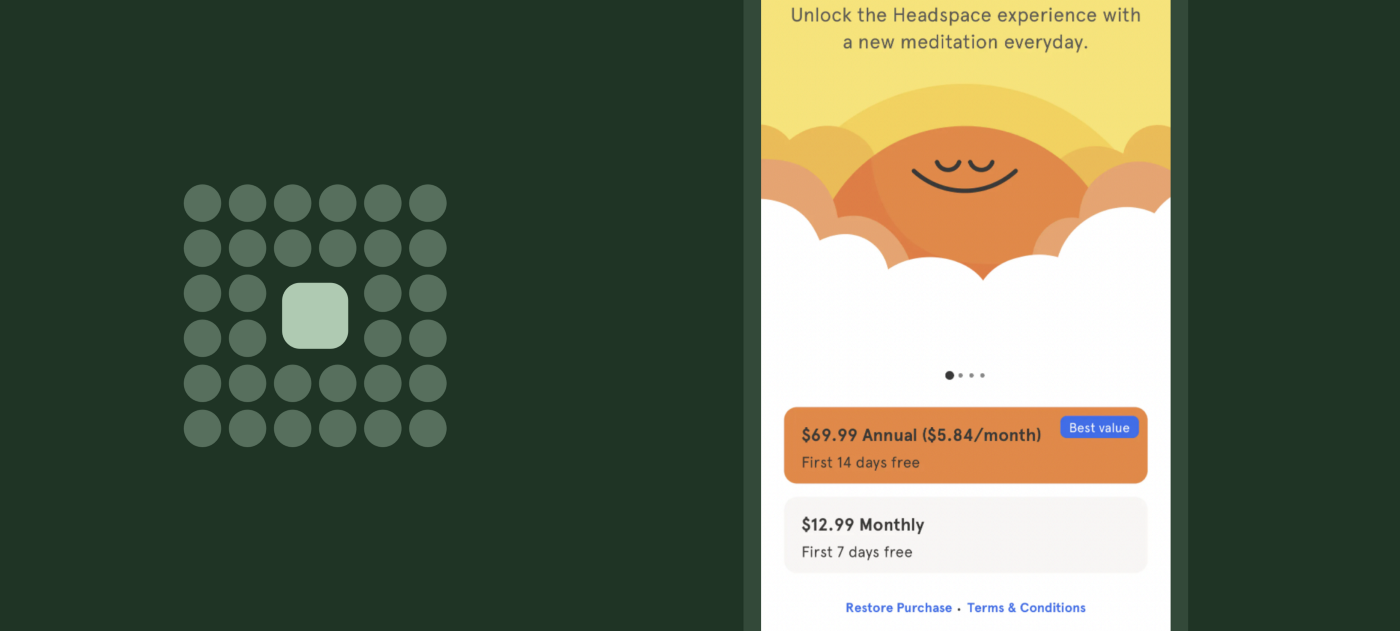
According to several kinds of research, it was found that the number of options you give to a user confuses them and makes the decision-making tough and the user will take a lot of time to make the perfect decision.
“The time it takes to make a decision increases with the number and complexity of choices.”
Just like going out and having a lot of places to go makes the decision to go for the place is a tough decision.
How Headspace uses the Hick’s Law:
- By highlighting the offer which might be best for an average user by giving it vibrant background color that makes it stand out.
- By labeling or giving a tag of “Best Offer” which makes it even more clear why the offer is highlighted.
- By giving the user fewer options, which makes the decision much more quickly and easier.
#3 Law of Proximity
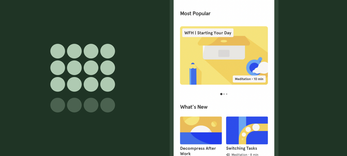
“Objects that are near, or proximate to each other, tend to be grouped together.”
The objects placed near each other tend to perceive they are closed and have some relation between them, the people, friends, and kids that are close and talking and having fun feel they have some kind of bond between them, just like that, closer the object in the design more it perceived closer.
How Headspace uses the Law of Proximity:
- By grouping elements that are related by giving them the same padding around the body, styling them with similar colors, shapes, etc.
- By giving more space between different elements that makes the element look separated from each other.
#4 Law of Common Region
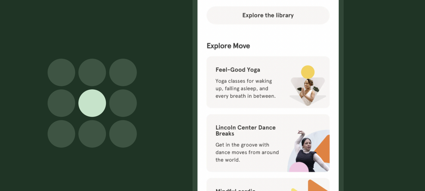
“Elements tend to be perceived into groups if they are sharing an area with a clearly defined boundary.”
Elements in a common region are perceived as grouped elements, if you wanted to show various elements together, then prefer using a common region with a border, with background shade or color, which makes the user believe that these elements belong to each other.
How Headspace uses the Law of Common Region
- By adding a Background to the common region.
- By placing all elements inside a container or a shape
- And stay consistent with your design, Don’t mix up points 1 and 2 together in-app use either border thing or background thing for consistency.
#5 Fitt’s Law
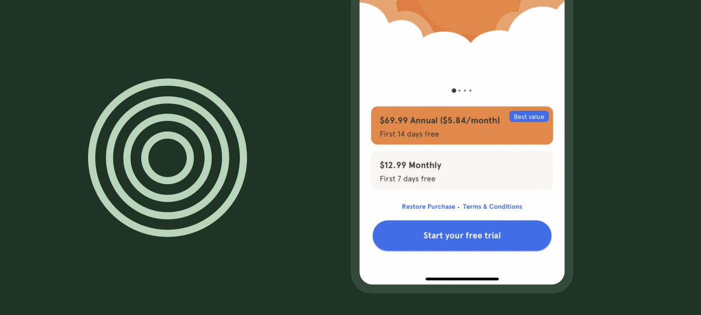
“The time to acquire a target is a function of the distance to and size of the target.”
A few weeks ago, I decided to make a habit of drinking more water and to do it much more effectively I put my water bottle near to me on my working desk, which helps me drink more water per day. Basically, it is the basics of Fitt’s law that explains that the closer the target is the easier it is to achieve it.
The closer the button is in the UI design to the thumb, the easier user feels to tap on the button and achieve the defined target like signup, confirm, subscribe, etc.
How Headspace uses Fitt’s Law:
- By Placing the buttons at the bottom of the screen makes it easy to touch especially when the user is using the app with one hand.
- By making the button big enough, which makes the range of target wide.
- By using vibrant colors, like in the above picture the blue color is used which is kind of different from the whole orange theme that helps it stand out from other elements.
#6 Doherty Threshold

“Productivity soars when a computer and its users interact at a pace (<400ms) that ensures that neither has to wait on the other.”
Providing the feedback helps others in knowing that they have listed just like nodding your head while in conversation with your boss to make them know you’re listening even though you’re thinking of going home :)
How Headspace uses Doherty Threshold:
- By providing animation to make users engaged with the app.
2. By adding loading indicators that make the user feel something is happening in the background and they have to wait.
Try using a loading indicator with a progress indicator that indicator how much time and if necessary add the percentage with it.
#7 Law of Similarity
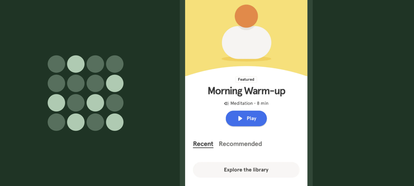
“The human eye tends to perceive similar elements in a design as a complete picture, shape, or group, even if those elements are separated.”
A similar object in the UI design tends to perceive alike, that they are similar or work exactly like the same, therefore the designers make the elements of a similar type consistent in the design.
How Headspace uses the Law of Similarity:
- By making the button look consistent, all the primary buttons in the app are fully rounded with blue color.
- By making the shapes look consistent with rounded corners, you can see all the elements, and buttons in the app are rounded.
- By making colors in the app consistent, Headspace uses the orange color as the primary color consistently in the app which makes it more recognizable.
- By using the same font family or typography.
- By using the illustrations alike, Headspace uses the cartoon illustration which is similar in the whole application, which eventually makes the brand stand out.
So, this is the article I wanted to write to teach you how various companies use the Laws of UX in their app. You can also read these.
Recommend
About Joyk
Aggregate valuable and interesting links.
Joyk means Joy of geeK