

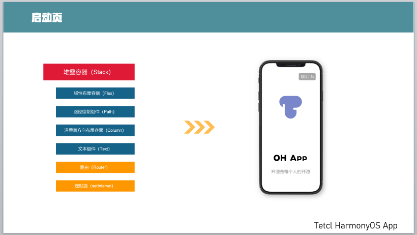
DAYU200体验官之App启动页
source link: https://os.51cto.com/article/710419.html
Go to the source link to view the article. You can view the picture content, updated content and better typesetting reading experience. If the link is broken, please click the button below to view the snapshot at that time.

- 开发板:DAYU200
- 系统版本:OpenHarmony 3.2.2.3
- SDK版本:ohos-sdk 3.2.2.3
- 开发工具:DevEco Studio 3.0.0.900(For OpenHarmony)
二、知识要点及示例图
三、知识点简要
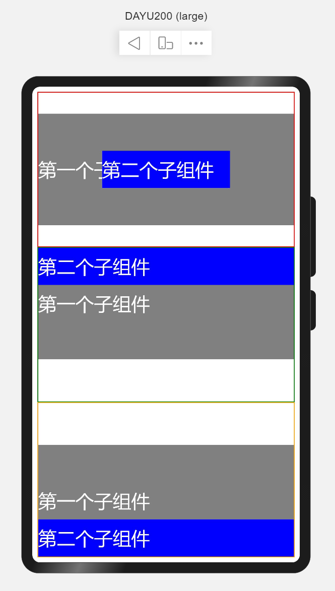
1、堆叠容器(Stack)
堆叠容器,即将子组件叠放在一起,后入先呈现的方式在UI中展示。可以理解为在箱子中装东西,最后放入箱子的在最上层。 使用场景如首页读秒跳转、页面悬浮按钮等。
简单示例(stackSimple.ets)
@Entry
@Component
struct StackSimple {
  build() {
    Flex({direction: FlexDirection.Column}) {
      // Stack(value: {alignContent?: Alignment })
      // alignContent: Alignment 默认Center 设置子组件在容器内的对齐方式,可缺省
      // 设置子组件在容器内的对齐方式为默认,即居中对齐
      Stack() {
        Text('第一个子组件').width('100%').height(300)
          .fontSize(50).fontColor(Color.White)
          .backgroundColor(Color.Grey)
        Text('第二个子组件').width('50%').height(100)
          .fontSize(50).fontColor(Color.White)
          .backgroundColor(Color.Blue)
      }
      .layoutWeight(1)
      .border({
        width: 2,
        style: BorderStyle.Solid,
        color: Color.Red
      })
      // 设置子组件在容器内的对齐方式为顶部对齐
      Stack({alignContent: Alignment.Top}) {
        Text('第一个子组件').width('100%').height(300)
          .fontSize(50).fontColor(Color.White)
          .backgroundColor(Color.Grey)
        Text('第二个子组件').width('100%').height(100)
          .fontSize(50).fontColor(Color.White)
          .backgroundColor(Color.Blue)
      }
      .layoutWeight(1)
      .border({
        width: 2,
        style: BorderStyle.Solid,
        color: Color.Green
      })
      // 设置子组件在容器内的对齐方式为底部对齐
      Stack({alignContent: Alignment.Bottom}) {
        Text('第一个子组件').width('100%').height(300)
          .fontSize(50).fontColor(Color.White)
          .backgroundColor(Color.Grey)
        Text('第二个子组件').width('100%').height(100)
          .fontSize(50).fontColor(Color.White)
          .backgroundColor(Color.Blue)
      }
      .layoutWeight(1)
      .border({
        width: 2,
        style: BorderStyle.Solid,
        color: Color.Orange
      })
    }
    .width('100%')
    .height('100%')
    .padding(14)
  }
}
详细参见:Stack堆叠容器组件
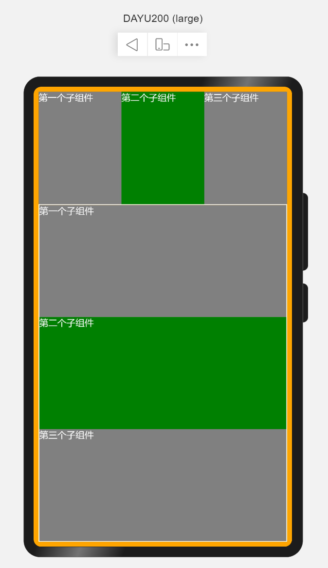
2、弹性布局容器(Flex)
弹性布局容器也可称为弹性盒子,并提供了两根轴线,分别为主轴和交叉轴,主轴的方向由direction属性设置,交叉轴始终垂直于主轴。使用场景相对较多,如列表展示、布局划分等。
简单示例(flexSimple.ets)
@Entry
@Component
struct FlexSimple {
  build() {
    // Flex(options?:{direction?:FlexDirection,wrap?:FlexWrap,justifyContent?:FlexAlign,alignItems?:ItemAlign,alignContent?:FlexAlign})
    // direction: 子组件在Flex容器上排列的方向,即主轴的方向。默认FlexDirection.Row
    Flex({direction: FlexDirection.Column}) {
      //不设置主轴方向,默认为Row
      Flex() {
        Text('第一个子组件')
          .fontSize(25).fontColor(Color.White)
          .backgroundColor(Color.Grey)
          .layoutWeight(1)
          .height('100%')
        Text('第二个子组件')
          .fontSize(25).fontColor(Color.White)
          .backgroundColor(Color.Green)
          .layoutWeight(1)
          .height('100%')
        Text('第三个子组件')
          .fontSize(25).fontColor(Color.White)
          .backgroundColor(Color.Gray)
          .layoutWeight(1)
          .height('100%')
      }
      .width('100%')
      .layoutWeight(1)

      // 设置主轴方向为Column
      Flex({direction: FlexDirection.Column}) {
        Text('第一个子组件')
          .fontSize(25).fontColor(Color.White)
          .backgroundColor(Color.Grey)
          .layoutWeight(1)
          .width('100%')
        Text('第二个子组件')
          .fontSize(25).fontColor(Color.White)
          .backgroundColor(Color.Green)
          .layoutWeight(1)
          .width('100%')
        Text('第三个子组件')
          .fontSize(25).fontColor(Color.White)
          .backgroundColor(Color.Gray)
          .layoutWeight(1)
          .width('100%')
      }
      .height('100%')
      .layoutWeight(3)
      .border({
        width: 2,
        style: BorderStyle.Solid,
        color: Color.White
      })
    }
    .width('100%')
    .height('100%')
    .padding(14)
    .backgroundColor(Color.Orange)
  }
}-
layoutWeight 容器尺寸确定时,元素与兄弟节点主轴布局尺寸按照权重进行分配,忽略本身尺寸设置。仅在Row/Column/Flex布局中生效。
详细参见:Flex弹性布局组件。
3、路径绘制组件(Path)
路径绘制组件是在固定的区域通过起点、途经点、结束点通过线条连接起来构成一个图形。形如你早上跑步,从家门口开始,绕着小区跑一圈,那么你所经过的路线构成一个不规则的圆形。使用场景绘制icon图形。
简单示例(pathSimple.ets)
@Entry
@Component
struct PathSimple {
  build() {
    // Path()
    // width 路径所在矩形宽度 height 路径所在矩形高度 commands 路径绘制命令字符串
    // commands('M起始坐标 L画直线到坐标 H画垂直直线到坐标 V画水平直线到坐标 C三次贝尔曲线到 S光滑三次贝尔曲线到 Q二次贝尔曲线到 T光滑二次贝尔曲线到 A椭圆弧 Z关闭')
    Flex({direction: FlexDirection.Column,justifyContent: FlexAlign.Center, alignItems: ItemAlign.Center, alignContent: FlexAlign.Center}) {
      // 画直线
      Path().width(300).height(10).commands('M0 0 L500 0 Z').stroke(Color.Blue).strokeWidth(3)
      // 画矩形
      Path().width(300).height(100).commands('M0 0 H500 V100 H0 Z').fill(Color.White).stroke(Color.Red).strokeWidth(3)
      // 画圆
      Path().width(300).height(300).commands('M150 150 a100 100 0 1 1 0 1 Z')
    }
    .width('100%')
    .height('100%')
  }
}- 若要实现类似SVG效果的图,需要了解Shape绘制组件的父组件。
详细参见:Path路径绘制组件。
4、沿垂直方向布局容器(Column)
沿垂直方向布局的容器,即通过设置属性使其子组件在垂直方向显示。使用场景如内容列表、聊天列表等。
简单示例(columnSimple.ets)
@Entry
@Component
struct ColumnSimple {
  build() {
    // Column(value:{space?:Length})
    // space纵向布局元素间距
    Column({space: 10}) {
      Text('1')
        .fontSize(50).fontColor(Color.White)
        .backgroundColor(Color.Blue)
        .width('100%')
        .textAlign(TextAlign.Center)
      Text('2')
        .fontSize(50).fontColor(Color.White)
        .backgroundColor(Color.Orange)
        .width('100%')
        .textAlign(TextAlign.Center)
      Text('3')
        .fontSize(50).fontColor(Color.White)
        .backgroundColor(Color.Green)
        .width('100%')
        .textAlign(TextAlign.Center)
    }
    .width('100%')
    .height('100%')
    .padding({
      top: 20
    })
  }
}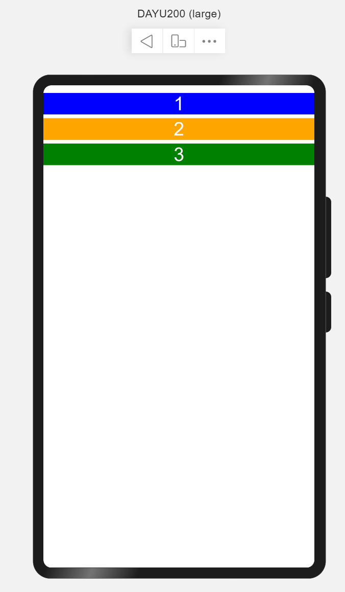
详细参见:Column沿垂直方向布局容器。
5、文本组件(Text)
文本组件是App中最常见的用于呈现信息的组件。常用场景如用户昵称、内容列表中文本信息、文章内容信息等。
简单示例(textSimple.ets)
@Entry
@Component
struct TextSimple {
  build() {
    Flex({direction: FlexDirection.Column, justifyContent: FlexAlign.Center, alignItems: ItemAlign.Center}) {
      // Text(content?:string)
      // content 文本内容
      Text('Welcome to OpenHarmony!')
        .fontSize(50).fontColor(Color.Red).fontWeight(FontWeight.Bold)
    }
    .width('100%')
    .height('100%')
  }
}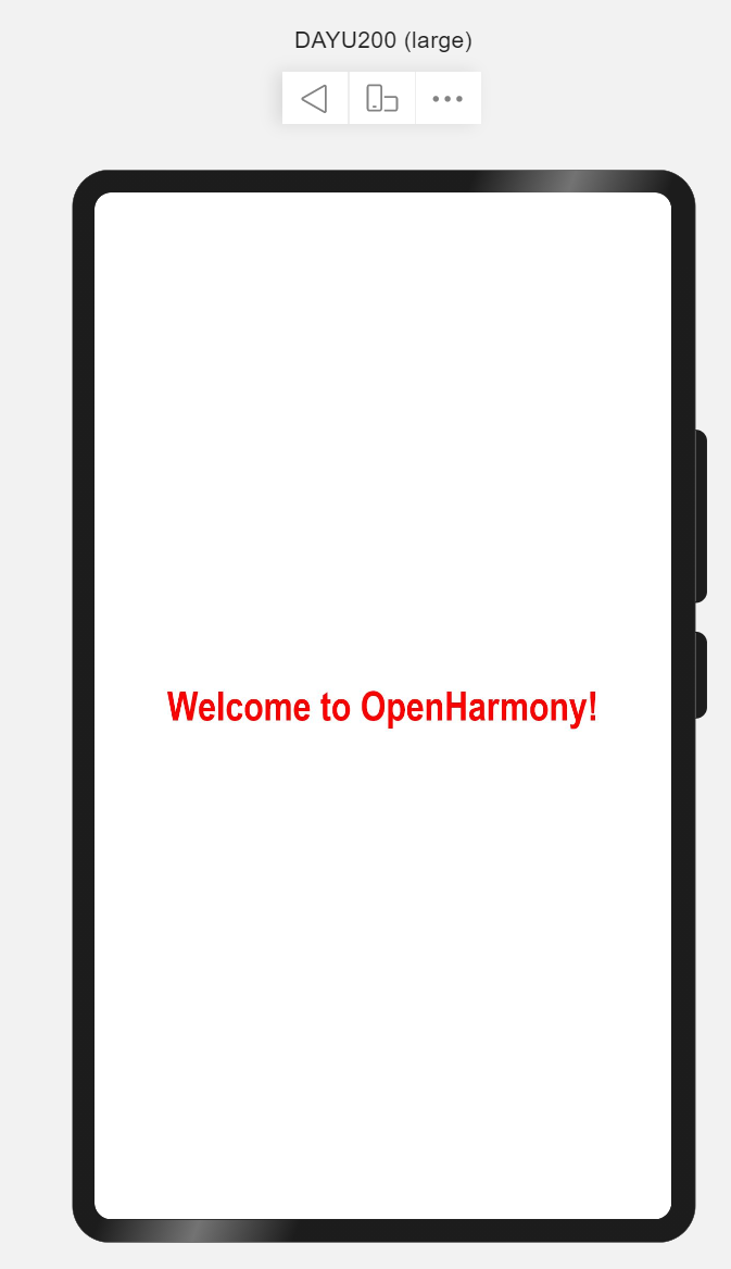
详细参见:Text文本组件。
6、路由(Router)
路由是页面间跳转常用的API,需要在页面中导入路由模块import router from '@ohos.router',常用router.push来做应用内跳转到指定页面。
简单示例(routerSimple.ets)
import router from '@ohos.router';
@Entry
@Component
struct RouterSimple {
  build() {
    Flex({justifyContent: FlexAlign.Center, alignItems: ItemAlign.Center}) {
      Button('跳转到首页')
        .width(300)
        .height(50)
        .fontSize(25)
        .onClick(() => {
          router.push({
            url: 'pages/index'
          })
        })
    }
    .width('100%')
    .height('100%')
  }
}- 注意:跳转页面必须是在
config.json的js->pages中配置的页面。
详细参见:Router路由。
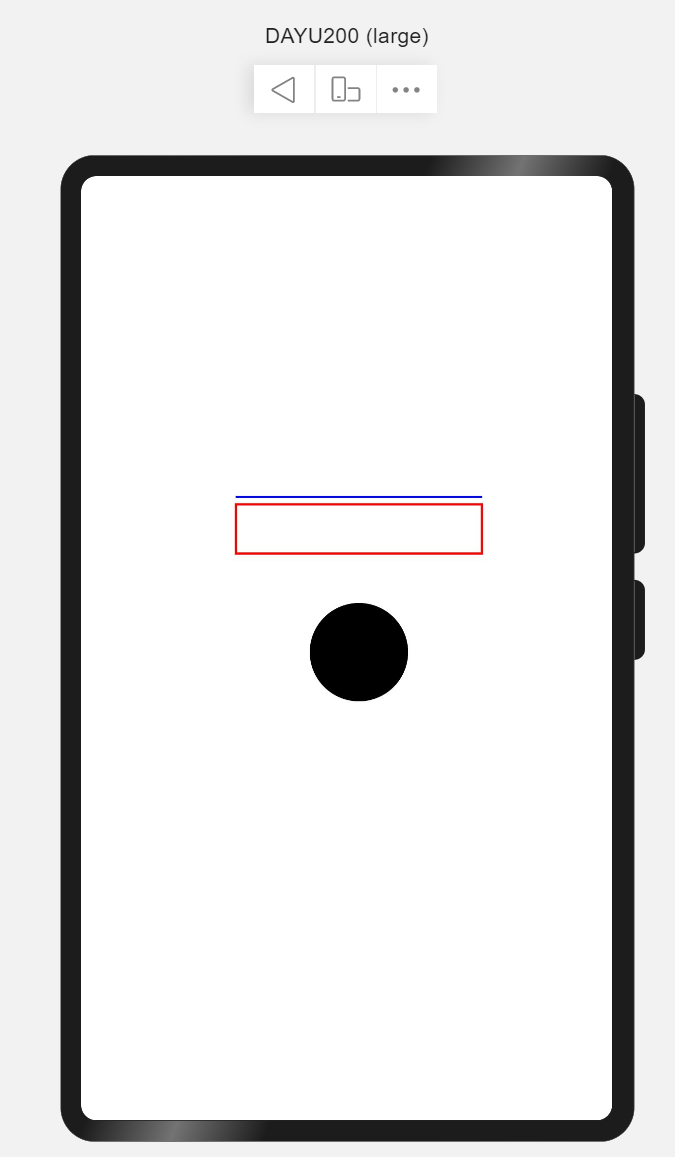
7、定时器(setInterval)
setInterval重复调用一个函数,在每次调用之间具有固定的时间延迟。使用场景3秒后跳转页面。
简单示例(intervalSimple.ets)
import router from '@ohos.router';
@Entry
@Component
struct IntervalSimple {
  @State time: number = 3;
  build() {
    Flex({justifyContent: FlexAlign.Center, alignItems: ItemAlign.Center}) {
      Text(`跳过 | ${this.time} s`)
        .fontSize(50).fontColor(Color.White)
        .backgroundColor(Color.Gray)
        .padding(10)
        .width(300)
        .height(120)
        .textAlign(TextAlign.Center)
        .borderRadius(50)
    }
    .width('100%')
    .height('100%')
  }

  aboutToAppear() {
    let skipWait = setInterval(() => {
      this.time--;
      if (this.time === 0) {
        clearInterval(skipWait);
        router.push({url: 'pages/index'})
      }
    }, 1000)
  }
}详细参见:setInterval定时器。
四、启动页实现
利用第3小结介绍的容器、组件及API,完成启动页,根据第2小结可知启动页由Logo、文本、以及跳过读秒组成。核心代码如下:
import router from '@ohos.router';
@Entry
@Component
struct Splash {
  @State timeMeter: number = 3;
  private skipWaite;
  build() {
    Stack({alignContent: Alignment.TopEnd}) {
      Flex({direction: FlexDirection.Column, alignItems: ItemAlign.Center, justifyContent: FlexAlign.Center}) {
        Flex({alignItems: ItemAlign.Center, justifyContent: FlexAlign.Center}) {
          Shape() {
            Path()
              .commands('M70 20 a50 50 0 0 0 0 100 Z')
            Path()
              .commands('M70 20 L300 20 L300 140 L100 140 L100 105 a15 15 0 0 0 -15 -15 a 15 15 0 0 0 -15 15 Z')
            Path()
              .commands('M300 20 a50 50 0 0 1 0 120 Z')
            Path()
              .commands('M100 120 L100 280 L250 280 L250 170 L220 170 a15 15 0 0 1 -15 -15 a15 15 0 0 1 15 -15 Z')
            Path()
              .commands('M100 280 a50 50 0 0 0 150 0 Z')
          }
          .height('400px')
          .width('400px')
          .fill(0x8B8ED7)
        }
        .layoutWeight(2)
        .width('100%')

        Flex({direction: FlexDirection.Column, alignItems: ItemAlign.Center, justifyContent: FlexAlign.Center}) {
          Text('叮音')
            .fontSize(50)
            .fontWeight(FontWeight.Bold)
            .fontColor(Color.White)
          Text('与乐符共舞,共普完美篇章')
            .fontSize(16)
            .fontColor(0xE5E5E5)
        }
        .layoutWeight(1)
        .width('100%')
      }
      .height('100%')
      .width('100%')

      Text(`跳过 | ${this.timeMeter}s`)
        .height(32)
        .fontSize(14)
        .fontColor(Color.White)
        .borderRadius(50)
        .backgroundColor(0xB2B2B236)
        .margin({
          top: 20,
          right: 20
        })
        .padding({
          top: 8,
          bottom: 8,
          left: 16,
          right: 16
        })
      .onClick(() => {
        clearInterval(this.skipWaite);
      })
    }
    .width('100%')
    .height('100%')
    .linearGradient({
      direction: GradientDirection.LeftTop,
      colors: [[0xA0EACF, 0], [0x014872, 1]]
    })
  }

  aboutToAppear() {
    this.skipWait = setInterval(() => {
      this.timeMeter--;
      if (this.timeMeter === 0) {
        clearInterval(skipWait);
        router.push({url: 'pages/index'})
      }
    }, 1000)
  }
}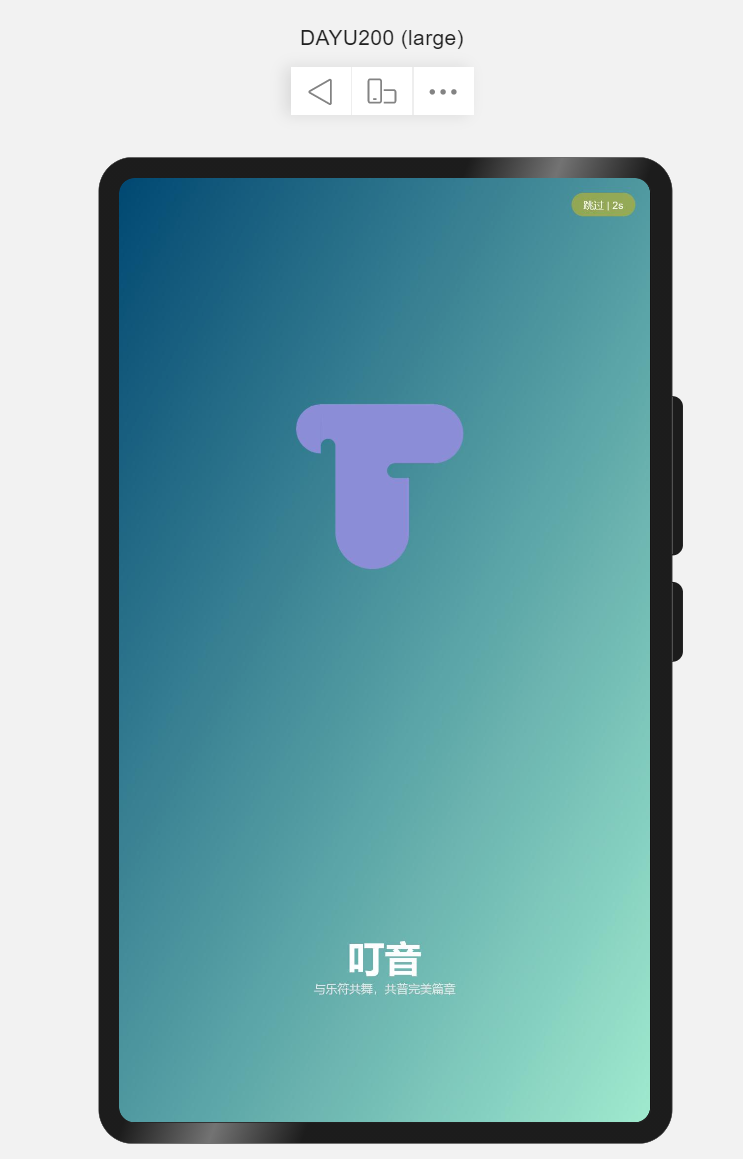
演示效果见: OpenHarmony App启动页及欢迎页。
Recommend
About Joyk
Aggregate valuable and interesting links.
Joyk means Joy of geeK