

First Look At The CSS object-view-box Property
source link: https://ishadeed.com/article/css-object-view-box/
Go to the source link to view the article. You can view the picture content, updated content and better typesetting reading experience. If the link is broken, please click the button below to view the snapshot at that time.
I have always wanted a native CSS way to crop an image and position it in any direction I need. This has been possible by using an additional HTML element combined with different CSS properties that I will explain later.
In this article, I will walk you through the new CSS property object-view-box that was suggested by Jake Archibald early this year. It allows us to crop or resize replaced HTML elements like an </img> or a <video>.
The problem
In the following example, we have an image that needs to be cropped. Notice how we only want a specific portion of that image.
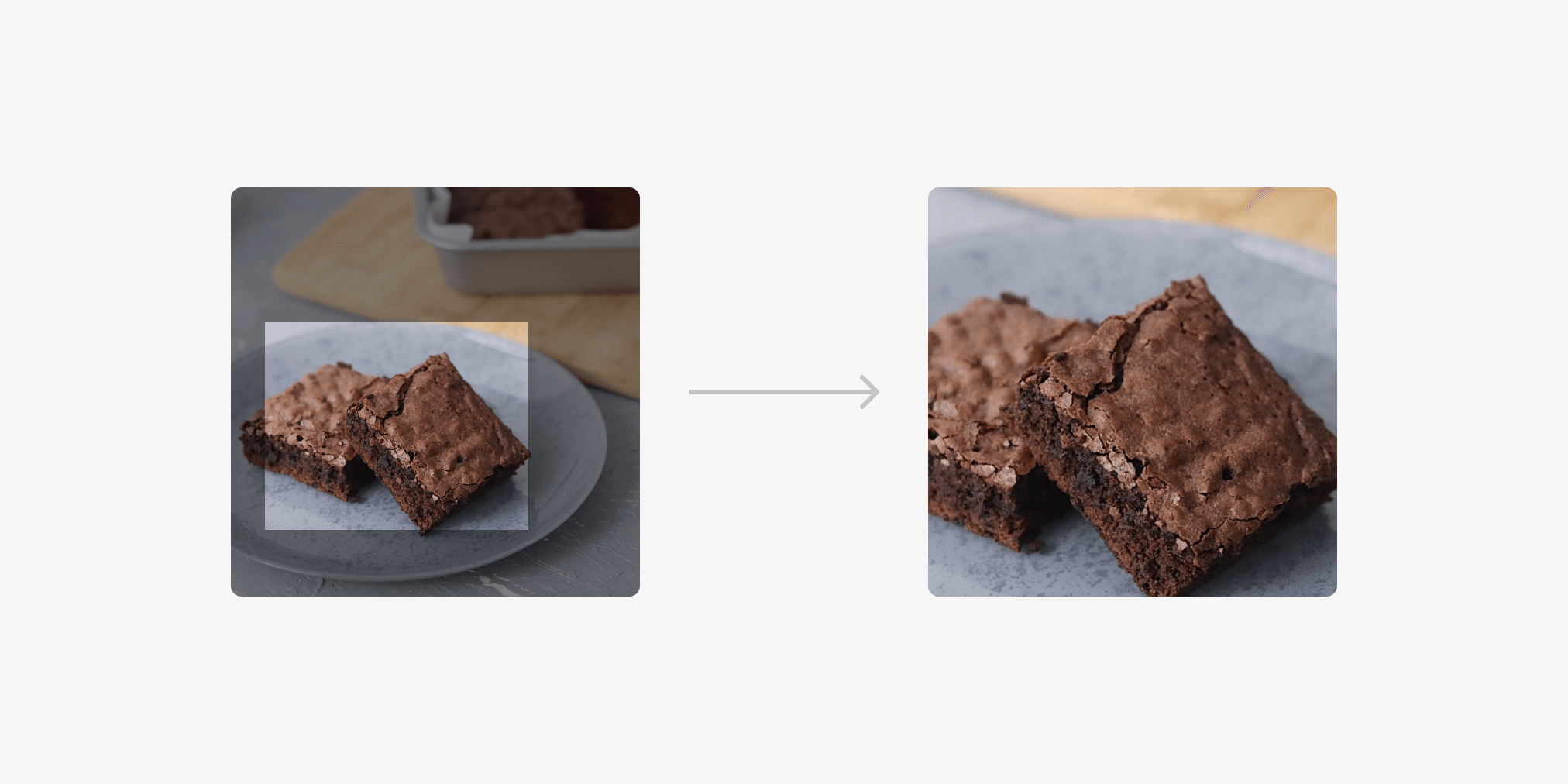
Currently, we can solve that by one of the following:
- Using an
<img>and wrapping it in an additional element - Using the image as a
background-imageand modifying the position and size
Wrapping in an additional element
This is a common solution to this problem, here is what’s happening:
- Wrapped the image in another element (The
<figure>in our case) - Added
position: relativeandoverflow: hidden - Added
position: absoluteto the image, and played with the positioning and sizing values to achieve the result
<figure>
    <img src="img/brownies.jpg" alt="">
</figure>
figure {
    position: relative;
    width: 300px;
    aspect-ratio: 1;
    overflow: hidden;
    border-radius: 15px;
}

img {
    position: absolute;
    left: -23%;
    top: 0;
    right: 0;
    bottom: 0;
    width: 180%;
    height: 100%;
    object-fit: cover;
}
Applying the image as a background
In this solution, we use a <div> and apply the image as a background, then we alter the position and size values.
<div class="brownies"></div>
.brownies {
  width: 300px;
  aspect-ratio: 3 / 2;
  background-image: url("brownies.jpg");
  background-size: 700px auto;
  background-position: 77% 68%;
  background-repeat: no-repeat;
}
It works great, but what if we want to apply the above to an <img>? Well, that’s what object-view-box is about.
Introducing object-view-box
I got excited when I saw that the property object-view-box might be shipped in Chrome 104. Available now in Chrome canary.
According to the CSS spec:
The object-view-box property specifies a “view box” over an element, similar to the
<svg viewBox>attribute, zooming or panning over the element’s contents.
The property takes the value <basic-shape-rect> = <inset()> | <rect()> | <xywh()>. For the demo in this article, I will focus on the inset() usage.
Let’s get back to the problem.
With object-view-box, we will be able to use inset to draw a rectangle from the four sides (top, right, bottom, left), and then apply object-fit: cover to avoid distortion.
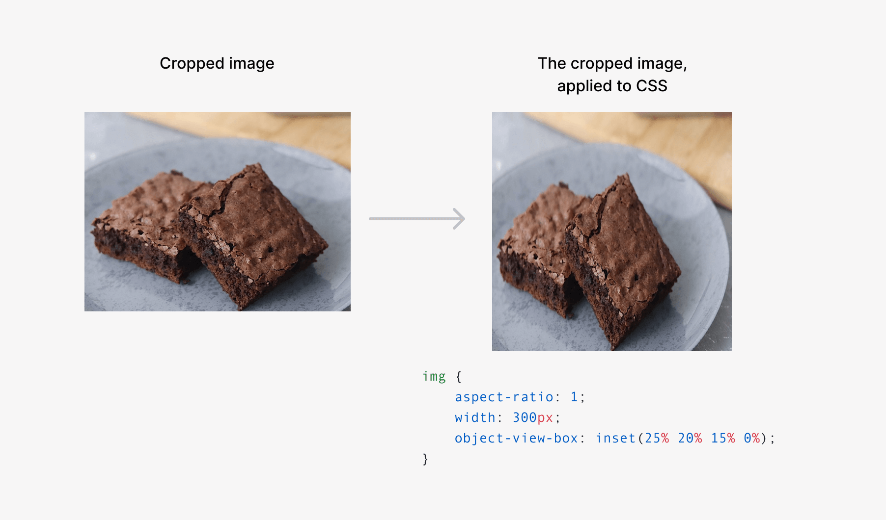
<img src="img/brownies.jpg" alt="">
img {
    aspect-ratio: 1;
    width: 300px;
    object-view-box: inset(25% 20% 15% 0%);
}
How is that even working? Don’t worry, I will explain everything below. Let’s go!
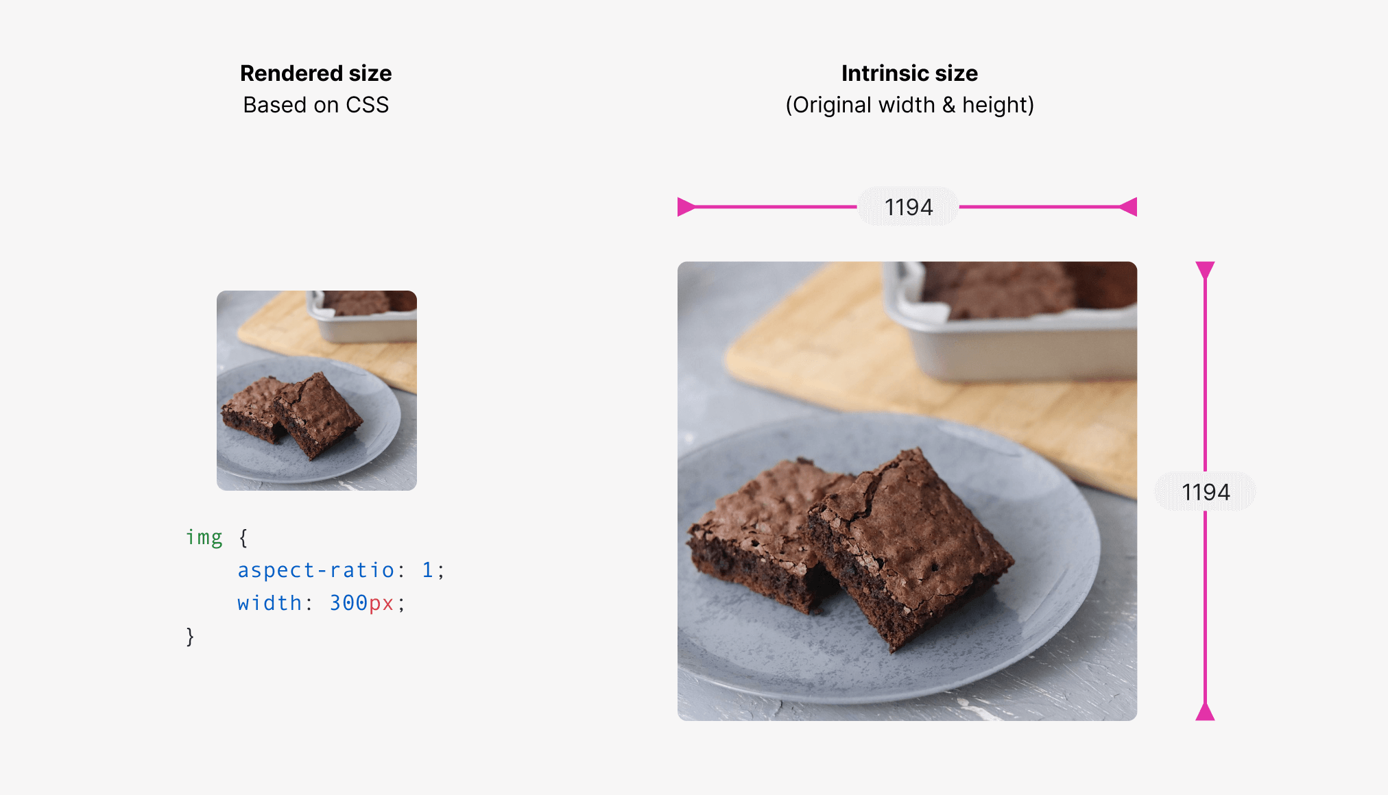
The image intrinsic size
The intrinsic size is the default image width and height. The image I’m dealing with has a size of 1194 × 1194 px.
img {
    aspect-ratio: 1;
    width: 300px;
}
With the above CSS, the rendered size of the image will be 300 × 300 px.
Our goal is to draw a rectangle on the intrinsic image. To do that, we will use the inset() value.
Applying the inset value
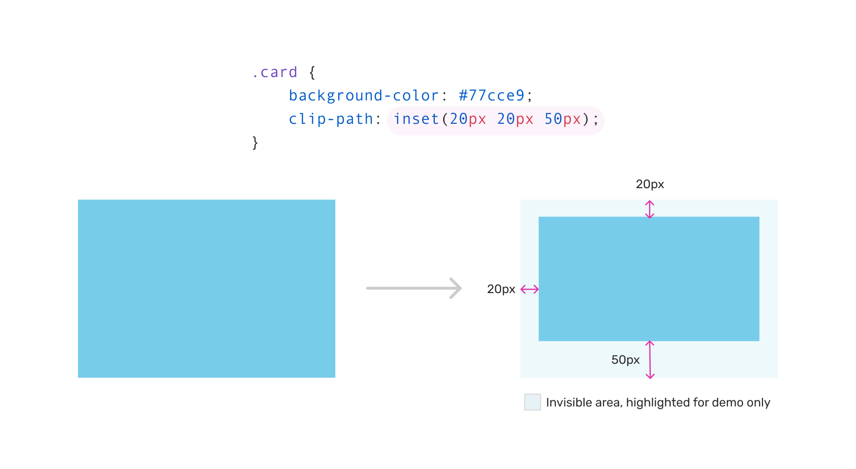
The inset() value will be based on the original image width & height, resulting in a cropped image. It will help us in drawing an inset rectangle and control the four edges, similar to dealing with margin or padding.
The inset value defines an inset rectangle. We can control the four edges, just like we deal with margin or padding. In the following example, the card has an inset of 20px from all the edges.
Let’s get back to the CSS for the object-view-box.
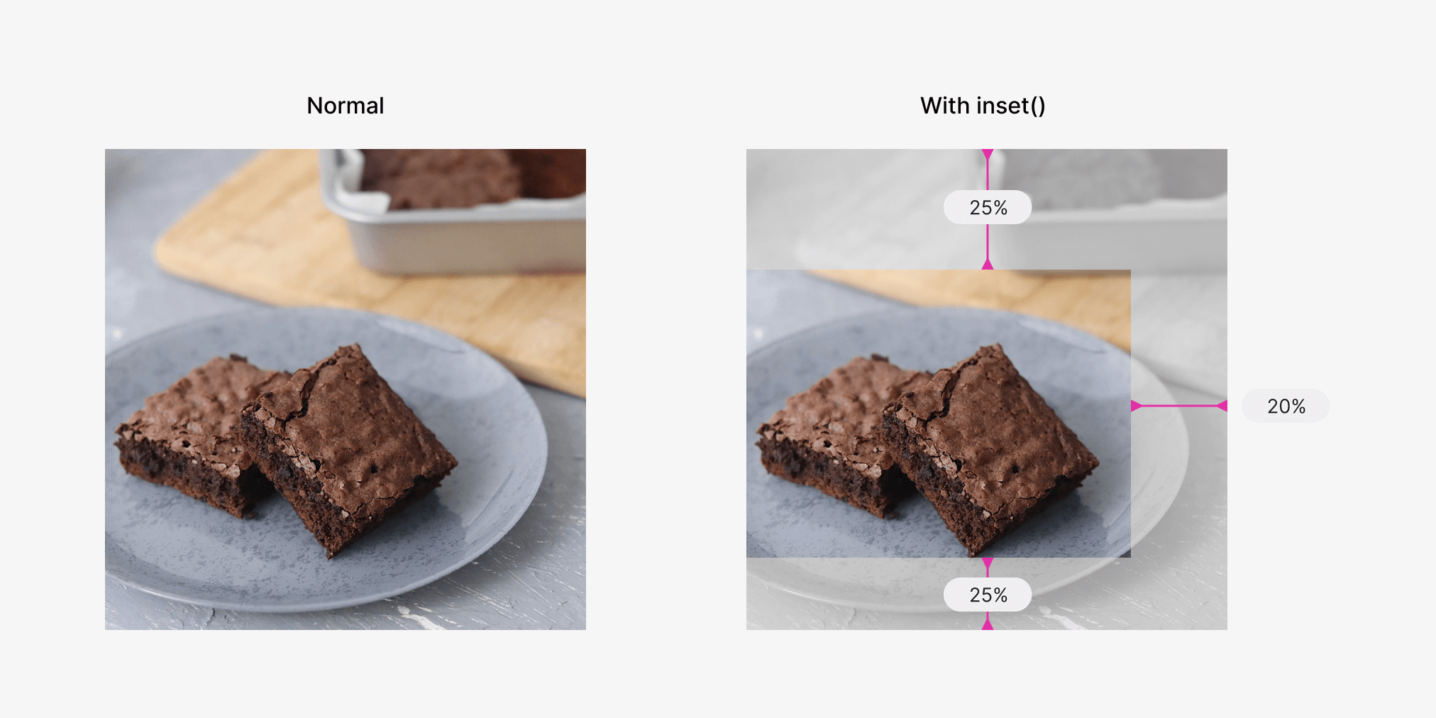
img {
    aspect-ratio: 1;
    width: 300px;
    object-view-box: inset(25% 20% 15% 0%);
}
Here is how the above looks behind the scenes. The values 25%, 20%, 15%, and 0% represent the top, right, bottom, and left respectively.
Fix image distorsion
If the size of the image is square, the cropped result will be distorted.
This can be easy with the well-supported object-fit property.
img {
    aspect-ratio: 1;
    width: 300px;
    object-view-box: inset(25% 20% 15% 0%);
    object-fit: cover;
}
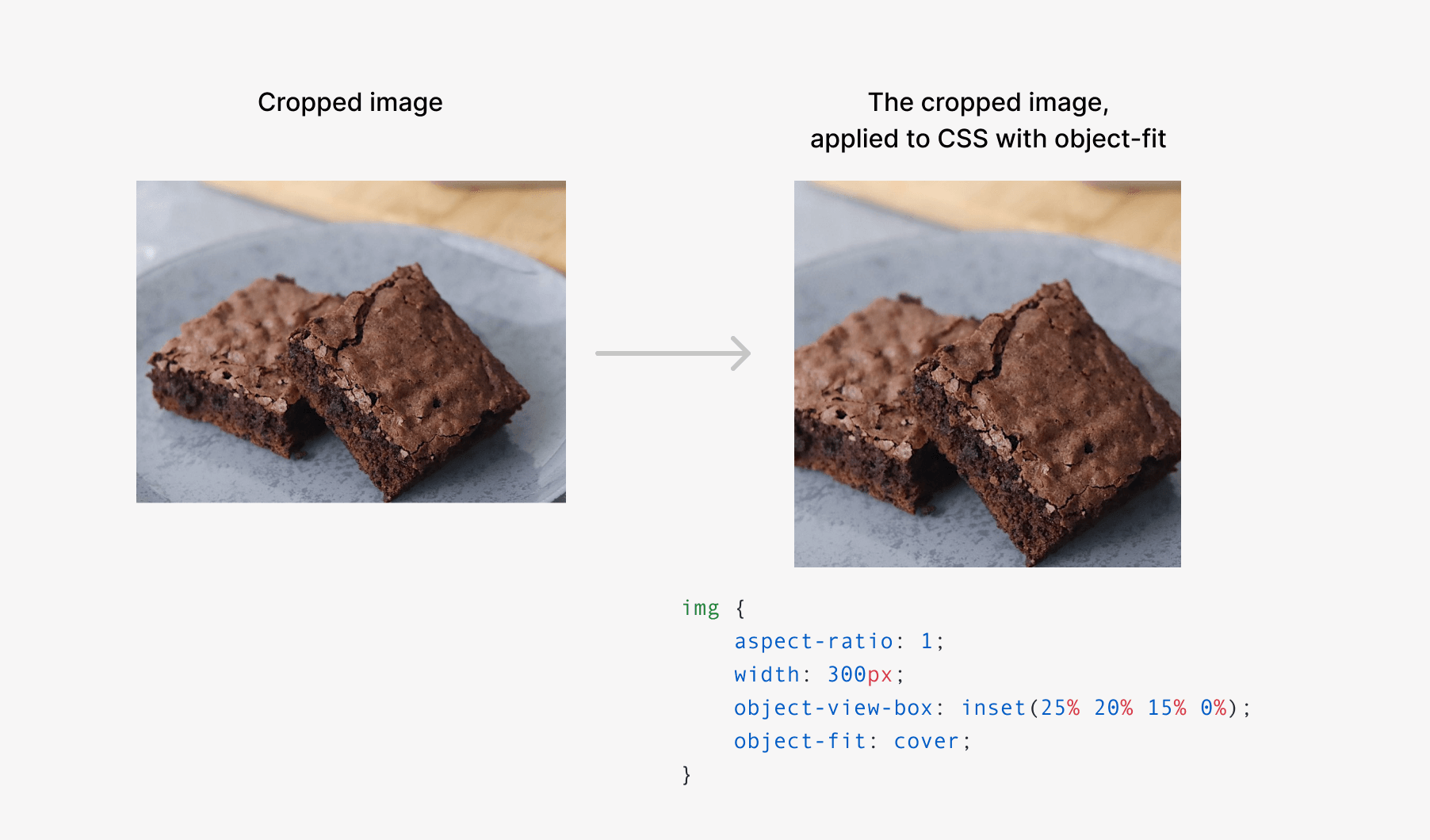
That’s it. Isn’t that just amazing? Being able to do art direction on an <img> can be very useful for responsive design, or even showing different parts of an image.
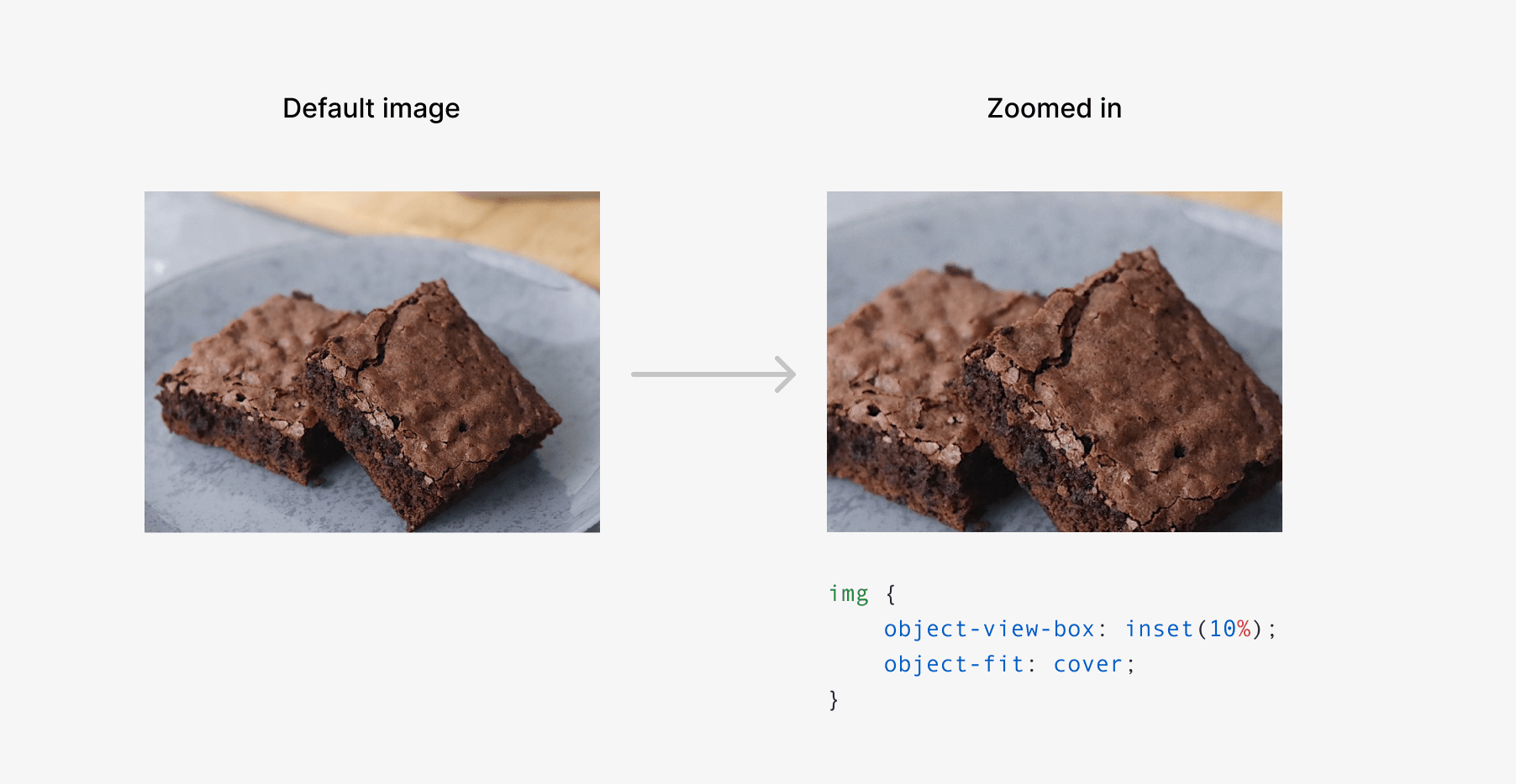
Zooming in or out
We can use the inset to zoom in or out an image. As per my testing, transition or animation won’t work with object-view-box.
We can also zoom out with a negative inset value.
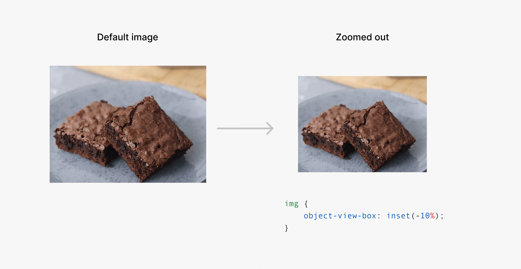
Image how this will be useful for being able to zoom an image, without wrapping it in an additional element.
Here is a demo that you can test in Chrome Canary today. Please make sure to enable the “Experimental Web Platform features” flag.
Conclusion
I’m so excited about other potential use-cases for this new feature. That was a quick first look, and I will come back later with more explorations.
Recommend
About Joyk
Aggregate valuable and interesting links.
Joyk means Joy of geeK