

Exploring innovative modeling designs built to battle bias
source link: https://blogs.sas.com/content/sascom/2022/05/11/exploring-innovative-modeling-designs-built-to-battle-bias/
Go to the source link to view the article. You can view the picture content, updated content and better typesetting reading experience. If the link is broken, please click the button below to view the snapshot at that time.
Exploring innovative modeling designs built to battle bias
Students at North Carolina State University completed design projects yielding striking visuals, purpose and functionality without unethical design characteristics.
If you were to design the ultimate vacation home, you would most certainly consider options and features that speak to your individual preferences and style.
It turns out that same inclination to design for yourself is almost always present when designing software, too, but with less desirable results – like unintended bias, inaccuracy, or a less-than-optimal modeling experience.
SAS is set on preventing it with responsible innovation.
It’s also why identifying unethical characteristics in model building, understanding the resulting bias, and removing it from models while maintaining sufficient accuracy were at the heart of Project Ethos, this year’s SAS College of Design Student Project with NC State University.
“We might design it, but they use it. Information architecture, psychology and technology are all needed to succeed.”
Now entering the design studio …
Five student teams worked all semester to be ready to present to what became a virtual audience of more than 165 participants on April 21. The project has been an annual effort since 2013. It gives students a chance to work directly with practitioners and put what they’ve learned into practice.
“It has been a valuable source of ideas and talent for us,” said Rajiv Ramarajan, SAS Director of Product Design. “This allows us to attack new challenges very quickly with fresh ideas and diverse perspectives.”
Jarrett Fuller, Assistant Professor, Graphic Design, experienced the project for the first time as a new academic faculty member at NC State. SAS engineers, data scientists, and others provided input on the stages of the process to ensure teams were heading in the right direction. “That feedback was invaluable and led to all sorts of iterations and revisions,” said Fuller.
One team’s perspectives: Opacity
The three-student Opacity project team of Jemi Liteli, Allegra Matthews and Riley Becker, attracted lots of activity in the online chat during their presentation, with positive comments about animation, usability, color palette and the exploratory nature found in their models.
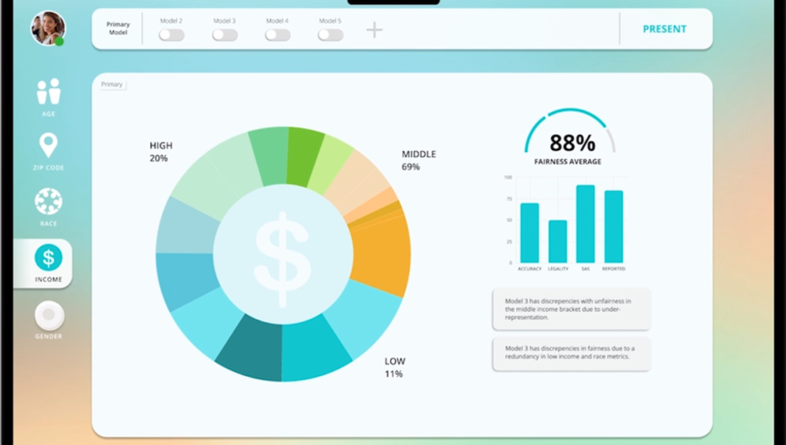
Modeling graphic showing fairness average for income.
During breakout sessions following the main event, however, team members admitted it wasn’t an easy task to uncover bias in the Design Challenge scenario: optimizing mailings from a non-profit organization seeking to reach those most likely to need the information.
“We struggled with that,” said Becker. “What does fairness mean in our context?”
Interviews with Veronique Van Vlasselaer, Senior Data Scientist, Technology Futures, clarified the pain points for the team. In those sessions, they learned that model users often need multiple interfaces to generate a presentation that works for their clients, and it’s difficult to compare various models with them. Van Vlasselaer said It often feels like solutions are built for data scientists, but not end-users.
In-depth interviews also refined the team’s wireframes. “Low fidelity mockups didn’t include comparisons, but in our mock client explanation we learned how important this was,” said Matthews. “Failing fast and taking input is key.”
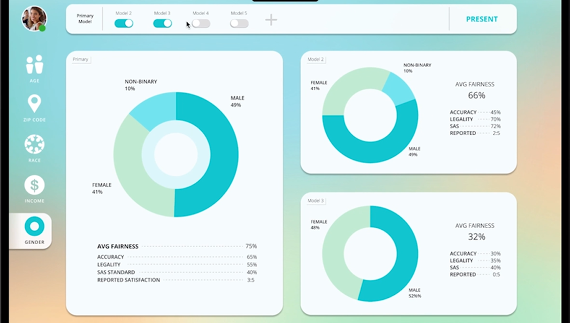
Modeling graphics showing primary and two alternate graphics for gender, model toggle on/off buttons.
Every great design begins with a story
“We initially planned some beautiful but pointless functionality,” said Liteli. “After the interviews, we simplified.”
In the breakout conversation, Macklin Frazier, Manager of User Experience Design, praised team members for the critical listening step in their design story. “We have to become like therapists,” he said. Asking why a user feels overwhelmed and how they’re struggling to explain things to clients can lead designers to more impactful outcomes. “Storytelling – don’t lose it,” he said.
“We might design it, but they use it,” said Ramarajan. “Information architecture, psychology and technology are all needed to succeed.”
“We are executing for performance here,” said Barry Hicks, Principal Software Developer, Data Ethics Practice. Hicks said this year’s Design Challenge scenario was different from something like a pharmaceutical drug discovery scenario, which is designed for learning rather than consensus. Either way, he said, “we need something visually striking and with purpose.”
Yes, no, wow
Team Opacity came through with both, pivoting to a design that allows data experts to combine several programs into one visually simple and striking application that also works for clients. In their final design prototype, users can:
- Easily toggle on and off different models by metric, such as race or gender.
- Show as many comparisons as they prefer and why each model is preferable.
- Nickname models to help users and clients easily distinguish one from another.
Moreover, users can shift to a beautifully designed presentation mode that generates:
- A client-ready, digital taxonomy of the chosen model in just one click.
- Visually appealing metrics of that model in a digestible format.
- Ability to compare the chosen model to other models.
- Hovering capabilities to display summaries and breakdowns of each model in easy-to-understand language, including why a model wasn’t chosen.
“We’re really proud of this,” Liteli said.
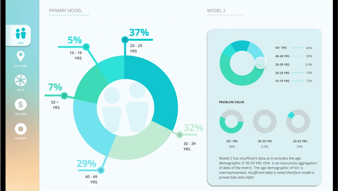
Modeling graphics showing digital taxonomy of primary model alongside alternate model with an explanation on why it is insufficient.
Explore all five of the student project presentations to learn more.
SAS on UX design
In addition to supporting the NC State design team, SAS UX designers provide a number of useful resources about the work they do. You can learn more about user-focused design from the video below and by exploring these SAS resources:
- Design at SAS Software: Stories from designers at SAS.
- Data Can be Beautiful: how to create a compelling data story.
Recommend
About Joyk
Aggregate valuable and interesting links.
Joyk means Joy of geeK