

Flutter 让你的Dialog脱胎换骨吧!(Attach,Dialog,Loading,Toast)_flutter_小呆呆6...
source link: https://xie.infoq.cn/article/9bfad1aa9ce793ffe032ebbac
Go to the source link to view the article. You can view the picture content, updated content and better typesetting reading experience. If the link is broken, please click the button below to view the snapshot at that time.
Flutter 让你的 Dialog 脱胎换骨吧!(Attach,Dialog,Loading,Toast)
功能更新频繁,请以 github 上都中文介绍为准:https://github.com/fluttercandies/flutter_smart_dialog
Q:你一生中闻过最臭的东西,是什么?
A:我那早已腐烂的梦。
兄弟萌!!!我又来了!
这次,我能自信的对大家说:我终于给大家带了一个,能真正帮助大家解决诸多坑比场景的 pub 包!
将之前的 flutter_smart_dialog,在保持 api 稳定的基础上,进行了各种抓头重构,解决了一系列问题
现在,我终于可以说:它现在是一个简洁,强大,侵入性极低的 pub 包!
关于侵入性问题
之前为了解决返回关闭弹窗,使用了一个很不优雅的解决方法,导致侵入性有点高
这真是让我如坐针毡,如芒刺背,如鲠在喉,这个问题终于搞定了!
同时,我在 pub 包内部设计了一个弹窗栈,能自动移除栈顶弹窗,也可以定点移除栈内标记的弹窗。
存在的问题
使用系统弹窗存在一系列坑,来和各位探讨探讨
必须传 BuildContext
在一些场景必须多做一些传参工作,蛋痛但不难的问题
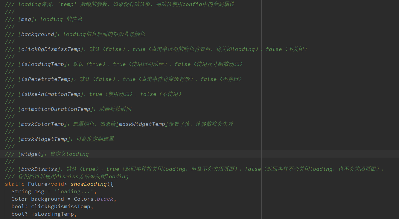
loading 弹窗
使用系统弹窗做 loading 弹窗,肯定遇到过这个坑比问题
loading 封装在网络库里面:请求网络时加载 loading,手贱按了返回按钮,关闭了 loading
然后请求结束后发现:特么我的页面怎么被关了!!!
系统弹窗就是一个路由页面,关闭系统就是用 pop 方法,这很容易误关正常页面
当然肯定有解决办法,路由监听的地方处理,此处就不细表了
某页面弹出了多个系统 Dialog,很难定点关闭某个非栈顶弹窗
蛋蛋,这是路由入栈出栈机制导致的,理解的同时也一样要吐槽
系统 Dialog,点击事件无法穿透暗色背景
这个坑比问题,我是真没辙
相关思考
上面列举了一些比较常见的问题,最严重的问题,应该就是 loading 的问题
loading 是个超高频使用的弹窗,关闭 loading 弹窗的方法,同时也能关闭正常使用的页面,本身就是一个隐患
穿透 dialog 遮罩是个非常重要的功能,基于该功能,能够在实际业务中,实现很多骚操作
既然在系统 dialog 难以解决各种痛点,加上系统 dialog 也是基于 overlay 去实现的,这样的话,我们也可以去高度定制 overlay!
这次,我要一次性帮各位解决:toast 消息,loading 弹窗,以及更强大的自定义 dialog!
初始化
引入(最新版本请点击 pub 查看):pub,github,web effect
dependencies:flutter_smart_dialog: ^3.3.0
接入方式更加简洁😊
void main() => runApp(MyApp());class MyApp extends StatelessWidget {@overrideWidget build(BuildContext context) {return MaterialApp(home: HomePage,// herenavigatorObservers: [FlutterSmartDialog.observer],// herebuilder: FlutterSmartDialog.init(),);}}
极简使用
toast 使用💬
SmartDialog.showToast('test toast');
loading 使用⏳
SmartDialog.showLoading();await Future.delayed(Duration(seconds: 2));SmartDialog.dismiss();
dialog 使用🎨
var custom = Container(height: 80,width: 180,decoration: BoxDecoration(color: Colors.black,borderRadius: BorderRadius.circular(20),),alignment: Alignment.center,child: Text('easy custom dialog', style: TextStyle(color: Colors.white)),);// hereSmartDialog.show(widget: custom, isLoadingTemp: false);
OK,上面展示了,只需要极少的代码,就可以调用相应的功能
当然,内部还有不少地方做了特殊优化,接下来,我会详细的向大家描述下
你可能会有的疑问
初始化框架的时候,相比以前,居然让大家多写了一个参数,内心十分愧疚😩
关闭页面本质上是一个比较复杂的情况,涉及到
物理返回按键
AppBar 的 back 按钮
手动 pop
为了监控这些情况,不得已增加了一个路由监控参数
实体返回键
对返回按钮的监控,是非常重要的,基本能覆盖大多数情况
pop 路由
虽然对返回按钮的监控能覆盖大多数场景,但是一些手动 pop 的场景就需要新增参数监控
不加
FlutterSmartDialog.observer如果打开了穿透参数(就可以和弹窗后的页面交互),然后手动关闭页面
就会出现这种很尴尬的情况
加了
FlutterSmartDialog.observer,就能比较合理的处理了当然,这里的过渡动画,也提供了参数控制是否开启 😉
关于 FlutterSmartDialog.init()
本方法不会占用你的 builder 参数,init 内部回调出来了 builder,你可以大胆放心的继续套
例如:继续套 Bloc 全局实例😄
class MyApp extends StatelessWidget {@overrideWidget build(BuildContext context) {return MaterialApp(home: HomePage,navigatorObservers: [FlutterSmartDialog.observer],builder: FlutterSmartDialog.init(builder: _builder),);}}Widget _builder(BuildContext context, Widget? child) {return MultiBlocProvider(providers: [BlocProvider.value(value: BlocSpanOneCubit()),],child: child!,);}
超实用的参数:backDismiss
这个参数是默认设置为 true,返回的时候会默认关闭弹窗;如果设置为 false,将不会关闭页面
这样就可以十分轻松的做一个紧急弹窗,禁止用户的下一步操作
我们来看一个场景:假定某开源作者决定弃坑软件,不允许用户再使用该软件的弹窗
SmartDialog.show(// herebackDismiss: false,clickBgDismissTemp: false,isLoadingTemp: false,widget: Container(height: 480,width: 500,padding: EdgeInsets.all(20),decoration: BoxDecoration(borderRadius: BorderRadius.circular(20),color: Colors.white,),alignment: Alignment.topCenter,child: SingleChildScrollView(child: Wrap(direction: Axis.vertical,crossAxisAlignment: WrapCrossAlignment.center,spacing: 10,children: [// titleText('特大公告',style: TextStyle(fontSize: 30, fontWeight: FontWeight.bold),),// contentText('鄙人日夜钻研下面秘籍,终于成功钓到富婆'),Image.network('https://cdn.jsdelivr.net/gh/xdd666t/MyData@master/pic/flutter/blog/20211102213746.jpeg',height: 200,width: 400,),Text('鄙人思考了三秒钟,怀着\'沉重\'的心情,决定弃坑本开源软件'),Text('本人今后的生活是富婆和远方,已无\'精力\' 再维护本开源软件了'),Text('各位叼毛,有缘江湖再见!'),// button (only method of close the dialog)ElevatedButton(onPressed: () => SmartDialog.dismiss(),child: Text('再会!'),)],),),),);
从上面的效果图可以看出来
点击遮罩,无法关闭弹窗
点击返回按钮无法关闭弹窗
只能点我们自己的按钮,才能关闭弹窗,点击按钮的逻辑可以直接写成关闭 app 之类
只需要俩个简单的参数设置,就能实现这样一个很棒的应急弹窗
设置全局参数
SmartDialog 的全局参数都有着一个比较合理的默认值
为了应付多变的场景,你可以修改符合你自己要求的全局参数
设置符合你的要求的数据,放在 app 入口就行初始化就行
注:如果没有特殊要求,可以不用初始化全局参数(内部皆有默认值)
SmartDialog.config..alignment = Alignment.center..isPenetrate = false..clickBgDismiss = true..maskColor = Colors.black.withOpacity(0.35)..maskWidget = null..animationDuration = Duration(milliseconds: 260)..isUseAnimation = true..isLoading = true..debounce = false..debounceTime = Duration(milliseconds: 300);
代码的注释写的很完善,某个参数不明白的,点进去看看就行了
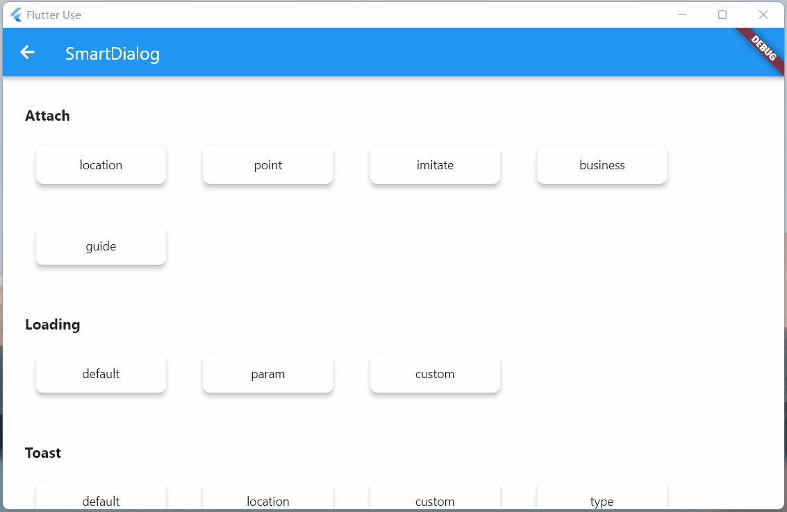
Attach 篇
这是一个很重要的功能,本来早就想加进去了,但是比较忙,一直搁置了;元旦(2022.1.1)开了头,就花了一些时间,完成了这个功能和相关 demo
定位目标 widget 的坐标,这个做起来并不难;但是必须要拿到我们传入的自定义 widget 大小,这样才能将自定义 widget 叠放到一个比较合适的位置(通过一些计算,获取中心点)
实际上 Flutter 提供一个非常合适的组件
CustomSingleChildLayout,这个组件还提供偏移坐标功能,按理来说非常合适但是,
CustomSingleChildLayout和SizeTransition动画控件,存在占位面积冲突,只能使用AnimatedOpacity渐隐动画位移动画不能用,这我没法忍,抛弃
CustomSingleChildLayout;使用了各种骚操作,终于拿到自定义 widget 的大小,比较完美实现了效果
定位 dialog,使用 showAttach 方法,参数注释写的相当详细,不明白用法的看看注释就行了
强大的定位功能
必须传目标 widget 的 BuildContext,需要通过它计算出目标 widget 的坐标和大小
var attach = (BuildContext context, AlignmentGeometry alignment) async {SmartDialog.showAttach(targetContext: context,isPenetrateTemp: true,alignmentTemp: alignment,clickBgDismissTemp: false,widget: Container(width: 100, height: 100, color: randomColor()),);await Future.delayed(Duration(milliseconds: 350));};//target widgetList<BuildContext> contextList = [];List<Future Function()> funList = [() async => await attach(contextList[0], Alignment.topLeft),() async => await attach(contextList[1], Alignment.topCenter),() async => await attach(contextList[2], Alignment.topRight),() async => await attach(contextList[3], Alignment.centerLeft),() async => await attach(contextList[4], Alignment.center),() async => await attach(contextList[5], Alignment.centerRight),() async => await attach(contextList[6], Alignment.bottomLeft),() async => await attach(contextList[7], Alignment.bottomCenter),() async => await attach(contextList[8], Alignment.bottomRight),];var btn = ({required String title,required Function(BuildContext context) onTap,}) {return Builder(builder: (context) {Color? color = title.contains('all') ? randomColor() : null;contextList.add(context);return Container(width: 130,child: ElevatedButton(style: ButtonStyle(backgroundColor: ButtonStyleButton.allOrNull<Color>(color),),onPressed: () => onTap(context),child: Text('$title'),),);});};SmartDialog.show(isLoadingTemp: false,widget: Container(width: 700,padding: EdgeInsets.all(70),decoration: BoxDecoration(borderRadius: BorderRadius.circular(20),color: Colors.white,),child: Wrap(spacing: 50,runSpacing: 50,alignment: WrapAlignment.spaceEvenly,children: [btn(title: 'topLeft', onTap: (context) => funList[0]()),btn(title: 'topCenter', onTap: (context) => funList[1]()),btn(title: 'topRight', onTap: (context) => funList[2]()),btn(title: 'centerLeft', onTap: (context) => funList[3]()),btn(title: 'center', onTap: (context) => funList[4]()),btn(title: 'centerRight', onTap: (context) => funList[5]()),btn(title: 'bottomLeft', onTap: (context) => funList[6]()),btn(title: 'bottomCenter', onTap: (context) => funList[7]()),btn(title: 'bottomRight', onTap: (context) => funList[8]()),btn(title: 'allOpen',onTap: (_) async {for (var item in funList) {await item();}},),btn(title: 'allClose',onTap: (_) => SmartDialog.dismiss(status: SmartStatus.allAttach),),],),),);
动画效果和 show 方法几乎是一致的,为了这个一致的体验,内部做了相当多的针对性优化
自定义坐标点
大多数情况基本都是使用 targetContext
SmartDialog.showAttach(targetContext: context,widget: Container(width: 100, height: 100, color: Colors.red),);
当然还有少数情况,需要使用自定义坐标,此处也提供 target 参数:设置了 target 参数,targetContext 将自动失效
targetContext 是十分常见的场景,所以,这边设置为必传参数,但是你可以给它设置为 null
SmartDialog.showAttach(targetContext: null,target: Offset(100, 100);,widget: Container(width: 100, height: 100, color: Colors.red),);
看来下自定义坐标点效果
var attach = (Offset offset) {var random = Random().nextInt(100) % 5;var alignment = Alignment.topCenter;if (random == 0) alignment = Alignment.topCenter;if (random == 1) alignment = Alignment.centerLeft;if (random == 2) alignment = Alignment.center;if (random == 3) alignment = Alignment.centerRight;if (random == 4) alignment = Alignment.bottomCenter;SmartDialog.showAttach(targetContext: null,target: offset,isPenetrateTemp: true,clickBgDismissTemp: false,alignmentTemp: alignment,keepSingle: true,widget: ClipRRect(borderRadius: BorderRadius.circular(10),child: Container(width: 100, height: 100, color: randomColor()),),);};SmartDialog.show(isLoadingTemp: false,widget: Container(width: 600,height: 400,alignment: Alignment.center,decoration: BoxDecoration(borderRadius: BorderRadius.circular(20),color: Colors.white,),child: GestureDetector(onTapDown: (detail) => attach(detail.globalPosition),child: Container(width: 500,height: 300,color: Colors.grey,alignment: Alignment.center,child: Text('click me', style: TextStyle(color: Colors.white)),),),),);
模仿 DropdownButton
实际上模仿 DropdownButton 挺不容易的
首先要计算 DropdownButton 控件的位置,在其位置上显示点击后的折叠控件
需要处理 DropdownButton 之外区域的点击事件(点击区域外关闭 DropdownButton)
还需要监听返回事件,手动 pop 路由事件;是这类事件的,需要关闭 DropdownButton
这玩意要自定义,挺让人头大的;但是,现在你可以使用
SmartDialog.showAttach轻松模仿一个,上述需要注意的事项都帮你处理好了
//模仿DropdownButtonvar imitate = (BuildContext context) {var list = ['小呆呆', '小菲菲', '小猪猪'];SmartDialog.showAttach(targetContext: context,isPenetrateTemp: true,widget: Container(margin: EdgeInsets.all(10),decoration: BoxDecoration(boxShadow: [BoxShadow(color: Colors.black12, blurRadius: 8, spreadRadius: 0.2)],),child: Column(children: List.generate(list.length, (index) {return Material(color: Colors.white,child: InkWell(onTap: () => SmartDialog.dismiss(),child: Container(height: 50,width: 100,alignment: Alignment.center,child: Text('${list[index]}'),),),);}),),),);};//imitate widgetvar dropdownButton = ({String title = 'Dropdown'}) {return DropdownButton<String>(value: '1',items: [DropdownMenuItem(value: '1', child: Text('$title:小呆呆')),DropdownMenuItem(value: '2', child: Text('小菲菲')),DropdownMenuItem(value: '3', child: Text('小猪猪'))],onChanged: (value) {},);};var imitateDropdownButton = () {return Builder(builder: (context) {return Stack(children: [dropdownButton(title: 'Attach'),GestureDetector(onTap: () => imitate(context),child: Container(height: 50, width: 140, color: Colors.transparent),)]);});};SmartDialog.show(isLoadingTemp: false,widget: Container(width: 600,height: 400,alignment: Alignment.center,padding: EdgeInsets.symmetric(horizontal: 100),decoration: BoxDecoration(borderRadius: BorderRadius.circular(20),color: Colors.white,),child: MaterialApp(debugShowCheckedModeBanner: false,home: Row(mainAxisAlignment: MainAxisAlignment.spaceBetween,children: [dropdownButton(), imitateDropdownButton()],),),),);
这次把遮罩特定区域高亮的功能加上了,这是一个非常实用的功能!
你只需要设置
highlight参数即可定义高亮的区域,他必须是个不通透的 Widget,例如是 Contaienr,必须设置一个颜色(色值无要求)
使用各种奇形怪状的图片也行,这样就能显示各种复杂图形的高亮区域
highlight 类型是 Positioned,你可以在屏幕上定位任何需要高亮的区域
SmartDialog.showAttach(targetContext: context,alignmentTemp: Alignment.bottomCenter,highlight: Positioned(right: 190,bottom: 190,child: Container(height: 120,width: 120,decoration: BoxDecoration(borderRadius: BorderRadius.circular(10),color: Colors.white,),),),widget: Container(width: 100, height: 100, color: Colors.red),);
实际的业务场景
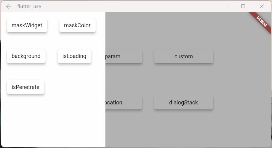
这边举俩个常见的例子,代码有一点点多,就不贴了,感兴趣的请查看:flutter_use
上面俩个业务场景非常常见,有时候,我们需要目标 widget 上面或下面或特定的区域,不被遮罩覆盖
自己去做的话,可以做出来,但是会很麻烦;现在你可以使用showAttach中的highlight参数轻松实现这个需求
引导操作
引导操作在 app 上还是非常常见的,需要指定区域高亮,然后介绍其功能
使用
showAttach中的highlight参数,也可以轻松实现这个需求,来看下效果代码同样有一点点多,感兴趣的请查看:flutter_use
Dialog 篇
弹窗从不同位置弹出,动画是有区别的
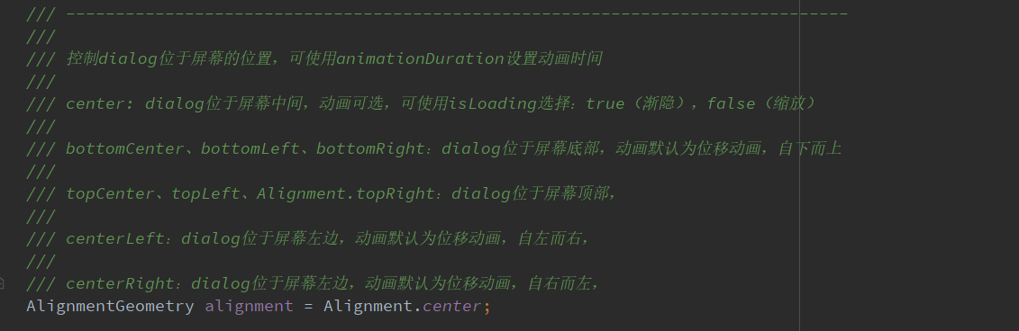
alignmentTemp:该参数设置不同,动画效果会有所区别
var location = ({double width = double.infinity,double height = double.infinity,}) {return Container(width: width, height: height, color: randomColor());};//leftSmartDialog.show(widget: location(width: 70),alignmentTemp: Alignment.centerLeft,);await Future.delayed(Duration(milliseconds: 500));//topSmartDialog.show(widget: location(height: 70),alignmentTemp: Alignment.topCenter,);await Future.delayed(Duration(milliseconds: 500));//rightSmartDialog.show(widget: location(width: 70),alignmentTemp: Alignment.centerRight,);await Future.delayed(Duration(milliseconds: 500));//bottomSmartDialog.show(widget: location(height: 70),alignmentTemp: Alignment.bottomCenter,);await Future.delayed(Duration(milliseconds: 500));//centerSmartDialog.show(widget: location(height: 100, width: 100),alignmentTemp: Alignment.center,isLoadingTemp: false,);
isPenetrateTemp:交互事件穿透遮罩
SmartDialog.show(alignmentTemp: Alignment.centerRight,isPenetrateTemp: true,clickBgDismissTemp: false,widget: Container(width: 80,height: double.infinity,color: randomColor(),),);
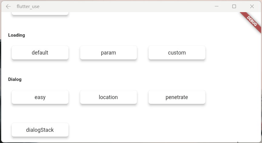
dialog 栈
这是一个强大且实用的功能!
可以很轻松的定点关闭某个弹窗
var stack = ({double width = double.infinity,double height = double.infinity,String? msg,}) {return Container(width: width,height: height,color: randomColor(),alignment: Alignment.center,child: Text('dialog $msg', style: TextStyle(color: Colors.white)),);};//leftSmartDialog.show(tag: 'A',widget: stack(msg: 'A', width: 70),alignmentTemp: Alignment.centerLeft,);await Future.delayed(Duration(milliseconds: 500));//topSmartDialog.show(tag: 'B',widget: stack(msg: 'B', height: 70),alignmentTemp: Alignment.topCenter,);await Future.delayed(Duration(milliseconds: 500));//rightSmartDialog.show(tag: 'C',widget: stack(msg: 'C', width: 70),alignmentTemp: Alignment.centerRight,);await Future.delayed(Duration(milliseconds: 500));//bottomSmartDialog.show(tag: 'D',widget: stack(msg: 'D', height: 70),alignmentTemp: Alignment.bottomCenter,);await Future.delayed(Duration(milliseconds: 500));//center:the stack handlerSmartDialog.show(alignmentTemp: Alignment.center,isLoadingTemp: false,widget: Container(decoration: BoxDecoration(color: Colors.white, borderRadius: BorderRadius.circular(15)),padding: EdgeInsets.symmetric(horizontal: 30, vertical: 20),child: Wrap(spacing: 20, children: [ElevatedButton(child: Text('close dialog A'),onPressed: () => SmartDialog.dismiss(tag: 'A'),),ElevatedButton(child: Text('close dialog B'),onPressed: () => SmartDialog.dismiss(tag: 'B'),),ElevatedButton(child: Text('close dialog C'),onPressed: () => SmartDialog.dismiss(tag: 'C'),),ElevatedButton(child: Text('close dialog D'),onPressed: () => SmartDialog.dismiss(tag: 'D'),),]),),);
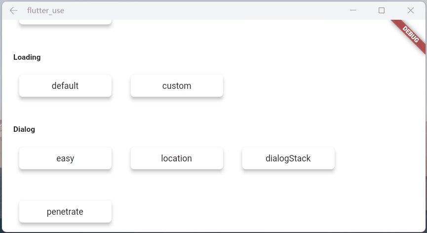
Loading 篇
开启 loading 后,可以使用以下方式关闭
SmartDialog.dismiss():可以关闭 loading 和 dialog
status 设置为 SmartStatus.loading:仅仅关闭 loading
// easy closeSmartDialog.dismiss();// exact closeSmartDialog.dismiss(status: SmartStatus.loading);
一般来说,loading 弹窗是封装在网络库里面的,随着请求状态的自动开启和关闭
基于这种场景,我建议:使用 dismiss 时,加上 status 参数,将其设置为:SmartStatus.loading
网络请求加载的时候,loading 也随之打开,这时很容易误触返回按钮,关闭 loading
当网络请求结束时,会自动调用 dismiss 方法
因为 loading 已被关闭,假设此时页面又有 SmartDialog 的弹窗,未设置 status 的 dismiss 就会关闭 SmartDialog 的弹窗
当然,这种情况很容易解决,封装进网络库的 loading,使用:
SmartDialog.dismiss(status: SmartStatus.loading);关闭就行了status参数,是为了精确关闭对应类型弹窗而设计的参数,在一些特殊场景能起到巨大的作用如果大家理解这个参数的含义,那对于何时添加
status参数,必能胸有成竹
参数在注释里面写的十分详细,就不赘述了,来看看效果
maskWidgetTemp:强大的遮罩自定义功能😆,发挥你的脑洞吧。。。
var maskWidget = Container(width: double.infinity,height: double.infinity,child: Opacity(opacity: 0.6,child: Image.network('https://cdn.jsdelivr.net/gh/xdd666t/MyData@master/pic/flutter/blog/20211101103911.jpeg',fit: BoxFit.fill,),),);SmartDialog.showLoading(maskWidgetTemp: maskWidget);
maskColorTemp:支持快捷自定义遮罩颜色
SmartDialog.showLoading(maskColorTemp: randomColor().withOpacity(0.3));/// random colorColor randomColor() => Color.fromRGBO(Random().nextInt(256), Random().nextInt(256), Random().nextInt(256), 1);
background:支持加载背景自定义
SmartDialog.showLoading(background: randomColor());/// random colorColor randomColor() => Color.fromRGBO(Random().nextInt(256), Random().nextInt(256), Random().nextInt(256), 1);

isLoadingTemp:动画效果切换
SmartDialog.showLoading(isLoadingTemp: false);isPenetrateTemp:交互事件可以穿透遮罩,这是个十分有用的功能,对于一些特殊的需求场景十分关键
SmartDialog.showLoading(isPenetrateTemp: true);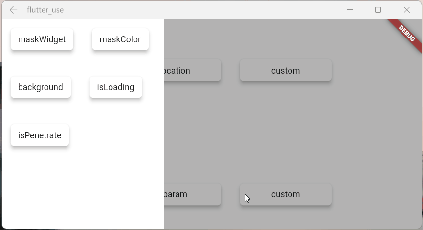
自定义 Loading
使用showLoading可以轻松的自定义出强大的 loading 弹窗;鄙人脑洞有限,就简单演示下
自定义一个 loading 布局
class CustomLoading extends StatefulWidget {const CustomLoading({Key? key, this.type = 0}) : super(key: key);final int type;@override_CustomLoadingState createState() => _CustomLoadingState();}class _CustomLoadingState extends State<CustomLoading>with TickerProviderStateMixin {late AnimationController _controller;@overridevoid initState() {_controller = AnimationController(duration: const Duration(milliseconds: 800),vsync: this,);_controller.forward();_controller.addStatusListener((status) {if (status == AnimationStatus.completed) {_controller.reset();_controller.forward();}});super.initState();}@overrideWidget build(BuildContext context) {return Stack(children: [// smileVisibility(visible: widget.type == 0, child: _buildLoadingOne()),// iconVisibility(visible: widget.type == 1, child: _buildLoadingTwo()),// normalVisibility(visible: widget.type == 2, child: _buildLoadingThree()),]);}Widget _buildLoadingOne() {return Stack(alignment: Alignment.center, children: [RotationTransition(alignment: Alignment.center,turns: _controller,child: Image.network('https://cdn.jsdelivr.net/gh/xdd666t/MyData@master/pic/flutter/blog/20211101174606.png',height: 110,width: 110,),),Image.network('https://cdn.jsdelivr.net/gh/xdd666t/MyData@master/pic/flutter/blog/20211101181404.png',height: 60,width: 60,),]);}Widget _buildLoadingTwo() {return Stack(alignment: Alignment.center, children: [Image.network('https://cdn.jsdelivr.net/gh/xdd666t/MyData@master/pic/flutter/blog/20211101162946.png',height: 50,width: 50,),RotationTransition(alignment: Alignment.center,turns: _controller,child: Image.network('https://cdn.jsdelivr.net/gh/xdd666t/MyData@master/pic/flutter/blog/20211101173708.png',height: 80,width: 80,),),]);}Widget _buildLoadingThree() {return Center(child: Container(height: 120,width: 180,decoration: BoxDecoration(color: Colors.white,borderRadius: BorderRadius.circular(15),),alignment: Alignment.center,child: Column(mainAxisSize: MainAxisSize.min, children: [RotationTransition(alignment: Alignment.center,turns: _controller,child: Image.network('https://cdn.jsdelivr.net/gh/xdd666t/MyData@master/pic/flutter/blog/20211101163010.png',height: 50,width: 50,),),Container(margin: EdgeInsets.only(top: 20),child: Text('loading...'),),]),),);}@overridevoid dispose() {_controller.dispose();super.dispose();}}
来看看效果
SmartDialog.showLoading(isLoadingTemp: false, widget: CustomLoading());await Future.delayed(Duration(seconds: 2));SmartDialog.dismiss();
SmartDialog.showLoading(isLoadingTemp: false,widget: CustomLoading(type: 1),);await Future.delayed(Duration(seconds: 2));SmartDialog.dismiss();
SmartDialog.showLoading(widget: CustomLoading(type: 2));await Future.delayed(Duration(seconds: 2));SmartDialog.dismiss();
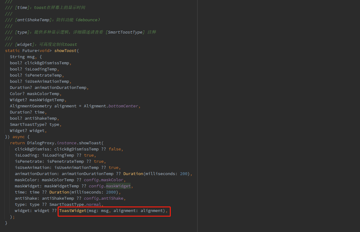
Toast 篇
toast 的特殊性
严格来说,toast 是一个非常特殊的弹窗,我觉得理应具备下述的特征
toast 消息理应一个个展示,后续消息不应该顶掉前面的 toast
这是一个坑点,如果框架内部不做处理,很容易出现后面 toast 会直接顶掉前面 toast 的情况
当然,内部提供了 type 参数,你可以选择你想要的显示逻辑
展示在页面最上层,不应该被一些弹窗之类遮挡
可以发现 loading 和 dialog 的遮罩等布局,均未遮挡 toast 信息
对键盘遮挡情况做处理
键盘这玩意有点坑,会直接遮挡所有布局,只能曲线救国
在这里做了一个特殊处理,当唤起键盘的时候,toast 自己会动态的调整自己和屏幕底部的距离
这样就能起到一个,键盘不会遮挡 toast 的效果
自定义 Toast
参数说明
toast 的一些参数并未向外暴露,仅仅暴露了 msg 和 alignment
例如:toast 字体大小,字体颜色,toast 的背景色等等之类,都没提供参数
一是觉得提供了这些参数,会让整体参数输入变的非常多,乱花渐入迷人眼
二是觉得就算我提供了很多参数,也不一定会满足那些奇奇怪怪的审美和需求
基于上述的考虑,我直接提供了大量的底层参数
你可以随心所欲的定制 toast
注意喔,不仅仅可以定制 toast,例如:成功提示,失败提示,警告提示等等
Toast 做了很多的优化,type 参数,让你能拥有多种显示逻辑,发挥你的想象力吧
注意:使用了
widget参数,msg和alignment参数会失效
调整 toast 显示的位置
SmartDialog.showToast('the toast at the bottom');SmartDialog.showToast('the toast at the center', alignment: Alignment.center);SmartDialog.showToast('the toast at the top', alignment: Alignment.topCenter);
更强大的自定义 toast
首先,整一个自定义 toast
class CustomToast extends StatelessWidget {const CustomToast(this.msg, {Key? key}) : super(key: key);final String msg;@overrideWidget build(BuildContext context) {return Align(alignment: Alignment.bottomCenter,child: Container(margin: EdgeInsets.only(bottom: 30),padding: EdgeInsets.symmetric(horizontal: 20, vertical: 7),decoration: BoxDecoration(color: _randomColor(),borderRadius: BorderRadius.circular(100),),child: Row(mainAxisSize: MainAxisSize.min, children: [//iconContainer(margin: EdgeInsets.only(right: 15),child: Icon(Icons.add_moderator, color: _randomColor()),),//msgText('$msg', style: TextStyle(color: Colors.white)),]),),);}Color _randomColor() {return Color.fromRGBO(Random().nextInt(256),Random().nextInt(256),Random().nextInt(256),1,);}}
SmartDialog.showToast('', widget: CustomToast('custom toast'));骚气的小技巧
有一种场景比较蛋筒
我们使用 StatefulWidget 封装了一个小组件
在某个特殊的情况,我们需要在这个组件外部,去触发这个组件内部的一个方法
对于这种场景,有不少实现方法,但是弄起来可能有点麻烦
这里提供一个简单的小思路,可以非常轻松的触发,组件内部的某个方法
建立一个小组件
class OtherTrick extends StatefulWidget {const OtherTrick({Key? key, this.onUpdate}) : super(key: key);final Function(VoidCallback onInvoke)? onUpdate;@override_OtherTrickState createState() => _OtherTrickState();}class _OtherTrickState extends State<OtherTrick> {int _count = 0;@overridevoid initState() {// herewidget.onUpdate?.call(() {_count++;setState(() {});});super.initState();}@overrideWidget build(BuildContext context) {return Center(child: Container(padding: EdgeInsets.symmetric(horizontal: 50, vertical: 20),decoration: BoxDecoration(color: Colors.white,borderRadius: BorderRadius.circular(10),),child: Text('Counter: $_count ', style: TextStyle(fontSize: 30.0)),),);}}
展示这个组件,然后外部触发它
VoidCallback? callback;// displaySmartDialog.show(alignmentTemp: Alignment.center,widget: OtherTrick(onUpdate: (VoidCallback onInvoke) => callback = onInvoke,),);await Future.delayed(Duration(milliseconds: 500));// handlerSmartDialog.show(alignmentTemp: Alignment.centerRight,maskColorTemp: Colors.transparent,widget: Container(height: double.infinity,width: 150,color: Colors.white,alignment: Alignment.center,child: ElevatedButton(child: Text('add'),onPressed: () => callback?.call(),),),);
来看下效果
相关地址
哎,人总是在不断的迷茫中前行。。。
Recommend
About Joyk
Aggregate valuable and interesting links.
Joyk means Joy of geeK