

Dark Pattern: How Youtube Makes Sure You Don’t Always “Skip Ad”
source link: https://blog.prototypr.io/dark-pattern-how-youtube-makes-sure-you-dont-always-skip-ad-e6ab2117e3b5
Go to the source link to view the article. You can view the picture content, updated content and better typesetting reading experience. If the link is broken, please click the button below to view the snapshot at that time.
Dark Pattern: How Youtube Makes Sure You Don’t Always “Skip Ad”
We all know what design dark pattern is, click baits, misleading visuals, hidden fees, we see them every day. However, YouTube’s dark pattern is so dark that most users don’t even notice it.
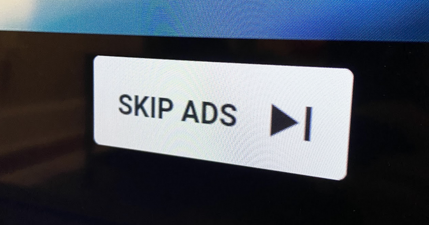
The “Skip Ad” Button: the Devil You Never Expected
YouTube get paid by the advertisers when they insert video ads. And they get paid even more when they let the advertisers insert longer video ads. On the other hand, YouTube needs to make sure their users are not too bothered by the long ads, so they created the “Skip Ad” button. However, the advertisers don’t have to pay YouTube when their ads are skipped too soon (via). This means YouTube can’t just let everyone click on the “Skip Ad” button all the time. After all, any additional click on the “Skip Ad” button is going to impact the revenue. Furthermore, if skipping ads was too easy, it would hurt the sales of YouTube’s ad-free subscription as well. So while YouTube offers the “Skip Ad” button, YouTube ultimately wants the users to stay away from clicking the “Skip Ad” button.
How the Video Ads Could Have Been Implemented
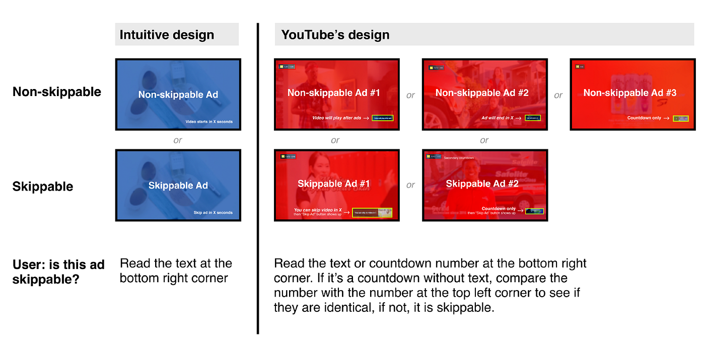
So we know there are two types of video ads: the non-skippable ads and the skippable ads. In theory, there would naturally only be two design variations:
#1:
The Non-skippable: ad plays for a few seconds and ends

#2.
The Skippable: ad plays for a few seconds and a “Skip Ad” button appears

Simple right? YouTube could arrange these ads however they want. Spread them out, put them one after another. It can be whatever, but it would always be one of these two design variations. Easy. Predictable.
Now compare these two ads with how YouTube actually does it.
How Youtube Implemented the Video Ads IRL
From YouTube’s perspective, they need to make sure their users don’t always click on the “Skip Ad” button due to the reasons mentioned. How? Make it as hard as possible to predict when the “Skip Ad” button would appear. This is why YouTube came up with at least 5 variations.
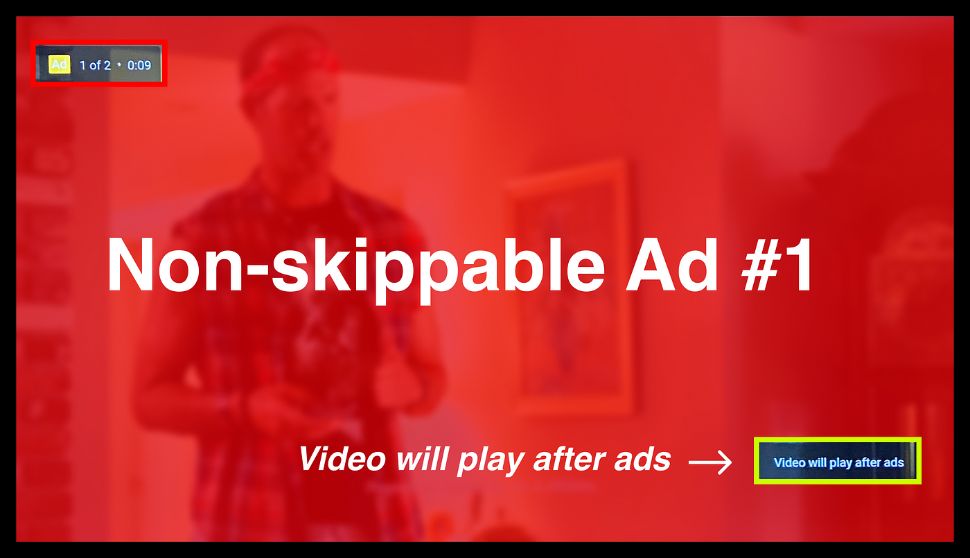
1.
Non-skippable Ad #1: “Video will play after ad(s)”
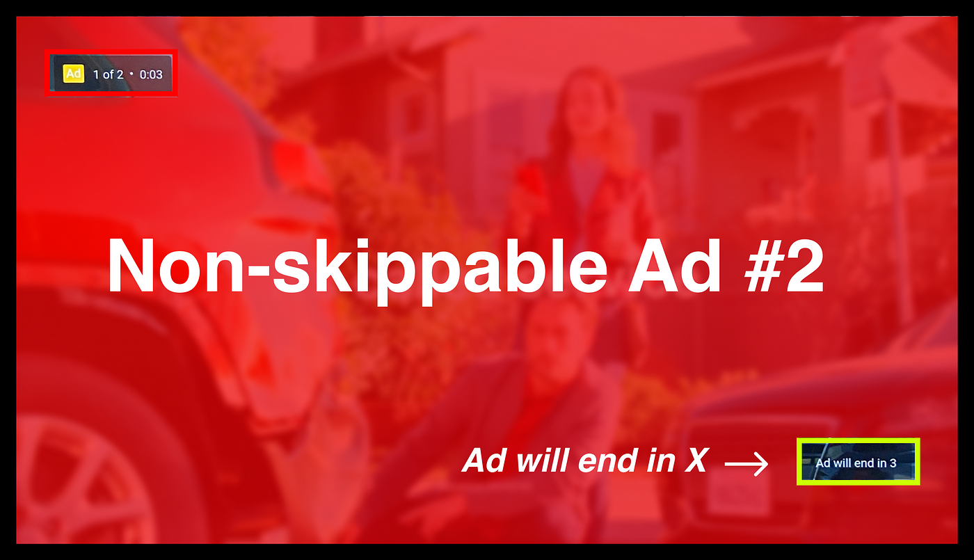
2.
Non-skippable Ad #2: “Ad will end in X”
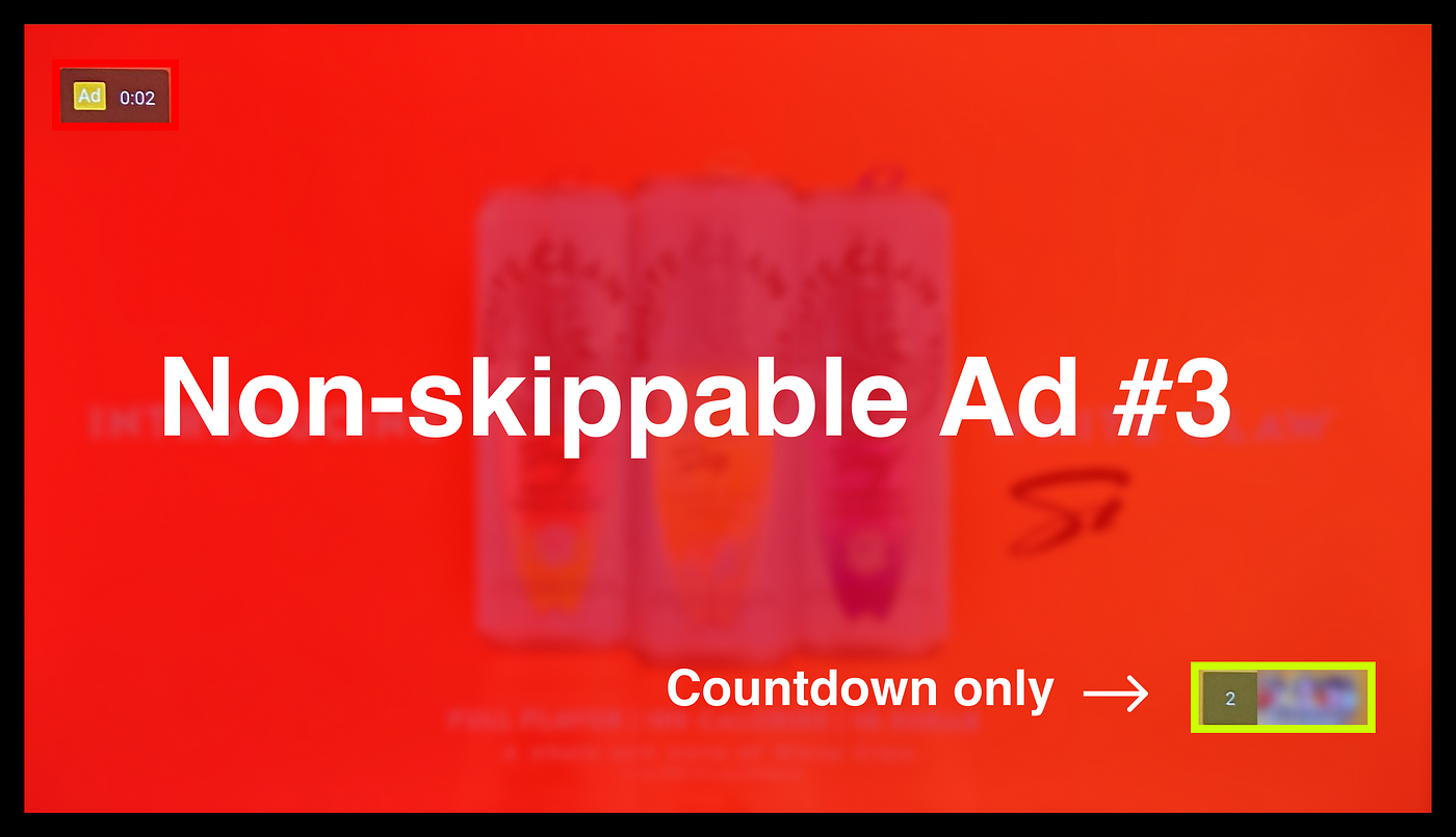
3.
Non-Skippable Ad #3: A countdown only
4.
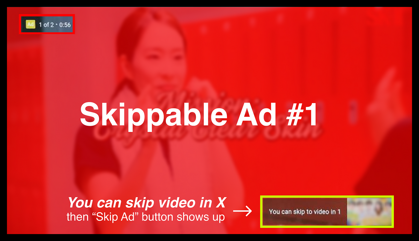
Skippable Ad #1: “You can skip to video in X”, then a “Skip Ad” button appears
5.
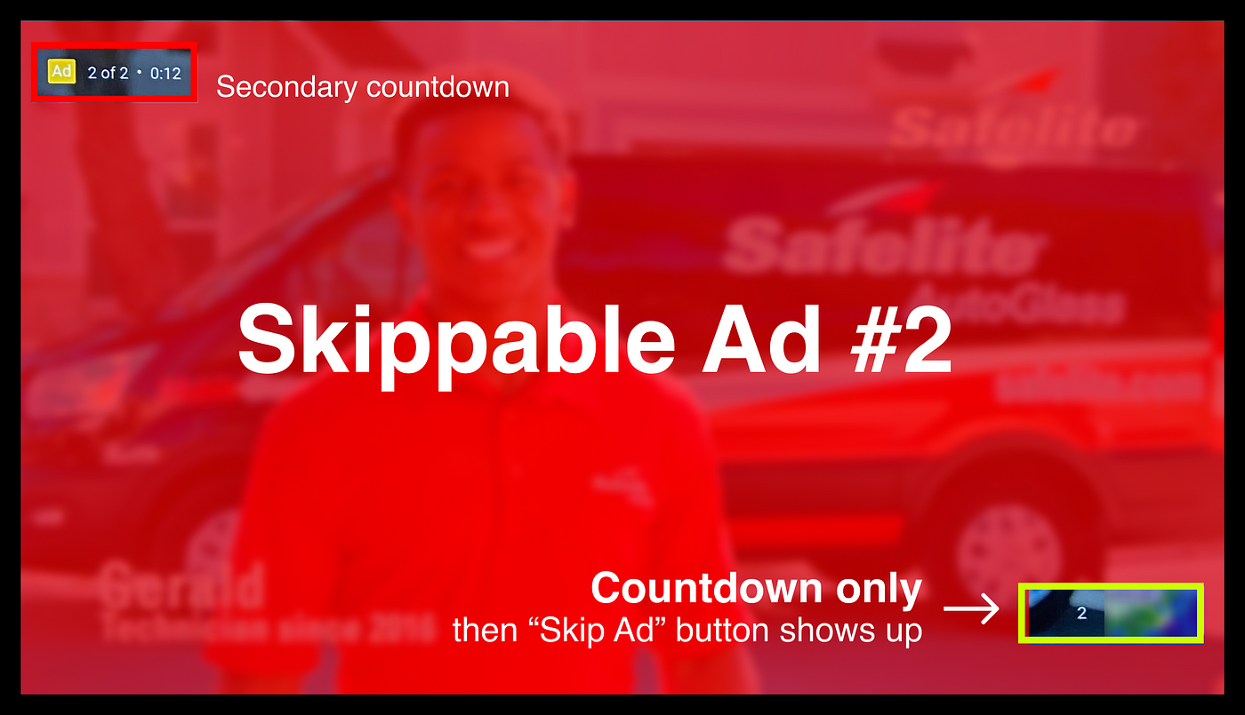
Skippable Ad #2: A countdown only, then a “Skip Ad” button appears
By introducing so many versions of design, it forbids a pattern to be established and recognized by the users. Essentially, the users look at the design, get confused about if there is going to be a “Skip Ad” button or not, get tired of trying to figure it out, and finally pay less attention to it which increases the chance of them end up watching ads that could have been skipped.
Here are some design details. Not only YouTube came up with various designs for something that could have been much simpler, YouTube created a secondary counter at the top left corner (sometimes bottom left depends on your device), conveniently located at the other side of where the “Skip Ad” button could be. This draws users’ attention away from monitoring the bottom right corner. Furthermore, sometimes the secondary counter is redundant and sometimes it’s not. Sometimes you get to skip shorter ads and sometimes you don’t. Sometimes you get a count down that would result in a “Skip Ad” button and sometimes you don’t. YouTube is doing everything it could to break any patterns you could potentially find and memorize.
Bonus point, see the yellow “Ad” label in the screenshots? It is written in white on yellow, likely another dark pattern where YouTube picked the two colors that have low contrast between them to decrease readability.
Now that YouTube’s secret formula is revealed here, you may think that it is not that hard to figure out this encrypted pattern. However, in real life, not only the users are working with limited time, a video ad would also be playing in the background when all this is happening.
Note: YouTube’s Skippable ad #1 seems to be currently missing which could indicate that YouTube has removed it because “You can skip to video in X” likely encouraged too many skips and decreased advertsers’ willingness to buy ads.
The Ethical Dilemma
In theory, by displaying more or fewer of some of these design variations, YouTube gets to fine-tune the exact percentage of skippable ads being skipped vs not which has a direct impact on revenue. This is an incredible asset to YouTube but it doesn’t come free. YouTube is essentially trading usability for revenue. On the other hand, is this acceptable as it does no big harm to the users?
Like most ethical dilemmas, there may not be a clear right or wrong answer but what are your thoughts?
Recommend
About Joyk
Aggregate valuable and interesting links.
Joyk means Joy of geeK