

How to Create Horizon Charts in Tableau
source link: https://datavis.blog/2022/04/30/horizon-charts-in-tableau/
Go to the source link to view the article. You can view the picture content, updated content and better typesetting reading experience. If the link is broken, please click the button below to view the snapshot at that time.
How to Create Horizon Charts in Tableau
This post aims to answer the following questions:
- What is a horizon chart?
- When would you use one?
- How do you create a horizon chart in Tableau?
What is a horizon chart?
A horizon chart is essentially an area chart that has been split into slices and the slices then layered on top of one another with the areas representing the highest (absolute) values on top.
Each slice has a greater intensity of colour based on the absolute value it represents.
It’s easier to explain by walking through an example.
We’ll start with this section of a standard area chart showing the normalised stock price of Meta Platforms. The axis of -1 to +1 represents the stock’s normalised daily value based on its highest and lowest closing price over the full timeframe of the data (note, in the section below not all data is shown, hence the normalised value does not extend down to -1).
We then divide the area chart into an equally sized slices:
Each slice is then given a darker shade of colour based on the values contained within that slice:
The negative values are then made positive so all areas are shown above the baseline with positive and negative values distinguished by colour:
The upper slices then are then moved down and place on top each other, with the highest absolute value slices at the top:
The final chart takes up the same space as just one of the original slices:
The space that is saved allows many more data series to be included in a relatively compact area allowing comparisons of trends across a large amount of data, such as in the below example, which I created for the #30DayChartChallenge (Day 24, Financial Times theme) comparing the trends of the top 20 Nasdaq stocks as at 24 April 2022:
When would you use a horizon chart?
The main advantage of horizon charts is that they allow you to show many data series in a relatively small space while still allowing the eye to be drawn to the extreme values.
For example, compare the above horizon chart to the below line chart version that was created using the same dataset and the same chart dimensions:
While the line chart will certainly be more recognisable to a general audience and trends can be seen, they do not stand out as much as they do in the horizon chart.
What about accuracy? It could be argued that the horizon chart makes accurate comparisons between data points more difficult. However, it’s important to keep in mind the purpose of the chart, which in this case is to focus on the overall trends of multiple data series.
“Like sparklines and to some extent heatmaps, the purpose of the horizon chart is not necessarily to enable readers to pick out specific values, but instead to easily spot general trends and identify extreme values.” – Jon Schwabish (Better Data Visualizations)
How do you create a horizon chart in Tableau?
Firstly, thanks to Yvan Fornes (and by extension to Joe Mako) who wrote this blog post on creating horizon charts in Tableau back in 2016. The approach I’ve taken is similar, however, instead of ‘cutting the measure’ as Yvan describes in the post, I took the following steps:
- Normalise the measure (stock price) to be between -1 and +1 so all stocks could be drawn with the same axis values and to make offsets easier (in step 3)
- Create a -ve version of the measure to show negative values as positive
- Create an offset measure for each slice (adjustable with a parameter)
- Add all slices to the view and colour each slice
- Sort the z-order of the layers from lowest to highest absolute value
Normalise the measure
To allow the same axis values to be used across every series and making the measure offsets in step 3 much easier, I first normalised the stock values to be between -1 and +1, where -1 is equal to the lowest closing stock price across the entire time frame and +1 is equal to the highest.
First, min and max LODs are created:
@Metric points to the [Close Price] measure and @Dimension points to the [Stock] dimension. I created these calculations to make it easier to switch to using different values as all other calculations refer to these two calculations.
Create a -ve version of the measure
Simply add a minus sign in front of the measure:
Create offset measures for each slice
A total of eight measures are created – four using the +ve version of the normalised metric and four using the -ve version. The first set of four are shown below:
The second set of four calcs are the same except they use the -ve version of the metric shown previously (“Metric ▼”).
The condition (IF p.Levels > N) ensures that the marks are only drawn if required. So if the levels parameter is set to 2, there is no need to draw slices 3 and 4. All the above measures are added to the view so this helps keep the number of marks drawn to a minimum.
Add all slices to the view and colour each slice
All measures are added to Measure Values and coloured using two colour palettes:
Here’s the view at this point:
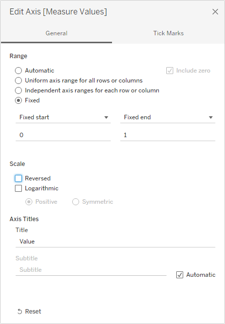
If we hide all data outside of the 0 to 1 axis range it looks like this:
And those slices are all we want to see in the horizon chart, so to achieve that we can fix the axis to be between 0 to 1:
And make the rows thinner to show more data series:
Tooltips
Despite the advantages of horizon charts mentioned earlier, they may be unintuitive to interpret for first time viewers. For this reason I added a tooltip that would provide the same information in a standard line chart.
To aid the interpretation of the horizon chart, I added a dynamic reference line to the tooltip to highlight the date that the user has hovered over in the horizon chart.
I’ll create a separate short blog post on how to create this dynamic viz in tooltip.
I found a list of the recent top 20 Nasdaq stocks on this The Motley Fool website page (original source is listed as: TD Ameritrade, as of March 25, 2022).
The stock prices were sourced from Google Finance by using the “GOOGLEFINANCE” function in Google Sheets.
Fonts
The Financial Times uses the Financier font, which was custom designed by Kris Sowersby. In the time I had, the closest font I could find that was available in Tableau Desktop was Segoe UI.
Create your own horizon chart
As mentioned earlier I have used some key source calculations @Metric, @Dimension and @Date, which all other calculations and views refer to. This means you can copy all the calculations in the workbook to your own workbook and update these three calculations to point to your own respective source values and all other calculations should then work.
You can even copy over the worksheet I have used and replace the data source (after you have updated the three ‘@’ calculations).
Video tutorial to create your own horizon chart
The below video gives a brief introduction to horizon charts and then walks through the process of copying over the required calculations and worksheets to your own workbook to easily create your own horizon chart:
Workbook
The workbook can be downloaded from my Tableau Public profile here.
Thanks for reading!
Recommend
About Joyk
Aggregate valuable and interesting links.
Joyk means Joy of geeK