
8

css利用border-image实现border渐变色效果
source link: https://www.fly63.com/article/detial/11399
Go to the source link to view the article. You can view the picture content, updated content and better typesetting reading experience. If the link is broken, please click the button below to view the snapshot at that time.
更新日期: 2022-04-29阅读量: 688标签: 渐变分享
扫一扫分享
border-image属性
border-image属性是一个是一个简写属性,通过此属性可使用图片来创建边框,该属性的使用语法是:
border-image: source slice width outset repeat|initial|inherit;border-image-source:用于指定要用于绘制边框的图像的位置。
border-image-slice:图像边界向内偏移。
border-image-width: 图像边界的宽度。
border-image-outset:用于指定在边框外部绘制 border-image-area 的量。
border-image-repeat:用于设置图像边界是否应重复(repeat)、拉伸(stretch)或铺满(round)。
下面主要介绍通过border-image来实现渐变色边框。
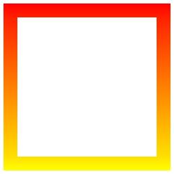
通过border-image实现border渐变色
代码:
<div class="content"></div>
<style>
.content {
    width: 200px;
    height: 200px;
    border:20px solid #ddd;
    border-image: -webkit-linear-gradient(red,yellow) 30 30;
    border-image: -moz-linear-gradient(red,yellow) 30 30;
    border-image: linear-gradient(red,yellow) 30 30;
}
</style>
效果如下:
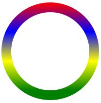
但是border-image无法实现圆角,所以换一个思路:通过padding来实现,给父节点设置渐变背景,通过padding模拟边框(此处的padding值就是border需要的值),注意父元素和子元素的border-radius属性值保持一致。
<div class="content">
	<div class="box"></div>
</div>
<style>
.content {
    width: 200px;
    height: 200px;
    box-sizing: border-box;
    padding: 20px;
    border-radius: 50%;
    background-image: -webkit-linear-gradient(top, red 0%, blue 30%, yellow 60%, green 90%);
    background-image: -moz-linear-gradient(top, red 0%, blue 30%, yellow 60%, green 90%);
    background-image: linear-gradient(top, red 0%, blue 30%, yellow 60%, green 90%);
}
.box {
    width:100%;
    height:100%;
    border-radius:50%;
    background:#fff;
}
</style>
效果如下:
Recommend
About Joyk
Aggregate valuable and interesting links.
Joyk means Joy of geeK