
Viridis color palettes in Power BI theme files – Data Savvy
source link: https://datasavvy.me/2022/04/25/viridis-color-palettes-in-power-bi-theme-files/
Go to the source link to view the article. You can view the picture content, updated content and better typesetting reading experience. If the link is broken, please click the button below to view the snapshot at that time.
Accessibility, Data Visualization, Power BI
Viridis color palettes in Power BI theme files
I am a fan of the viridis color palettes available in python and R, so I decided to make Power BI theme files for each of the 4 color maps (viridis, inferno, magma, plasma). These color palettes are not only lovely to look at, they are colorblind/CVD friendly and perceptually uniform (or close to it).
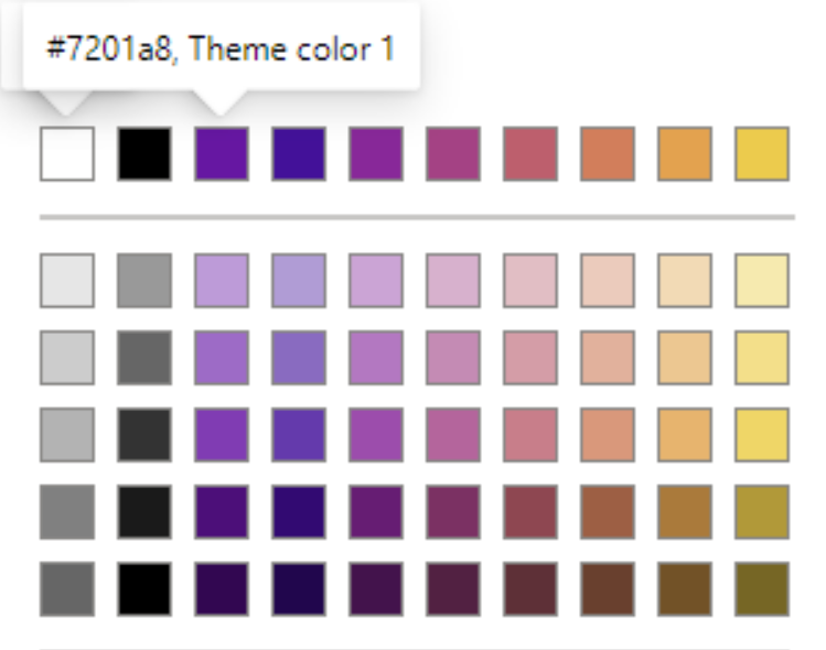
The screenshots below show the colors you’ll get when you use my theme files.
Viridis
Viridis theme colors in Power BIPlasma
Plasma theme colors in Power BIMagma
Magma theme colors in Power BIInferno
Inferno theme colors in Power BII generated a palette of 10 colors and then dropped the darkest and lightest colors in an effort to try to help you get good color contrast without inadvertently highlighting a data point. I chose to use the second darkest color of the 8 as the first/main color, which should work well on light backgrounds.
You’ll also notice that I have set in the theme the minimum, center, and maximum colors for use in a diverging color palette. This diverging palette includes the darkest and lightest color in an effort to give you a wider scale.
Give the themes a try
If you don’t enjoy choosing colors and just want something that looks good, feel free to hop over to the Github project and download the JSON files. You can learn more about the method I used to choose the colors and my suggestions for usage in the project documentation.
If you do use the themes, feel free to let me know how they worked and if you have suggestions for improvements.
Tagged DCAC
Published by Meagan Longoria
Recommend
About Joyk
Aggregate valuable and interesting links.
Joyk means Joy of geeK


