

Intuitive Explanation of the Gini Coefficient
source link: https://theblog.github.io/post/gini-coefficient-intuitive-explanation/
Go to the source link to view the article. You can view the picture content, updated content and better typesetting reading experience. If the link is broken, please click the button below to view the snapshot at that time.

Intuitive Explanation of the Gini Coefficient
The Gini coefficient is a popular metric on Kaggle, especially for imbalanced class values. But googling "Gini coefficient" gives you mostly economic explanations. Here is a descriptive explanation with regard to using it as an evaluation metric in classification. The Jupyter Notebook for this post is here.
First, let's define our predictions and their actual values:
import numpy as np
import matplotlib.pyplot as plt
import scipy.interpolate
import scipy.integrate

predictions = [0.9, 0.3, 0.8, 0.75, 0.65, 0.6, 0.78, 0.7, 0.05, 0.4, 0.4, 0.05, 0.5, 0.1, 0.1]
actual = [1, 1, 1, 1, 1, 1, 0, 0, 0, 0, 0, 0, 0, 0, 0]
We can calculate the Gini coefficient using one of the many efficient but inexpressive implementations from this thread. This gives us the values that I will try to explain next.
# Copied from https://www.kaggle.com/c/ClaimPredictionChallenge/discussion/703
def gini(actual, pred, cmpcol = 0, sortcol = 1):
    assert (len(actual) == len(pred))
    all = np.asarray(np.c_[actual, pred, np.arange(len(actual))], dtype=np.float)
    all = all[np.lexsort((all[:, 2], -1 * all[:, 1]))]
    totalLosses = all[:, 0].sum()
    giniSum = all[:, 0].cumsum().sum() / totalLosses

    giniSum -= (len(actual) + 1) / 2.
    return giniSum / len(actual)


def gini_normalized(actual, pred):
    return gini(actual, pred) / gini(actual, actual)
We calculate the Gini coefficient for the predictions:
gini_predictions = gini(actual, predictions)
gini_max = gini(actual, actual)
ngini= gini_normalized(actual, predictions)
print('Gini: %.3f, Max. Gini: %.3f, Normalized Gini: %.3f' % (gini_predictions, gini_max, ngini))
Gini: 0.189, Max. Gini: 0.300, Normalized Gini: 0.630So, how do we get this Gini of 0.189 and the Normalized Gini of 0.630?
Economic Explanation
The first figure in the Gini coefficient Wikipedia article is this one:

They go through the population from poorest to richest and plot the running total / cumulative share of income, which gives them the Lorenz Curve. The Gini coefficient is then defined as the blue area divided by the total area of the triangle.
Application to Machine Learning
Instead of going through the population from poorest to richest, we go through our predictions from lowest to highest.
# Sort the actual values by the predictions
data = zip(actual, predictions)
sorted_data = sorted(data, key=lambda d: d[1])
sorted_actual = [d[0] for d in sorted_data]
print(sorted_actual)
Instead of summing up the income, we sum up the actual values of our predictions:
# Sum up the actual values
cumulative_actual = np.cumsum(sorted_actual)
cumulative_index = np.arange(1, len(cumulative_actual)+1)

plt.plot(cumulative_index, cumulative_actual)
plt.xlabel('Cumulative Number of Predictions')
plt.ylabel('Cumulative Actual Values')
plt.show()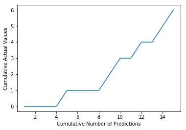
This corresponds to the Lorenz Curve in the diagram above.
We normalize both axes so that they go from 0 to 100% like in the economic figure and display the 45° line to illustrate random guessing:
cumulative_actual_shares = cumulative_actual / sum(actual)
cumulative_index_shares = cumulative_index / len(predictions)

# Add (0, 0) to the plot
x_values = [0] + list(cumulative_index_shares)
y_values = [0] + list(cumulative_actual_shares)

# Display the 45° line stacked on top of the y values
diagonal = [x - y for (x, y) in zip(x_values, y_values)]

plt.stackplot(x_values, y_values, diagonal)
plt.xlabel('Cumulative Share of Predictions')
plt.ylabel('Cumulative Share of Actual Values')
plt.show()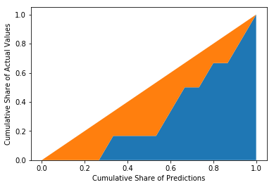
Now, we calculate the orange area by integrating the curve function:
fy = scipy.interpolate.interp1d(x_values, y_values)
blue_area, _ = scipy.integrate.quad(fy, 0, 1, points=x_values)
orange_area = 0.5 - blue_area
print('Orange Area: %.3f' % orange_area)
Orange Area: 0.189So, the orange area is equal to the Gini coefficient calculated above with the gini function. We can do the same using the actual values as predictions to get the maximum possible Gini coefficient.
cumulative_actual_shares_perfect = np.cumsum(sorted(actual)) / sum(actual)
y_values_perfect = [0] + list(cumulative_actual_shares_perfect)

# Display the 45° line stacked on top of the y values
diagonal = [x - y for (x, y) in zip(x_values, y_values_perfect)]

plt.stackplot(x_values, y_values_perfect, diagonal)
plt.xlabel('Cumulative Share of Predictions')
plt.ylabel('Cumulative Share of Actual Values')
plt.show()

# Integrate the the curve function
fy = scipy.interpolate.interp1d(x_values, y_values_perfect)
blue_area, _ = scipy.integrate.quad(fy, 0, 1, points=x_values)
orange_area = 0.5 - blue_area
print('Orange Area: %.3f' % orange_area)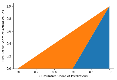
Orange Area: 0.300Dividing both orange areas gives us the Normalized Gini coefficient:
0.189 / 0.3 = 0.630
Alternative Explanation
I also found another interpretation of the Gini coefficient here. Again, we take the predictions and actual values from above and sort them in descending order:
print('Predictions', predictions)
print('Actual Values', actual)
print('Sorted Actual', list(reversed(sorted_actual)))
Predictions [0.9, 0.3, 0.8, 0.75, 0.65, 0.6, 0.78, 0.7, 0.05, 0.4, 0.4, 0.05, 0.5, 0.1, 0.1]
Actual Values [1, 1, 1, 1, 1, 1, 0, 0, 0, 0, 0, 0, 0, 0, 0]
Sorted Actual [1, 1, 0, 1, 0, 1, 1, 0, 0, 0, 1, 0, 0, 0, 0]Now, we count the number of swaps of adjacent digits (like in bubble sort) it would take to get from the "Sorted Actual" state to the "Actual Values" state. In this scenario, it would take 10 swaps.
We also calculate the number of swaps it would take on average to get from a random state to the "Actual Values" state. With 6 ones and 9 zeros this results in
6⋅92=276⋅92=27 swaps.
The Normalized Gini coefficient is how far away we are with our sorted actual values from a random state measured in number of swaps:
NGini=swapsrandom−swapssortedswapsrandom=27−1027=63%NGini=swapsrandom−swapssortedswapsrandom=27−1027=63%
I hope I could give you a better feeling for the Gini coefficient.
Like what you read?
I don't use Google Analytics or Disqus because they require cookies. I would still like to know which posts are popular, so if you liked this post you can let me know here on the right.
You can also leave a comment if you have a GitHub account. The "Sign in" button will store the GitHub API token in a cookie.
Recommend
-
70
-
21
An Intuitive Explanation of NeoDTI NeoDTI is a task-specific node embedding learning algorithm for link prediction on heterogeneous networks. Introduction In the previous stories of this series,...
-
28
An Intuitive Explanation of EmbedS Most GDL techniques ignore the semantics of the network. EmbedS aims to represent semantic relations as well. Introduction In the previous stories, we discusse...
-
16
Intuitive explanation of Neural Machine Translation A simple explanation of Sequence to Sequence model for Neural Machine Translation(NMT) What is Neural Machine Translation? Neural machine tr...
-
24
A comprehensive but simple guide which focus more on the idea behind the formula rather than the math itself — start building the block with expectation, mean, variance to finally understand the large picture i.e. co-var...
-
25
An Intuitive Explanation of Field Aware Factorization Machines From LM to Poly2 to MF to FM to FFM
-
10
An Intuitive (and Short) Explanation of Bayes’ Theorem Bayes’ theorem was the subject of a detailed article. The essay is good, but over 15,000 words long — here’s the condensed v...
-
8
Against overuse of the Gini coefficient Against overuse of the Gini coefficient 2021 Jul 29 See all posts Against overuse of the Gini coefficient Special thanks to Barnabe M...
-
6
Decision Tree with Gini Index as Impurity MeasureDecision Tree with Gini Index as Impurity MeasureVideo Player is loading.Loaded: 0%Remaining Tim...
-
4
Intuitive Explanation of Arithmetic, Geometric, & Harmonic Mean If you Google for an explainer on the differences and use cases for the arithmetic mean vs geometric mean vs harmonic mean, I feel like everyt...
About Joyk
Aggregate valuable and interesting links.
Joyk means Joy of geeK