

Designing variant experiments is as simple as A/B. See?
source link: https://uxdesign.cc/designing-variant-experiments-is-as-simple-as-a-b-see-d5784e7c7498
Go to the source link to view the article. You can view the picture content, updated content and better typesetting reading experience. If the link is broken, please click the button below to view the snapshot at that time.
Designing variant experiments is as simple as A/B. See?
How we used variant testing in designs for new editors on Wikipedia
By Rita Ho
Baffled_LIGO_Scientists | By Nutsinee Kijbunchoo (User:Nkij) | CC BY 4.0
As hinted at in the name, the purpose of the Wikimedia Foundation’s Growth team is to grow the number of new people who come and make a first edit on Wikipedia, and to keep more of them around (a.k.a. “editor retention”).
There is an element of teaching and persuasion involved, since we need to convey to the majority of people extremely familiar with using Wikipedia one way (reading and consuming information) that in fact they should consider using it quite differently (participating in writing and changing the information), and then guiding them how to use it in this brand new way. It’s like telling someone who has eaten eggs their whole life that actually, the egg shells can be eaten as a calcium supplement too, if properly prepared ( it’s true).
Our approach to this mission has been to work briskly, and try out our ideas of how to provide opportunities to edit as a series of experiments. Instead of releasing a new feature or tool for everyone and iterating on the results, we test them out on smaller groups (typically limited to people on a few smaller Wikipedia languages and rarely on the bigger languages like English), then compare how the experimental feature performs against the control (the existing experience). We then iterate on the designs based on a mixture of usability feedback, community feedback, and finally from interpreting the resulting data from people using the feature (or in some cases not using it!).
For one of the key features on which our team has worked, we decided to run an A/B test. Whilst it is relatively common for the Fundraising department to multivariate test small UI variations (e.g., different button placement, copy differences) on donation banners, it has been less commonly used by the Product Design team to experiment with different user experiences in reading and editing on Wikipedia itself. A major reason we don’t typically run such A/B tests is that there is a high bar for respecting the privacy of people who use Wikipedia, especially those who are anonymous. However, since the Growth features are offered to those who have already created an account, this was a case where A/B testing was a good fit for our purposes.
A/B testing
The inciting incident: A new experiment
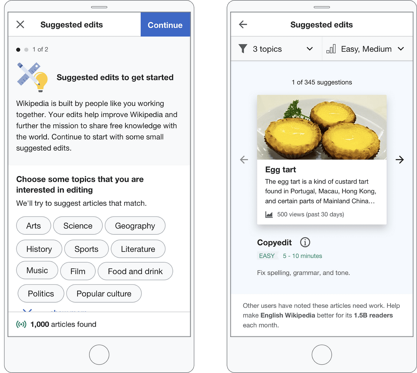
We knew from past research that many people who create a Wikipedia account often do so with the intention of editing, but then aren’t able to easily find articles to which they can contribute. This led us to design a feature that appears for newcomers after they join Wikipedia, which encourages them to do some small “suggested edits” (like copyediting or adding links) on articles across a variety of topics they might be interested in.
Our hypothesis underpinning this feature was that if we give people specific, and achievable small editing tasks to do, they will be more likely to try a first edit, and more of these people will do enough to build their expertise and interest to become long term contributors.
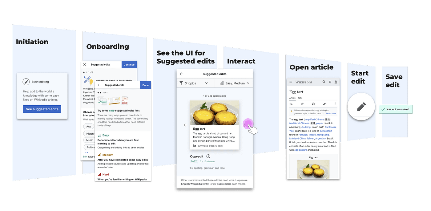
The diagram below illustrates the user flow initially designed for the feature. Newcomers would first be provided with a prompt to “opt-in” to seeing these suggestions, and if they choose to proceed, they are then provided with some short onboarding screens to learn what it’s about and how to customise suggestions to their interests before seeing the actual suggested articles.
Experimenting within the controlled experiment: Enter Variant B
We started developing the design for this feature, with the design described above as the new feature that would be implemented in a controlled experiment — comparing editing retention with a control group of new accounts which would not receive these suggested edits at all.
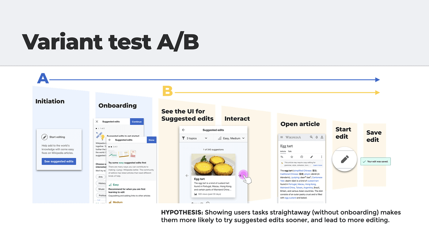
During the course of development, Marshall, our Product Manager had a hypothesis that if we showed people the suggestions sooner (without onboarding), that they would do more edits. I agreed this was a valid point, and wondered how we could balance this consideration with my reasons for the importance of user education in letting people understand why doing one was valuable and relevant to them (going back to my earlier analogy of explaining how one can eat egg shells).
And this is how we decided to run our first simple variant test — a nested test within the controlled experiment. We would split the experiment group so that half the participants received variant A which had the “full” designed flow with opt-in and user education; whilst the other half received variant B where they would see the suggestions immediately in their newcomer homepage.
The results are in and the winner is…
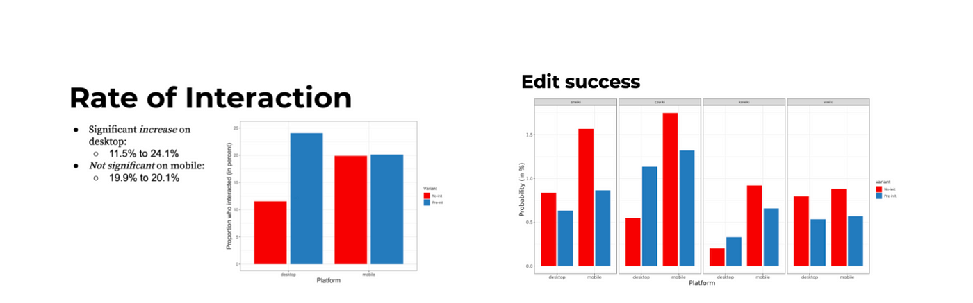
Together with the data analyst and PM, the key metrics were examined and interpreted to figure out what was significant.
As it turned out, the results vindicated the user-education hypothesis! The results varied depending on the wiki and platform, but generally showed that whilst more people did indeed interact with the suggested edits module when it was shown to them immediately in variant B on desktop; in the end, more of those in variant A who had to opt-in to the feature and saw the onboarding made successful edits.
Data-informed iteration
So what did this mean for design improvements moving forward? As we saw it, the three key takeaways from the test were:
- Featuring suggested edits prominently was key to getting people to try the tool; but at the same time…
- Onboarding is crucial to driving more people to successfully completing an edit.
- Mobile and Desktop performed differently so as not to be strictly comparable.
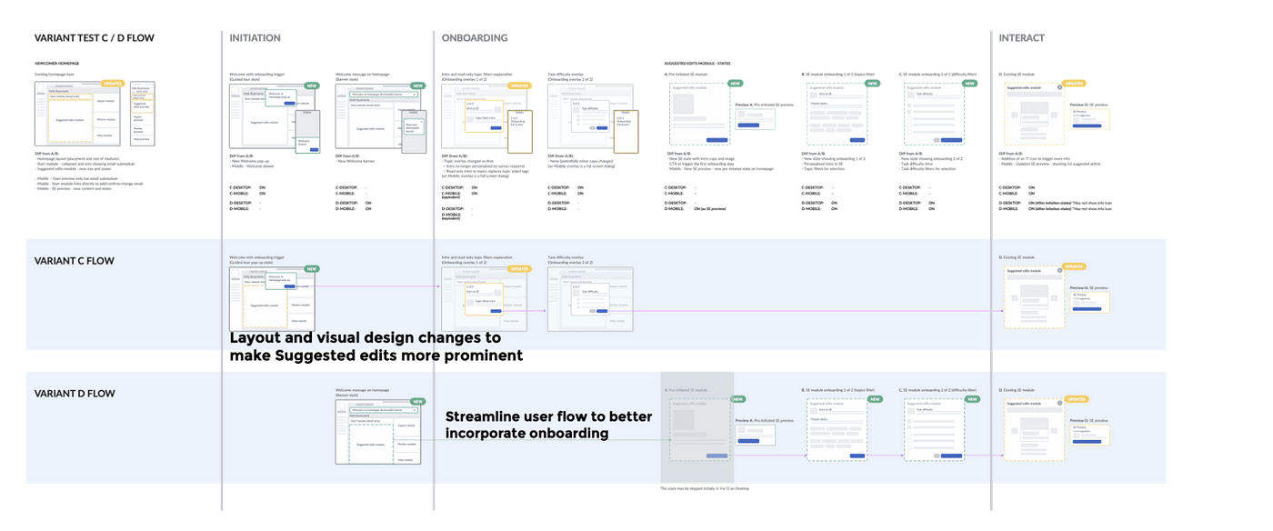
It was based on these findings that the next two new variants C/D were created, which applied the best aspects we interpreted from the results of the first test, roughly translated into the designs in the following ways:
- Variants C and D centred much more on the suggested edits feature in the homepage, removing a smaller ‘start’ module and making it more prominent in size and the focus of onboarding.
- Onboarding is available in both variants C & D, though it is optional (and more easily dismissible) in variant C.
- On mobile, variants C and D explore different ways to give more direct access to the suggested edits feature immediately from the homepage.
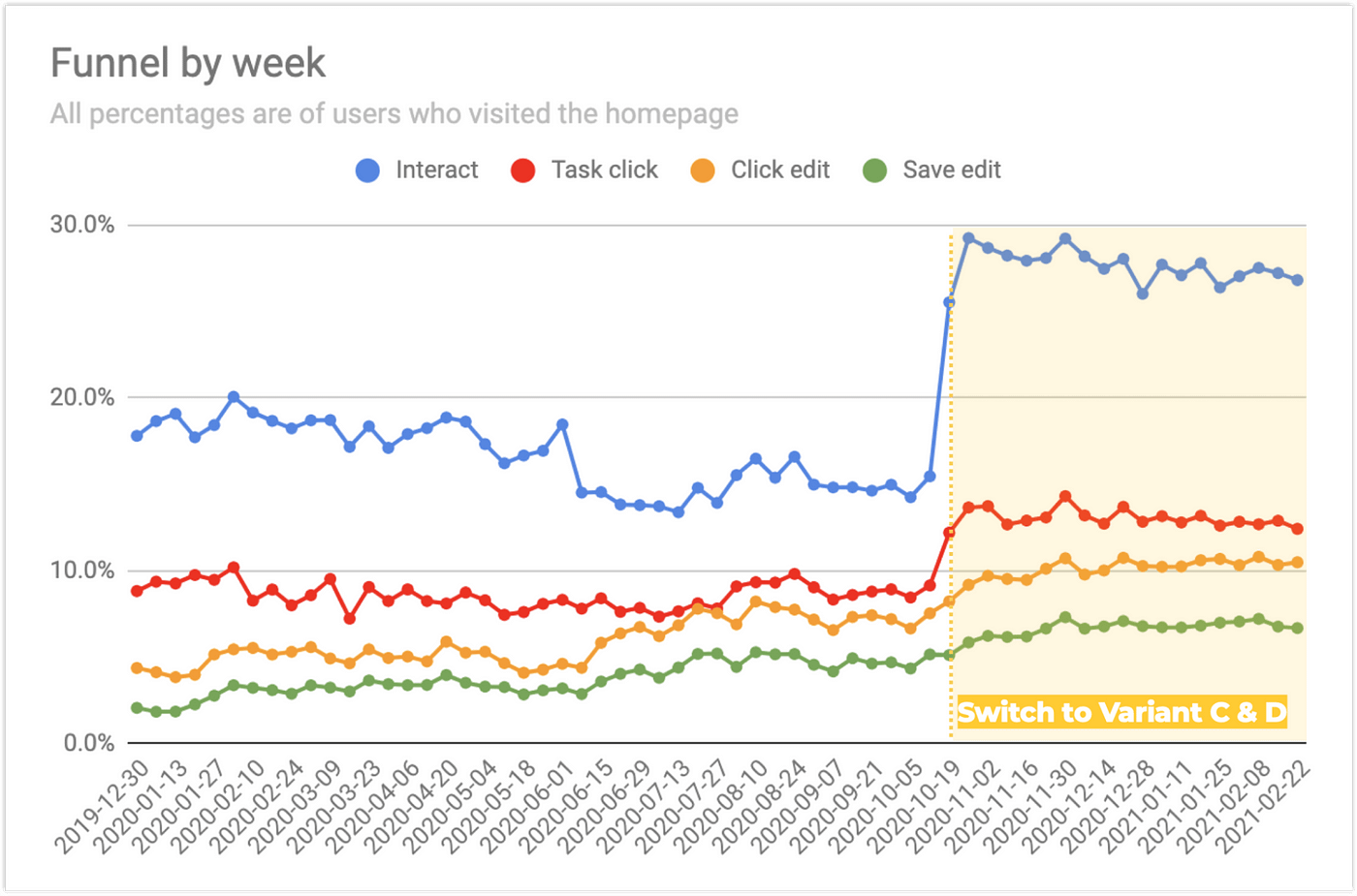
Design decisions affirmed by data
And it was great to see our interpretation of data and design decisions payoff! In the form of both C & D variants in the next iteration leading to both more usage and successful edits.
Learnings and tips
Besides the gratification of seeing variant tests make a difference in people’s experience of a design, it’s been a great learning experience to apply this method of design optimisation often seen as hard to utilise effectively with other more qualitative approaches.
In my opinion, these are the key aspects of running A/B tests:
- Set a clear, testable hypothesis. Formulating the rationale for why different designs bring about better outcomes will help in devising an experiment that accurately measures the impact of those design changes. Besides that, it’s also good practice for critical thinking that is helpful for design decision making when there is no time/need to run experiments.
- Determine if the effort is worth the investment. Once the hypothesis is set, ask whether it is worth the considerable time and investment request to run an experiment to get the answer, or whether other tactics (such as user testing) can be used instead to help move the design forward.
- Be bold with the variant differences. If the test ends up being about different button colours, it’s probably a multivariate test that is needed. On the other hand, it’s also not advisable to have too many variables (such as testing complete redesigns) since this would make it hard to pinpoint what changes made the difference.
- Ask the right questions of the data: For our team, we care about how many people finish an edit (saving it), not if they started it.
- Collaborate closely with data-savvy colleagues. It was vital to work closely with the data analyst and product manager to check the hypothesis and test was sound, to ensure the correct (and sufficient) data was being measured, and then properly analysed. Having an data analyst expert is also very important in removing confirmation bias, akin to having a design researcher conduct usability testing. They are the key person in determining the experiment feasibility and timeframe from an audience size perspective to get statistically significant results. For folks without an awesome analyst at hand, there are free tools available (like this one, the experiment calculator) that provide sample sizes and time needed to run robust experiments.
- Involve your engineering team early too. Another important partnership is obviously the engineering team who are responsible for both implementing the different features and instrumentation to measure the experiment. Involving them as early as possible as to the parts of the experience that may vary will help them to build them a flexible framework for A/B testing.
Bonus learning before I go
One final learning is not about the A/B test method itself, but about people we design for that came from these variant tests: there’s nothing wrong with providing guidance. I don’t really like the term “user education” or “onboarding” because it is a little condescending (the implication is that the onus is on people to learn how to get on board with this awesome product). User onboarding is actually an opportunity for us as designers to provide persuasive and clear communication, explaining to our newcomer editors what the value is for them to make contributions to Wikipedia in this way.
Thanks for reading! You can read more details about the Growth team’s variant testing on the project page, or about all of our initiatives for bringing new editors to Wikipedia on our team page.
Thanks Marshall Miller, Morten Warncke-Wang, and Matthew Williams for your feedback, editing help, and additional insights into A/B testing.
[1]Details about “Privacy Conscious A/B testing for anonymous readers” can be read here
[2]Phabricator task with more details of the implementation https://phabricator.wikimedia.org/T246533
[3]https://www.nngroup.com/articles/putting-ab-testing-in-its-place/
Recommend
About Joyk
Aggregate valuable and interesting links.
Joyk means Joy of geeK