
2

实现AnimateCSS动画
source link: https://ost.51cto.com/posts/11643
Go to the source link to view the article. You can view the picture content, updated content and better typesetting reading experience. If the link is broken, please click the button below to view the snapshot at that time.
【甜甜酱OH实践】ETS简单实现AnimateCSS动画 原创 精华
接口名称 功能描述
animateTo(value: AnimationOption, event: ()=> void) : void 提供全局animateTo显式动画接口来指定由于闭包代码导致的状态变化插入过渡动效。 event指定显示动效的闭包函数,在闭包函数中导致的状态变化系统会自动插入过渡动画。
来看一个简单的示例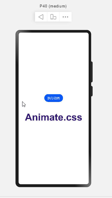
@Entry
@Component
struct AnimationPage {
  // 位移属性
  @State _translate: TranslateOptions = {
    x: 0,
    y: 0,
    z: 0
  }

  build() {
    Flex({
      alignItems: ItemAlign.Center,
      justifyContent: FlexAlign.Center,
      direction: FlexDirection.Column
    }) {
      Button('执行动画').margin({ bottom: 50 }).onClick(() => {
        //添加一个简单显式动画
        animateTo({
          duration: 1000, // 动画时长
          tempo: 0.5, // 播放速率
          curve: Curve.EaseInOut, // 动画曲线
          delay: 0, // 动画延迟
          iterations: 1, // 播放次数
          playMode: PlayMode.Normal, // 动画模式
        }, () => {
          //闭包内更改状态
          this._translate = {
            x: 0,
            y: 100,
            z: 0
          }
        })
      })

      Column() {
        Text('Animate.css')
          .fontSize(50)
          .fontWeight(FontWeight.Bold)
          .fontColor('#351c75')
          .translate(this._translate) // 位移变换
      }
    }
    .width('100%')
    .height('100%')
  }
}
如果我们希望向下位移完成后,再向右位移,就需要在第一个动画完成后再进行第二个动画,即在第一个动画的onFinish函数中执行第二个动画。
这样组合起来可以构成一个更复杂的连续动画。

// 单步动画执行函数
animationStep(value: AnimateParam, event: () => void) {
    return () => {
      return new Promise((resolve) => {
        let onFinish = value.onFinish
        value.onFinish = () => {
          if(onFinish) onFinish()
          resolve(true)
        }
        animateTo(value, event)
      })
    }
}
创建4步动画
aboutToAppear() {
    // 每步动画执行时长
    let time = 200
    this.step1 = this.animationStep({
      duration: time, // 动画时长
      tempo: 0.5, // 播放速率
      curve: Curve.EaseInOut, // 动画曲线
      delay: 0, // 动画延迟
      iterations: 1, // 播放次数
      playMode: PlayMode.Normal, // 动画模式
      onFinish: () => {
        // 动画执行完成
        console.info('play end')
      }
    }, () => {
      //闭包内更改状态
      this._translate = {
        x: 0,
        y: 100,
        z: 0
      }
    })


    this.step2 = this.animationStep({
      duration: time, // 动画时长
      tempo: 0.5, // 播放速率
      curve: Curve.EaseInOut, // 动画曲线
      delay: 0, // 动画延迟
      iterations: 1, // 播放次数
      playMode: PlayMode.Normal, // 动画模式
      onFinish: () => {
        // 动画执行完成
        console.info('play end')
      }
    }, () => {
      //闭包内更改状态
      this._translate = {
        x: 100,
        y: 100,
        z: 0
      }
    })

    this.step3 = this.animationStep({
      duration: time, // 动画时长
      tempo: 0.5, // 播放速率
      curve: Curve.EaseInOut, // 动画曲线
      delay: 0, // 动画延迟
      iterations: 1, // 播放次数
      playMode: PlayMode.Normal, // 动画模式
      onFinish: () => {
        // 动画执行完成
        console.info('play end')
      }
    }, () => {
      //闭包内更改状态
      this._translate = {
        x: 100,
        y: 0,
        z: 0
      }
    })

    this.step4 = this.animationStep({
      duration: time, // 动画时长
      tempo: 0.5, // 播放速率
      curve: Curve.EaseInOut, // 动画曲线
      delay: 0, // 动画延迟
      iterations: 1, // 播放次数
      playMode: PlayMode.Normal, // 动画模式
      onFinish: () => {
        // 动画执行完成
        console.info('play end')
      }
    }, () => {
      //闭包内更改状态
      this._translate = {
        x: 0,
        y: 0,
        z: 0
      }
    })
}
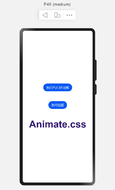
顺序执行4步动画
Button('执行动画').margin({ bottom: 50 }).onClick(async () => {
    await this.step1()
    await this.step2()
    await this.step3()
    await this.step4()
})
实现AnimateCSS动画
AnimateCSS
https://cdn.bootcdn.net/ajax/libs/animate.css/4.1.1/animate.css
pulse动画
看下pulse动画样式代码
.animate__pulse {
  -webkit-animation-name: pulse;
  animation-name: pulse;
  -webkit-animation-timing-function: ease-in-out;
  animation-timing-function: ease-in-out;
}

@keyframes pulse {
  from {
    -webkit-transform: scale3d(1, 1, 1);
    transform: scale3d(1, 1, 1);
  }

  50% {
    -webkit-transform: scale3d(1.05, 1.05, 1.05);
    transform: scale3d(1.05, 1.05, 1.05);
  }

  to {
    -webkit-transform: scale3d(1, 1, 1);
    transform: scale3d(1, 1, 1);
  }
}
ETS实现
@State _scale: ScaleOptions = {
    x: 1,
    y: 1,
    z: 1
}

...

Column() {
    Text('Animate.css')
      .fontSize(50)
      .fontWeight(FontWeight.Bold)
      .fontColor('#351c75')
      .translate(this._translate) // 位移变换
      .scale(this._scale) //比例变化
}
传递一个动画总时长time
第一步动画执行段为 0%-50%,所以动画执行时长为总时长time * 50%
第二步动画执行段为 50%-100%,所以动画执行时长为总时长time * 50%
async pulse(time) {
    // 0% - 50%
    let step1 = this.animationStep({
      duration: time * 0.5, // 动画时长
      tempo: 0.5, // 播放速率
      curve: Curve.EaseInOut, // 动画曲线
      delay: 0, // 动画延迟
      iterations: 1, // 播放次数
      playMode: PlayMode.Normal, // 动画模式
    }, () => {
      this._scale = {
        x: 1.05,
        y: 1.05,
        z: 1.05
      }
    })

    // 50% - 100%
    let step2 = this.animationStep({
      duration: time * 0.5, // 动画时长
      tempo: 0.5, // 播放速率
      curve: Curve.EaseInOut, // 动画曲线
      delay: 0, // 动画延迟
      iterations: 1, // 播放次数
      playMode: PlayMode.Normal, // 动画模式
    }, () => {
      this._scale = {
        x: 1,
        y: 1,
        z: 1
      }
    })

    await step1()
    await step2()
}
Button('执行PULSE动画').margin({ bottom: 50 }).onClick(() => {
	this.pulse(500)
})
©著作权归作者所有,如需转载,请注明出处,否则将追究法律责任
已于2022-4-20 16:26:47修改
Recommend
About Joyk
Aggregate valuable and interesting links.
Joyk means Joy of geeK