

Designing big, complex products from scratch
source link: https://uxdesign.cc/designing-big-complex-products-from-scratch-b7d36fe9bdf7
Go to the source link to view the article. You can view the picture content, updated content and better typesetting reading experience. If the link is broken, please click the button below to view the snapshot at that time.
Designing big, complex products from scratch
3 tips for overcoming complexity and going from 0 to 1.
Every new product comes with core design challenges. These are the crucial challenges that determine the early success of a product, and they can range from creating engagement, to building trust, to forming new habits.
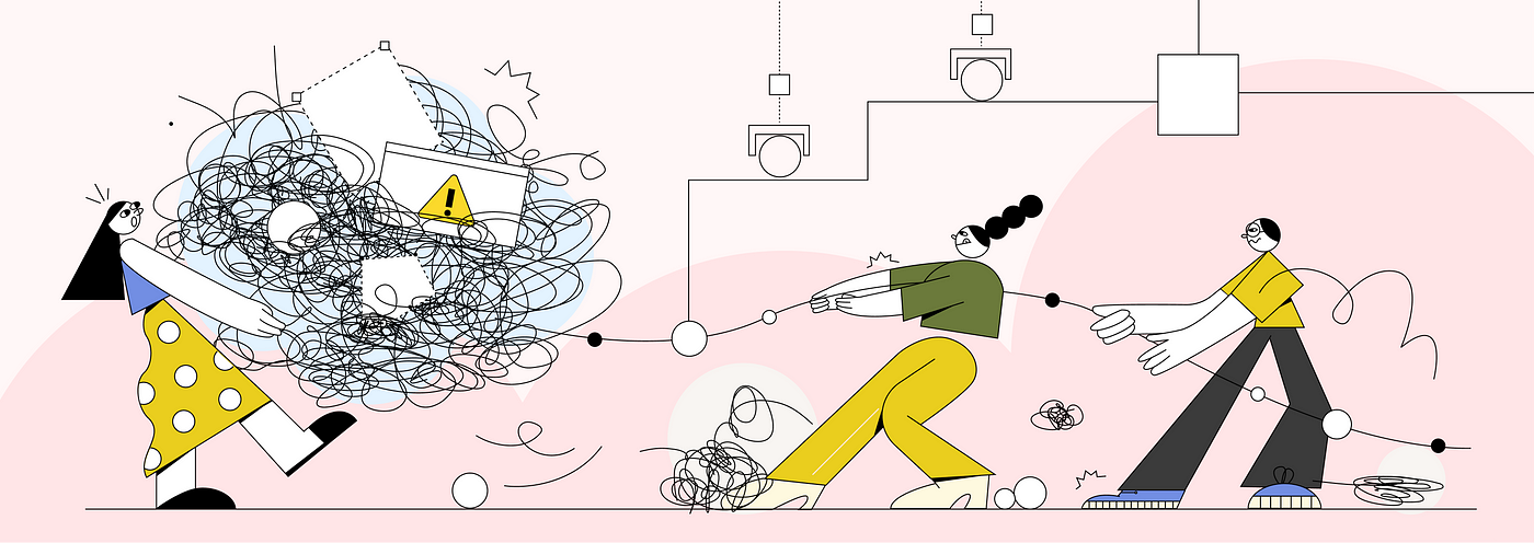
Today, as more and more product-driven companies are building software for employees, we are seeing design utilised in previously underserved areas such as healthcare, automation, and logistics. For the designers working on these products, it’s likely they will come up against a particular core design challenge — managing size and complexity.
This is because products in these areas tend to share some characteristics that make them large, complicated, and difficult to get started on:
- The need for niche, specialist knowledge
- Extensive user flows
- Dense, detailed data
- Complicated systems
- Endless edge cases
In order to move forward, you need to find ways of taming this complexity.
This is something we experienced first hand at Picnic, when we set out to build automated warehouses that allow us to deliver more groceries to more families. In these new warehouses, employees will work alongside high-tech robotics, and interact with deep, automated systems. Starting with just an empty building, we planned to build everything from the ground up: workflows, interfaces, automation, hardware…
In order to move forward, you need to find ways of taming this complexity.
Now two years on, and with a lot of learning and refining, we are launching our first automated warehouse. In this article, we’ll explore three of the strategies that were most valuable for getting there, and for taking a big, complex product from 0 to 1.
1. Treat principles like products
As you begin to work on a new product, you’ll be faced with an overwhelming number of design decisions: How does the user navigate? What are the key interactions? How do we shape our design language?…
These are difficult choices, and compounded when working on complex products with a big scope. Without a framework with which to make these decisions, inconsistencies spiral out of control, processes slow down, and the product loses focus.
For mature products, design principles form a key part of this framework. They provide alignment and direction, and are particularly crucial for large products where a holistic experience and approach is vital.
However, when you’re starting out, defining principles is more difficult — you’re not sure what’s important yet, and there are still many unknowns. We tend to treat design principles as a fixed truth, so they are also scary things to commit to. When starting to design the flows for our automated warehouse, we faced these exact challenges.
Without a framework with which to make these decisions, inconsistencies spiral out of control, processes slow down, and the product loses focus.
To help us move forward, we developed the idea of ‘minimum viable design principles’.
Defined at the start of the project, these principles are initially loose guides that aim to create coherence and facilitate decision making. They’re your best guess at what might work — a rough framework shaped by business goals and assumptions of user needs.
Then over time, as your learning about the users and product grows, you can begin to shape these principles into something more actionable and effective. Rather than a definitive set of values, minimum viable principles are constantly evolving. Just as you would test and iterate on a product, you can test and refine your design principles.

Minimum viable principles in action
One of our early minimum viable principles was ‘The fewest steps with the least friction’, and we assumed this would create the fastest flows. Whilst this helped shape our first designs, user tests revealed we were being too simplistic. For our use case, two clear steps were actually faster than one that makes you think, and friction that helps you understand something was faster in the long run.
We realised that speed came from clarity, so we evolved our principle to be more actionable — ‘Short term clarity creates long term speed’.
As we continue to design and test our product, we revisit the principles every couple of months to see how they can guide us better:
- What have we learned?
- What doesn’t work?
- What was more important than we thought?
- What was less important than we thought?
By starting with rough principles that you test, review and iterate on over time, you should be able to get started on large flows that are consistent and focussed. As your minimum viable design principles evolve over time, you will also continually hone in on what is most important.
2. Set yourself up to scale
A vital part of starting on large, complex products is understanding your resources and capacity.
- How many screens and flows need to be designed?
- How much design capacity do you have?
- How fast do you need to move?
- Do you have additional support? e.g researchers, copywriters, etc…
For Picnic’s automated warehouse MVP, we knew we needed to design hundreds of screens across tens of workflows, all from scratch. As the only designer on the project, this challenge fundamentally shaped the way I had to work.
The priority was scalability — how could we set up a structure that allowed us to design at scale?
Creative constraints
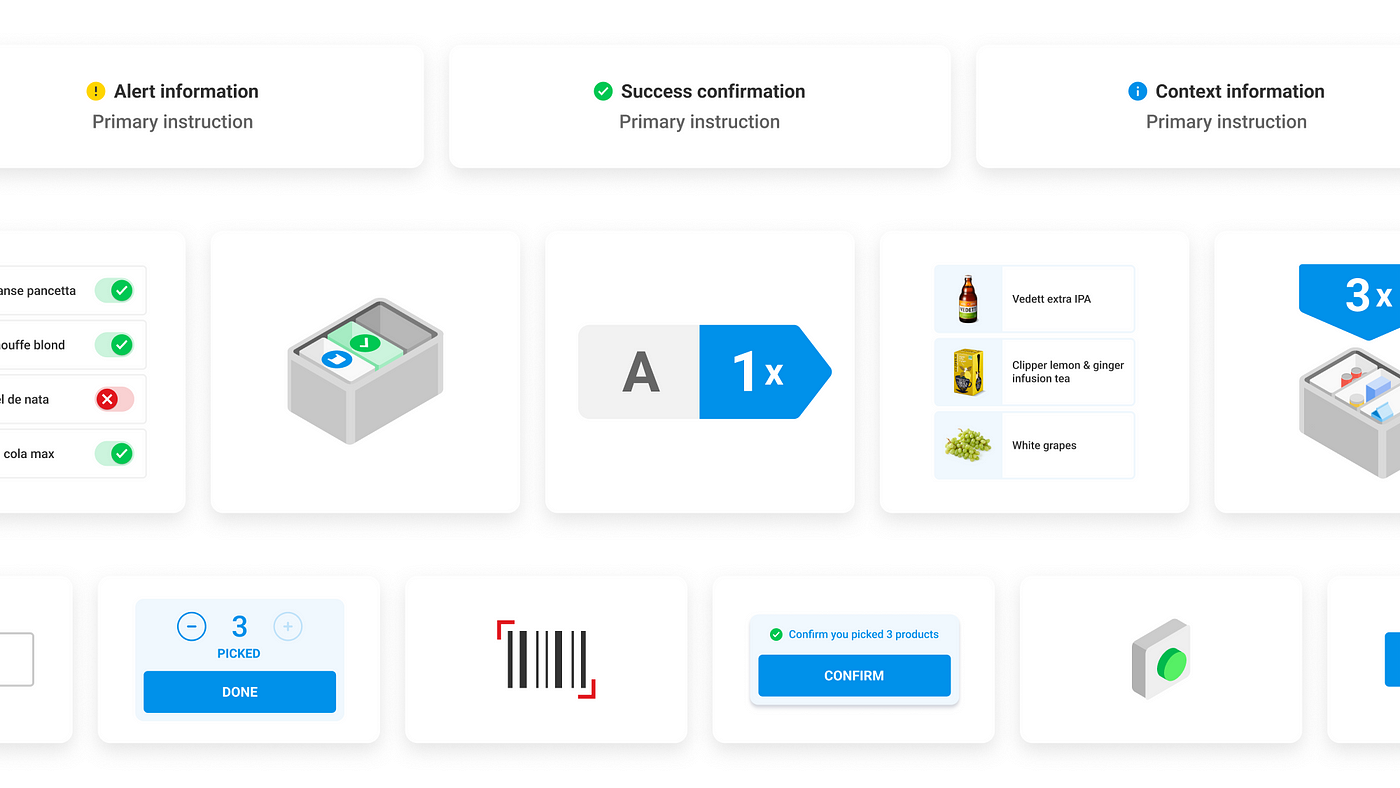
One strategy we used was to define a small set of adaptable building blocks that could be used to construct every flow. We defined 4 core blocks:
- Task screens
- Overflow menus
- Confirmation dialogs
- Selection dialogs
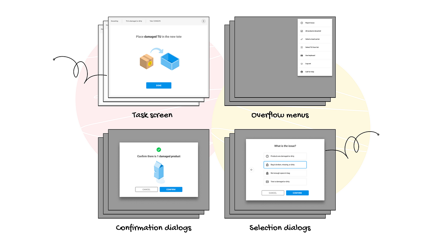
Each block has a simple structure, constructed of a few key elements. By swapping elements out (and with a bit of creativity) you’re able to design screens for a huge range of use cases in a very short time. This tight set of constraints allowed us to design, test and build at a high cadence, and to build consistent, intuitive flows at a large scale.
Designed to adapt
We took a similar approach in how we think about patterns and components, which are designed to be general and multi-purpose. We aim for a limited number of options, but with each option offering a high degree of flexibility.
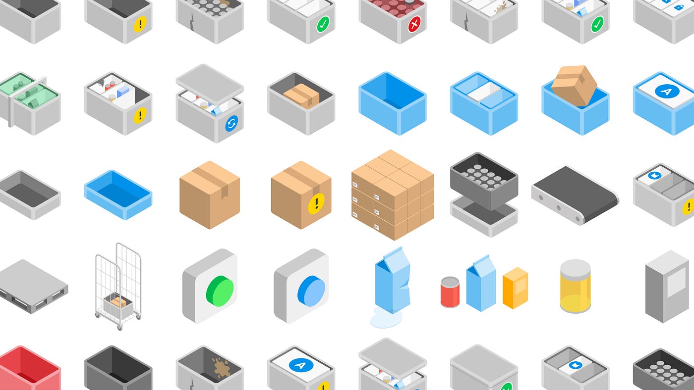
This approach was particularly valuable with illustrations, which are a vital part of how we communicate with our users. We needed illustrations to cover a huge range of use cases, however we had little to no illustration capacity.
To handle this, we built a simple, modular illustration framework. All illustrations are isometric, with only the essential details, and are designed to be easily adapted and reused. This structure allowed us to quickly build up a collection of illustrations that easily evolved over time, and could be continually repurposed to fit new use cases.
If you need to work quickly and effectively at a large scale, take the time at the beginning of a project to bake in design decisions that allow for scalability. From flows to screens to components, introduce structure and constraints that allow you to streamline decisions and design a big, consistent product
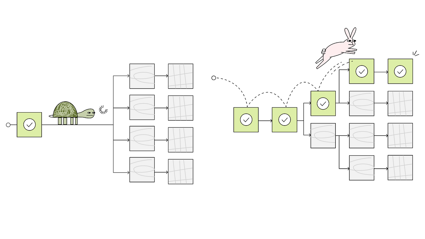
3. Test at increasing levels of realism
When starting on complex products with many moving parts, user testing can present a challenge. You want confident insights as soon as possible, but in the beginning phases of a project you might not be able to create a confident, realistic test:
- Maybe it’s too difficult, expensive or time consuming…
- Maybe what you need for the test doesn’t even exist yet…
- Maybe there are still too many unknowns and possibilities…
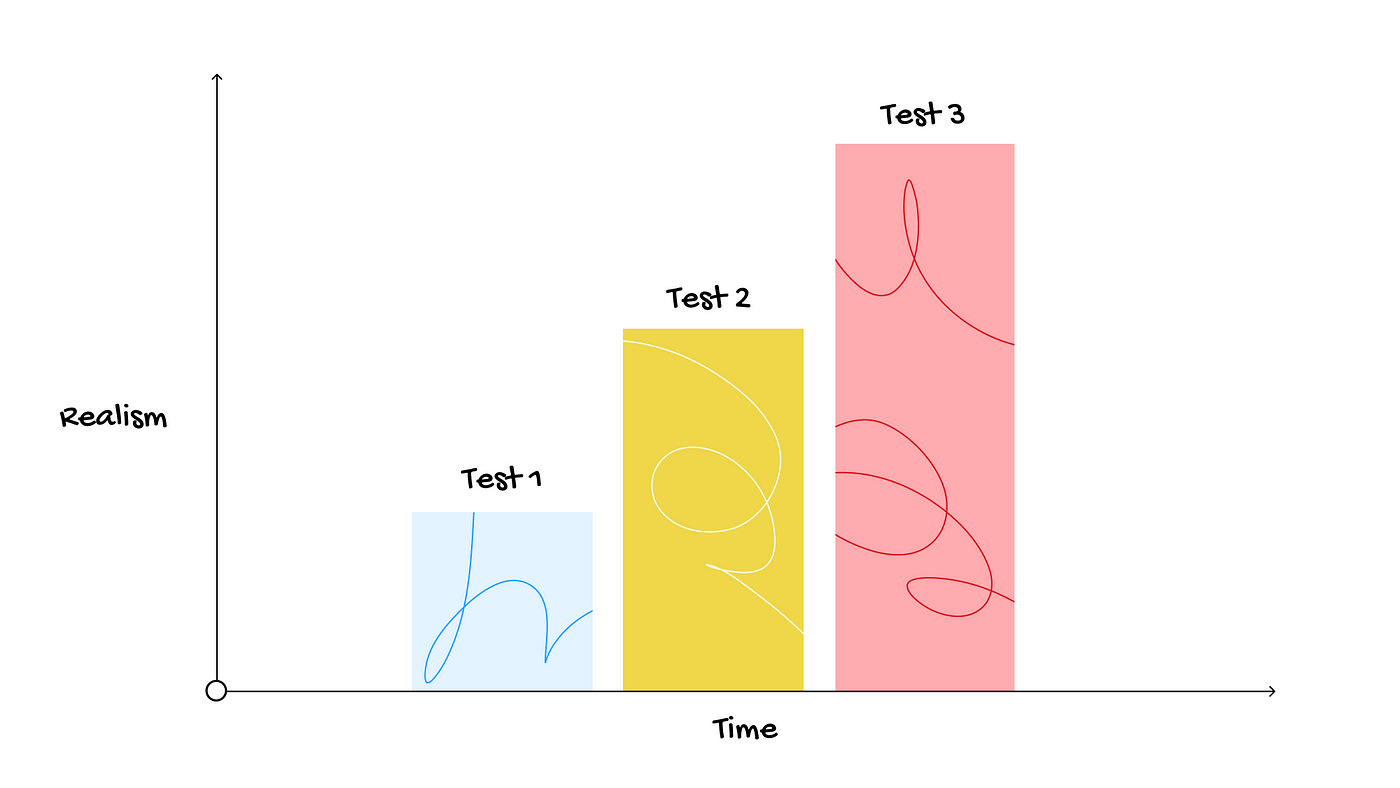
Whilst you want your test to be as realistic as possible, waiting for that perfect scenario to materialise is not an option — you’ll miss out on the insights and iterations that are a fundamental part of product development. To counter this, take the iterative mentality used when designing products and apply it to the testing process.
Starting with scrappy ‘low-fidelity’ test setups, you can continuously test your product at increasing levels of realism. Rather than treating realism as binary, treat it as an increasing scale, and with each step bring the test closer a more realistic scenario. There are many variables with which you can increase realism, for example:
- Hardware and equipment
- Environment and context
- UI and interactions
- End users
The aim at each stage is not to create the perfect test — it’s to learn what you need to move forward.
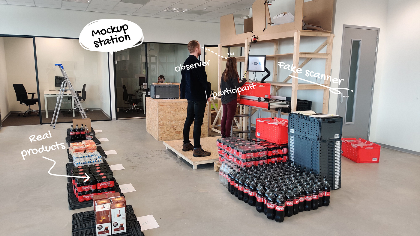
When we started designing the workflows for our automated fulfilment centre, there was just an empty shell — no workstations, no robotics, no systems. To align with the timeframe of the project, we defined 4 levels of realism with which we would test each flow over the coming 1.5 years. For each level we defined a goal that we could confidently explore at that level of realism:
Level 1: Clickable prototype tested in the office
Goal: Identify low hanging fruit and early usability improvements
Participants: Colleagues and fellow designers
Level 2: Clickable prototype tested in a mockup station
Goal: Assess how the digital tasks and instructions translate to the real world
Participants: Approximate end users
Level 3: Clickable prototype tested in a real station
Goal: Improve the performance and efficiency of the flows from an operational perspective
Participants: Approximate end users
Level 4: Implemented software tested in a real station
Goal: Deeper understanding of user behaviour over longer time periods and as part of a wider system
Participants: Real end users
With this approach we were able to accelerate our learning, tackle unknowns, and build confidence in product and design decisions.
The aim at each stage is not to create the perfect test — it’s to learn what you need to move forward.
Recommend
About Joyk
Aggregate valuable and interesting links.
Joyk means Joy of geeK