

rustdoc: Recent UI and UX changes in generated documentation
source link: https://blog.guillaume-gomez.fr/articles/2022-04-08+rustdoc%3A+Recent+UI+and+UX+changes+in+generated+documentation
Go to the source link to view the article. You can view the picture content, updated content and better typesetting reading experience. If the link is broken, please click the button below to view the snapshot at that time.

rustdoc: Recent UI and UX changes in generated documentation
Rustdoc is the tool used to generate documentation of the Rust crates. It's also the tool used to generate documentation on docs.rs. Recently, we made a lot of UI (user interface) changes aiming to improve the UX (user experience) when browsing the documentation. All this was possible thanks to @jsha leading this effort.
The goal of this blog post is to explain why we did them as also show some before/after comparisons.
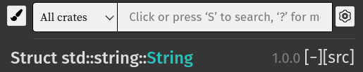
Removal of non-pertinent attributes
We removed the display of the #[must_use] attribute as we considered it was not pertinent enough. So no more:
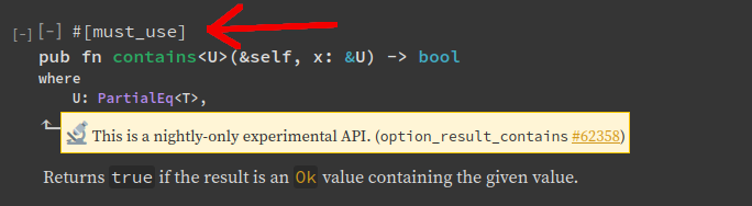
Pull request: https://github.com/rust-lang/rust/pull/86277
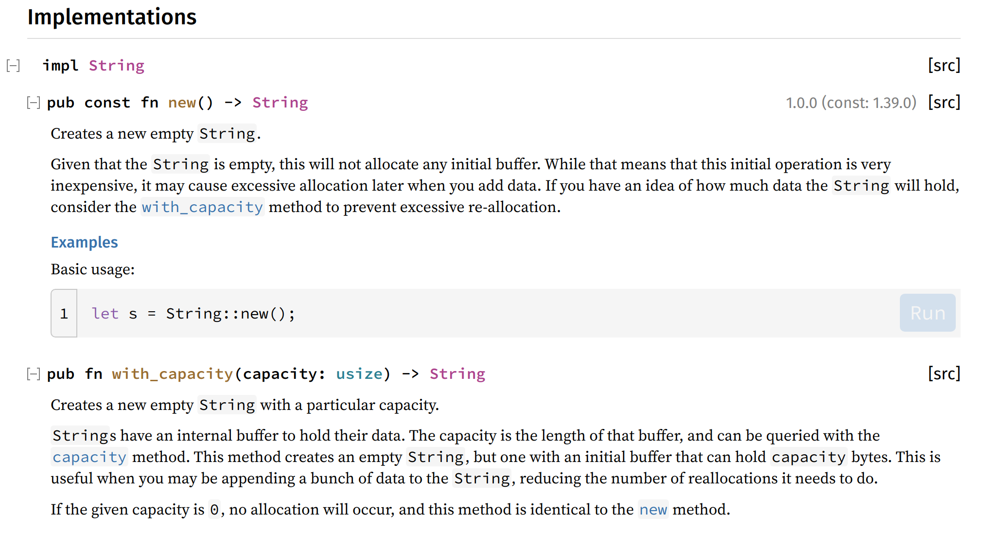
Fix alignment of method headings
Methods are now aligned with their Implementations heading and we increased the font size of the Implementations heading to indicate it is higher in the hierarchy.
Before:
After:
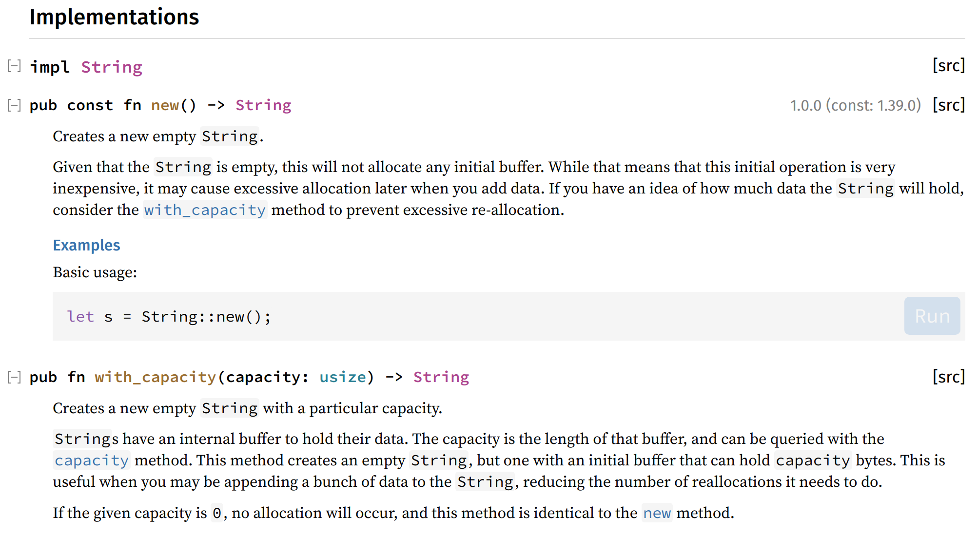
Pull request: https://github.com/rust-lang/rust/pull/90155
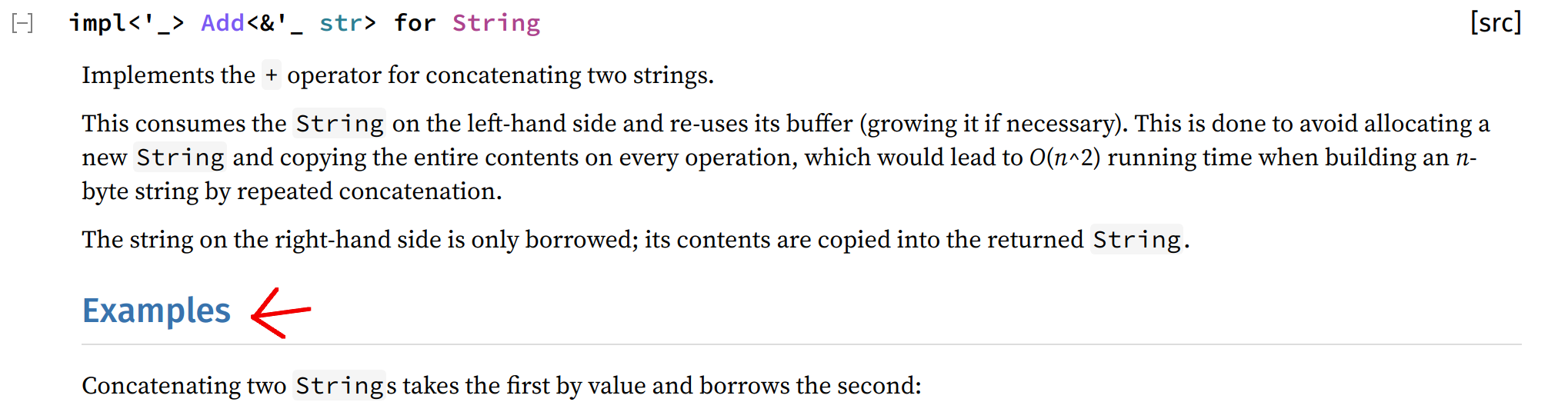
Improve display of headings in documentation blocks
We removed the underline of some headings (everything under <h2> for the non-"top" documentation blocks) in the documentation blocks and also made them smaller.
Before:
After:
It was attracting the attention because they were actually bigger than the item itself and the underline was creating a "content split".
Pull request: https://github.com/rust-lang/rust/pull/90156
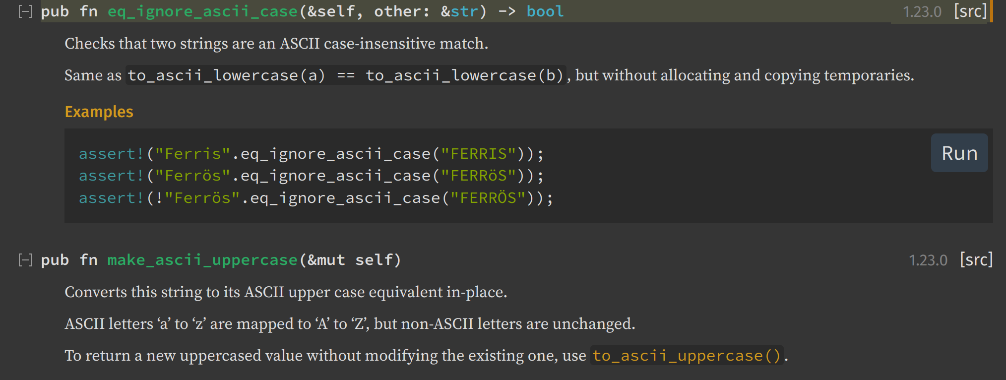
Only display the "Run button" on hover
So the "Run button":
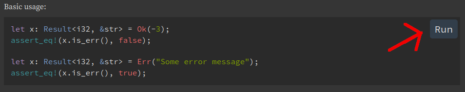
which was displayed in all code examples before will now only appear when you hover the code example. It allowed to make the documentation less "noisy", making them easier to read.
Pull request: https://github.com/rust-lang/rust/pull/92058
Fix/improve font size handling
This one doesn't really have a visual effects for most people, but in case you have set a different default font size, the display of rustdoc now uses it instead of overwriting it like before.
For technical details: instead of specifying the size of the font in pixels, we started using rem.
Pull request: https://github.com/rust-lang/rust/pull/92448
Move search crate filtering drop-down
This one is quite a big change. We moved the search crate-filtering drop-down into the results page directly. So from this:
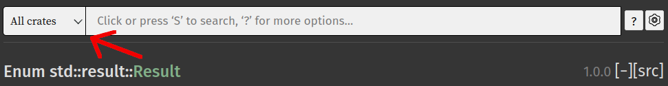
To this:
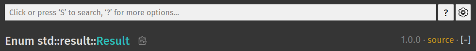
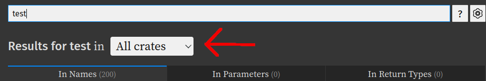
It allows to reduce the number of information displayed on the documentation while keeping the same amount of functionalities.
To be noted that this is the first step of a bigger plan to refactor how the search works: we intend to improve the UI in order to help the users write down the search request. More information in the coming months. :)
Pull request: https://github.com/rust-lang/rust/pull/92490
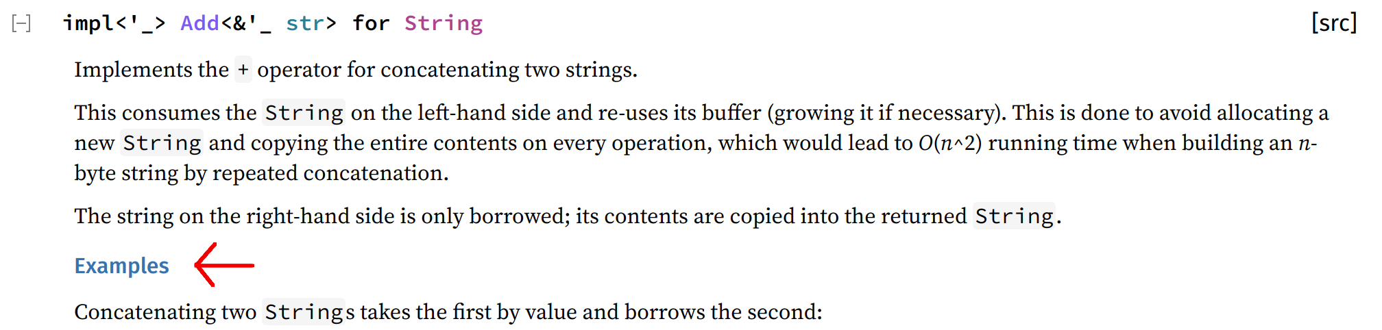
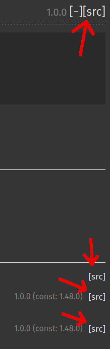
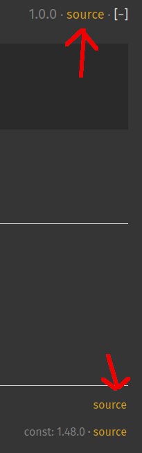
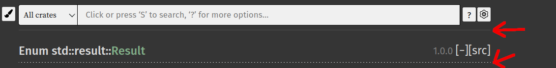
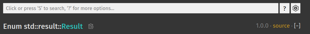
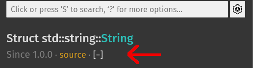
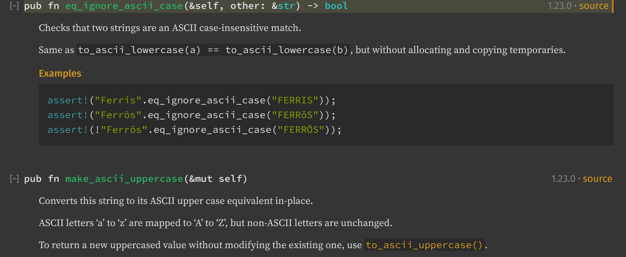
Improve source links display
This is another big change: the change of source links appearance. We made this change for two reasons:
- It wasn't obvious for non-native english speakers to understand what
[src]is about. Withsource, it's more clear. - The
[]were attracting the eyes. It reduces this attraction a bit.
Pull request: https://github.com/rust-lang/rust/pull/92602
Make the current item name link to the top of the page
This isn't a UI change but definitely a UX one. You can now click on the item name in the sidebar to go back to the top of page.
Pull request: https://github.com/rust-lang/rust/pull/92795
Remove horizontal lines at the top of the page
Under the search input and under the title (where the name of the item is), there were horizontal lines. This separation was not useful and just making the page "heavier" for the eye.
Before:
After:
Pull request: https://github.com/rust-lang/rust/pull/92797
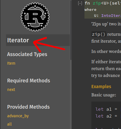
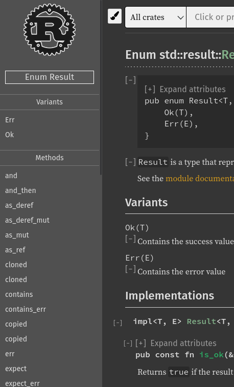
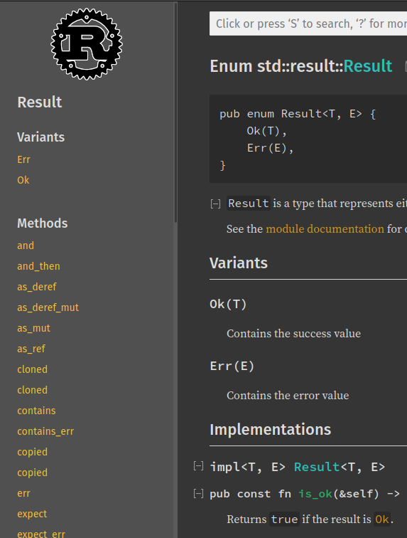
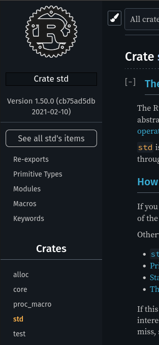
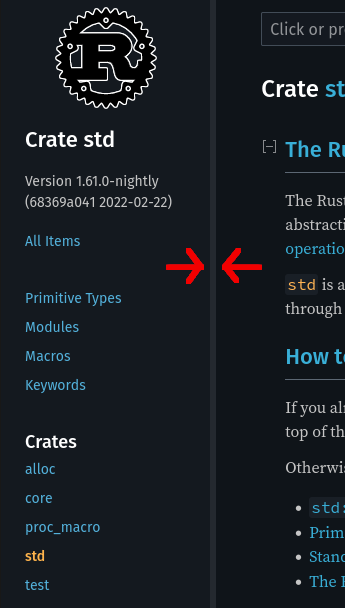
Improve sidebar display
The sidebar was certainly one of the elements that needed the most changes. It got cleaned up and unified with the rest of the page.
Desktop
Mobile
Before:
After:
To see all the changes, I recommend you to go read the pull request.
Move item information on their own line on mobile
It was getting very crowded with all the item information. To make it easier to read, we moved the item information on its own line.
Before:
After:
Pull request: https://github.com/rust-lang/rust/pull/92861
Remove item extra information distraction
There is already the indent to allow the readers to see the item. Removing this arrow also allowed us to align it with the text below it.
Before:
After:
Pull request: https://github.com/rust-lang/rust/pull/92651
More spacing to distinguish items
Previously, there was not much spacing between the bottom of item A and the top of item B. That made it not clear whether item B's title was related to A or B. We increased the spacing at the bottom of item A so it would be clear where A ends and B begins.
We also made similar changes to the "Trait implementations" section that made it easier to see where one implementation ends and the next begins; and oft-requested improvement.
All this was also done in #92651.
Before:
After:
Unify search input and buttons size
It was a weird incoherence: the height, the border radius and the hover were behaving differently between buttons and the search input.
Before:

After:

Pull request: https://github.com/rust-lang/rust/pull/93113
Make scrollbar in the sidebar always visible for visual consistency
The problem here was that if you went from a page with not many elements into another one with enough elements to make the scrollbar in the sidebar appear, it was creating an unneeded change in layout by adding a new element (the scrollbar).
Before:
After:
Pull request: https://github.com/rust-lang/rust/pull/90983
Add rustdoc version into the help popup
This one isn't so much as a UI/UX change but more as a nice thing to have. So now, when you open the help popup (the ? button or by pressing the ? key), you will be able to see the version of rustdoc used to generate this documentation:
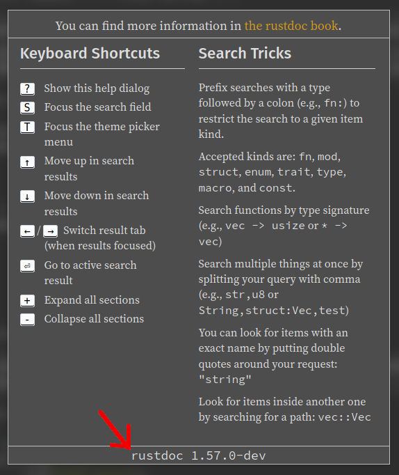
Pull request: https://github.com/rust-lang/rust/pull/88964
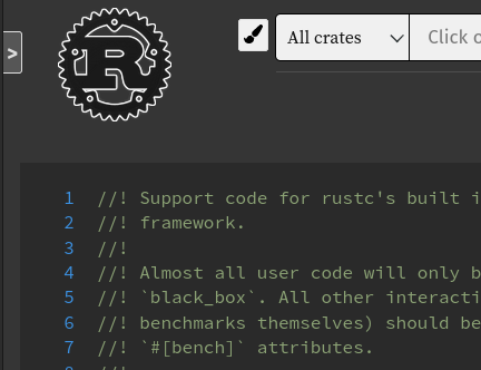
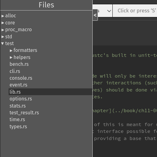
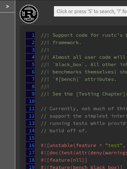
Improve source code viewer sidebar
The source code viewer sidebar was suboptimal to say the least:
- Its appearance didn't match the rest of rustdoc.
- When expanded, it was over the source code.
- Its content could be better looking.
The source code viewer sidebar is now more consistent and usable.
Before:
After:
Pull request: https://github.com/rust-lang/rust/pull/91356
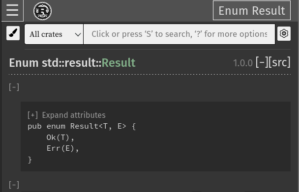
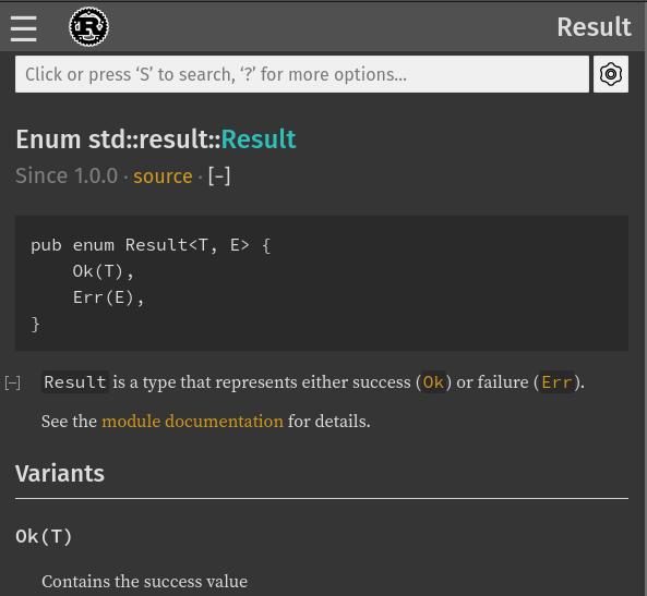
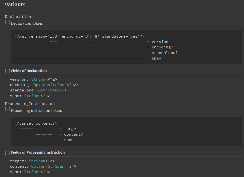
Improve display of enum variants
There were multiple issues with the old way of displaying enum variants:
- It was very verbose.
- The bottom borders were distracting.
- The doc blocks were weirdly placed.
- The UX part wasn't great because headings were not HTML headings (we were using
<div>).
Before:
After:
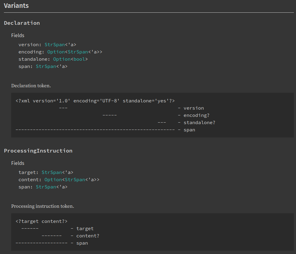
Pull request: https://github.com/rust-lang/rust/pull/90089
Use correct heading levels
In some cases, we had some <h2> inside some <h3>. It was very bad UX for screen reader users. This pull request fixed it. Althougth it was a very important improvement in itself, there was no UI changes. It's just to show that UX is also something very important for us.
Conclusion
So as you saw, this is a mix of very small changes and much bigger ones. We're still continuing our effort to make Rust documentation easier to use for everyone so expect more improvements to be added in the next months!
And finally, many thanks to @jsha for their review and help on this blog post!
Recommend
-
12
Performance improvement on front-end generated by rustdoc We recently wrote a blog post about the performance improvement in rus...
-
8
Changes to the Rustdoc team Jan. 19, 2021 · Guillaume Gomez on behalf of the rustdoc team Recently, there ha...
-
6
Recent Outages: Why We Accelerated Registry Changes March 1, 2021 by Jeremy Milk //
-
15
Copy link Contributor ehuss commented
-
10
Sunday, August 22, 2021 Recent and not so recent changes in OpenBSD that make life better (and may turn up elsewhere too) Known to be "functional, free and secure by defa...
-
6
Three Recent Seismic Geopolitical Changes That Have Flown Under The Radar and What They Mean For European Identity
-
4
Hatnote Recent Changes Map about & blog...
-
8
December 8, 2022 ...
-
13
Paul Barker: "So, further to recent changes …"Paul Barker@[email protected], further to recent changes at Gandi, I've just g...
-
5
Recent changes and personal commitments Sandor Dargo 22 hours ago2023-06-07T00:00:00+02:00Life is change. Such a cliché.Yet it is true. Everything is changing around us and if we try to stay the same,...
About Joyk
Aggregate valuable and interesting links.
Joyk means Joy of geeK