

CSS Tips and Tricks you May Need To Know 📕✨
source link: https://dev.to/devsyedmohsin/css-tips-and-tricks-you-will-add-to-cart-163p
Go to the source link to view the article. You can view the picture content, updated content and better typesetting reading experience. If the link is broken, please click the button below to view the snapshot at that time.
As we are done with HTML and JavaScript tricks now its time to cover CSS Tips and Tricks 💖✨
The print media queries
You can style the printable version of your sites using print media queries.
@media print {

  * {
    background-color: transparent;
    color: #000 ;
    box-shadow: none;
    text-shadow: none;
  }

}
Enter fullscreen mode
Exit fullscreen mode
The gradient text
h1{
  background-image: linear-gradient(to right, #C6FFDD, #FBD786, #f7797d);
  background-clip: text;
  color: transparent;
}
Enter fullscreen mode
Exit fullscreen mode
Improve media defaults
When writing css reset add these properties to improve media defaults.
img, picture, video, svg {
  max-width: 100%;
  object-fit: contain;  /* preserve a nice aspect-ratio */
}
Enter fullscreen mode
Exit fullscreen mode
The column count
Craft nice column layouts for text elements using column properties.
p{
  column-count: 3;
  column-gap: 5rem;
  column-rule: 1px solid salmon; /* border between columns */
}
Enter fullscreen mode
Exit fullscreen mode

Centering with positioning
In case you don't know grid or flex this is the way to center a div vertically and horizontally.
div{
  position: absolute;
  top: 50%;
  left: 50%;
  transform: translate(-50%,-50%);
}
Enter fullscreen mode
Exit fullscreen mode
The comma separated list
This is the code required to craft a comma separated list.
li:not(:last-child)::after{
  content: ',';
}
Enter fullscreen mode
Exit fullscreen mode
The smooth scrolling
You are just one line away from smooth scrolling.
 html {
  scroll-behavior: smooth;
}
Enter fullscreen mode
Exit fullscreen mode
The hyphens
Set hyphens property on your text content to make it hyphenated when text wraps across multiple lines.

The first letter
Avoid unnecessary spans and use pseudo elements to style your content likewise first letter pseudo element we also have first-line pseudo element.
 h1::first-letter{
   color:#ff8A00;
}
Enter fullscreen mode
Exit fullscreen mode
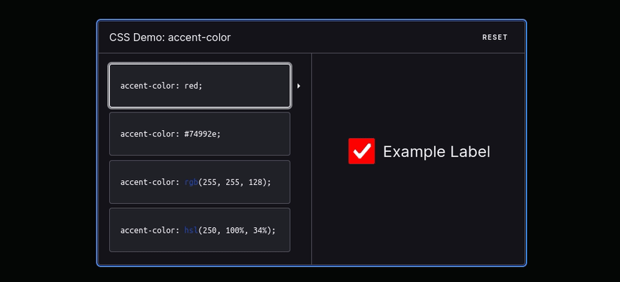
The accent color
Instead of using builtin default colors customize your form controls colors using accent color this has builtin color contrast accessibility features.
The Image filled text
h1{
  background-image: url('illustration.webp');
  background-clip: text;
  color: transparent;
}
Enter fullscreen mode
Exit fullscreen mode

The placeholder pseudo-element
Use placeholder pseudo-element to style placeholders.
::placeholder{
  font-size:1.5em;
  letter-spacing:2px;
  color:green;
  text-shadow:1px 1px 1px black;
}
Enter fullscreen mode
Exit fullscreen mode
The colors animation
Change elements colors with hue-rotate filter.
button{
  animation: colors 1s linear infinite;
}

@keyframes colors {
  0%{
    filter: hue-rotate(0deg);
  }
  100%{
    filter: hue-rotate(360deg);
  }
}
Enter fullscreen mode
Exit fullscreen mode
Centering with margin
.parent{
  display: flex;  /* display: grid; also works */
}

.child{
  margin: auto;
}
Enter fullscreen mode
Exit fullscreen mode
The clamp function
Use clamp function for responsive and fluid typography.
h1{
  font-size: clamp(5.25rem,8vw,8rem);
}
Enter fullscreen mode
Exit fullscreen mode
The selection pseudo element
Set styles on content selection.
::selection{
  color:coral;
}
Enter fullscreen mode
Exit fullscreen mode

The decimal leading zero
Set list style type to decimal leading zero to append leading zero to your ordered list items.
li{
  list-style-type:decimal-leading-zero;
}
Enter fullscreen mode
Exit fullscreen mode

Centering with flex
.parent{
  display: flex;
  justify-content: center;
  align-items: center;
}
Enter fullscreen mode
Exit fullscreen mode
The custom cursors
html{
  cursor:url('no.png'), auto;
}
Enter fullscreen mode
Exit fullscreen mode
The caret color
You can customize your text input cursor color using caret color property.
input{
  caret-color:coral;
}
Enter fullscreen mode
Exit fullscreen mode

The resize property
Set resize property to none to avoid the resizing of textarea
textarea{
  resize:none;
}
Enter fullscreen mode
Exit fullscreen mode
The only child
Only child pseudo-class selects an element if it is only child of its parent.
li:only-child{
  color:lightgrey;
}
Enter fullscreen mode
Exit fullscreen mode

Centering with grid
.parent{
  display: grid;
  place-items: center;
}
Enter fullscreen mode
Exit fullscreen mode
The text indent
Text indent property allows us to indent the first line of text we can also use negative values.
p{
  text-indent:5.275rem;
}
Enter fullscreen mode
Exit fullscreen mode

The list style type
You can set a emoji as a list style type.
li{
  list-style-type:'🟧';
}
Enter fullscreen mode
Exit fullscreen mode

Hope you enjoyed reading this article! if you have something to say or have any questions feel 💯 free to comment below.
Happy Coding 📕✨
Recommend
About Joyk
Aggregate valuable and interesting links.
Joyk means Joy of geeK