

Take Me Out to the Ballgame: Score Bugs and the UX of America’s Pastime
source link: https://medium.com/@alainazemanick/take-me-out-to-the-ballgame-score-bugs-and-the-ux-of-americas-pastime-27b83ae175b1
Go to the source link to view the article. You can view the picture content, updated content and better typesetting reading experience. If the link is broken, please click the button below to view the snapshot at that time.

Take Me Out to the Ballgame: Score Bugs and the UX of America’s Pastime
Over the last two years, it seems as though everyone gained newfound interests due to conditions of quarantine, including me. Beyond changing my career, I became a sports fan, which, for an unathletic, lapsed academic, was rather unexpected. (You can read about my former career here!) But, even more unlikely, I became a baseball fan.
I’m from Pittsburgh, a city that revolves around its sports teams. While I enjoyed watching the Steelers with my family, I never liked baseball. Growing up, my father took me to see the Pirates under the sweltering summer sun with boredom to boot. Many years later, I went to college in Red Sox country, not understanding the fanfare when they won the World Series in 2013. Simply put, I didn’t get the hype.
All of that disdain somehow dissipated this past season. Coincidentally, I’m now a Red Sox fan, converted by my Massachusetts sports fan of a boyfriend. I watched baseball almost every evening with him to unwind after work and as merely something to do, especially as COVID cases spiked again last fall.
Spending so much time watching baseball and learning the rules in tandem, I realized that the broadcast’s means of representing the scores and bases was important to my education. Called score bugs, this graphic is a rather new innovation in televised sports. ESPN first began using score bugs during their World Cup broadcast in 1994, an idea implemented in soccer matches in the UK (source). Since then, score bugs don’t just communicate the scores of a game. For example, football viewers can also see the number of downs and number of yards needed before a first-down conversion. In sports where possession is a concern, score bugs indicate who has the ball at a particular point in the game.
In baseball, the score bug has evolved to show vital pieces of data about the current state of the game (especially in a sport that relies so much on that data!). Minimally, it will include:
- The score
- The teams competing and which team is currently at bat
- The inning and whether it’s the top or the bottom of an inning
- Number of strikes or balls
- Number of outs in the inning
- How many bases are loaded
Given how much information needs to be conveyed, creating an effective score bug can be a rather difficult task. Not only that, the score bug can’t take up the majority of a television screen, just a small corner or across the top or bottom. A good score bug has to be informative yet subtle, aiding the sports fan in understanding the game at any given time without drawing their attention away from the game itself.
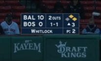
Last season, I watched my fair share of baseball, enjoying the MLB package as well as the local games and playoffs. While I’m not a long-time baseball fan, I have seen enough games to view a variety of score bugs, even this one (with a literal bug!) after a Kiké Hernandez home run:
As a UX designer, I realized the user experience of a baseball broadcast is often dependent on a station’s score bug. Let’s take a moment to explore some baseball score bugs from the perspective of UX, from the good, the bad, and the irritating.
Fox Sports: Don’t Fix It If It Ain’t Broke
Up until the 2021 playoffs, Fox Sports had a simple, accessible design for their score bugs, and it was beloved by many sports fans, including myself. I’ve included an example below:
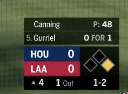
Many considered this score bug the best in the sport. It included enough information to quickly ascertain what was happening in the game while not having a busy graphic design. The typography, a single color for a team, nice color contrast… sometimes, you’d forget it was even there, which is indicative of a great design!
Then, Fox Sports thought they could make the best product even better and debuted a new approach to their score bug:
I had a visceral reaction upon seeing this score bug during a Red Sox playoff game. Why are the bases three dimensional with a tilted perspective? And why do they look like pizza boxes? Why have a faded, hardly-noticeable team logo behind their respective score? I understood the stylistic choice behind the font, but outside the original context of uniforms, the text looks awkward and clunky, as if they used a header font for body text.
As I stated in my introduction, good score bugs are informative yet subtle — while Fox Sports’ latest score bug relays the current status of the game, it most certainly is not understated. With the overlaid graphics, decorative font, and perspectival bases, I would argue that the new score bug is too noisy. In fact, it distracts viewers from the game itself. Let’s return to the Kiké Hernandez home run score bug error, which was on Fox Sports. Aside from the distracting name mistake, the score bug is almost 75% of the screen width, covering up any view of home plate. Viewers then missed the celebration among Red Sox players for Hernandez’s feat, all because Fox Sports decided to broadcast the home run stats in such a large format.
Instead of focusing on what the user needs to know about the game, Fox Sports decided to show off their graphic design skills to the point of scope creep. Score bugs are not an opportunity to flex your visual expertise — it’s instead supposed to supplement the main purpose of the broadcast: enjoying America’s pastime.
Lesson Learned: a simple and effective product can be enough to satisfy user needs. Don’t mess with a good thing!
NESN: Keep It Simple for Baseball Fans
As someone who watched a lot of Red Sox baseball last season, I most often encountered the score bug of NESN, New England’s regional sports network. Whenever I wasn’t delighted by the commentary of the late great Jerry Remy, I focused on the information provided in NESN’s straightforward approach to the score bug.
For a novice baseball fan, I appreciated the simplicity of NESN’s score bug. The score is bolded with an emphasis overall on the pitcher and the number of pitches. Aside from that, loaded bases are indicated in yellow with the usual information conveyed, much like the original Fox Sports score bug. There is no additional or superfluous information that could confuse me or distract me from the game.
In researching baseball score bugs, I found a lot of critics of NESN’s take, saying that it was too understated. I do agree to an extent — I question how this score bug would vary from game to game when the Red Sox are playing against different opponents. No colors aside from navy and white are used. For a true baseball beginner, there could be confusion over which team is the city abbreviation, since there are no other indications of what the team name or colors are. Perhaps there are some who wouldn’t know which team is the Red Sox! NESN assumes a lot on behalf of the user — they presume that the viewer knows who Boston is on the field and has knowledge of other baseball teams.
This assumption, however, is not exactly a bad thing. After all, someone who is tuning into a local regional sports station is more likely than not a fan of the team. Regional stations thus have a more specific target audience than national broadcast, one that doesn’t need a sports bug to educate die-hard fans on which team is which.
Lesson Learned: regional stations often cater their score bug to their user base, since viewers have more depth of knowledge for their local teams.
ESPN: Align with the Existing Design
I want to return to ESPN, the network that pioneered score bugs stateside. Unlike Fox Sports and NESN, who implement small, vertical score bugs located in corners, ESPN uses a horizontal design to convey the score of the game.
Rather than stacking the scores and game data, ESPN has laid it out across the screen. They incorporate some text hierarchy with the score and the team name, making the rest of the information smaller by comparison. A team logo accompanies the name of each team with the respective color as a background. These visual cues allow viewers to associate which team is which on the field — if an everyday sports fan is tuning into the game, they can quickly gather the score before turning their attention to the action. The means of relaying the pitcher’s and the hitter’s names is off-putting though — by having the names stick out like a file tab, the feature disrupts the left-right flow of the score bug.
However, the horizontal score bug design is smart when thinking about ESPN’s existing broadcast. Throughout any show or televised game on the network, there is always a chyron displaying scores from other sports on the lower third of the screen. ESPN can’t afford to lose more real estate during a sports game, and aesthetically, they likely didn’t want a design that didn’t coordinate with their existing display. The straight score bug runs parallel to the information at the bottom of the television screen, thereby replicating the existing design ESPN has implemented.
Lesson Learned: when building a new product within a design system, take care of existing features to create a cohesive experience.
My interest in baseball hasn’t just been a fun way to pass the time— it’s also allowed me to broaden my perspective on design. If you sharpen your lens, the principles of UX design can be found in the most unlikely of places, even when watching the old ballgame.
(If this piece has sparked some new-found curiosity within you — much like my new-found curiosity of baseball! — I recommend following artofscorebug on Twitter and checking out the Redditposts of icondesign on r/baseball. They provided some entertaining yet informative material for my research!)
Recommend
About Joyk
Aggregate valuable and interesting links.
Joyk means Joy of geeK