

Avalonia DataGrid - Advanced Features coming from NP.Avalonia.Visuals Package
source link: https://www.codeproject.com/Articles/5329865/Avalonia-DataGrid-Advanced-Features-coming-from-NP
Go to the source link to view the article. You can view the picture content, updated content and better typesetting reading experience. If the link is broken, please click the button below to view the snapshot at that time.
Introduction
Avalonia is a great new multiplatform .NET Framework for building UI desktop applications. It is very similar to WPF, more powerful and less buggy and also running not only on Windows, but also on Linux and Mac. One can call it multiplatform WPF++. Recently it became possible to run Avalonia in a browser and I understand that mobile version of Avalonia are coming soon.
I wrote extensively about Avalonia on the codeproject and produced several Avalonia based packages/frameworks also described in my codeproject articles.
Avalonia has only recently become production ready and because of that, the major 3rd party component providers like Telerik, DevExpress or Infragistics still have not released the components for Avalonia.
In my experience, only two components from the large providers like Telerik were necessary - a window docking functionality and a data grid. Everything else - custom buttons, boxes etc can (and should) be easily built by the team out of the WPF or Avalonia primitives to meet the UX requirements.
The lack of the docking framework in Avalonia is compensated by my UniDock package.
DataGrid already exists in Avalonia. Largerly, it is a port of the built-in WPF DataGrid. Unfortunately just like its WPF counterpart, the Avalonia DataGrid it missing some important features, including,
- Filtering
- Changing the Visibility of the Grid Columns
- Saving/Restoring the Layout
- Grouping
I have added all the above capabilities to the built-in Avalonia DataGrid aside from Grouping (which is on my list and should be added soon). All of them are added to my NP.Avalonia.Visuals library/package.
This article presents a sample demonstrating how to use those advanced features.
Demo Code
Demo code is located within NP.Avalonia.Demos repository, under NP.Demos.VisualSamples/NP.Demos.AdvancedDataGridDemo project.
To get the the project clone the repository, NP.Demos.VisualSamples/NP.Demos.AdvancedDataGridDemo folder and open NP.Demos.AdvancedDataGridDemo.sln solution (you will need to employ Visual Studion 2022 for that).
Build the solution, make sure that all the needed nuget packages have been downloaded by you visual studion.
If you open the packages regions of the dependency of the only project within the solution, you will see only two projects:
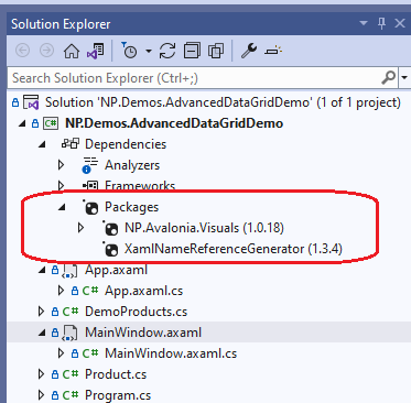
The rest of the Avalonia refernces are all coming from NP.Avalonia.Visuals dependency.
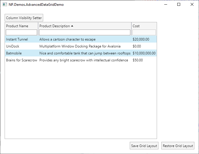
Run the solution; here is the window that is going to pop up:
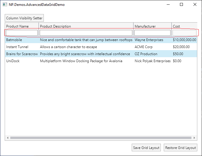
The red rectangular curve contains the text filters. Filter for the last column "Cost" is disabled.
Try typing some string within the filters' text boxes. You will see that only the rows that contain the filter text will be shown - the rest will become invisible:
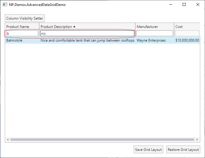
The picture above shows the record that contain 'b' in its Product Name and 'nic' in its Product Description.
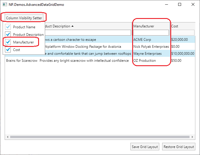
Now right click on one of the columns (say Manufacturer) and choose "Remove Column" menu item:
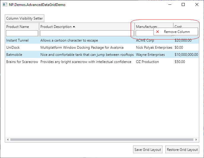
Once it is clicked, the column (Manufacturer) becomes invisible:
Now click "Column Visibility Setter" button at the top, in the open dropdown click on the checkbutton next to Manufacturer column to make it visible again:
Now change the widths of various columns and change their order by draggin some columsn to other locatetions, e.g.
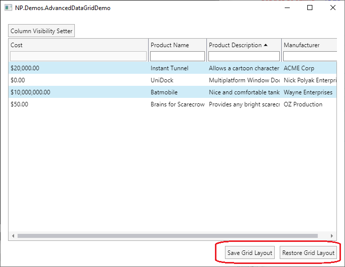
Save the grid layout by pressing button "Save Grid Layout"
Restart the application and press button "Restore Grid Layout". The saved layout will be restored.
Demo Code
Within the Demo, we define a simple class Product:
public class Product
{
    public string? Name { get; }

    public string? Description { get; }

    public string? Manufacturer { get; }

    public double? Cost { get; }


    public Product(string? name, string? description, string? manufacturer, double? cost)
    {
        Name = name;
        Description = description;
        Manufacturer = manufacturer;
        Cost = cost;
    }
}
and a predefined collection of products - DemoProducts:
public class DemoProducts : ObservableCollection<product>
{
    private void AddProduct(string? name, string? description, string? manufacturer, double? cost)
    {
        this.Add(new Product(name, description, manufacturer, cost));
    }

    public DemoProducts()
    {
        AddProduct("Batmobile", "Nice and comfortable tank that can jump between rooftops", "Wayne Enterprises", 10000000);
        AddProduct("Instant Tunnel", "Allows a cartoon character to escape", "ACME Corp", 20000);
        AddProduct("Brains for Scarecrow", "Provides any bright scarecrow with intellectual confidence", "OZ Production", 50);
        AddProduct("UniDock", "Multiplatform Window Docking Package for Avalonia", "Nick Polyak Enterprises", 0);
    }
}
</product>
Most of the rest of the code is defined within MainWindow.axaml file, only references to style files are defined within App.axaml.
An object of type DemoProducts is defined as a resource with MainWindow.axaml file:
<Window.Resources>
    <local:DemoProducts x:Key="TheDemoProducts"/>
</Window.Resources>
The most important part of MainWindow.axaml file is the DataGrid itself:
<DataGrid x:Name="TheDataGrid"
          Classes="WithColumnFilters"
          CanUserReorderColumns="True"
          CanUserResizeColumns="True"
          HorizontalAlignment="Left"
          Grid.Row="1"
          np:DataGridFilteringBehavior.DataGridFilterTextBoxClasses="DataGridFilterTextBox"
          np:DataGridFilteringBehavior.RowDataType="{x:Type local:Product}"
          np:DataGridCollectionViewBehavior.ItemsSource="{StaticResource TheDemoProducts}">
    <DataGrid.Columns>
        <DataGridTextColumn Header="Product Name"
                            np:DataGridColumnManipulationBehavior.CanRemoveColumn="False"
                            np:DataGridFilteringBehavior.FilterPropName="Name"
                            Binding="{Binding Path=Name}"/>
        <DataGridTextColumn Header="Product Description"
                            np:DataGridFilteringBehavior.FilterPropName="Description"
                            Binding="{Binding Path=Description}"/>
        <DataGridTextColumn Header="Manufacturer"
                            np:DataGridFilteringBehavior.FilterPropName="Manufacturer"
                            Binding="{Binding Path=Manufacturer}"/>
        <DataGridTextColumn Header="Cost"
                            Binding="{Binding Path=Cost, StringFormat='$\{0:#,##0.00\}'}"/>
    </DataGrid.Columns>
</DataGrid>
In order to display the filtering textboxes and column removing menu, one needs to use "WithColumnFilters" class within the DataGrid classe, while the "ThemeStyles.axaml" styles file from NP.Avalonia.Visuals should be visible within the application (which is achieved by us adding line
<StyleInclude Source="avares://NP.Avalonia.Visuals/Themes/ThemeStyles.axaml"/>
to the App.axaml file).
The line np:DataGridCollectionViewBehavior.ItemsSource="{StaticResource TheDemoProducts}" of the DataGrid tag, changes the collection source of the grid (which is simply the TheDemoProducts resource) into a DataGridCollectionView object which is actually assigned to the Items property of the DataGrid.
DataGridCollectionView class is essentially a collection, with some useful functionality built into it allowing Filtering, Grouping and Sorting.
Line np:DataGridFilteringBehavior.RowDataType="{x:Type local:Product}" of the DataGrid tag, sets the row type to the object of type Product. This helps creating fast precompiled filter based on the property name.
line np:DataGridFilteringBehavior.DataGridFilterTextBoxClasses="DataGridFilterTextBox" allows one to specify classes to style the filtering TextBox. E.g one can use it to change the background of the filtering TextBox, its size, its Font etc.
Now let us describe the column specifi properties.
Binding property simply allows the DataGrid to bind the column value to a property of the row - this is how the basic DataGrid (without any improvements from NP.Avalonia.Visuals) works.
If you want to show an enabled and working filter TextBox you need to set the attached property np:DataGridFilteringBehavior.FilterPropName to some property name on the row object, e.g.
np:DataGridFilteringBehavior.FilterPropName="Description"
Column "Cost" does not specify such property name and because of that, its Filtering TextBox is disabled.
If you do not want your column to be removable you have to set the attached property np:DataGridFilteringBehavior.DataGridFilterTextBoxClasses to false, the way it is done on "Product Name" column:
np:DataGridColumnManipulationBehavior.CanRemoveColumn="False"
By default the columns are removable.
Once a column is removed, we need to provide a way to re-add it back. This is the purpose of "Column Visibility Setter" button at the top. Here is the related code:
<Button Content="Column Visibility Setter"
        Margin="0,2"
        HorizontalAlignment="Left"
        VerticalAlignment="Center">
    <Button.Flyout>
        <Flyout Placement="Bottom">
            <ContentPresenter Content="{Binding #TheDataGrid.Columns}"
                              ContentTemplate="{StaticResource DataGridColumnsVisibilityDataTemplate}"/>
        </Flyout>
    </Button.Flyout>
</Button>
The button simply opens a Flyout (a kind of a menu popup) that contains a content control displaying an entry for every Column of the DataGrid. The DataTemplate is provides by Static Resource named DataGridColumnsVisibilityDataTemplate defined in one of the files within NP.Avalonia.Visuals project.
Finally take a look at the Layout saving/restoring buttons code at the bottom:
<StackPanel HorizontalAlignment="Right"
            Orientation="Horizontal"
            Margin="0,10,0,0"
            Grid.Row="2">
    <Button Content="Save Grid Layout"
            np:CallAction.TheEvent="{x:Static Button.ClickEvent}"
            np:CallAction.TargetObject="{Binding #TheDataGrid}"
            np:CallAction.StaticType="{x:Type np:DataGridColumnManipulationBehavior}"
            np:CallAction.MethodName="SaveDataGridLayoutToFile"
            np:CallAction.HasArg="True"
            np:CallAction.Arg1="MyGridLayoutFile.xml"/>
    <Button Content="Restore Grid Layout"
            Margin="10,0,0,0"
            np:CallAction.TheEvent="{x:Static Button.ClickEvent}"
            np:CallAction.TargetObject="{Binding #TheDataGrid}"
            np:CallAction.StaticType="{x:Type np:DataGridColumnManipulationBehavior}"
            np:CallAction.MethodName="RestoreDataGridLayoutFromFile"
            np:CallAction.HasArg="True"
            np:CallAction.Arg1="MyGridLayoutFile.xml"/>
</StackPanel>
We are using CallAction behavior defined within NP.AvaloniaVisuals package to call static method
DataGridColumnManipulationBehavior.SaveDataGridLayoutToFile(dataGrid, "MyGridLayoutFile.xml")
defined within NP.Avalonia Visuals pacakge, in order to save the layout of the DataGrid (which we pass as the first argument to the static method) into file "MyGridLayoutFile.xml" which we pass as the second argument.
When restoring a layout, we employ method
DataGridColumnManipulationBehavior.RestoreDataGridLayoutFromFile(dataGrid, "MyGridLayoutFile.xml")
instead.
CallAction is a very important and useful behavior defined within NP.Avalonia.Visuals package that will be explained in detail elsewhere.
Implementation Notes
For those who are curious about how the filtering, column visibility and layout saving restoring functionality were created, I provide a brief description below.
Implementation of Filtering Functionality
For the filters and column removal functionality, I provide a DataGrid column header Style with WithFilter class (see ThemeStyles.axaml file within NP.Avalonia.Visuals project). It changes the column header inserting the filtering TextBox under the usual header:
<TextBox x:Name="FilterTextBox"
         HorizontalAlignment="Stretch"
         Grid.Row="1"
         Margin="3,1"
         Padding="2,1"
         IsVisible="{Binding $parent[DataGrid].HasFilters}"
         np:ClassesBehavior.TheClasses="{Binding $parent[DataGrid].DataGridFilterTextBoxClasses}"
         IsEnabled="{Binding !!$parent[DataGridColumnHeader].Column.FilterPropName}"
         Text="{Binding $parent[DataGridColumnHeader].ColumnFilterText,
                        Mode=TwoWay}"/>
Then I use various attached properties and behaviors to wire the filtering behavior, classes that define the look and feel of the text box and whether the TextBox is visible or enabled.
Then I use AddClassesToDataGridColumnHeaderBehavior attached behavior to inject the WithFilter DataGridColumnHeader class for every column within the DataGrid.
Changing Column Visibiltity
The menu to change the column Visibility is also built into DataGridColumnHeader.WithFilter styles as a context flyout menu to the main grid of the header:
<Grid.ContextFlyout>
	<MenuFlyout>
		<MenuItem Header="Remove Column"
					IsEnabled="{Binding $parent[DataGridColumnHeader].Column.CanRemoveColumn}"
					np:CallAction.TheEvent="{x:Static MenuItem.ClickEvent}"
					np:CallAction.StaticType="{x:Type np:DataGridColumnManipulationBehavior}"
					np:CallAction.TargetObject="{Binding $parent[DataGridColumnHeader].Column}"
					np:CallAction.MethodName="RemoveColumn">
			<MenuItem.Icon>
				<Path Data="{StaticResource CloseIcon}"
						Stretch="Uniform"
						Fill="Red"
						Width="9"
						VerticalAlignment="Center"
						HorizontalAlignment="Center"/>
			</MenuItem.Icon>
		</MenuItem>
	</MenuFlyout>
</Grid.ContextFlyout>
The CallAction behavior is wired to call static method
DataGridColumnManipulationBehavior.RemoveColumn(DataGridColumn column)
when the menu item is clicked. The method simple changes the column's IsVisible property to false.
The popup for restoring the grid columns is provided by "DataGridColumnsVisibilityDataTemplate" DataTemplate defined within DataGridResources.axaml file:
<DataTemplate x:Key="DataGridColumnsVisibilityDataTemplate">
    <ItemsControl Items="{Binding}">
        <ItemsControl.ItemTemplate>
            <DataTemplate>
                <StackPanel Orientation="Horizontal">
                    <np:NpToggleButton IsChecked="{Binding Path=IsVisible, Mode=TwoWay}"
                                       HorizontalAlignment="Center"
                                       VerticalAlignment="Center"
                                       Margin="3"
                                       IsEnabled="{Binding CanRemoveColumn}"/>
                    <TextBlock Text="{Binding Header}"
                               HorizontalAlignment="Center"
                               VerticalAlignment="Center"
                               Margin="5,0,0,0"/>
                </StackPanel>
            </DataTemplate>
        </ItemsControl.ItemTemplate>
    </ItemsControl>
</DataTemplate>
For each column it displays a CheckBox followed by the name of the column allowing the user to toggle the checkbox making the column visible or not.
Saving/Restoring DataGrid Layout
The two methods SaveDataGridLayoutToFile(...) and RestoreDataGridLayoutFromFile(...) for saving and restoring the data grid layout correspondingly are defined within static DataGridColumnManipulationBehavior static class.
Here is the saving method's implementation:
public static void SaveDataGridLayoutToFile(this DataGrid dataGrid, string fileName)
{
    var colSerializationData =
        dataGrid
            .Columns
                .OrderBy(col => col.DisplayIndex)
                .Select
                (col => new ColumnSerializationData
                        {
                            IsVisible = col.IsVisible,
                            WidthStr = TheDataGridLengthConverter.ConvertToString(col.Width),
                            HeaderId = col.Header?.ToStr()
                        }).ToArray();

    XmlSerializationUtils.SerializeToFile(colSerializationData, fileName);
}
We convert the column collection into a collection of ColumnSerializableData objects and then save it to a file using XmlSerializationUtils.SerializeToFile(...) method.
In the restoring method - we do the opposite - we restore a colleciton of ColumnSerializableData object from a file and then apply their values to the current grid:
public static void RestoreDataGridLayoutFromFile(this DataGrid dataGrid, string fileName)
{
    ColumnSerializationData[] colSerializationData =
        XmlSerializationUtils.DeserializeFromFile<ColumnSerializationData[]>(fileName);

    colSerializationData
        .DoForEach
        (
            (col, idx) =>
            {
                DataGridColumn gridCol =
                    dataGrid.Columns.Single(dataGridCol => dataGridCol.Header?.ToString() == col.HeaderId);

                gridCol.IsVisible = col.IsVisible;
                gridCol.DisplayIndex = idx;
                gridCol.Width = (DataGridLength)TheDataGridLengthConverter.ConvertFromString(col.WidthStr);
            });
}
And here is the implementation of ColumnSerializableData class:
public class ColumnSerializationData
{
    [XmlAttribute]
    public string? HeaderId { get; set; }

    [XmlAttribute]
    public bool IsVisible { get; set; }

    [XmlAttribute]
    public string? WidthStr { get; set; }
}
Conclusion
In this article I explained how to add the important missing features to the Avalonia DataGrid including Filtering, Layout saving/restoring and controlling the column visibility. These extra functionality comes for free from my open source NP.Avalonia.Visuals library.
I plan to write more about this library, including giving detail descriptions of its most important attached behaviors.
In the near future I also plan to add filtering to the Avalonia DataGrid.
Recommend
About Joyk
Aggregate valuable and interesting links.
Joyk means Joy of geeK