

Designers are spending too much time designing UI variations manually
source link: https://uxdesign.cc/designers-are-spending-too-much-time-designing-ui-variations-manually-ad665d8d5e40
Go to the source link to view the article. You can view the picture content, updated content and better typesetting reading experience. If the link is broken, please click the button below to view the snapshot at that time.
Designers are spending too much time designing UI variations manually
“…[design] is way more than just interface elements” — a discussion I overheard about product design, UX, IXD and other terms used in the field. The conversation wasn’t really going anywhere, but everyone involved agreed that design is indeed more than interface elements, in a disappointingly plain conclusion.
Somehow, “more than just interface elements”, sounds as if UI design is a lower form of practice within the field. In the end, research findings, business opportunities and ideas have to be visualised in context. If this part of the process doesn’t get the attention it needs, all the groundwork risks to be poorly expressed. Unfortunately, UI design is sometimes associated with either entry-level or busy work that doesn’t need as much thought, and I believe it’s mainly because of the inefficient ways in which we build interfaces. Currently, the process of fine-tuning visual elements to find usable, balanced, beautiful variations of interface elements requires too much repetitive work.
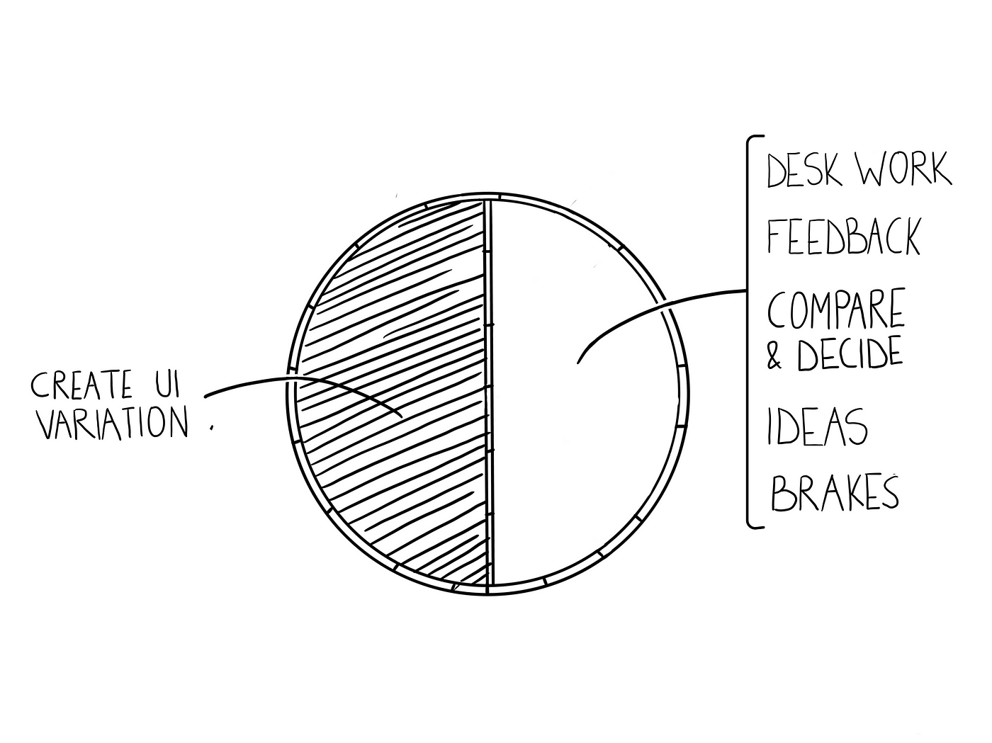
Whenever I mention variation, I’m referring to any amount of change applied to UI element’s properties, which leads to creating a new variant of that element. Whether changing a corner radius from 5 to 4 is actually significant to users’ experiences, is a different question. Now, the industry is already trying to address the challenge in a more generic way, looking at the overall UI design process:
- Full automation: these are products that replace the process entirely, by creating finished UIs based on choices as theme, industry, style. They target a larger audience, but can’t always be fully customised. For example: Wix, Squarespace.
- Component aggregators : these reduce the time needed to build UIs by quickly taking components from a libraries and putting them together, sometimes even automatically. These require a well built library with experts handling it. When used correctly, they provide good starting points. For example: GTP3 Figma plug-in.
- Support tools: these are usually plug-ins that play with basic automation, removing repetitive work or giving access to external assets. They are usually focused on making single tasks more efficient and usually people combine multiple ones at a time. For example: Iconbay, Rename It.
- Collective assets: thankfully, common UI elements or templates can be easily picked up from shared libraries. This saves time and improves consistency, as long as libraries are up to date.
Design tools available now, do very little in addressing efficiency in UI work, given their default configuration. Every new project starts with a blank screen, a few tools and basic shapes. Plug-ins, tool integrations or shared libraries have to be added manually, while each change means direct manipulation of each elements and their properties.
What’s wrong with this ? Well, the ability to handle each pixel pushes some designers into converging on a single variant too quickly, because they spend hours on trying out tiny repetitive changes. Others, probably many more, don’t even have the time to explore them. Since sorting out details is known to be hard work involving repetitive tasks, checking for inspiration, data, continuous comparisons and decisions, they might as well settle with good enough.
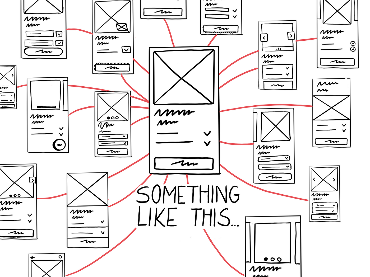
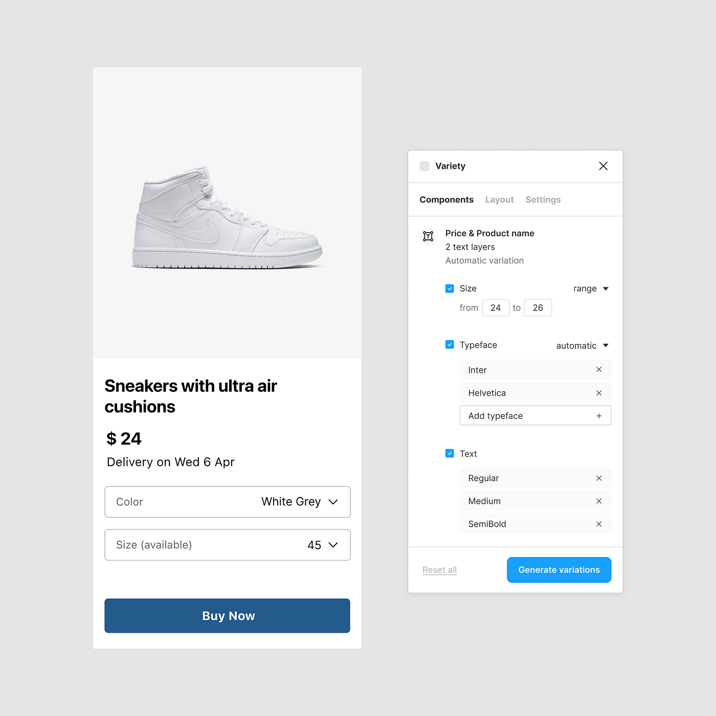
Let’s look at a practical example. The task at hand is to design product details, in a new e-commerce mobile app. Following a lengthy process that involved data analysis, research and ideation, the main elements are identified. Afterwards, a first version of the interface is put together and the time comes to focus on its visual details. Two important elements are the product name and the price. Both texts can be shown in various ways, combining sizes, colours, typeface, and more. Obviously, in order to compare these variations, they must first be created, which involves a few tasks:
- Copy and paste the first version
- Select the product name and price text layers
- Change their properties (could be done more than once)
- Check and adjust spacings across the layout for consistency
- Deselect layers and have a look at the UI (sometimes involves taking a small break or switching context to have a fresh perspective)
- Rename or delete artboard
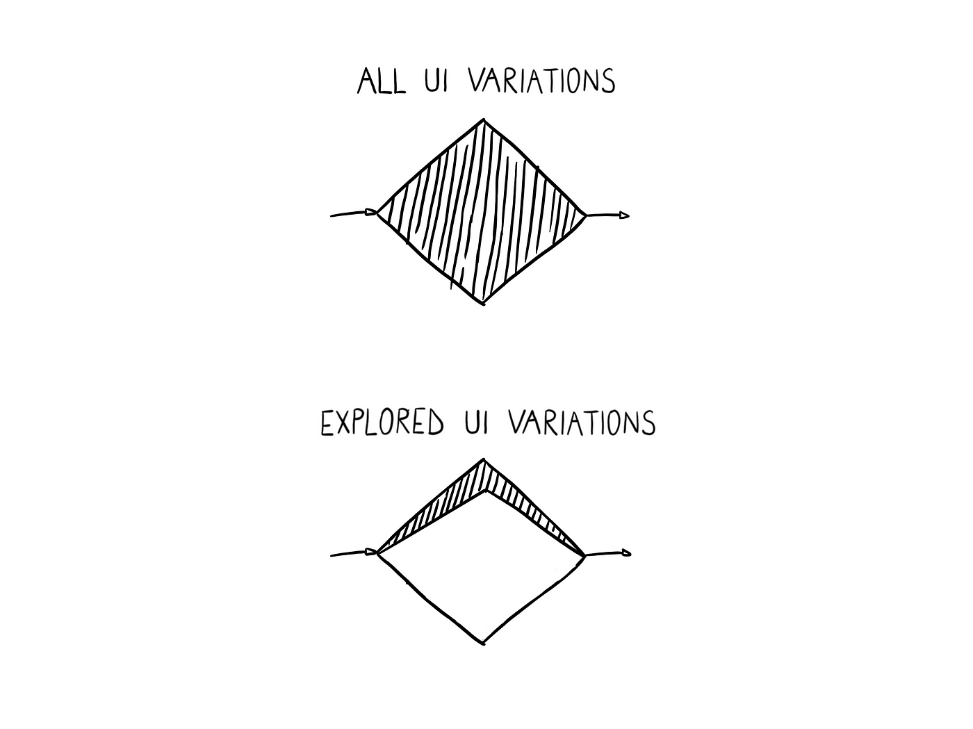
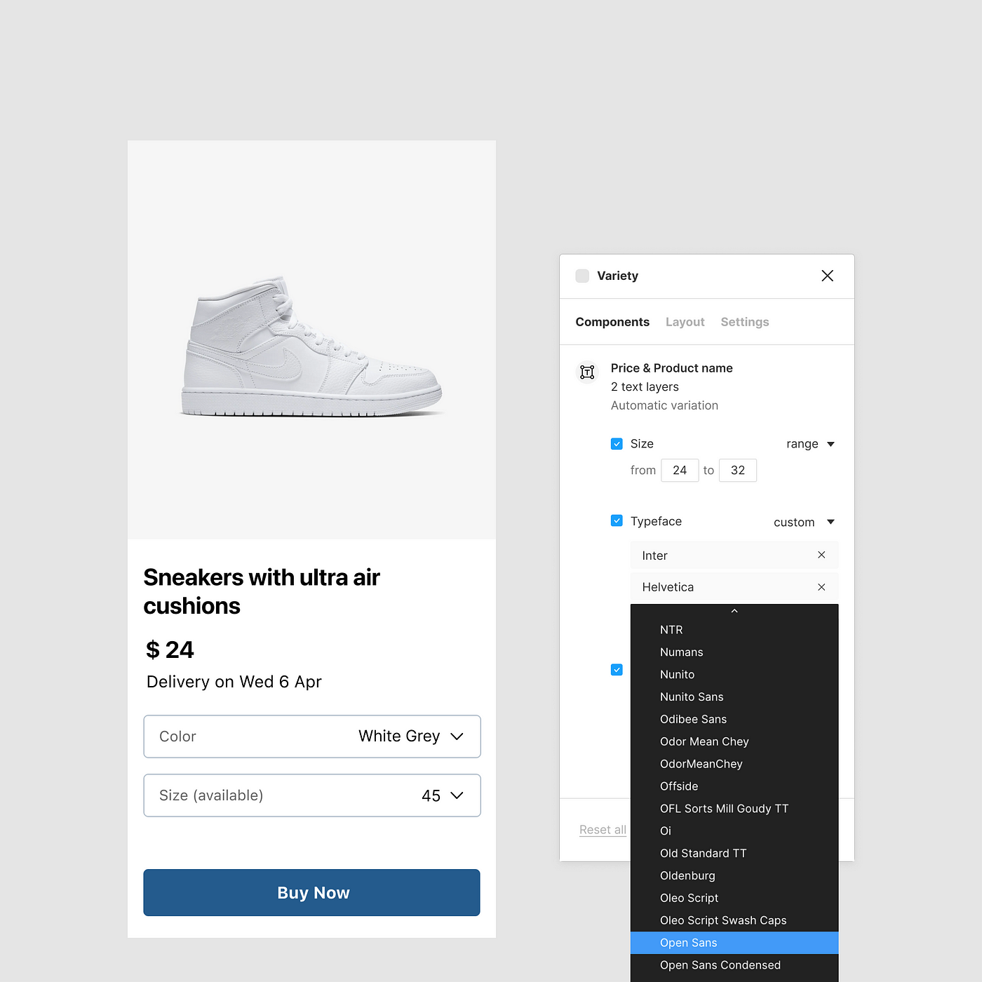
Even a restricted amount of choices as four typefaces and five text sizes, will lead to 20 possible combinations, repeating the above list at least 20 times. Most people would never explore all 20, since our brain doesn’t really work like that. Very few people would start thinking how many posssible combinations there are, to then immediately create them one by one without getting attached to any specific one. It sound like something an automated tool should do. Typography is specifically interesting when it comes to automation, since it’s a core component with clear properties for creating variations:
- typeface (Open Sans, Helvetica, Lato, etc.)
- font (bold, semibold, regular, etc.)
- colour (mostly within black and white range)
We would save valuable time if we could automatically create version for typography used in user interface. We would get to see more variants at once, while also having more time for everything else. The time we spend to find a solution might be the same, but the quality of work would improve.
Even if we exclude a large amount of typefaces from the usual design list we get in design software, because they would never be used in a live product, and the we also exclude detailed properties as line height, letter spacing, the total number of variations would still be impossible to discover manually. Furthermore, if the increment of change is controlled, then variations would also become more relevant. Instead of a designers changing the position of a button by 1dp at a time, an automated tool would move it by 4dp at a time, to make it statistically significant.
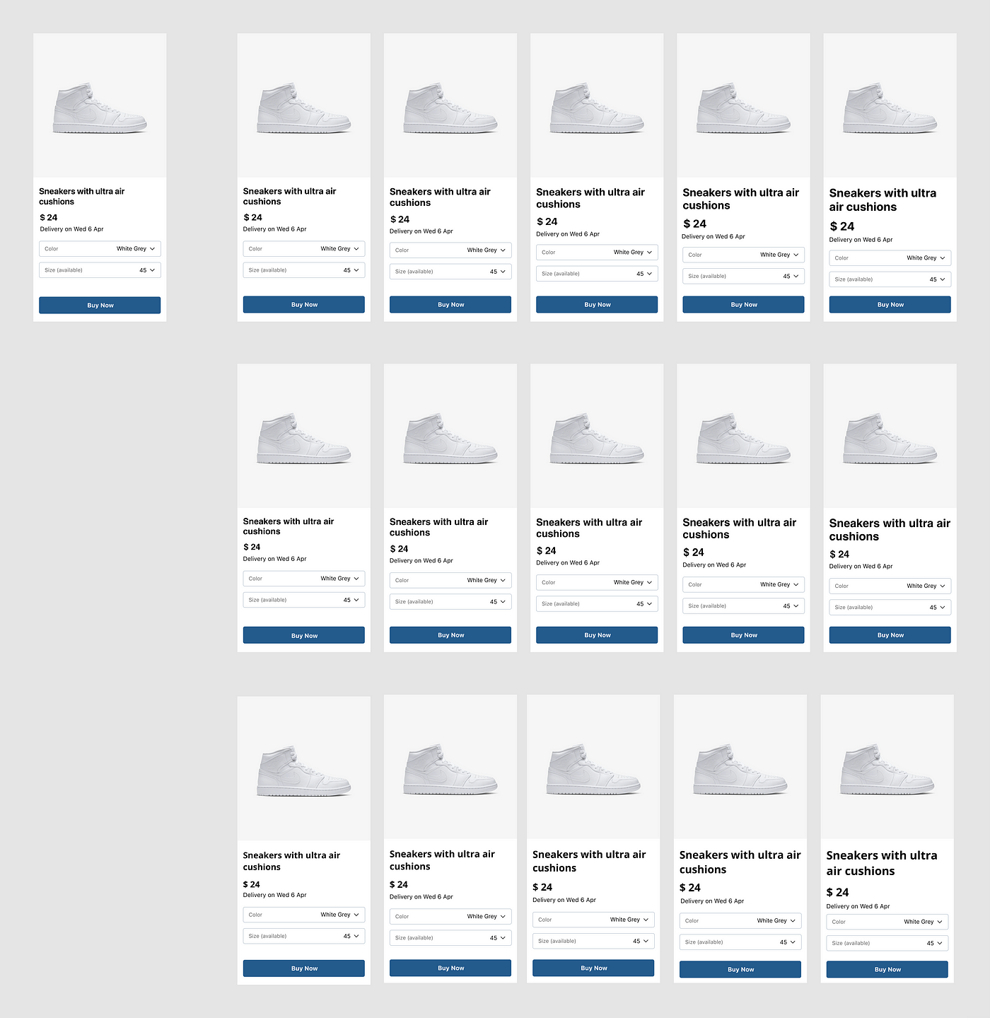
How does this help ? If parameters are used correctly, designers will get to skip dozens of repetitive actions, while also accessing a bunch of new variations they would’ve never made. Eventually it could mix in data based on user ratings, A/B tests run in production, other similar products analytics tools. The downside of using it is that designers will have to sort through many terrible variants, until it becomes more natural and more clear what parts of the UI design process can be passed on to automated tools.
“App rating, really ?” I know, but you get the idea…Ultimately, this would have a huge impact if it’s used across the design process, from individual elements to entire layouts or even flows. At that point, besides the time designers saved, there will also be an impact on improving experiences, and company revenue.
Recommend
About Joyk
Aggregate valuable and interesting links.
Joyk means Joy of geeK