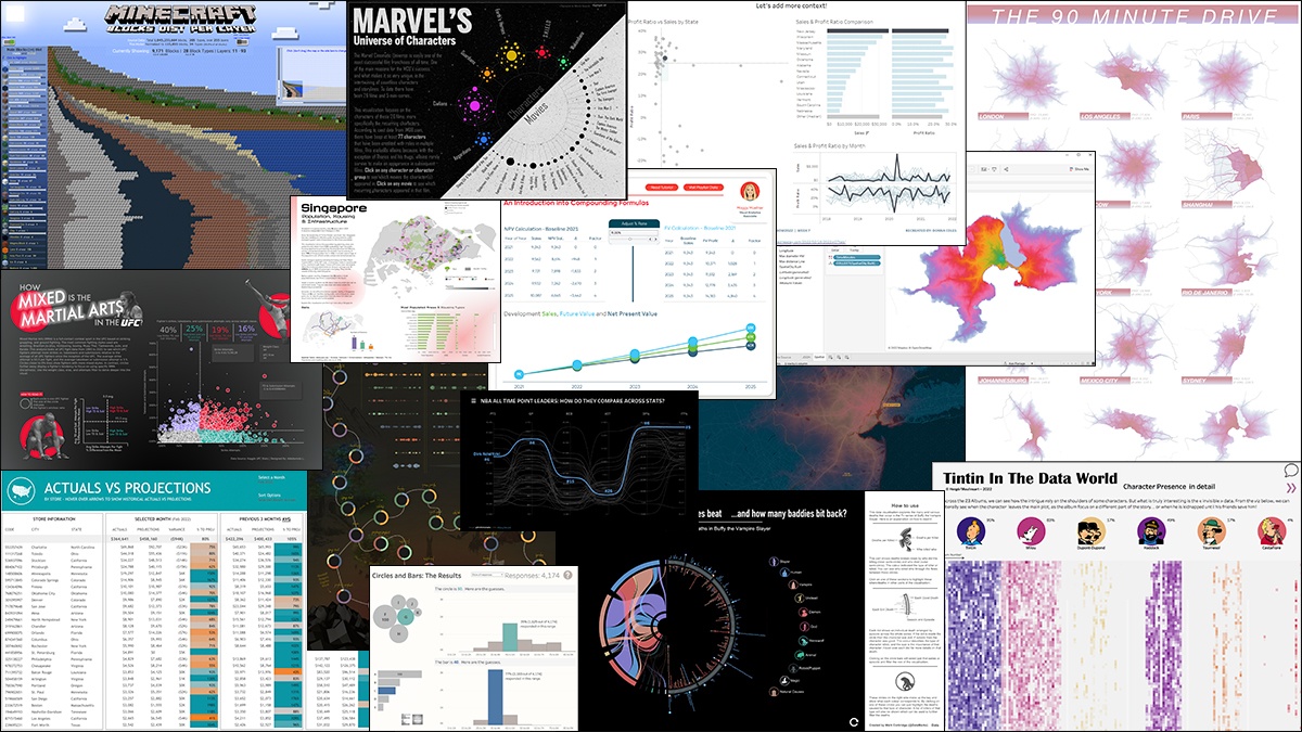

Best of Tableau Web: February 2022
source link: https://www.tableau.com/about/blog/2022/3/best-tableau-web-february-2022
Go to the source link to view the article. You can view the picture content, updated content and better typesetting reading experience. If the link is broken, please click the button below to view the snapshot at that time.

Best of Tableau Web: February 2022
Welcome to Best of Tableau Web—a monthly highlight of tips, tricks, and inspiration from across the internet on Tableau and data visualization. This month's highlight is by Julia Biedry Gonzalez, Tableau lead solution engineer for the United Nations, and Global Philanthropy Chair for Salesforce’s Latinoforce Equality Group.
A leader on the Tableau Solution Engineering team asked me to record a short video about why I love data for our recent team meeting. After thinking about it for a bit, my answer was clear—data has no language and no borders. Data has the power to tell universal stories that are universally understood and the power to make change.
The truly global nature of our data community always blows me away, and I’m reminded of it in my daily work here at Tableau. From our global Tableau User Groups (TUGs) and Tableau Conference to Community Forums and my favorite Twitter hashtag—#DataFam—the community is as strong as it is vast. I want to shout out to all the Community members providing content and blogs to the Tableau Community in multiple languages and making data skills more accessible across the world. Especially near to my heart is team COMUNI[DATOS], who recently celebrated a full year of TUG sessions in Spanish for the Latino/a/x data community, as well as the launch of a new podcast.
Being a part of Tableau Service Corps (TSC) has given me even more exposure to the global community—through TSC I’ve educated data students in Nigeria, visualized data on gender-based violence in Pacific nations, and helped organizations in the U.S. fight homelessness, expand access to education, and expose injustice and inequity, all using data. I love how our global community comes together to use data for advocacy, equity, and change. Community programs like TSC, Viz for Social Good, Diversity in Data, and the Racial Equity Data Hub harness the power of the global community to bring to light the most important data stories and create a more connected, equitable, and inclusive world. This past month was also Black History Month, and I was incredibly inspired by the impactful data stories shared by the community. The DuBois Challenge, for example, which celebrates W.E.B DuBois’s data visualization legacy, has yielded some incredible work.
In these past tumultuous weeks, I’ve been especially thinking about our world community, in the broader sense. My solidarity is with the people of Ukraine and with all across the world who are affected by conflict and violence. When there is a threat to peace anywhere across the world, it affects us all. If you’d like to support organizations working to address this global crisis, here are a few useful resources I’ve found: UNHCR UN Refugee Agency, Flexport, and World Central Kitchen.

With that, let’s dive into this month’s Best of the Tableau Web for February. Be sure to check out the list of blogs that we follow for Best of the Tableau Web. If you don’t see yours on the list, we invite you to add it here.
Formatting, Design, Storytelling
Inspiration
Iron Viz
Tips and Tricks
Visualizations
View last month’s Viz of the Day on Tableau Public gallery.
Recommend
-
 127
127
[原]解密Airbnb 自助BI神器:Superset 颠覆 Tableau Original...
-
 15
15
Red Hat Developer roundup: Best of February 2022 Skip to main content
-
 7
7
Best Android Phones Under $100 (February 2022) (Image credit...
-
 10
10
Design and Web team summary – 25 February 2022 Tags:
-
 7
7
Now available in Tableau 2022.1—Workbook Optimizer, Ask Data Phrase Builder, enhanced enterprise capabilities, and more ...
-
 4
4
Best Android phones: Our top picks for February 2022 Best Andr...
-
 16
16
Best of Tableau Web: March 2022 ...
-
 5
5
The Tableau 2022.1 release includes exciting and powerful capabilities for IT and administrators to help you better manage and scale your analytics with increased efficiency. Let’s take a closer look at what’s included. Deploy
-
 9
9
Tableau 2022.1 introduces a wide range of capabilities designed to improve every stage of data analysis—from data preparation to dashboard consumption. Let’s take a closer look at what’s included for analysts and business users. Perfo...
-
 9
9
Staff picks for Tableau Conference 2022 sessions There’s a lot to take in at Tableau Confere...
About Joyk
Aggregate valuable and interesting links.
Joyk means Joy of geeK