

srcset x vs w : Which to use? In what situation? A simple guide.
source link: https://dev.to/livefiredev/srcset-x-vs-w-which-to-use-in-what-situation-a-simple-guide-3b85
Go to the source link to view the article. You can view the picture content, updated content and better typesetting reading experience. If the link is broken, please click the button below to view the snapshot at that time.


srcset x vs w : Which to use? In what situation? A simple guide.
When I first understood “srcset”, I had the same doubt. Why are there 2 units? An “x” and a “w”. Which should I use? Why? So, this article aims to resolve the “srcset x vs w” question.
Summary: The “x” unit is to be used in simple situations. When the image stays in the same place and takes up the same space (roughly) on all screen sizes. It’s a simple way to let the browser choose a higher resolution image based on the “devicePixelRatio”. The “w” unit is used when the image takes up more or less of the screen width based on device / layout / orientation etc.
Why does “srcset” Have 2 Units?
The two units are to be used in 2 different situations.
We will call these situations:
- The simple case
- The responsive layout case
The simple case syntax is simple. The responsive case syntax is more elaborate.
Let’s look at what all this means…
When To Use “x” (The simple case: Roughly the same on all screens)
The perfect example for this would be something like a logo.
As you can see, the logo stays in the nav bar in the same place on the desktop and the mobile.
But, the issue is that different devices have different “pixel densities”.
If you are not clear on what that is, I suggest learning about it from Steve Jobs himself. (By the way, this is what a ‘retina display’ is. In case you have heard of that.)
So, there are pixels that the browser tells you about. And there are actual pixels. Many “actual” pixels might be packed into a single “virtual or logical” pixel.
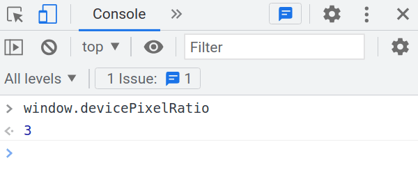
As you can see above, Chrome seems to think that the iPhone12 is 390px in width.
But, according to the Apple website, the width is 1170px.
You see, an iPhone 12 has a pixel density of 3. And the device I am writing on right now is a laptop. It has a pixel density of 1.
You can even check what pixel density a device has with a small piece of Javascript:
So, the way we get to 1170px number is:
390 x 3 = 1170
What Is The Impact Of All This?
To fill up “200px” width with a logo on an iPhone12, you will need to use a 600px image! That seems crazy. But, if you do not do it, you will get a blurry logo on an iPhone 12!
So, how to solve this problem?
A Bad Solution (Don’t do this!)
When you need to fill up 200px width, use a 600px image on all screen sizes. The image will always be crisp.
The downside is that the image is way bigger than necessary on a lot of screens with a lower pixel density.
A Better Solution: “The ‘x’ unit with srcset”
Give the browser all 3 different sizes and let it decide based on the devicePixelRatio. Perfect, crisp images every time. Images will not be any larger than they need to be.
What Mozilla Developer Network (MDN) Official Article Has To Say (So that you know it’s not just my thoughts)
You can check out the whole article on responsive images here. But below I am going to quote the relevant part:
Resolution switching: Same size, different resolutions
If you’re supporting multiple display resolutions, but everyone sees your image at the same real-world size on the screen, you can allow the browser to choose an appropriate resolution image by using srcset with x-descriptors and without sizes — a somewhat easier syntax!
How To Use The “x” Unit?
The best part about the “x” unit is that the code is much simpler than the “w” unit. Just give the browser a set of sources with different sizes, and you’re done.
<img srcset="http://placehold.jp/200x50.png 1x,
             http://placehold.jp/400x100.png 2x,
             http://placehold.jp/600x150.png 3x,
             http://placehold.jp/800x200.png 4x"
src="http://placehold.jp/800x200.png">
Enter fullscreen mode
Exit fullscreen mode
(Side note: If you are thinking, “OMG! Now I have to create all these different image sizes!” Don’t panic. It’s easy. You need to use an Image CDN)
As you can see above, it’s just a set of sources. Next to each one is the “pixelDensity” that the URL is perfect for.
With this, the browser can do its thing, and you can step back and forget about it.
What Sizes Should You Create When Using “x”?
So, according to this article maintained by Google, you need to create 4 versions. Below is the quote from the page:
These days most devices have a device-pixel-ratio between 1.0 and 4.0.
As you might have noticed from Steve Jobs’s video above, the human eye cannot handle any higher pixel density. The images would just look the same.
This means that since human hardware is likely to stay the same for the next many years, we just need to worry about these 4 sizes.
If you have doubts about how one creates 4 image versions, you use an ImageCDN. You don’t have to do it manually.
When To Use “w” (The responsive layout case)
Nowadays, most pages are responsive. We change the layout of the page, based on the device screen. Take the example below:

On the desktop, the image takes up half the screen. On the mobile, it takes up the complete screen width.
This is the situation where we need the “w” unit.
“w” stands for “width” and using this unit along with the “sizes” attribute, we tell the browser how much of the width of the screen the image is going to take up. All of these help the browser figure out which image it should use.
How To Use The “w” Unit
This is what the code looks like:
<img src="https://placehold.jp/576x576.png"
srcset="https://placehold.jp/576x576.png 576w,
           https://placehold.jp/768x768.png 768w,
           https://placehold.jp/992x992.png 992w,
           https://placehold.jp/600x600.png 600w,
           https://placehold.jp/700x700.png 700w,
           https://placehold.jp/960x960.png 960w"
sizes="(min-width: 992px) 50vw, 100vw"
/>
Enter fullscreen mode
Exit fullscreen mode
(By the way: If you are thinking, “OMG! Now I have to create all these different image sizes!” Don’t panic. It’s easy. You need to use an Image CDN)
Let me break up the code and explain it all:
<img src="
Enter fullscreen mode
Exit fullscreen mode
It’s a normal IMG tag that you know from your very first day of HTML.
srcset="https://placehold.jp/576x576.png 576w,
            https://placehold.jp/768x768.png 768w,
            https://placehold.jp/992x992.png 992w,
            https://placehold.jp/600x600.png 600w,
            https://placehold.jp/700x700.png 700w,
            https://placehold.jp/960x960.png 960w,
            https://placehold.jp/1200x1200.png 1200w,
            https://placehold.jp/1500x1500.png 1500w,
            https://placehold.jp/1700x1700.png 1700w,
            https://placehold.jp/1920x1920.png 1920w"
Enter fullscreen mode
Exit fullscreen mode
There is a new attribute called: ‘srcset’ which is a “set of sources”.
Each source has 2 parts: URL & Size in a unit “w”
https://placehold.jp/768x768.png 768w
Enter fullscreen mode
Exit fullscreen mode
The “w” unit might seem weird at first. It’s just used to tell the browser: “width of the image in px”. Height does not matter.
sizes="(min-width: 992px) 50vw, 100vw"
Enter fullscreen mode
Exit fullscreen mode
There is also a “sizes” attribute. It tells the browser, that depending on the screen size, what part of the screen or “vw” or “viewport width” does the image take up. As you can see, it’s like a media query.
(min-width: 992px) 50vw, 100vw
Enter fullscreen mode
Exit fullscreen mode
In the above case, it says: for a min width of 992px and above (a desktop) it takes up 50% or 50vw of the screen.
And anything that does not match a previous condition, it takes up 100 viewport width.
What Sizes Should You Create When Using “w”?
A good way to decide on the image size is to follow what NextJS (a JS framework that has srcset built in) is doing. By default, there are the size they generate: 640, 750, 828, 1080, 1200, 1920, 2048, 3840
Yes, that is a lot of sizes. I agree. It’s going to be a pain to generate all of them. So, let me share with you some tips for getting it does painlessly.
How Do You Make So Many Sizes?
You have to use an ImageCDN. Basically it’s a service, you can generate as many image sizes you want on the fly by changing the URL slightly.
For example:
To generate the above image, I have used the ImageKit.io CDN. It has very generous free plan: 20 GB bandwidth & 20 GB media storage.
Also, it supports a wide variety of platforms
Closing Notes & Conclusion
- I hope this helps close all your doubts around “srcset x vs w”
- Use “x” when you just need bigger images for higher devicePixelRatios
- Use “w” when there is a responsive layout involved.
Recommend
-
89
Attention. This project is not maintained any more !!! vlayout 中文文档 Projects of Tangram Android Project
-
7
关于图片img的响应属性srcset,和sizes及picture,很久之前看过,但是因为浏览器兼容原因,一直没有在项目中使用,但是最近发现,这几个属性兼容性还可以了,可以去caniuse中看一下,基本可以在项目中使用了。今天,简单介绍一下这几个属性。 srcset 和...
-
5
Responsive images – when to use x or w units in the img srcset There are two ways we can express the srcset attribute. Both do the same thing: responsive images - serving the appropriate image with the appropri...
-
9
Jesse Fulton Posted on Dec 19, 2017...
-
5
-
7
by zhangxinxu from http://www.zhangxinxu.com 本文地址:http://www.zhangxinxu.com/wordpress/?p=4371
-
10
Angelika Salmen March 16, 2022 4 minute read ...
-
5
img标签的srcset属性更新日期: 2022-06-06阅读量: 18标签: 标签分享...
-
6
Use every situation as an opportunity to learn Tip for the day: Software development is a career of continual learning. There’s always something...
-
6
A Beginner's Guide: Responsive Images With srcsetA Beginner's Guide: Responsive Images With srcsetJune 23rd 2023 New Story by
About Joyk
Aggregate valuable and interesting links.
Joyk means Joy of geeK