
1

【Echarts项目】前端就业数据可视化(HTML+Less+JavaScript+jQuery)入门级
source link: https://blog.csdn.net/qq_23073811/article/details/123573109
Go to the source link to view the article. You can view the picture content, updated content and better typesetting reading experience. If the link is broken, please click the button below to view the snapshot at that time.

在线体验(推荐)
https://yangyanyan.top/echarts-jobmap/
记得给个star
https://gitee.com/yyy1203/echarts-jobmap.git
很详细喔,跟着我的教程来,很简单哒
https://blog.csdn.net/qq_23073811/article/details/123425963
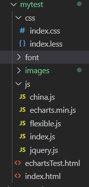
文件架构以及部分源码展示
- 架构其实就是简单的前端三剑客
部分源码展示
核心代码index.js,主要包含对echarts的配置
// 柱状图模块1 左边纵向
(function () { // 立即执行函数
// 1实例化对象
var myChart = echarts.init(document.querySelector(".bar1 .chart"));
// 2. 指定配置项和数据
var option = {
color: ["#2f89cf"],
tooltip: {
trigger: "axis",
axisPointer: {
// 坐标轴指示器,坐标轴触发有效
type: "shadow" // 默认为直线,可选为:'line' | 'shadow'
}
},
// 修改图表的大小
grid: {
left: "0%",
top: "10px",
right: "0%",
bottom: "4%",
containLabel: true
},
// x轴
xAxis: [{
type: "category",
data: [
"旅游行业",
"教育培训",
"游戏行业",
"医疗行业",
"电商行业",
"社交行业",
"金融行业"
],
axisTick: {
alignWithLabel: true
},
// 修改刻度标签 相关样式
axisLabel: {
color: "rgba(255,255,255,.6)",
fontSize: 10
},
// 不显示x坐标轴的样式
axisLine: {
show: false
}
}],
// y轴
yAxis: [{
type: "value",
// 修改刻度标签 相关样式
axisLabel: {
color: "rgba(255,255,255,.6) ",
fontSize: 12
},
// y轴的线条改为了 2像素
axisLine: {
lineStyle: {
color: "rgba(255,255,255,.1)",
width: 2
}
},
// y轴分割线的颜色
splitLine: {
lineStyle: {
color: "rgba(255,255,255,.1)"
}
}
}],
series: [{
name: "直接访问",
type: "bar",
barWidth: "35%",
data: [200, 300, 300, 900, 1500, 1200, 600],
itemStyle: {
// 修改柱子圆角
barBorderRadius: 5
}
}]
};
// 3. 把配置项给实例对象
myChart.setOption(option);
// 4. 让图表跟随屏幕自动的去适应
window.addEventListener("resize", function () {
myChart.resize();
});
})();
// 柱状图2 横向
(function () {
var myColor = ["#1089E7", "#F57474", "#56D0E3", "#F8B448", "#8B78F6"];
// 1. 实例化对象
var myChart = echarts.init(document.querySelector(".bar2 .chart"));
// 2. 指定配置和数据
var option = {
grid: {
top: "10%",
left: "22%",
bottom: "10%"
// containLabel: true
},
// 不显示x轴的相关信息
xAxis: {
show: false
},
yAxis: [
// 两组y轴数据 左右
{
type: "category",
inverse: true, // 反转坐标轴
data: ["HTML5", "CSS3", "javascript", "VUE", "NODE"],
// 不显示y轴的线
axisLine: {
show: false
},
// 不显示刻度
axisTick: {
show: false
},
// 把刻度标签里面的文字颜色设置为白色
axisLabel: {
color: "#fff"
}
},
{
data: [702, 350, 610, 793, 664],
inverse: true,
// 不显示y轴的线
axisLine: {
show: false
},
// 不显示刻度
axisTick: {
show: false
},
// 把刻度标签里面的文字颜色设置为白色
axisLabel: {
color: "#fff"
}
}
],
series: [
// 两组数据重叠成一个
{
name: "条",
type: "bar",
data: [70, 34, 60, 78, 69],
yAxisIndex: 0, // 类似z-index
// 修改第一组柱子的圆角
itemStyle: {
barBorderRadius: 20,
// 此时的color 可以修改柱子的颜色
color: function (params) {
// params 传进来的是柱子对象
// console.log(params);
// dataIndex 是当前柱子的索引号
return myColor[params.dataIndex];
}
},
// 柱子之间的距离
barCategoryGap: 50,
//柱子的宽度
barWidth: 10,
// 显示柱子内的文字
label: {
show: true,
position: "inside",
// {c} 会自动的解析为 数据 data里面的数据
formatter: "{c}%"
}
},
{
name: "框",
type: "bar",
barCategoryGap: 50,
barWidth: 15,
yAxisIndex: 1,
data: [100, 100, 100, 100, 100],
itemStyle: {
color: "none",
borderColor: "#00c1de",
borderWidth: 3,
barBorderRadius: 15
}
}
]
};
// 3. 把配置给实例对象
myChart.setOption(option);
// 4. 让图表跟随屏幕自动的去适应
window.addEventListener("resize", function () {
myChart.resize();
});
})();
// 折线图1模块制作 左边
(function () {
// 年份数据
var yearData = [{
year: "2020", // 年份
data: [
// 两个数组是因为有两条线
[24, 40, 101, 134, 90, 230, 210, 230, 120, 230, 210, 120],
[40, 64, 191, 324, 290, 330, 310, 213, 180, 200, 180, 79]
]
},
{
year: "2021", // 年份
data: [
// 两个数组是因为有两条线
[123, 175, 112, 197, 121, 67, 98, 21, 43, 64, 76, 38],
[143, 131, 165, 123, 178, 21, 82, 64, 43, 60, 19, 34]
]
}
];
// 1. 实例化对象
var myChart = echarts.init(document.querySelector(".line1 .chart"));
// 2.指定配置
var option = {
// 通过这个color修改两条线的颜色
color: ["#00f2f1", "#ed3f35"],
tooltip: {
trigger: "axis"
},
legend: {
// 如果series 对象有name 值,则 legend可以不用写data
// 修改图例组件 文字颜色
textStyle: {
color: "#4c9bfd"
},
// 这个10% 必须加引号
right: "10%"
},
grid: {
top: "20%",
left: "3%",
right: "4%",
bottom: "3%",
show: true, // 显示边框
borderColor: "#012f4a", // 边框颜色
containLabel: true // 包含刻度文字在内
},
xAxis: {
type: "category",
boundaryGap: false,
data: [
"1月",
"2月",
"3月",
"4月",
"5月",
"6月",
"7月",
"8月",
"9月",
"10月",
"11月",
"12月"
],
axisTick: {
show: false // 去除刻度线
},
axisLabel: {
color: "#4c9bfd" // 文本颜色
},
axisLine: {
show: false // 去除轴线
}
},
yAxis: {
type: "value",
axisTick: {
show: false // 去除刻度线
},
axisLabel: {
color: "#4c9bfd" // 文本颜色
},
axisLine: {
show: false // 去除轴线
},
splitLine: {
lineStyle: {
color: "#012f4a" // 分割线颜色
}
}
},
series: [{
name: "新增粉丝",
type: "line",
// smooth:true 可以让我们的折线显示带有弧度
smooth: true,
data: yearData[0].data[0]
},
{
name: "新增游客",
type: "line",
smooth: true,
data: yearData[0].data[1]
}
]
};
// 3. 把配置给实例对象
myChart.setOption(option);
// 4. 让图表跟随屏幕自动的去适应
window.addEventListener("resize", function () {
myChart.resize();
});
// 5.点击切换效果
$(".line h2").on("click", "a", function () {
// alert(1);
// console.log($(this).index());
// 点击 a 之后 根据当前a的索引号 找到对应的 yearData的相关对象
// console.log(yearData[$(this).index()]);
var obj = yearData[$(this).index()];
option.series[0].data = obj.data[0];
option.series[1].data = obj.data[1];
// 需要重新渲染
myChart.setOption(option);
});
})();
// 折线图2 模块制作
(function () {
var myChart = echarts.init(document.querySelector(".line2 .chart"));
var option = {
tooltip: {
trigger: "axis"
},
legend: {
top: "0%",
textStyle: {
color: "rgba(255,255,255,.5)",
fontSize: "12"
}
},
grid: {
left: "10",
top: "30",
right: "10",
bottom: "10",
containLabel: true
},
xAxis: [{
type: "category",
boundaryGap: false,
// x轴更换数据
data: [
"01",
"02",
"03",
"04",
"05",
"06",
"07",
"08",
"09",
"10",
"11",
"12",
"13",
"14",
"15",
"16",
"17",
"18",
"19",
"20",
"21",
"22",
"23",
"24",
"25",
"26",
"26",
"28",
"29",
"30"
],
// 文本颜色为rgba(255,255,255,.6) 文字大小为 12
axisLabel: {
textStyle: {
color: "rgba(255,255,255,.6)",
fontSize: 12
}
},
// x轴线的颜色为 rgba(255,255,255,.2)
axisLine: {
lineStyle: {
color: "rgba(255,255,255,.2)"
}
}
}],
yAxis: [{
type: "value",
axisTick: {
show: false
},
axisLine: {
lineStyle: {
color: "rgba(255,255,255,.1)"
}
},
axisLabel: {
textStyle: {
color: "rgba(255,255,255,.6)",
fontSize: 12
}
},
// 修改分割线的颜色
splitLine: {
lineStyle: {
color: "rgba(255,255,255,.1)"
}
}
}],
series: [{
name: "播放量",
type: "line",
smooth: true,
// 单独修改当前线条的样式
lineStyle: {
color: "#0184d5",
width: "2"
},
// 填充颜色设置
areaStyle: {
color: new echarts.graphic.LinearGradient(
0,
0,
0,
1,
[{
offset: 0,
color: "rgba(1, 132, 213, 0.4)" // 渐变色的起始颜色
},
{
offset: 0.8,
color: "rgba(1, 132, 213, 0.1)" // 渐变线的结束颜色
}
],
false
),
shadowColor: "rgba(0, 0, 0, 0.1)"
},
// 设置拐点
symbol: "circle",
// 拐点大小
symbolSize: 8,
// 开始不显示拐点, 鼠标经过显示
showSymbol: false,
// 设置拐点颜色以及边框
itemStyle: {
color: "#0184d5",
borderColor: "rgba(221, 220, 107, .1)",
borderWidth: 12
},
data: [
30,
40,
30,
40,
30,
40,
30,
60,
20,
40,
30,
40,
30,
40,
30,
40,
30,
60,
20,
40,
30,
40,
30,
40,
30,
40,
20,
60,
50,
40
]
},
{
name: "转发量",
type: "line",
smooth: true,
lineStyle: {
normal: {
color: "#00d887",
width: 2
}
},
areaStyle: {
normal: {
color: new echarts.graphic.LinearGradient(
0,
0,
0,
1,
[{
offset: 0,
color: "rgba(0, 216, 135, 0.4)"
},
{
offset: 0.8,
color: "rgba(0, 216, 135, 0.1)"
}
],
false
),
shadowColor: "rgba(0, 0, 0, 0.1)"
}
},
// 设置拐点 小圆点
symbol: "circle",
// 拐点大小
symbolSize: 5,
// 设置拐点颜色以及边框
itemStyle: {
color: "#00d887",
borderColor: "rgba(221, 220, 107, .1)",
borderWidth: 12
},
// 开始不显示拐点, 鼠标经过显示
showSymbol: false,
data: [
130,
10,
20,
40,
30,
40,
80,
60,
20,
40,
90,
40,
20,
140,
30,
40,
130,
20,
20,
40,
80,
70,
30,
40,
30,
120,
20,
99,
50,
20
]
}
]
};
myChart.setOption(option);
// 4. 让图表跟随屏幕自动的去适应
window.addEventListener("resize", function () {
myChart.resize();
});
})();
// 饼形图1
(function () {
// 1. 实例化对象
var myChart = echarts.init(document.querySelector(".pie1 .chart"));
// 2.指定配置
var option = {
color: ["#065aab", "#066eab", "#0682ab", "#0696ab", "#06a0ab"],
tooltip: {
trigger: "item",
formatter: "{a} <br/>{b}: {c} ({d}%)"
},
legend: {
bottom: "0%",
// 修改小图标的大小
itemWidth: 10,
itemHeight: 10,
// 修改图例组件的文字为 12px
textStyle: {
color: "rgba(255,255,255,.5)",
fontSize: "12"
}
},
series: [{
name: "年龄分布",
type: "pie",
// 这个radius可以修改饼形图的大小
// radius 第一个值是内圆的半径 第二个值是外圆的半径
radius: ["40%", "60%"],
center: ["50%", "45%"],
avoidLabelOverlap: false,
// 图形上的文字
label: {
show: false,
position: "center"
},
// 链接文字和图形的线是否显示
labelLine: {
show: false
},
data: [{
value: 1,
name: "0岁以下"
},
{
value: 4,
name: "20-29岁"
},
{
value: 2,
name: "30-39岁"
},
{
value: 2,
name: "40-49岁"
},
{
value: 1,
name: "50岁以上"
}
]
}]
};
// 3. 把配置给实例对象
myChart.setOption(option);
// 4. 让图表跟随屏幕自动的去适应
window.addEventListener("resize", function () {
myChart.resize();
});
})();
// 饼形图2 地区分布模块
(function () {
var myChart = echarts.init(document.querySelector(".pie2 .chart"));
var option = {
color: [
"#006cff",
"#60cda0",
"#ed8884",
"#ff9f7f",
"#0096ff",
"#9fe6b8",
"#32c5e9",
"#1d9dff"
],
tooltip: {
trigger: "item",
formatter: "{a} <br/>{b} : {c} ({d}%)"
},
legend: {
bottom: "0%",
itemWidth: 10,
itemHeight: 10,
textStyle: {
color: "rgba(255,255,255,.5)",
fontSize: "12"
}
},
series: [{
name: "地区分布",
type: "pie",
radius: ["10%", "70%"],
center: ["50%", "50%"],
roseType: "radius", // 半径模式
// 图形的文字标签
label: {
fontSize: 10
},
// 链接图形和文字的线条
labelLine: {
// length 链接图形的线条
length: 6,
// length2 链接文字的线条
length2: 8
},
data: [{
value: 20,
name: "云南"
},
{
value: 26,
name: "北京"
},
{
value: 24,
name: "山东"
},
{
value: 25,
name: "河北"
},
{
value: 20,
name: "江苏"
},
{
value: 25,
name: "浙江"
},
{
value: 30,
name: "四川"
},
{
value: 42,
name: "湖北"
}
]
}]
};
myChart.setOption(option);
// 监听浏览器缩放,图表对象调用缩放resize函数
window.addEventListener("resize", function () {
myChart.resize();
});
})();
// 模拟飞行路线模块地图模块
(function() {
var myChart = echarts.init(document.querySelector(".map .chart"));
var geoCoordMap = {
上海: [121.4648, 31.2891],
东莞: [113.8953, 22.901],
东营: [118.7073, 37.5513],
中山: [113.4229, 22.478],
临汾: [111.4783, 36.1615],
临沂: [118.3118, 35.2936],
丹东: [124.541, 40.4242],
丽水: [119.5642, 28.1854],
乌鲁木齐: [87.9236, 43.5883],
佛山: [112.8955, 23.1097],
保定: [115.0488, 39.0948],
兰州: [103.5901, 36.3043],
包头: [110.3467, 41.4899],
北京: [116.4551, 40.2539],
北海: [109.314, 21.6211],
南京: [118.8062, 31.9208],
南宁: [108.479, 23.1152],
南昌: [116.0046, 28.6633],
南通: [121.1023, 32.1625],
厦门: [118.1689, 24.6478],
台州: [121.1353, 28.6688],
合肥: [117.29, 32.0581],
呼和浩特: [111.4124, 40.4901],
咸阳: [108.4131, 34.8706],
哈尔滨: [127.9688, 45.368],
唐山: [118.4766, 39.6826],
嘉兴: [120.9155, 30.6354],
大同: [113.7854, 39.8035],
大连: [122.2229, 39.4409],
天津: [117.4219, 39.4189],
太原: [112.3352, 37.9413],
威海: [121.9482, 37.1393],
宁波: [121.5967, 29.6466],
宝鸡: [107.1826, 34.3433],
宿迁: [118.5535, 33.7775],
常州: [119.4543, 31.5582],
广州: [113.5107, 23.2196],
廊坊: [116.521, 39.0509],
延安: [109.1052, 36.4252],
张家口: [115.1477, 40.8527],
徐州: [117.5208, 34.3268],
德州: [116.6858, 37.2107],
惠州: [114.6204, 23.1647],
成都: [103.9526, 30.7617],
扬州: [119.4653, 32.8162],
承德: [117.5757, 41.4075],
拉萨: [91.1865, 30.1465],
无锡: [120.3442, 31.5527],
日照: [119.2786, 35.5023],
昆明: [102.9199, 25.4663],
杭州: [119.5313, 29.8773],
枣庄: [117.323, 34.8926],
柳州: [109.3799, 24.9774],
株洲: [113.5327, 27.0319],
武汉: [114.3896, 30.6628],
汕头: [117.1692, 23.3405],
江门: [112.6318, 22.1484],
沈阳: [123.1238, 42.1216],
沧州: [116.8286, 38.2104],
河源: [114.917, 23.9722],
泉州: [118.3228, 25.1147],
泰安: [117.0264, 36.0516],
泰州: [120.0586, 32.5525],
济南: [117.1582, 36.8701],
济宁: [116.8286, 35.3375],
海口: [110.3893, 19.8516],
淄博: [118.0371, 36.6064],
淮安: [118.927, 33.4039],
深圳: [114.5435, 22.5439],
清远: [112.9175, 24.3292],
温州: [120.498, 27.8119],
渭南: [109.7864, 35.0299],
湖州: [119.8608, 30.7782],
湘潭: [112.5439, 27.7075],
滨州: [117.8174, 37.4963],
潍坊: [119.0918, 36.524],
烟台: [120.7397, 37.5128],
玉溪: [101.9312, 23.8898],
珠海: [113.7305, 22.1155],
盐城: [120.2234, 33.5577],
盘锦: [121.9482, 41.0449],
石家庄: [114.4995, 38.1006],
福州: [119.4543, 25.9222],
秦皇岛: [119.2126, 40.0232],
绍兴: [120.564, 29.7565],
聊城: [115.9167, 36.4032],
肇庆: [112.1265, 23.5822],
舟山: [122.2559, 30.2234],
苏州: [120.6519, 31.3989],
莱芜: [117.6526, 36.2714],
菏泽: [115.6201, 35.2057],
营口: [122.4316, 40.4297],
葫芦岛: [120.1575, 40.578],
衡水: [115.8838, 37.7161],
衢州: [118.6853, 28.8666],
西宁: [101.4038, 36.8207],
西安: [109.1162, 34.2004],
贵阳: [106.6992, 26.7682],
连云港: [119.1248, 34.552],
邢台: [114.8071, 37.2821],
邯郸: [114.4775, 36.535],
郑州: [113.4668, 34.6234],
鄂尔多斯: [108.9734, 39.2487],
重庆: [107.7539, 30.1904],
金华: [120.0037, 29.1028],
铜川: [109.0393, 35.1947],
银川: [106.3586, 38.1775],
镇江: [119.4763, 31.9702],
长春: [125.8154, 44.2584],
长沙: [113.0823, 28.2568],
长治: [112.8625, 36.4746],
阳泉: [113.4778, 38.0951],
青岛: [120.4651, 36.3373],
韶关: [113.7964, 24.7028]
};
var XAData = [
[{ name: "西安" }, { name: "拉萨", value: 100 }],
[{ name: "西安" }, { name: "上海", value: 100 }],
[{ name: "西安" }, { name: "广州", value: 100 }],
[{ name: "西安" }, { name: "西宁", value: 100 }],
[{ name: "西安" }, { name: "银川", value: 100 }]
];
var XNData = [
[{ name: "西宁" }, { name: "北京", value: 100 }],
[{ name: "西宁" }, { name: "上海", value: 100 }],
[{ name: "西宁" }, { name: "广州", value: 100 }],
[{ name: "西宁" }, { name: "西安", value: 100 }],
[{ name: "西宁" }, { name: "银川", value: 100 }]
];
var YCData = [
[{ name: "拉萨" }, { name: "潍坊", value: 100 }],
[{ name: "拉萨" }, { name: "哈尔滨", value: 100 }],
[{ name: "银川" }, { name: "上海", value: 100 }],
[{ name: "银川" }, { name: "西安", value: 100 }],
[{ name: "银川" }, { name: "西宁", value: 100 }]
];
var planePath =
"path://M1705.06,1318.313v-89.254l-319.9-221.799l0.073-208.063c0.521-84.662-26.629-121.796-63.961-121.491c-37.332-0.305-64.482,36.829-63.961,121.491l0.073,208.063l-319.9,221.799v89.254l330.343-157.288l12.238,241.308l-134.449,92.931l0.531,42.034l175.125-42.917l175.125,42.917l0.531-42.034l-134.449-92.931l12.238-241.308L1705.06,1318.313z";
//var planePath = 'arrow';
var convertData = function(data) {
var res = [];
for (var i = 0; i < data.length; i++) {
var dataItem = data[i];
var fromCoord = geoCoordMap[dataItem[0].name];
var toCoord = geoCoordMap[dataItem[1].name];
if (fromCoord && toCoord) {
res.push({
fromName: dataItem[0].name,
toName: dataItem[1].name,
coords: [fromCoord, toCoord],
value: dataItem[1].value
});
}
}
return res;
};
var color = ["#a6c84c", "#ffa022", "#46bee9"]; //航线的颜色
var series = [];
[
["西安", XAData],
["西宁", XNData],
["银川", YCData]
].forEach(function(item, i) {
series.push(
{
name: item[0] + " Top3",
type: "lines",
zlevel: 1,
effect: {
show: true,
period: 6,
trailLength: 0.7,
color: "red", //arrow箭头的颜色
symbolSize: 3
},
lineStyle: {
normal: {
color: color[i],
width: 0,
curveness: 0.2
}
},
data: convertData(item[1])
},
{
name: item[0] + " Top3",
type: "lines",
zlevel: 2,
symbol: ["none", "arrow"],
symbolSize: 10,
effect: {
show: true,
period: 6,
trailLength: 0,
symbol: planePath,
symbolSize: 15
},
lineStyle: {
normal: {
color: color[i],
width: 1,
opacity: 0.6,
curveness: 0.2
}
},
data: convertData(item[1])
},
{
name: item[0] + " Top3",
type: "effectScatter",
coordinateSystem: "geo",
zlevel: 2,
rippleEffect: {
brushType: "stroke"
},
label: {
normal: {
show: true,
position: "right",
formatter: "{b}"
}
},
symbolSize: function(val) {
return val[2] / 8;
},
itemStyle: {
normal: {
color: color[i]
},
emphasis: {
areaColor: "#2B91B7"
}
},
data: item[1].map(function(dataItem) {
return {
name: dataItem[1].name,
value: geoCoordMap[dataItem[1].name].concat([dataItem[1].value])
};
})
}
);
});
var option = {
tooltip: {
trigger: "item",
formatter: function(params, ticket, callback) {
if (params.seriesType == "effectScatter") {
return "线路:" + params.data.name + "" + params.data.value[2];
} else if (params.seriesType == "lines") {
return (
params.data.fromName +
">" +
params.data.toName +
"<br />" +
params.data.value
);
} else {
return params.name;
}
}
},
legend: {
orient: "vertical",
top: "bottom",
left: "right",
data: ["西安 Top3", "西宁 Top3", "银川 Top3"],
textStyle: {
color: "#fff"
},
selectedMode: "multiple"
},
geo: {
map: "china",
label: {
emphasis: {
show: true,
color: "#fff"
}
},
// 把中国地图放大了1.2倍
zoom: 1.2,
roam: true,
itemStyle: {
normal: {
// 地图省份的背景颜色
areaColor: "rgba(20, 41, 87,0.6)",
borderColor: "#195BB9",
borderWidth: 1
},
emphasis: {
areaColor: "#2B91B7"
}
}
},
series: series
};
myChart.setOption(option);
// 监听浏览器缩放,图表对象调用缩放resize函数
window.addEventListener("resize", function() {
myChart.resize();
});
})();
Recommend
About Joyk
Aggregate valuable and interesting links.
Joyk means Joy of geeK