

Replicating Contact & Message UI in Xamarin Forms
source link: https://askxammy.com/replicating-contact-message-ui-in-xamarin-forms/
Go to the source link to view the article. You can view the picture content, updated content and better typesetting reading experience. If the link is broken, please click the button below to view the snapshot at that time.

Replicating Contact & Message UI in Xamarin Forms
 In this article, we are going to replicate a Contact & Message UI obtained from Dribble. I hope this is useful for you!
 Before starting, to get the best out of the post, I’ll leave you some instructional notes so that you have a better experience reproducing the UI:
 At the beginning, you will see an image with the original UI where you will see divided into blocks as we’ll be working on each part of the design. Each block presents the image with the design explicitly that we’ll be working on that block, they are highlighted in a box. In each of the code blocks, you can see a comment that says: “Here add the code that is being explained in the next block“. To keep you as focused as possible, this part indicates to you that the next block code explanation goes right where the comment line is added. I will not be using styles so that the properties added to the various components can be seen and understood faster in the explanation process.
Let’s start!
Let’s divide the original design into blocks
To better understand, I have divided the original design into blocks, which are listed in the order in which we will be reproducing each one, these are:


Let’s start by creating our first screen, which we’ll name Contacts.xaml.
Let’s establish our main Layout: This layout is the one that will contain all the elements that make up our UI, for this, we will use the Grid.
<!-- Main layout--> <Grid RowDefinitions="Auto,Auto,Auto,Auto,*" ColumnDefinitions="*,Auto" Padding="30,60,30,-50">
<!-- Here add the code that is being explained in all the blocks --> </Grid>
As we see in the image above, this block is made up of three controls, which we will detail below:

-
- Contact title:
<Label Grid.Row="0" Grid.Column="0" Text="Contact" FontAttributes="Bold" TextColor="White" FontSize="27"/>
-
- Add Button:
<Button Grid.Row="0" Grid.Column="1" CornerRadius="7" ImageSource="AddIcon" BackgroundColor="White" HeightRequest="35" WidthRequest="35"/>
-
- Searchbar:
<SearchBar Grid.Row="1" Grid.Column="0" Grid.ColumnSpan="2" TextColor="#818181" PlaceholderColor="#818181" Placeholder="Search" BackgroundColor="Transparent" Margin="0,10"/>
<!-- Here add the code that is being explained in this block -->

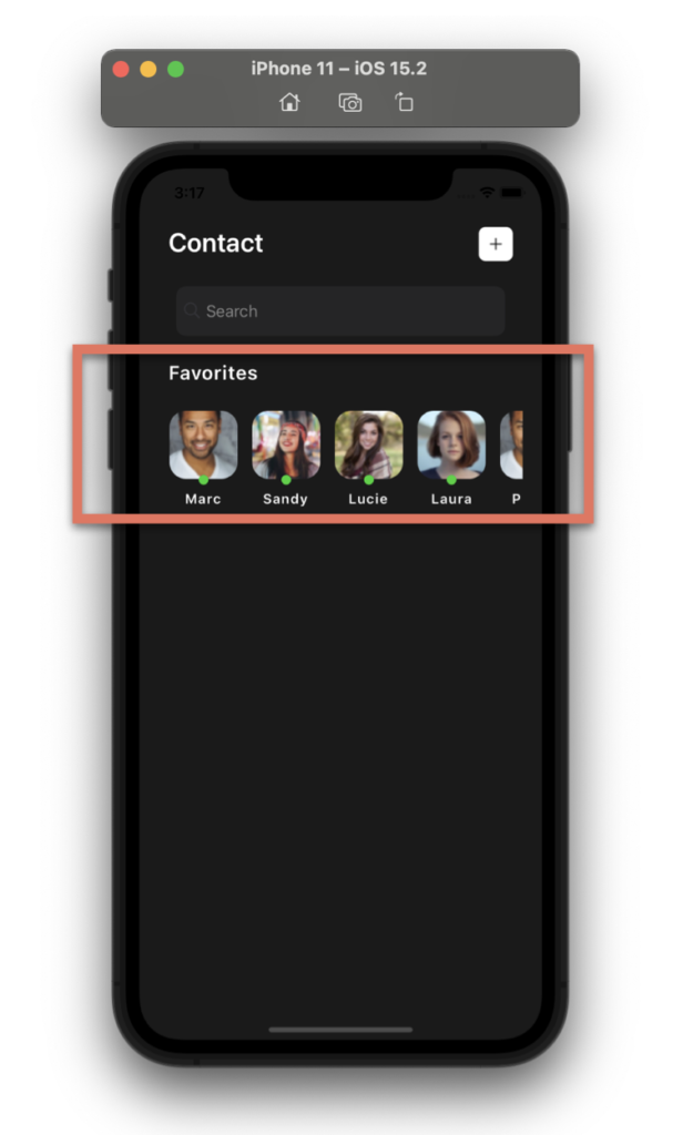 Continuing with de Favorite Block, let’s replicate a contact list, which is even similar to Instagram Stories
  , for this, we will use a Horizontal CollectionView.
Also, to round the edges of the images we will use a Frame. Check out this super interesting technique!
<!-- Favorite list--> <Label Grid.Row="2" Grid.Column="0" Text="Favorites" FontAttributes="Bold" TextColor="White" FontSize="20" CharacterSpacing="1" Margin="0,0,0,20"/>
<CollectionView Grid.Row="3" Grid.Column="0" Grid.ColumnSpan="2" HorizontalScrollBarVisibility="Never" ItemsSource="{Binding contacts}" Margin="0,0,-10,0" HeightRequest="120" ItemsLayout="HorizontalList"> <CollectionView.ItemTemplate> <DataTemplate> <Grid RowDefinitions="Auto,Auto,Auto" Padding="0,0,15,0"> <Frame Grid.Row="0" BorderColor="Transparent" HorizontalOptions="Start" VerticalOptions="Start" WidthRequest="70" HeightRequest="70" HasShadow="False" CornerRadius="17" Padding="0" IsClippedToBounds="True"> <Image Source="{Binding Picture}" Aspect="AspectFill"/> </Frame> <Ellipse Grid.Row="1" HorizontalOptions="Start" Margin="30,-10,30,0" Fill="#1ad32e" VerticalOptions="End" HeightRequest="10" WidthRequest="10" StrokeThickness="0"/> <Label Grid.Row="2" Grid.Column="0" Text="{Binding Name}" HorizontalOptions="Center" FontAttributes="Bold" TextColor="White" FontSize="14" CharacterSpacing="1" Margin="0,0,0,20"/> </Grid> </DataTemplate> </CollectionView.ItemTemplate> </CollectionView>
 To finish with our first screen, let’s work with the “Active Contacts” block, now we will add a set of contacts followed by their status!
To do it, let’s use a Frame, and inside, let’s add a CollectionView with Vertical Orientation to display the list!
<!-- Active Contacts Frames--> <Frame Grid.Row="4" Grid.Column="0" Grid.ColumnSpan="2" Margin="-30,0" VerticalOptions="FillAndExpand" HasShadow="True" CornerRadius="40" BackgroundColor="White"> <CollectionView HorizontalScrollBarVisibility="Never" HorizontalOptions="FillAndExpand" VerticalScrollBarVisibility="Never" ItemsSource="{Binding contactsStatus}"> <CollectionView.ItemTemplate> <DataTemplate> <Grid ColumnDefinitions="Auto,*,Auto" RowDefinitions="Auto,Auto" Padding="20"> <Frame Grid.Row="0" Grid.RowSpan="2" Grid.Column="0" BorderColor="Transparent" HorizontalOptions="Start" VerticalOptions="Start" HasShadow="False" CornerRadius="17" Padding="0" IsClippedToBounds="True" Margin="0,0,20,0"> <Image Source="{Binding Picture}" Aspect="AspectFill" WidthRequest="60" HeightRequest="60"/> </Frame> <Label Grid.Row="0" Grid.Column="1" Text="{Binding Name}" FontAttributes="Bold"/> <Label Grid.Row="1" Grid.Column="1" Text="{Binding StatusComment}" FontAttributes="Bold" TextColor="#b4b4b4"/> <Ellipse Grid.Row="0" Grid.Column="2" Grid.RowSpan="2" IsVisible="{Binding IsOnline}" VerticalOptions="Center" HorizontalOptions="Start" Margin="30,-10,30,0" Fill="#1ad32e" HeightRequest="10" WidthRequest="10" StrokeThickness="0"/> </Grid> </DataTemplate> </CollectionView.ItemTemplate> </CollectionView> </Frame>

For the “Messages” block, we will create another page called “MessagePage.xaml”. As main layout we’ll be also using a Grid!
<!-- Main layout--> <Grid RowDefinitions="Auto,Auto,*" ColumnDefinitions="*,*" Padding="30,60,30,0"> <!-- Here add the code that is being explained in this block -->
</Grid>
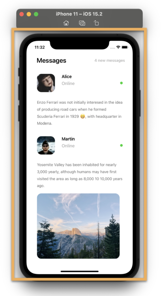 This screen is composed of the following components:
- Main title and message indicator:
<!-- Main Label and message indicator:--> <Label Grid.Row="0" Grid.Column="0" Text="Messages" FontAttributes="Bold" Margin="10,0,0,0" FontSize="25"/> <Label Grid.Row="0" Grid.Column="1" Text="4 new messages" TextColor="#b4b4b4" VerticalTextAlignment="Center" FontAttributes="Bold" HorizontalTextAlignment="End" FontSize="15"/>
<!-- Here add the code that is being explained in next step -->
- Messages from contacts:
<!-- Message list--> <CollectionView Grid.Row="1" Grid.Column="0" Grid.ColumnSpan="2" Margin="0,20,0,0" HorizontalOptions="FillAndExpand" VerticalScrollBarVisibility="Never" ItemsSource="{Binding messages}"> <CollectionView.ItemTemplate> <DataTemplate> <Grid ColumnDefinitions="Auto,*,Auto" RowDefinitions="Auto,Auto,Auto,Auto" Padding="10"> <Frame Grid.Row="0" Grid.RowSpan="2" Grid.Column="0" BorderColor="Transparent" HorizontalOptions="Start" VerticalOptions="Center" HasShadow="False" CornerRadius="17" Padding="0" IsClippedToBounds="True" Margin="0,0,20,0"> <Image Source="{Binding Picture}" Aspect="AspectFill" WidthRequest="70" HeightRequest="70"/> </Frame> <Label Grid.Row="0" Grid.Column="1" Text="{Binding Name}" FontAttributes="Bold"/> <Label Grid.Row="1" Grid.Column="1" Text="{Binding StatusComment}" FontAttributes="Bold" TextColor="#b4b4b4"/> <Ellipse Grid.Row="0" Grid.Column="2" Grid.RowSpan="2" IsVisible="{Binding IsOnline}" VerticalOptions="Center" HorizontalOptions="Start" Fill="#1ad32e" HeightRequest="10" WidthRequest="10" StrokeThickness="0"/> <Label Grid.Row="2" Grid.Column="0" Grid.ColumnSpan="3" TextColor="#6c6c6c" Margin="0,15" LineHeight="1.5" Text="{Binding Comment}" FontSize="15" /> <Frame Grid.Row="3" Grid.Column="0" Grid.ColumnSpan="3" IsVisible="{Binding IsCommentPicture}" BorderColor="Transparent" HorizontalOptions="Start" VerticalOptions="Center" HasShadow="False" CornerRadius="17" Padding="0" IsClippedToBounds="True"> <Image Source="{Binding CommentPicture}" Aspect="AspectFill" HorizontalOptions="CenterAndExpand" VerticalOptions="CenterAndExpand"/> </Frame> </Grid> </DataTemplate> </CollectionView.ItemTemplate> </CollectionView>
 .
.

Tagged AskXammy, Replicating UI, Xamarin, Xamarin Forms
Recommend
About Joyk
Aggregate valuable and interesting links.
Joyk means Joy of geeK