

CollegeMate: A Website That Makes Your College Life Easier
source link: https://uxplanet.org/collegemate-a-website-that-makes-your-college-life-easier-359435fff947
Go to the source link to view the article. You can view the picture content, updated content and better typesetting reading experience. If the link is broken, please click the button below to view the snapshot at that time.

CollegeMate: A Website That Makes Your College Life Easier
In this case study, I’ll be sharing my process of designing a website for college students that would allow them to keep a better track of their college activities.
Team: Abiral Jain, Jatin Gupta, Adarsh Pathak
My Role: Product Designer
Duration: 4 Weeks
Project Role: Personal Project
Overview
This project started with a conversation with my friend Jatin, we were discussing our class timetable. We found that there are 4 or 5-time tables present in our class group for my current semester, and none are followed. So we dig in and find out other problems which also needed attention. This resonated with us. We saw an opportunity to help other students who struggle with this daily life and professors facing the same issues.
As a product team of three, we explored the problem space of how professors and students connect and where they face issues.
We focused on designing our product for two target audiences:
Students who face any problem with college department-related issues aim to make students’ college life easier.
Professors also face problems maintaining a systematic database of documents of all students who are under their supervision.
We made this app for both Students and Professors but our primary goal is to solve problems for larger audience i.e. students. So all the findings and goals in this case study are related to students but during the project, we also take inputs from Professors.
Problem
Usually, college-goers rely upon social platforms or mail such as WhatsApp about college events or important notices. The whole process is scattered, and many fail to attend classes or events due to improper communication.
How might we make students’ lives easier to know about that particular update or notice that the college can change at any time?
Challenge
There are currently many applications available that provide a modern and efficient way to handle these problems. As a UX/UI designer for this project, my responsibility was to design the interface and visuals that are not just for another product that offers the same functionality as all other applications do. I often asked myself:
Why would anyone want to use this application daily?
How might we make this experience fun and interactive?
Goals
Our goal as a team is to create a responsive website for college students to quickly and seamlessly use this platform. We wanted to seek opportunities to:
- Get notified about the events happening in the institute.
- Fill up the leave application form.
- See the timetable.
- Student profile with all their basic details and documents which were submitted to the college.
Solution
We designed a responsive website that allows college students to search or check all their needs called CollegeMate. Students can only register for an account using their verified college email to ensure safety from fake accounts.
Design Process
Keeping our goals in mind, we followed our 5 golden steps:
Design ProcessUser Research
Quantitative Research
My team and I prepared a screener survey. I am sharing the little stats from all I could gather from my connections.
This screenshot is taken from the google formPeople responded and the demographics were:
Sums up the major user dynamicsThe major demographics represent most of the people facing the same issue as we were discussing. Also since the covid online classes came into the picture, these issues are only increasing in number, it is highly important to make features a little soothing.
Relevant to make or not?Also, a huge population uses mobile as well as laptop both, it is must make sure design suits their needs.
Qualitative Research
We interviewed 5 people to validate the idea of such a site, taking into account Don Norman’s ideology that it is possible to learn about 80% of errors, problems, and behavior from the first 5 users.
Each interview took approximately 10 minutes and included topics to get to the core of the user’s goals and pain points.
We asked questions such as:
- How often do you take leave in a month?
- How long do you have to wait outside the faculty office for signing the leave form?
- What are your thoughts on the online leave application form system?
- Do you find it difficult to know about current events held in college?
- How many times do you check the noticeboard in a week?
- Did you ever miss any class due to the wrong timetable?
- What obstacles did colleges face to manage student documents?
- Will a web app help resolve your issues?
Common Learning from Interview
- Managing time and attending more events seem like the goal for all five personas.
- Most students didn’t get to know the events held in college.
- Most of the students do wait for faculty to sign the leave application form.
- The majority of users want to have a proper place where the timetable is present updated.
- All students have to submit their basic documents every time for new activities and the college does not have a proper database for this.
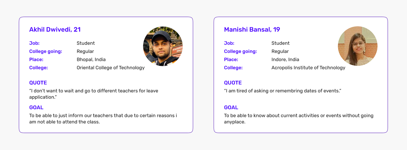
Persona
To humanize our data, we created our personas, Akhil and Manishi, to represent our target audience’s goals, needs, and pain points. To gain more empathy with our target audience, we referred back to these personas as a foundation for ideating our product.
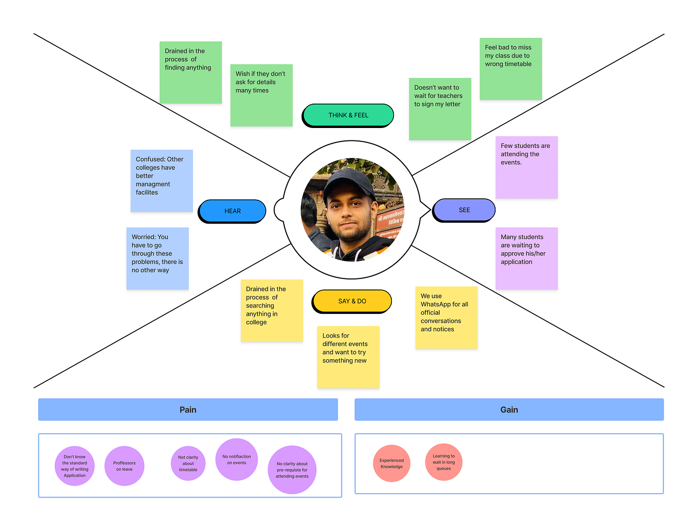
Ideation and empathy mapping
I used empathy maps to establish common ground among team members and to understand and prioritize user needs. In user-centered design, empathy maps are best used from the very beginning of the design process.
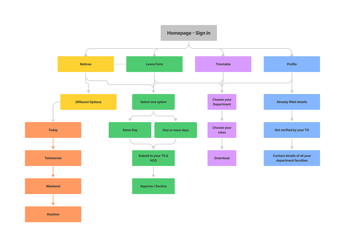
Information Architechture
Information architecture is to visualize all the screens within the website. focuses on organizing, structuring, and labeling content effectively and sustainably. The goal is to help users find information and complete tasks.
Brainstorming Ideas
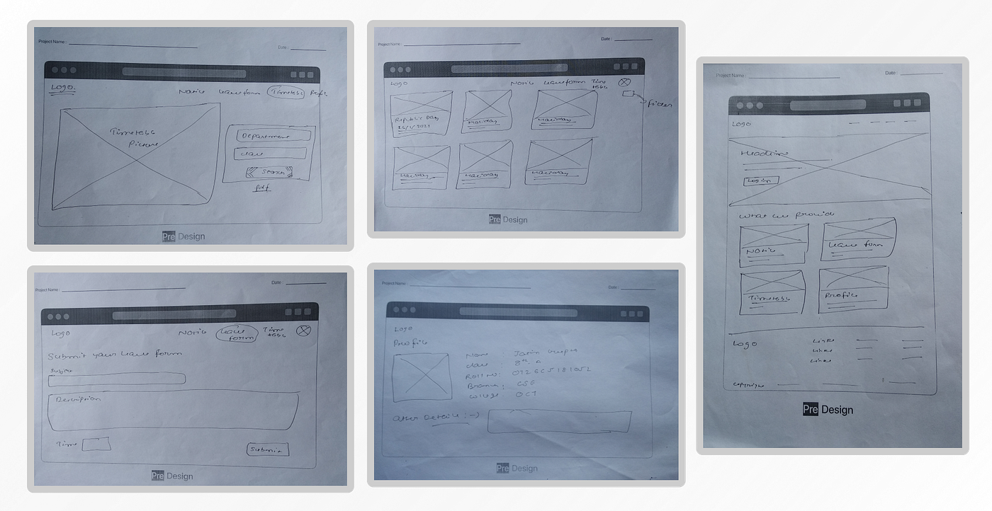
Low-fidelity Design:
My team and I do a session to involve in our ideation and design process. We utilized this collaboration method to quickly generate ideas and sketches for our product. We pulled several features and functionalities from this session we considered to have on the website and sketched low-fi prototypes of what it may look like.
Prototype
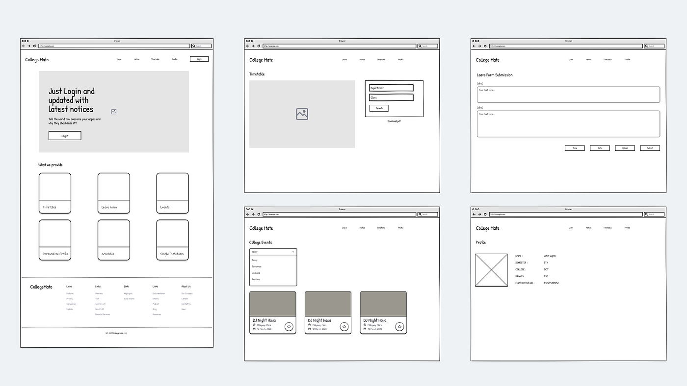
After Low-fidelity design, I started sketching the core features and designing mid-fidelity wireframes.
The wireframes will be tested by users to identify pain points and optimize the design.
Tests
Usability Test
I conducted Usability Test using my prototypes to assess the learnability of new users interacting with the CollegeMate for the first time. I observed and measured if users understand the site and how to complete functions such as logging in, searching events, filling a leave form, and viewing the timetable.
Thanks to the Usability Test I was able to define and solve a few issues.
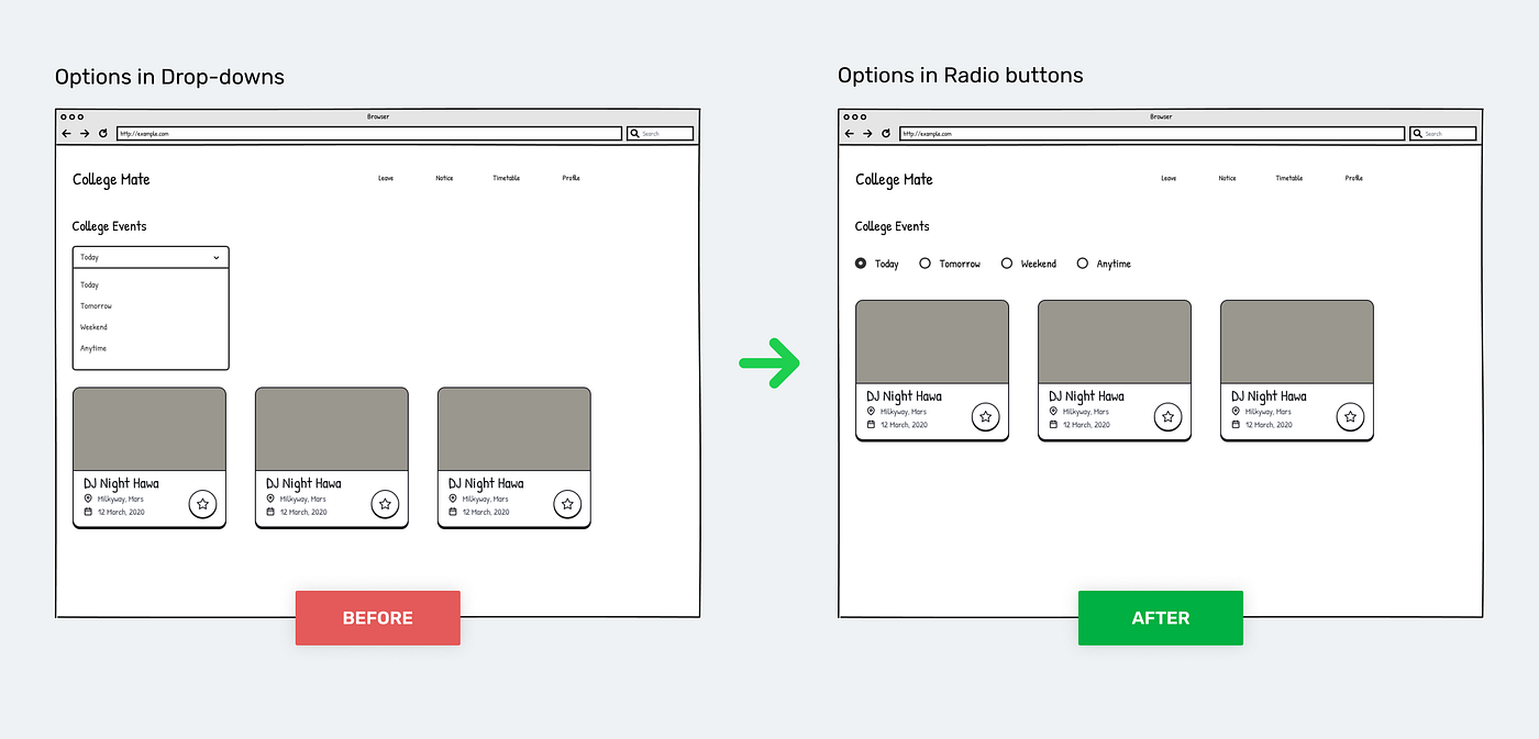
Issue #1: Some users suggested changing the drop-downs into radio buttons. However, then we study the usability of these controls, it is obvious that radio buttons and drop-downs should be used in certain scenarios to make it easier for users to select a given input.
Some of them are:
- When we want users to read all options.
- When we have less than 5 options.
- When visibility and quick response is a priority.
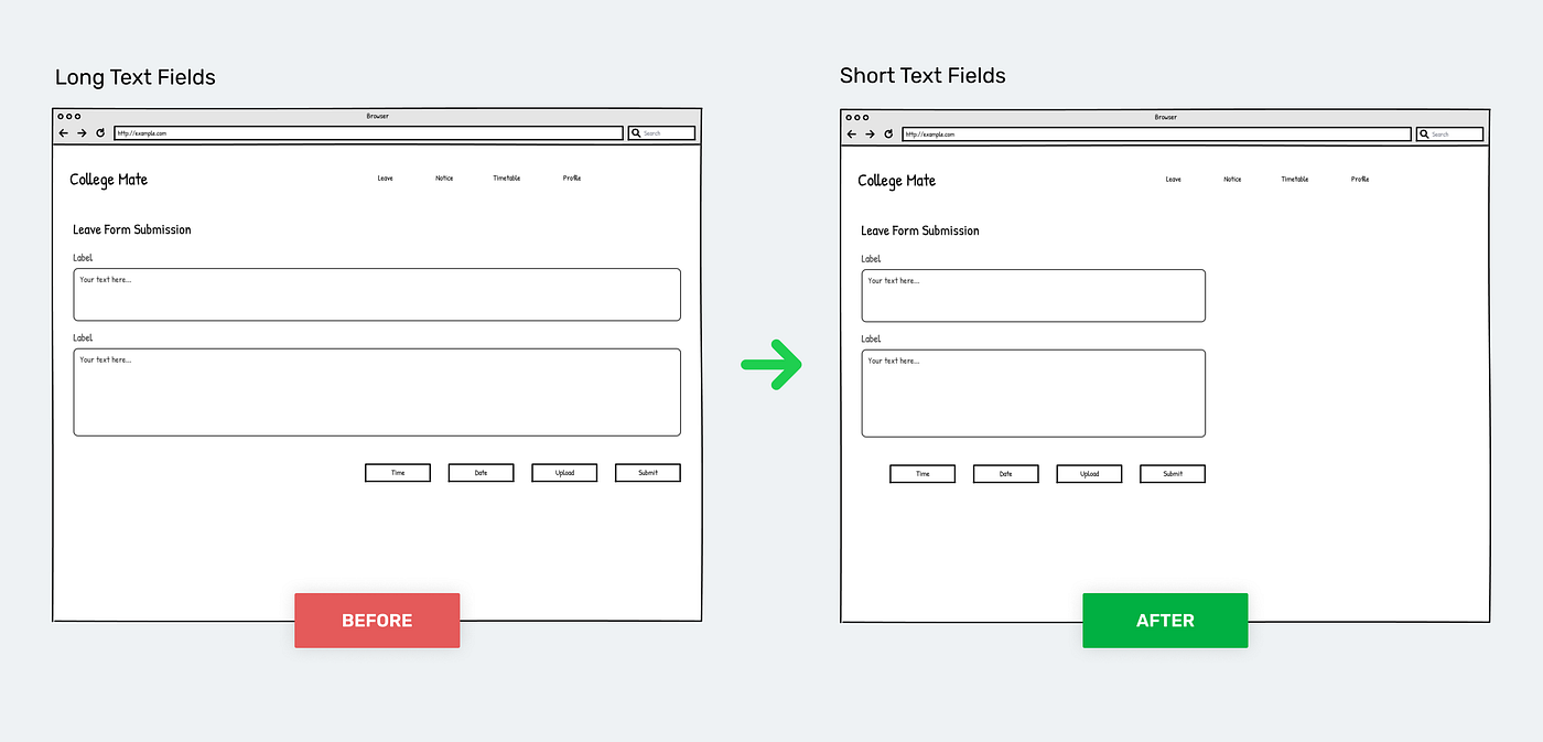
Issue #2: Some users pointed out that writing applications on long text fields is quite difficult and not useful as users have to write large texts.
The size of input fields reduces along with proper hierarchy with buttons. After resizing the input fields, the flow was streamlined.
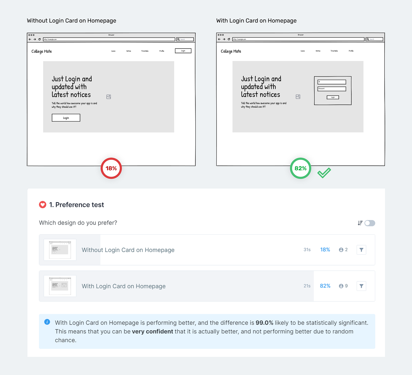
Preference Test
After conducting a preference test with some users, 82% of them have expressed a preference for option #2, which is why new users will see Sign Up on Homepage and reduce one step.
Style Guide and Design system
We chose a few important screens from the wireframes and experimented with different color combinations and typeface combinations.
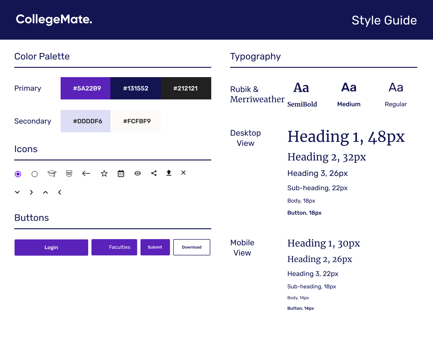
- Since it is an educational website and users will spend more time staring at the screen, we decided on making a light mode UI, so that all age groups (professors) can enjoy the product.
- We chose the primary color to be ‘Purple’ as it conveys high value and lofty goals for the colors.
- We iterated in different font combinations before settling for ‘Rubik’.
- We planned on using consistent illustrations so that they match the personality of the product.
High Fidelity Design
As the project progressed, we incorporated some slight changes that I felt would work better. We focused on the website design for the desktop view since most of the surfing was done there.
The application is divided into four main categories —
Leave Form (Students)
The students can fill out the form easily, as we also provide two different options.
- Students can leave the same day between the college.
- Or they can take leave for one or more than one day.
Leave Form (Professors)
The professors can check all the requests from students and can either accept or decline the request.
Timetable
This is a section where one can access and download the timetable of their respective class and professors can upload a new timetable with a minimum number of steps
Timetable Screen for StudentsTimetable Screens for ProfessorsEvents
This page is where all the events information is available and professors can add a new event with 3 step process.
Event Screens for StudentsEvent Screens for ProfessorsProfile
The user can view and manage all their details and also the user doesn't require to fill out detailed forms for any activity since management can fetch all their details from the database.
Profile of StudentEmpty States
Empty states are moments in a user’s experience with a product where there is nothing to display.
The Empty States and Forgot Password UIFinal Prototype
We continued to use Figma to create the high-fidelity wireframes and an interactive prototype. We incorporated as many interactions and animations as we could while making sure that they made sense in the overall flow and were not distracting or disruptive to the experience. Both student and professors prototype link:
Pocket Version
We created a scaled-down version of the website for users to access through their mobile devices. Since we focused on the desktop view of the website all the time, this needs to be tested to ensure users do not have issues interacting with it.

Recommend
About Joyk
Aggregate valuable and interesting links.
Joyk means Joy of geeK