

OpenHarmony自定义单选组组件实现
source link: https://os.51cto.com/article/702881.html
Go to the source link to view the article. You can view the picture content, updated content and better typesetting reading experience. If the link is broken, please click the button below to view the snapshot at that time.


https://harmonyos.51cto.com
什么是单选组
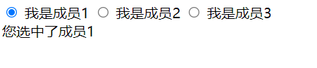
熟悉web的小伙伴一定知道,在html中如果我们给radio表单设置相同的name,会视为一个单选组。
<input type="radio" name="group" value="1"> 我是成员1
<input type="radio" name="group" value="2"> 我是成员2
<input type="radio" name="group" value="3"> 我是成员3
对于一个单选组,我们只需要知道这个组里,我们选中的表单值就好了。
document.getElementsByName("group").forEach((v) => {
  v.addEventListener("change", function (e) {
    let value = e.currentTarget.value
    document.getElementById("result").innerText = "您选中了成员" + value
  }, false)
})
单选组效果:
在OpenHarmony应用开发中,我们可以使用多个Toggle组件来实现。
- OpenHarmony Toggle组件请参考:
- 【甜甜酱OH文档补充】OpenHarmony Toggle组件
来看看我们想要的一个效果吧。
现在先定义出一个新的组件RadioGroup。
@Component
struct RadioGroup {
  build(){}
}
要实现一个单选组组件,首先要知道我们需要什么。
一个单选项应该由两种数据构成。
- 单选项的对应值
- 单选项要显示文字。
那么我们先定义一个接口叫Option。
interface Option {
    displayValue: string,    //显示文字
    value: string | number  //对应值
}
一个单选组一定是由多个单选项组成的。那么RadioGroup组件一定是需要获取一个单选项数组Option[]。
private list: Option[] //一个Option数组对于一个单选组,永远会是有值的,因为总有一个选项是被选中的。
单选组值我们进行双向绑定。
@Link value: string | number //类型与Option的value保持一致如果没有给定单选组值,那么默认单选组值为第一个选项的对应值。
aboutToAppear() {
    if (!this.value) {
        this.value = this.list[0].value
    }
}
现在我们先渲染一个基本的页面来看看效果吧。
interface Option {
displayValue: string,
value: string | number
}
@Component
struct RadioGroup {
private list: Option[]
@Link value: string | number
aboutToAppear() {
if (!this.value) {
this.value = this.list[0].value
}
}
build() {
Flex({
wrap: FlexWrap.Wrap
}) {
ForEach(this.list, (option: Option, index: number) => {
Toggle({
type: ToggleType.Button,
isOn: false
}) {
Text(option.displayValue).fontSize(24).fontColor(Color.White)
}
.width(150)
.height(80)
.selectedColor(Color.Blue)
})
}
}
}
@Entry
@Component
struct Index {
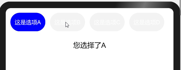
private list: Option[] = [
{
displayValue: "这是选项A",
value: "A"
},
{
displayValue: "这是选项B",
value: "B"
},
{
displayValue: "这是选项C",
value: "C"
},
{
displayValue: "这是选项D",
value: "D"
}
]
@State value: string | number = ''
build() {
Column() {
RadioGroup({
list: this.list,
value: $value
})
Column(){
Text(`您选择了${this.value}`).fontSize(30)
}
.height(100)
.margin({ top: 40 })
}
.height('100%')
.width('100%')
.padding(20)
}
}但是现在每个Toggle组件控制都是独立的。
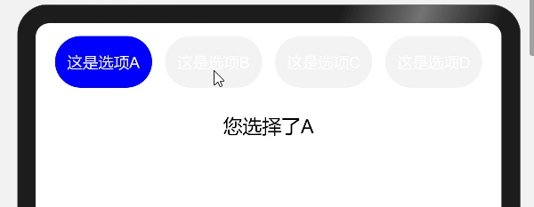
我们知道Toggle组件是靠isOn的值来渲染自己当前的状态,现在我们为单选组建立一个状态管理数组。
@State _state: boolean[] = [] //状态管理数组现在按照索引为每个选项组件建立好自己的状态数据。
- 选项默认状态为关闭false
- 单选组值对应的选项状态为开启true
if (!this.value) {
    this.value = this.list[0].value
}
this.list.forEach((option, index) => {
    let state = false
    if (option.value == this.value) { //单选组值对应选项
        state = true
    }
    this._state[index] = state
})
当我们每次修改单选组值value后,应该刷新状态管理数组_state。
我们定义一个刷新状态的方法refresh。
private refresh(){
    this.list.forEach((option, index) => {
        let state = false
        if (option.value == this.value) {
          state = true
        }
        this._state[index] = state
    })
}
Toggle组件每次切换状态会执行onChange方法。
当我们发现组件发生变化时,就去更新单选组值,并刷新整个状态数组。
ForEach(this.list, (option: Option, index: number) => {
Toggle({
type: ToggleType.Button,
isOn: this._state[index]
})
.onChange((isOn: boolean) => {
this.value = option.value
this.refresh()
})
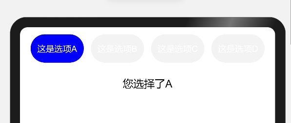
})现在还差最重要的一步,就是保证选中的单选项再次被点击后不会切换状态。
这里就要用到enabled属性了,只要我们发现这个选项被选中就让这个选项不可响应。
ForEach(this.list, (option: Option, index: number) => {
    Toggle({
      type: ToggleType.Button,
      isOn: this._state[index]
    })
    .enabled(!this._state[index]) //是否响应状态 正好与 是否选中状态值相反
})
自定义选项
虽然实现了一个单选组组件,但是我们发现每个选项的样式都被固定在RadioGroup组件内,我们如果想修改样式就必须修改RadioGroup组件。那么有没有什么办法,可以让我们使用单选组逻辑的同时又能够自定义Toggle组件的样式呢。
这里要感谢社区小伙伴提供的ets插槽思路,使用ForEach配合@Builder装饰器来实现。
选项构造器
首先我们为RadioGroup组件添加一个选项构造器itemBuilder。
type Update = () => void
type ItemBuilder = (item: Option, index: number, state: boolean, update: Update) => void

struct RadioGroup {
  private itemBuilder: ItemBuilder
  ...
}
这个构造器会为父级组件提供RadioGroup选项信息。
- item: Option 当前选项信息
- index:number 当前选项索引
- state:boolean 当前选项状态
- update:Update 刷新RadioGroup状态方法
有了构造器,我们就可以利用构造器返回的信息渲染单个选项。
我们来看看构造器是如何使用的。
@Builder装饰器定义了一个如何渲染自定义组件的方法。此装饰器提供了一个修饰方法,其目的是和build函数一致。
@Builder装饰器装饰的方法的语法规范与build函数也保持一致。
通过@Builder装饰器可以在一个自定义组件内快速生成多个布局内容。
@Entry
@Component
struct Index {
  @State value: string = ''
  // 渲染选项
  @Builder OptionItem(option: Option, index: number, state: boolean, update: Update) {
    Toggle({
      type: ToggleType.Button,
      isOn: state  //Toggle组件状态
    }) {
      // 选项显示文字
      Text(`${option.displayValue}`).fontSize(24).fontColor(Color.White)
    }
    .onChange((isOn)=>{
        // 发生变化时,执行刷新方法
        update()
    })
    .enabled(!state)  //Toggle组件可响应状态
    .selectedColor(Color.Blue)
    .size({
      width: 150,
      height: 80
    })
  }
  build() {
    Column() {
      RadioGroup({
        value: $value, // 单选组值是双向绑定的
        list: this.list,
        itemBuilder: (option: Option, index: number, state: boolean, update: Update) => {
            // 在itemBuilder内调用@Builder装饰器方法
            this.OptionItem(option, index, state, update)
        }
      })
    }
    .height('100%')
    .width('100%')
  }
}
实现构造器
那么这个构造器怎么实现呢?
我们要知道build方法内仅支持:
- 使用渲染控制语法
- 调用@Builder装饰的方法
要让itemBuilder构造器方法在build中被调用,我们就需要让itemBuilder成为一个组件。
这就要提起我们的ForEach循环渲染了。
当我们使用ForEach只执行一次循环时,就相当于是一个组件在被渲染。那么只要我们将itemBuilder构造器方法重新定义在ForEach生成子组件的lambda函数上,就可以让itemBuilder构造器成为一个可以被渲染的组件了。
bind()函数创建了一个新函数(原函数的拷贝),这个函数接受一个提供新的this上下文的参数,以及之后任意可选的其他参数。当这个新函数被调用时,它的this关键字指向第一个参数的新上下文。而第二个之后的参数会与原函数的参数组成新参数(原函数的参数在后),传递给函数。
另外使用call()、apply()都是可以的,我们要的就是重新定义ForEach的生成子组件方法。
private _once = Array(1)
@Builder RadioGroupItem(option: Option, index: number) {
    ForEach(this._once, this.itemBuilder.bind(this, option, index, this._state[index], () => {
        this.value = option.value
        this.refresh()
    }))
}
循环渲染选项组件
build() {
    Flex({
        wrap: FlexWrap.Wrap
    }) {
        ForEach(this.list, (option: Option, index: number) => {
            this.RadioGroupItem(option, index)
        })
    }
}
ui/RadioGroup.ets
export interface Option {
  displayValue: string,
  value: string | number
}
export type Update = () => void
export type ItemBuilder = (item: Option, index: number, state: boolean, update: Update) => void
// 单选组
@Component
export struct RadioGroup {
  private list: Option[]
  private itemBuilder: ItemBuilder
  @State _state: boolean[] = []
  @Link value: string | number
  private _once: number[]
  private refresh() {
    this.list.forEach((option, index) => {
      let state = false
      if (option.value == this.value) {
        state = true
      }
      this._state[index] = state
    })
  }
  aboutToAppear() {
    this._once = [1]
    if (!this.value) {
      this.value = this.list[0].value
    }
    this.refresh()
  }
  @Builder RadioGroupItem(option: Option, index: number) {
    ForEach(this._once, this.itemBuilder.bind(this, option, index, this._state[index], () => {
      this.value = option.value
      this.refresh()
    }))
  }
  build() {
    Flex({
      wrap: FlexWrap.Wrap
    }) {
      ForEach(this.list, (option: Option, index: number) => {
        this.RadioGroupItem(option, index)
      })
    }
  }
}
index.ets
import {Option, RadioGroup, Update} from '../ui/RadioGroup.ets';
@Entry
@Component
struct Index {
  @State value: string = ''
  private list: Option[] = [
    {
      displayValue: "这是选项A",
      value: "A"
    },
    {
      displayValue: "这是选项B",
      value: "B"
    },
    {
      displayValue: "这是选项C",
      value: "C"
    },
    {
      displayValue: "这是选项D",
      value: "D"
    }
  ]
  @Builder OptionItem(option: Option, index: number, state: boolean, update: Update) {
    Flex({
      alignItems: ItemAlign.Center,
      justifyContent: FlexAlign.Center
    }) {
      Toggle({
        type: ToggleType.Button,
        isOn: state
      }) {
        Text(`${option.displayValue}`).flexGrow(1).fontSize(24).fontColor(Color.White)
      }
      .onChange((isOn) => {
        update()
      })
      .enabled(!state)
      .selectedColor(Color.Blue)
      .borderRadius(150)
      .size({
        width: 150,
        height: 80
      })
    }
    .width('25%')
    .margin({
      top: 10,
      bottom: 10
    })
  }
  build() {
    Column() {
      RadioGroup({
        value: $value,
        list: this.list,
        itemBuilder: (option: Option, index: number, state: boolean, update: Update) => {
          this.OptionItem(option, index, state, update)
        }
      })
      Column() {
        Text(`您选择了${this.value}`).fontSize(30)
      }.margin(40)
    }
    .height('100%')
    .width('100%')
  }
}
这是我自己的一个思路,自定义组件在实际应用开发中应该要考虑到更多的情况。
https://harmonyos.51cto.com


 分享到微信
分享到微信  分享到微博
分享到微博Recommend
About Joyk
Aggregate valuable and interesting links.
Joyk means Joy of geeK