

How to Get Started with Flowbite, an Open Source Tailwind CSS component Library
source link: https://hackernoon.com/how-to-get-started-with-flowbite-an-open-source-tailwind-css-component-library
Go to the source link to view the article. You can view the picture content, updated content and better typesetting reading experience. If the link is broken, please click the button below to view the snapshot at that time.
How to Get Started with Flowbite, an Open Source Tailwind CSS component Library
Flowbite is a set of UI components based on Tailwind CSS that can be used to speed up the development process. It uses utility classes instead of OOCSS or BEM and instead of a CSS preprocessing language it relies on PostCSS for transforming CSS.
Flowbite works with both CSS v2x and v3x versions within Flowbite. The full list of Flowbite components is available on Github and can be installed via NPM and included as a plugin inside a new or existing tailwind CSS project.
Listen to this story
Tailwind CSS is a framework that you’ve probably seen around quite often now and it looks like the technology is being adopted by more and more web developers.
What’s unique about this framework is that it uses utility classes instead of OOCSS or BEM and instead of a CSS preprocessing language it relies on PostCSS for transforming CSS.
Although we’ve seen quite a spectacular growth for Tailwind CSS this year (433% increase in weekly downloads based on NPM Trends), one thing that’s missing is a set of UI components that can be used to speed up the development process.
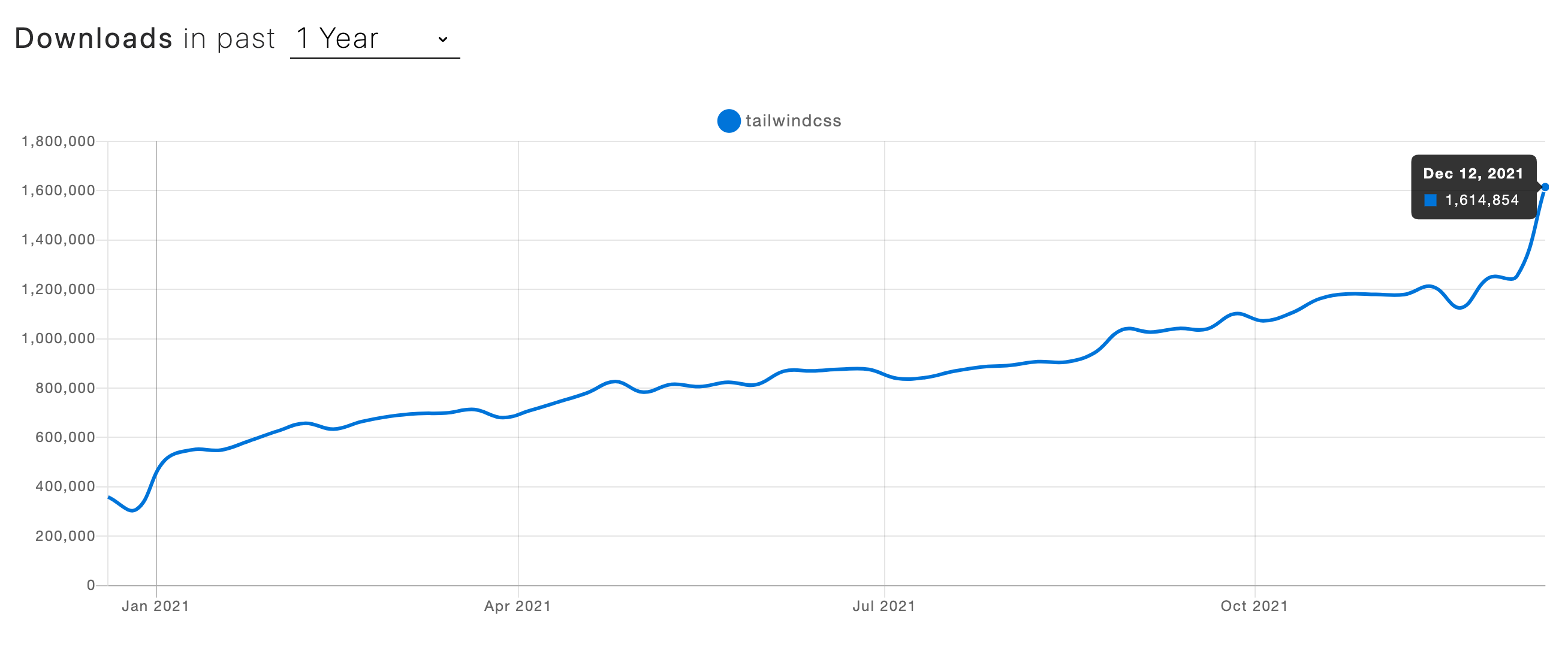
Tailwind CSS weekly downloads based on NPM Trends
In this article, I want to introduce you to one of the most popular component libraries based on Tailwind CSS and it’s called Flowbite. It’s an open-source project available on Github under the MIT license.
I’ll show you how to get started by installing Flowbite as a plugin for Tailwind CSS and show you some of the components and features that it has.
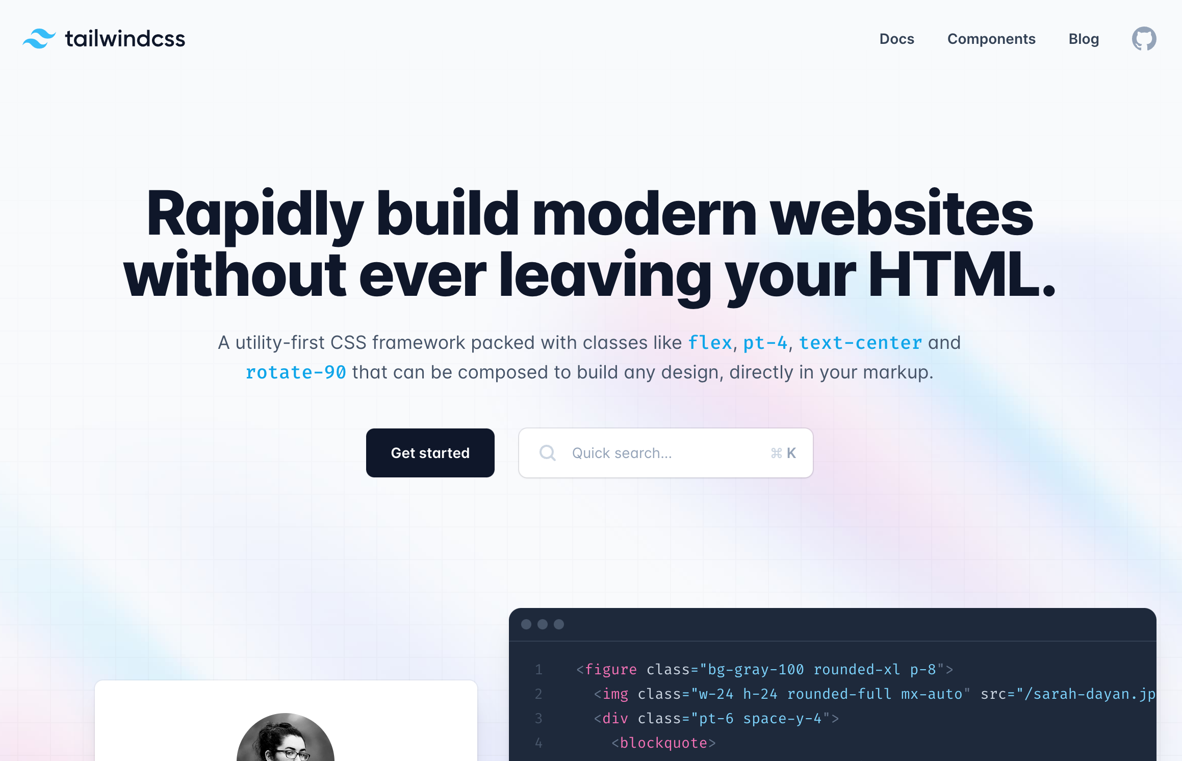
What is Tailwind CSS?
Tailwind CSS is a utility-first framework created by Adam Wathan which redefines the way you interact with stylesheets by moving the CSS logic right into your HTML by using utility classes for spacing, sizing, colors, fonts, and more.
Tailwind CSS v3.x
With the release of the JIT mode the compilation and the number of utility classes that can be used when developing a project increased significantly.
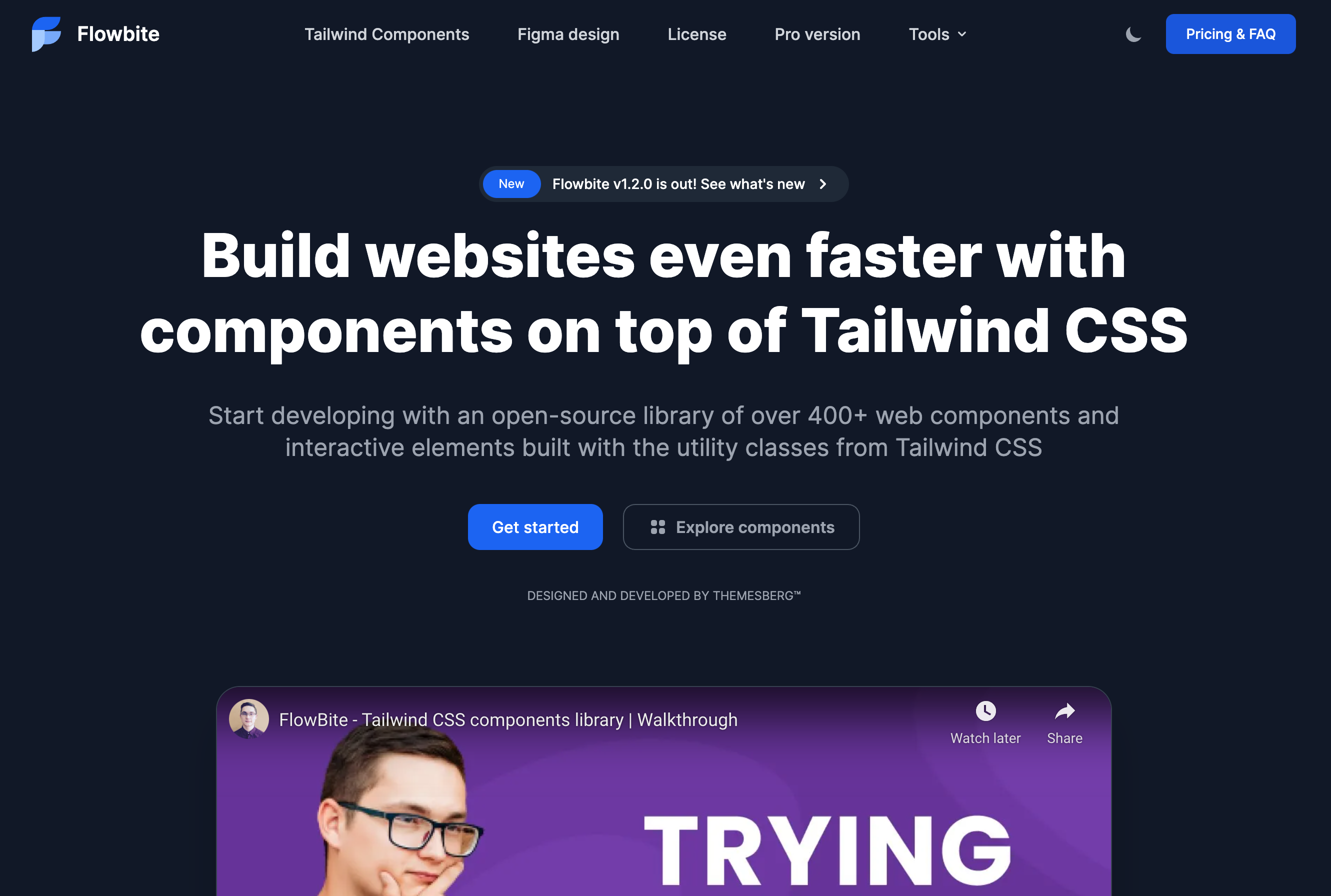
What is Flowbite?
Flowbite is a set of UI components built with the utility classes from Tailwind CSS including buttons, dropdowns, modals, tabs, navbars, and more. It can be installed via NPM and included as a plugin inside a new or existing Tailwind CSS project.
Flowbite - Tailwind CSS components
Getting started
The first thing you need to do is have a working Tailwind CSS project installed locally. If you haven’t done that yet, I recommend you to check out the installation guide on the documentation.
After you’ve done that, you can follow the quickstart guide from Flowbite and learn how to download and install the project.
You should first install the Flowbite package via NPM:
npm i @themesberg/flowbiteThen require the plugin inside the tailwind.config.js file:
module.exports = {

    plugins: [
        require('@themesberg/flowbite/plugin')
    ]

}
Finally, make sure that the JavaScript file is included just before the closure of your <body tag:
<script src="../path/to/@themesberg/flowbite/dist/flowbite.bundle.js"></script>Flowbite works with both Tailwind CSS v2.x and v3.x versions.
Tailwind CSS components within Flowbite
Now that you have a working Tailwind CSS project with Flowbite installed as a plugin you can now start exploring the Tailwind CSS components from the library.
The full list of components are as follows:
Alerts
Badge
Breadcrumbs
Buttons
Button group
Cards
Dropdowns
Forms
List groups
Typography
Modals
Navbar
Pagination
Progress bar
Tables
Tooltips
Datepicker
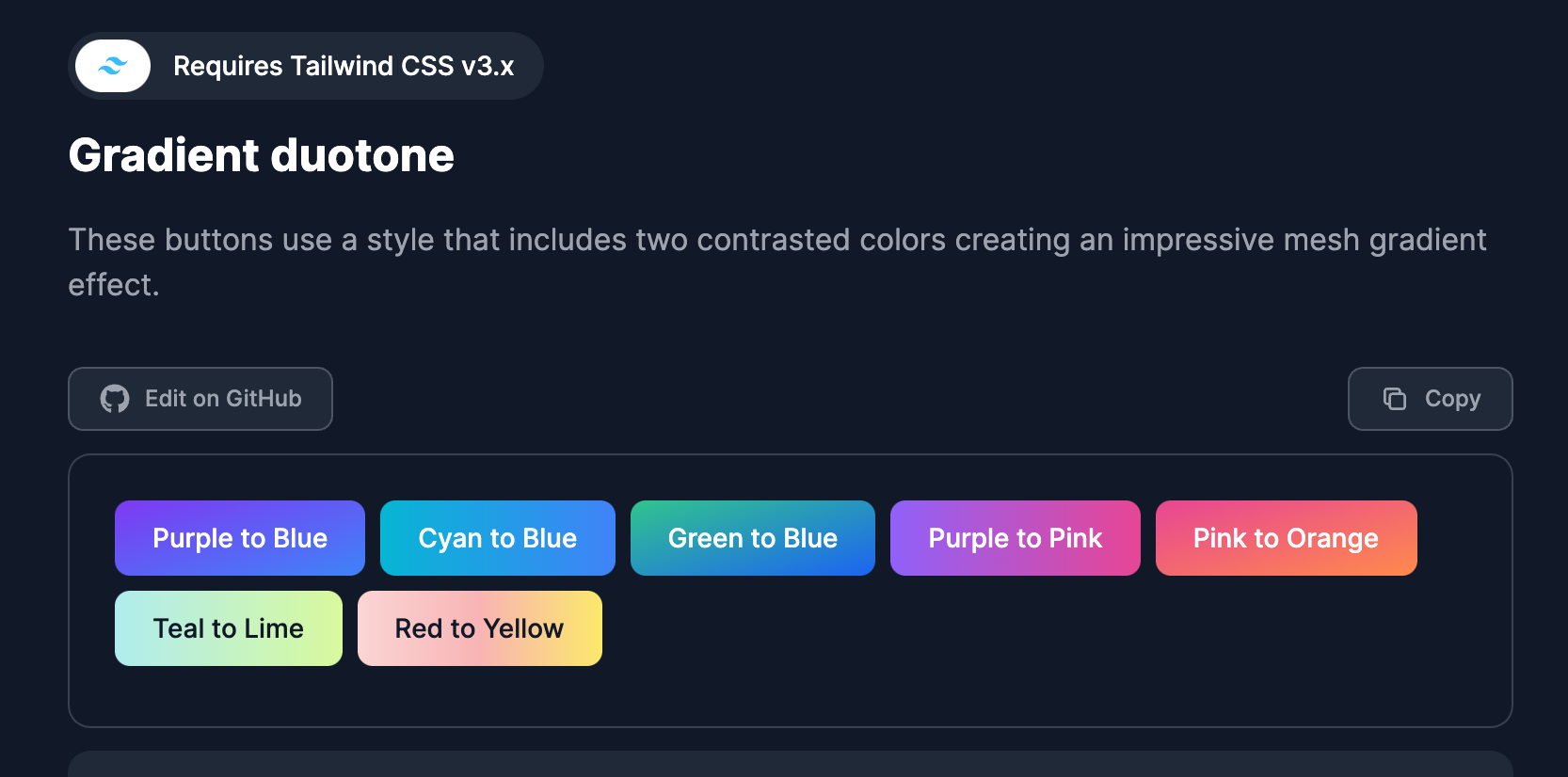
Here’s an example of a couple of gradient background buttons from the library:
Gradient Tailwind CSS buttons
<button type="button" class="text-white bg-gradient-to-br from-purple-600 to-blue-500 hover:bg-gradient-to-bl focus:ring-4 focus:ring-blue-300 dark:focus:ring-blue-800 font-medium rounded-lg text-sm px-5 py-2.5 text-center mr-2 mb-2">Purple to Blue</button>
<button type="button" class="text-white bg-gradient-to-r from-cyan-500 to-blue-500 hover:bg-gradient-to-bl focus:ring-4 focus:ring-cyan-300 dark:focus:ring-cyan-800 font-medium rounded-lg text-sm px-5 py-2.5 text-center mr-2 mb-2">Cyan to Blue</button>
<button type="button" class="text-white bg-gradient-to-br from-green-400 to-blue-600 hover:bg-gradient-to-bl focus:ring-4 focus:ring-green-200 dark:focus:ring-green-800 font-medium rounded-lg text-sm px-5 py-2.5 text-center mr-2 mb-2">Green to Blue</button>
<button type="button" class="text-white bg-gradient-to-r from-purple-500 to-pink-500 hover:bg-gradient-to-l focus:ring-4 focus:ring-purple-200 dark:focus:ring-purple-800 font-medium rounded-lg text-sm px-5 py-2.5 text-center mr-2 mb-2">Purple to Pink</button>
<button type="button" class="text-white bg-gradient-to-br from-pink-500 to-orange-400 hover:bg-gradient-to-bl focus:ring-4 focus:ring-pink-200 dark:focus:ring-pink-800 font-medium rounded-lg text-sm px-5 py-2.5 text-center mr-2 mb-2">Pink to Orange</button>
<button type="button" class="text-gray-900 bg-gradient-to-r from-teal-200 to-lime-200 hover:bg-gradient-to-l hover:from-teal-200 hover:to-lime-200 focus:ring-4 focus:ring-lime-200 dark:focus:ring-teal-700 font-medium rounded-lg text-sm px-5 py-2.5 text-center mr-2 mb-2">Teal to Lime</button>
<button type="button" class="text-gray-900 bg-gradient-to-r from-red-200 via-red-300 to-yellow-200 hover:bg-gradient-to-bl focus:ring-4 focus:ring-red-100 dark:focus:ring-red-400 font-medium rounded-lg text-sm px-5 py-2.5 text-center mr-2 mb-2">Red to Yellow</button>
As you can see, all of the classes from these elements are based on the Tailwind CSS utility classes and there’s also dark mode support included.
Another example would be the dropdown elements which also requires the JavaScript file to be included:
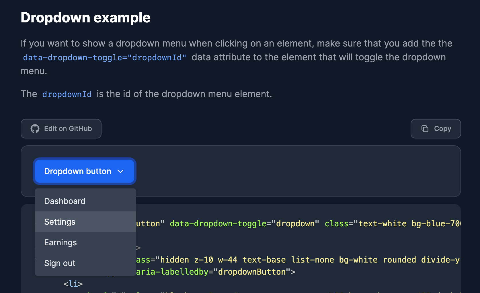
Tailwind CSS dropdown example
<button id="dropdownButton" data-dropdown-toggle="dropdown" class="text-white bg-blue-700 hover:bg-blue-800 focus:ring-4 focus:ring-blue-300 font-medium rounded-lg text-sm px-4 py-2.5 text-center inline-flex items-center dark:bg-blue-600 dark:hover:bg-blue-700 dark:focus:ring-blue-800" type="button">Dropdown button <svg class="ml-2 w-4 h-4" fill="none" stroke="currentColor" viewBox="0 0 24 24" xmlns="http://www.w3.org/2000/svg"><path stroke-linecap="round" stroke-linejoin="round" stroke-width="2" d="M19 9l-7 7-7-7"></path></svg></button>

<div id="dropdown" class="hidden z-10 w-44 text-base list-none bg-white rounded divide-y divide-gray-100 shadow dark:bg-gray-700">
  <ul class="py-1" aria-labelledby="dropdownButton">
    <li>
      <a href="#" class="block py-2 px-4 text-sm text-gray-700 hover:bg-gray-100 dark:hover:bg-gray-600 dark:text-gray-200 dark:hover:text-white">Dashboard</a>
     </li>
    <li>
      <a href="#" class="block py-2 px-4 text-sm text-gray-700 hover:bg-gray-100 dark:hover:bg-gray-600 dark:text-gray-200 dark:hover:text-white">Settings</a>
    </li>
    <li>
      <a href="#" class="block py-2 px-4 text-sm text-gray-700 hover:bg-gray-100 dark:hover:bg-gray-600 dark:text-gray-200 dark:hover:text-white">Earnings</a>
    </li>
    <li>
      <a href="#" class="block py-2 px-4 text-sm text-gray-700 hover:bg-gray-100 dark:hover:bg-gray-600 dark:text-gray-200 dark:hover:text-white">Sign out</a>
    </li>
  </ul>
</div>
For the dropdown component, you can use the data attribute data-dropdown-toggle=”dropdownId” to connect the menu with the button using the event listeners from Flowbite.
I’ll show you one more example from the form components section:
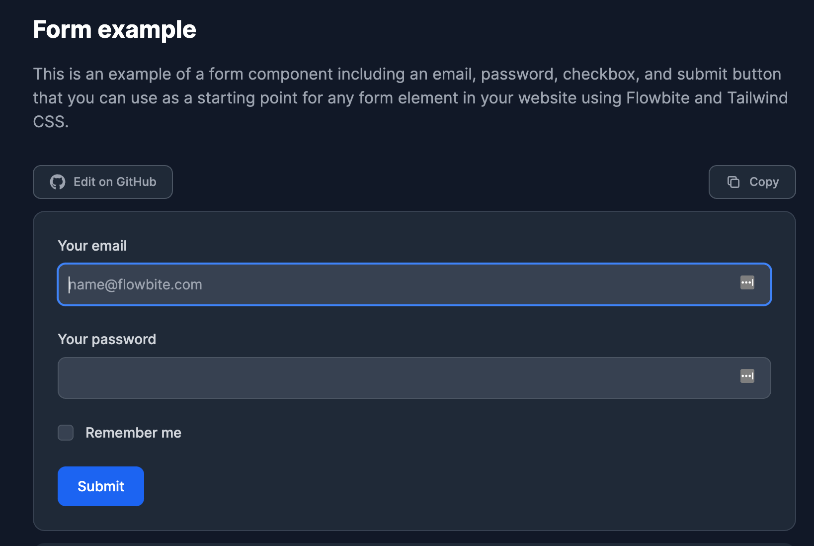
Tailwind CSS form example
<form>
  <div class="mb-6">
    <label for="email" class="block mb-2 text-sm font-medium text-gray-900 dark:text-gray-300">Your email</label>
    <input type="email" id="email" class="bg-gray-50 border border-gray-300 text-gray-900 text-sm rounded-lg focus:ring-blue-500 focus:border-blue-500 block w-full p-2.5 dark:bg-gray-700 dark:border-gray-600 dark:placeholder-gray-400 dark:text-white dark:focus:ring-blue-500 dark:focus:border-blue-500" placeholder="[email protected]" required="">
  </div>
  <div class="mb-6">
      <label for="password" class="block mb-2 text-sm font-medium text-gray-900 dark:text-gray-300">Your password</label>
      <input type="password" id="password" class="bg-gray-50 border border-gray-300 text-gray-900 text-sm rounded-lg focus:ring-blue-500 focus:border-blue-500 block w-full p-2.5 dark:bg-gray-700 dark:border-gray-600 dark:placeholder-gray-400 dark:text-white dark:focus:ring-blue-500 dark:focus:border-blue-500" required="">
  </div>
  <div class="flex items-start mb-6">
    <div class="flex items-center h-5">
      <input id="remember" aria-describedby="remember" type="checkbox" class="w-4 h-4 bg-gray-50 rounded border border-gray-300 focus:ring-3 focus:ring-blue-300 dark:bg-gray-700 dark:border-gray-600 dark:focus:ring-blue-600 dark:ring-offset-gray-800" required="">
    </div>
    <div class="ml-3 text-sm">
      <label for="remember" class="font-medium text-gray-900 dark:text-gray-300">Remember me</label>
    </div>
  </div>
  <button type="submit" class="text-white bg-blue-700 hover:bg-blue-800 focus:ring-4 focus:ring-blue-300 font-medium rounded-lg text-sm w-full sm:w-auto px-5 py-2.5 text-center dark:bg-blue-600 dark:hover:bg-blue-700 dark:focus:ring-blue-800">Submit</button>
</form>
The form components include custom styles and variants for text inputs, checkboxes, radio buttons, toggle buttons, file uploads, and many more.
How to use dark mode
All of the components from Flowbite already support dark mode and since the release of Tailwind CSS v3.x, these styles will be automatically applied based on your browser preference.
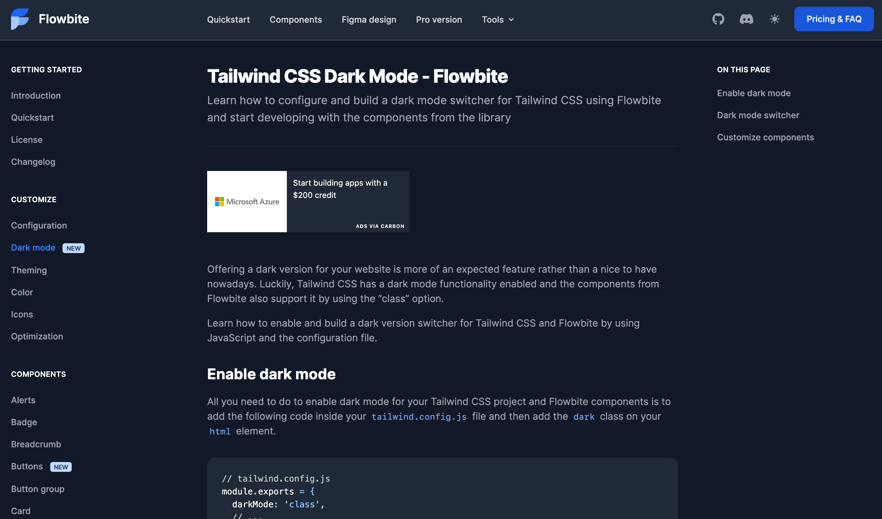
Tailwind CSS dark mode
If you want to create a dark mode switcher, you can check out the official guide on Flowbite on how to integrate a dark mode switcher with Tailwind CSS.
Figma design files
If you’re a fan of the Figma software design tool, you’ll be happy to learn that Flowbite also has a Figma design file included based on the utility classes from Tailwind CSS.
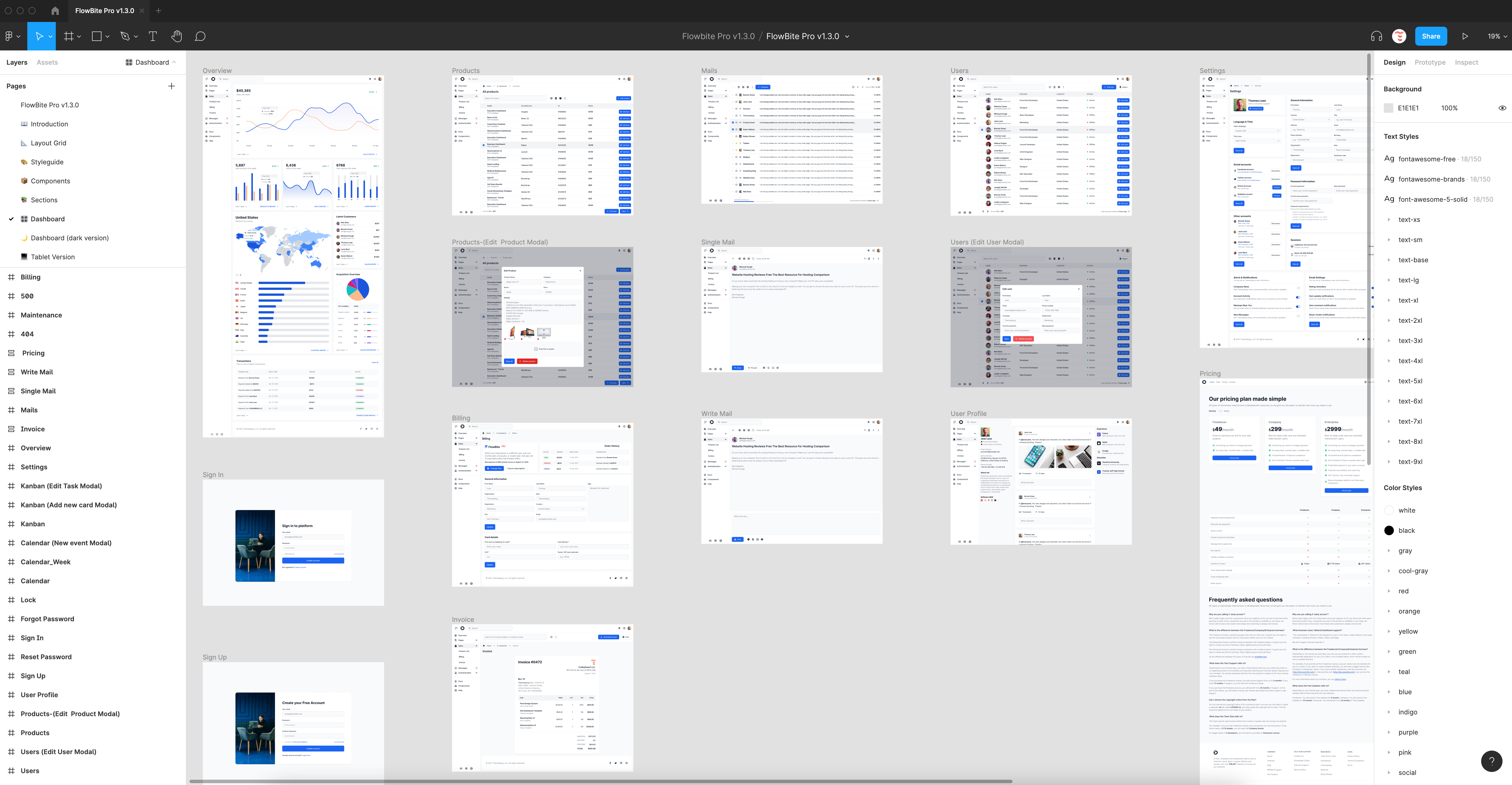
Flowbite Figma design file
You can use this design file to prototype and design your components and pages before coding them with Tailwind CSS and Flowbite.
Recommend
About Joyk
Aggregate valuable and interesting links.
Joyk means Joy of geeK