

UI/UX Design: Abstract Gradients 2022
source link: https://uxplanet.org/ui-ux-design-abstract-gradients-2022-219830932f7
Go to the source link to view the article. You can view the picture content, updated content and better typesetting reading experience. If the link is broken, please click the button below to view the snapshot at that time.

UI/UX Design: Abstract Gradients 2022
How to make clean, modern, & scalable abstract gradients for your Figma projects (+ Bonus free resources)
Overview
We all know that abstract gradients have taken the UI world by storm, and think it’s easy to see why.
They offer an aesthetic element that, for quite sometime, was really difficult to achieve using conventional methods, but with modern tooling, we can create these awesome looking abstract gradients quickly, and easily.
Today, we’re going to cover:
- How to create these abstract gradients
- How to modify them once they’ve been created
- How to make them fit different sizes, and
- How to get them placed in your Figma projects
One day, we’ll be able to do this right from within Figma, but for now, we’ll have to lean on our trusty copy of Adobe Illustrator.
But what if I don’t have Illustrator?
If you DON’T have Adobe Illustrator, don’t even worry about it, because at the end of this article I’ve got a free abstract gradient pack that I’ve put together just for you.
With that said, let’s get into it.
How to make these gradients
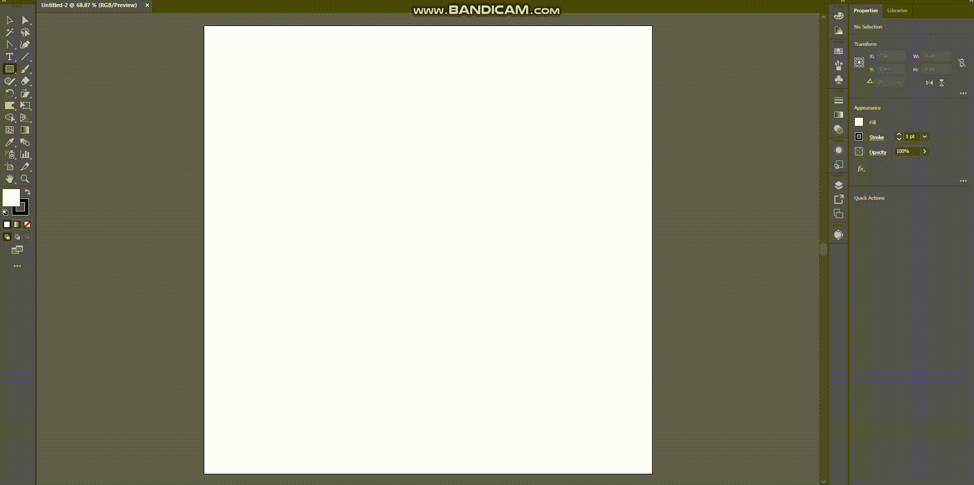
- Load up Illustrator, and create a brand new file that is about 1000 x 1000 px, 150 dpi for raster effects (note: this original file will be saved as vector so you won’t have any issues resampling at a larger size if and when you need to).
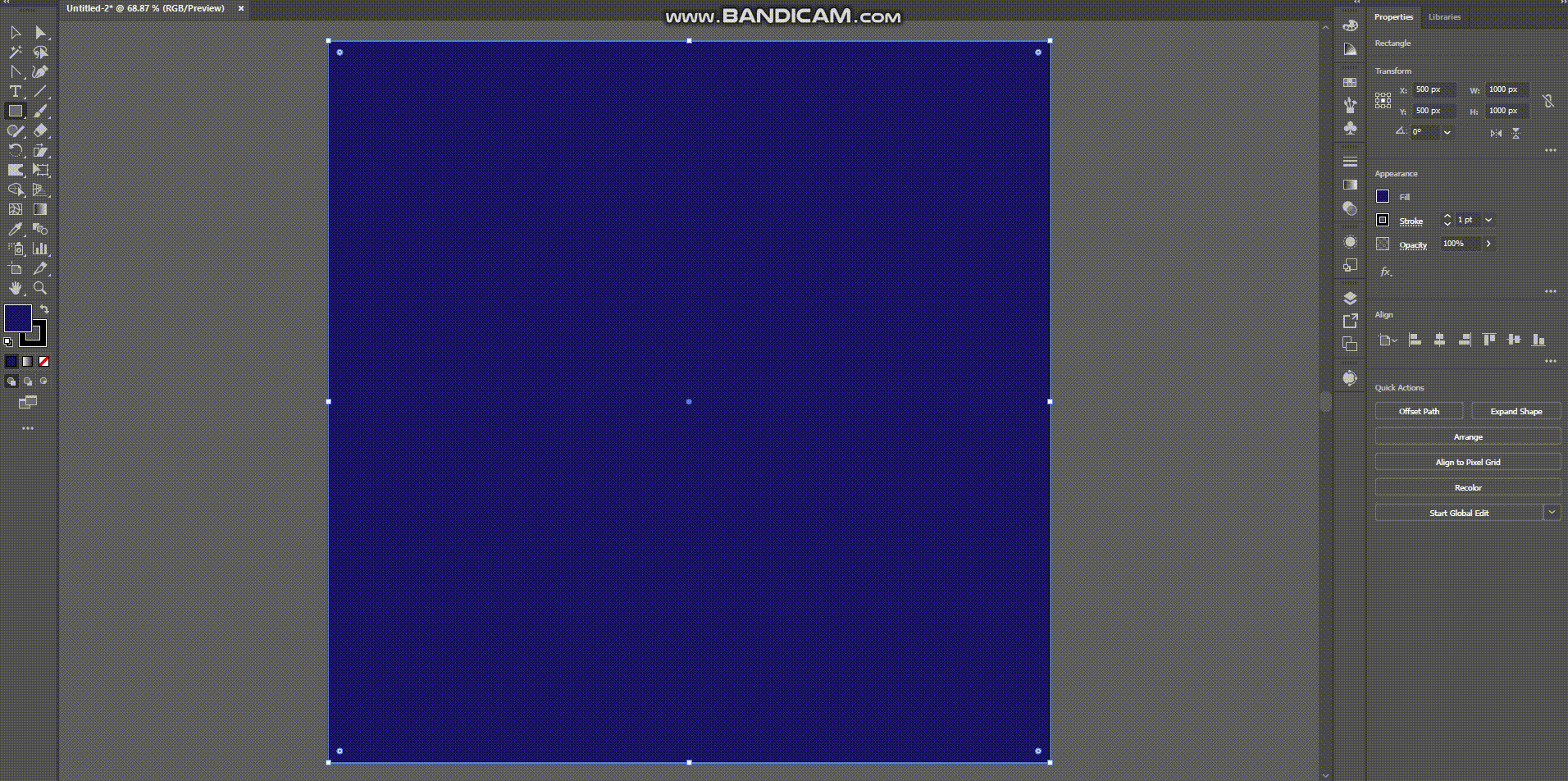
2. Fill your new artboard with a rectangle that is a solid, dark color.
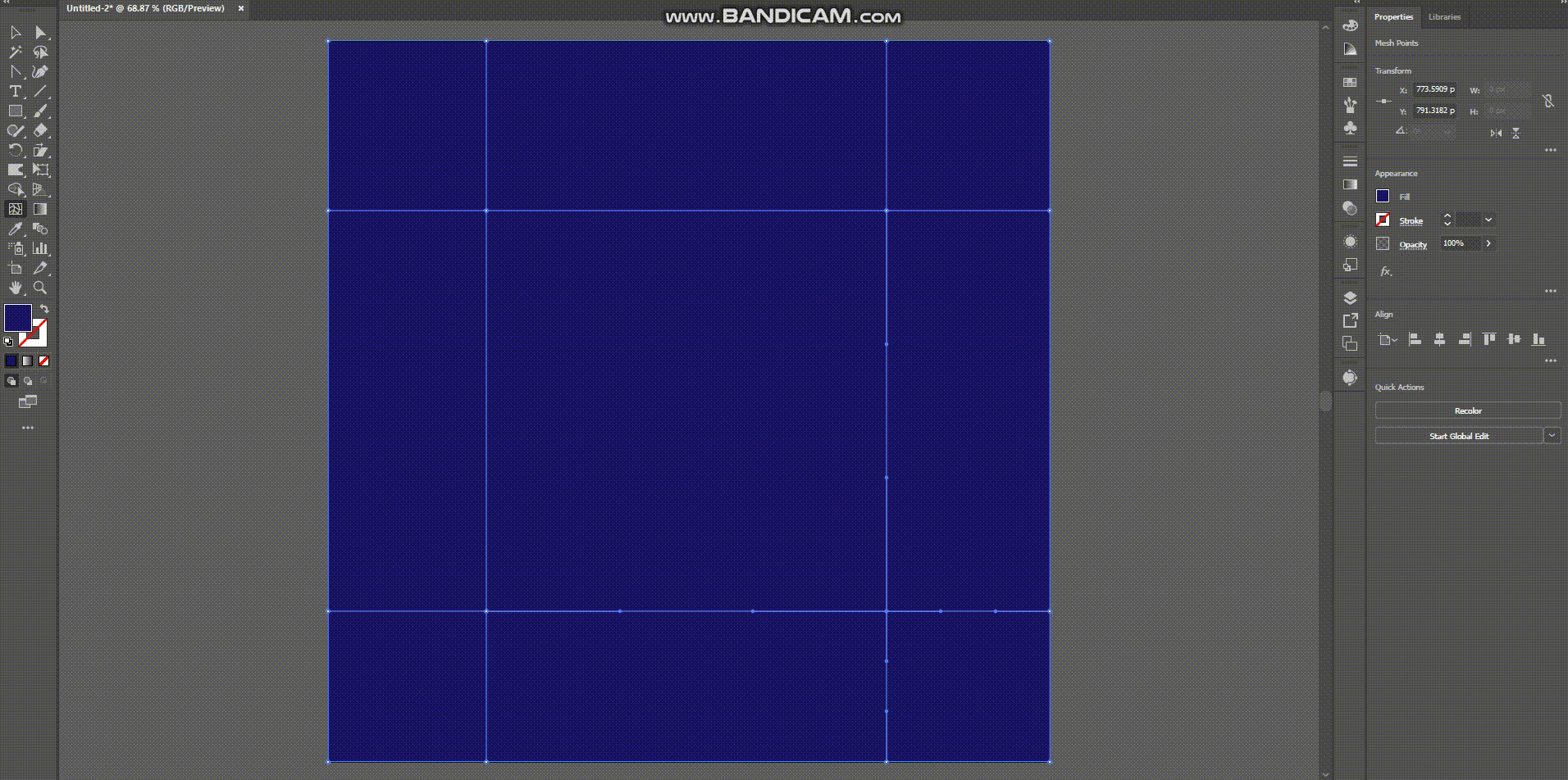
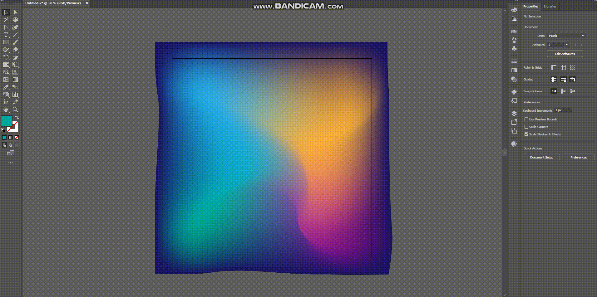
3. Select your Gradient Mesh tool, and click once in the upper-left quadrant, and once in the lower-right quadrant. This should give you four points to work with (we want to keep this mesh simple to reduce artifact).
4. Select each point and in your gradient mesh, and apply a new color from your swatches, picker, or libraries until you have something that looks roughly like this.
5. Now, grab your Warp Tool, adjust the settings as shown below, select all your nodes with CTRL/CMD+A, and very gently begin to mix your gradient together.

6. Resize your warp so that it’s larger than your artboard
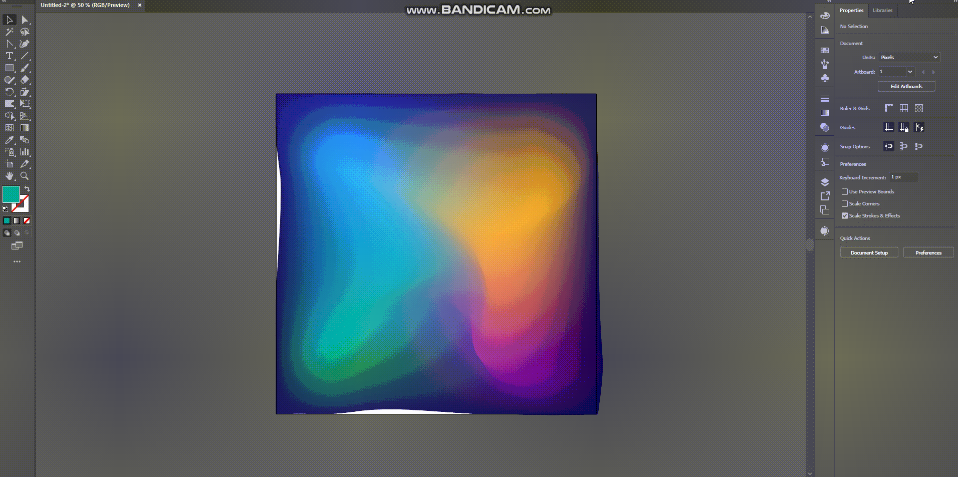
7. Take a look, adjust, scale, and transform as-desired
8. Export your artboard and you should be good to go! :)

Modifying the gradient
Let’s say you need it to look different though. No worries at all!
Since it’s saved as an illustrator file, and since the gradient is being created via vector calculations, you can always redo the warping, hone the curves, and modify the colors super fast.
Let me show you what I’m talking about here:
Making them fit different sizes
You can also stretch these out without degrading the quality because they’re vector, but if you wanted to make one that was specifically for a particular artboard size, you can do that as well!
Getting them into Figma
Once you’ve got your gradients saved and exported, getting them into Figma is super easy.
In fact, all you have to do is drag and drop your exported files into your artboard and position them in your background wherever you’d like.
Let’s look at a few bad examples
In order to show you how to really get the most out of these gradients, we have to understand the proper time and place to use them.
Check this out:


AS YOU CAN SEE: The above example is gratuitous overkill, and illustrates how these can produce a good amount of visual distraction when used with other images.
That being said, abstract gradients can really add a lot of punch to designs that just need a little bit of extra accentuation.
These can do a lot for your designs on pages where:
- There are a lot of blank inputs
- There are large blocks of content
- There is a splash-loader or transition, or
- There is a need for accentuating a page for a specific reason.
Let’s look at a few better examples
Now that we know how NOT to use these gradients, let’s look at a few areas where it might make more sense within you app.

In these example, we have a lot less clashing content, which is perfect for the visual accentuation that abstract gradients can provide.
To clarify: these gradients are best used on pages that don’t have a ton going on, have content in large blocks, or are dominated by input fields.
Bonus free gradient pack
Now, I promised you a free gradient pack, and I intend to deliver.
You can get the Abstract Gradient Pack 2022, for absolutely free, just download and enjoy!
If you’d like to make a donation to buy me a coffee, you totally can, but it’s by no means required.
Bringing it all together
In summary, we’ve learned:
- How to create abstract gradients
- How to modify them once they’ve been created
- How to make them fit different sizes, and
- How to get them placed in your Figma projects
The possibilities with this technique are nearly limitless, so feel free to get creative and I look forward to seeing what you create! :D
Recommend
-
5
The Stateof Designin 2...
-
5
-
10
Design TipsHow to Design Sexy GradientsActionable UI tips to help you design better gradients.This article is brought to you by B...
-
6
Elements of design: The wows and hows of abstract artAs a child have you ever dreamt of becoming an artist just like me?If you have achieved it, great! But if not, well,...
-
5
Abstract Factory Design Pattern in Java - Introduction, Example, and Key points This video tutorial takes a closer look at Abstr...
-
6
Abstract Design Pattern in Java #5 Reading Time: 2 minutesIn this blog, we will discuss Abstract Design Pattern, its examp...
-
7
Design Patterns VS Design Principles: Abstract Factory Published April 6, 2022 - 0 Comments In the “Desig...
-
9
-
4
-
5
OverviewI was recently working on a micro-project in my spare time (something I highly encourage all designers to do
About Joyk
Aggregate valuable and interesting links.
Joyk means Joy of geeK