

The tortuous journey of enhancing our color palette
source link: https://medium.com/doctolib/the-tortuous-journey-of-enhancing-our-color-palette-4616b5b9c43e
Go to the source link to view the article. You can view the picture content, updated content and better typesetting reading experience. If the link is broken, please click the button below to view the snapshot at that time.
The tortuous journey of enhancing our color palette
Colors are always a tricky topic to address for many reasons. First, it’s a key pillar of a brand’s identity and has a clear impact on the perception of the brand by both the user and employees, and because it’s linked to an emotional aspect of each of us. Second, in the case of Doctolib, the color palette was created long ago, years before our Design System Oxygen, and in parallel our product has evolved quite fast. All this means that reworking our color palette is a challenge in which we will face many legacy issues in terms of both design and code. No migration would be a piece of cake. (🚨 spoiler: that’s what happened).
Several reasons lead us to start the work of revamping our color palette.
1. Clutter & Legacy
There are three main families of users clearly dealing with colors in a company: Brand Designers, Product Designers, and Tech people.
For all those families the repository to find colors are different. At Doctolib, all the designers are working in
(+ Adobe CC for the Brand Designers), and Developers are mainly using Storybook and Github.
As you can see on the mapping above:
- There were 2 Figma libraries, one for Brand, one for Product. That’s OK to have this split, only if the common colors shared between those libraries are aligned. Happily it was not such a big deal, and many colors dedicated to Brand were only used for illustration purposes (skin tones for example), and not at all concerning Product.
- The colors officially available to developers (in Storybook) were not the same as our Figma library. For some colors we had more or fewer shades (see Teal for example). For others, we had shades with the same name but not the same value (take a look at Green for example)
- To make matters worse, many colors have been directly hard-coded in the product, and not even in the color palette, only in the codebase. Could be legacy colors, mistakes or part of bootstrap CSS default settings. They are not represented here.
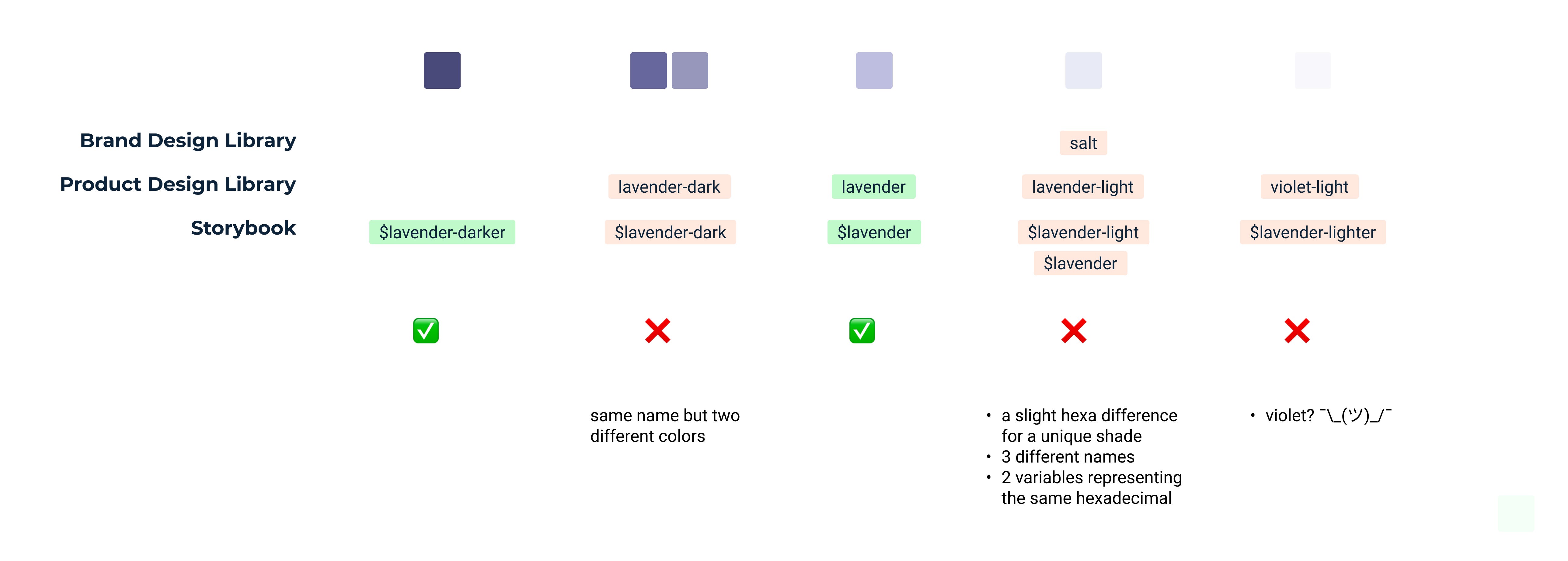
- Naming was also an issue, as shown below:
2. Simplify our designer’s journey
Some issues our designers were regularly struggling with was the lack of shades. Five greys are quite limitating when you need to create hover states for items containing grey text and grey icons with a grey hover in a dropdown that is on a grey background…

It was the exact same case with our corporate blue, and I haven’t even mentioned having only 2 shades of green and other semantic colors.
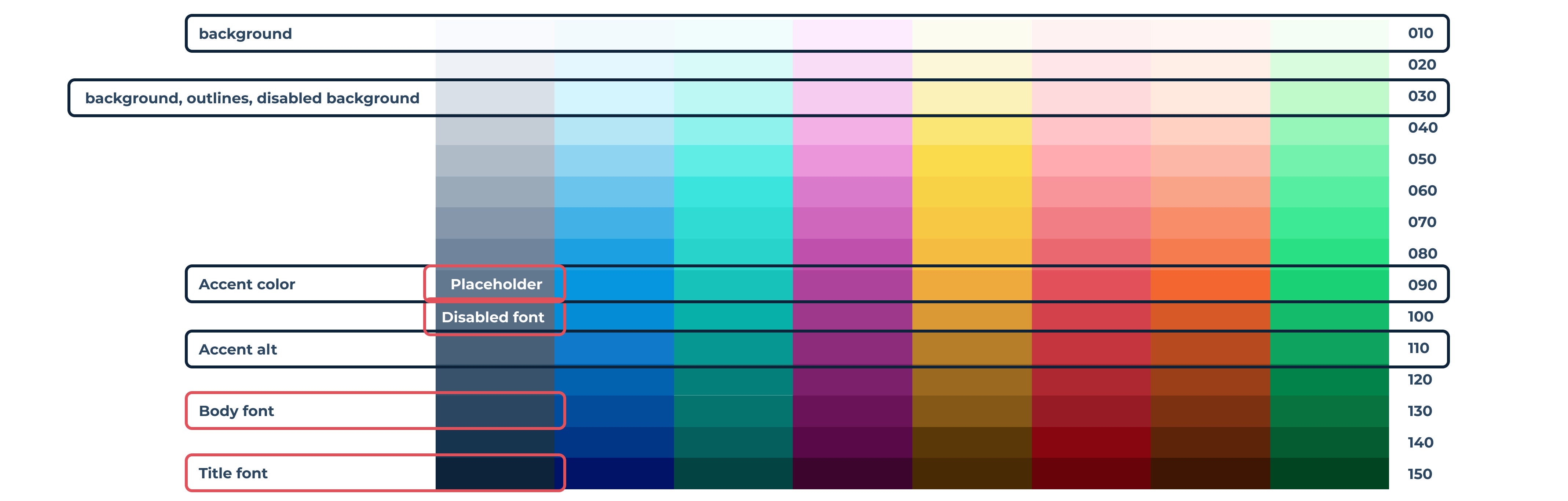
Another point is that Product Designers had no clear guidance on how and when to use colors. Background, outlines, or even disabled states could be any color from the palette, and this automatically lead to inconsistencies across the product.
3. Accessibility
Last but not least, we clearly had an issue of accessibility, but worst was the fact that our corporate blue, created at the birth of Doctolib back in 2013, was not AA-compliant on either white, nor our darker color.

We attribute about 80% of our contrast issues to our use of this blue. So, fixing it means having a real impact on accessibility.
Our goal and biggest constraint when crafting this new color palette was to reach AA compliance. That is, achieving AA-by-design on every component.
The Process
Starting point
As you may have deduced from the previous section, we had several goals:
- Create a consistent palette for all stakeholders of Doctolib
- Normalize the palette on all software and having a common language (Zeroheight, Figma, Storybook, Github)
- All use cases must be covered with this color palette, without needing to add a new color in the future (from huge illustrations to tiny components and Google Slides…)
- Reach the AA level by design, by offering more lighter and darker shades, and therefore creating more contrast (and pleasing our Designers 😉).
- Finally, take this as an opportunity to undust our color palette and pimp our colors
Our biggest constraint and challenge was to carefully adjust the corporate blue, as it was a pillar of Doctolib’s identity and not a decision we could take on our own. We also had to keep in mind that our goal was to revamp the palette without reinventing the wheel and losing our identity.
Last point I haven’t mentioned is that our identity is based on many illustrations, all including various gradients. This was a request from the Brand Design Team to bring more flexibility and richness with this new color palette.
Iterations, iterations, iterations…
The start point of our journey was to rework the corporate blue. And this has been a real manual effort to find a color that reaches the 4.5 ratio on white, but without compromising the perception of our identity.
We finally found what we now call Digital Docto Blue, but we also chose to keep the old corporate blue in our official palette. It is still featured in our logo, in printed assets and illustrations.
Then, to have a good overview, we mapped the shades depending on their luminance following the process created by Amplitude. This quite mathematical approach really helps us to address our pain points from an accessibility point of view.

Armed with this new Blue, we refined all the blue shades using Colorbox, an amazing tool created by Lyft. This tool is really convenient to play with hue, saturation, and brightness.
Then we iterated on the other colors with Colorbox following the same process, and it really helped us to create a color lightness-to-darkness consistency.
What does the new palette look like?

Accessibility
Every color 0–70 is at least AA compliant (4.5:1) on our darker shade ($neutral-150), and every color 110–150 is at least AA compliant (4.5:1) on white.
We also have a simple rule to remember ratios between lighter and darker shades, which is quite convenient when crafting a component if you’re aware of the basics of accessibility (i.e. depending on your font size and weight).
- 2 darkers on 2 lighters > 7:1
- 3 darkers on 3 lighters > 4.5:1
- 4 darkers on 4 lighters > 3:1

Naming colors
I didn’t mention this earlier, but naming color was also a point of discord between tech and product, some were speaking of blue-500, some of primary500, and some of Doctolib Blue.
We decided to fix all that confusion by standardizing the naming, and as long as we do, using a semantic approach.
Unfortunately, some colors (mainly secondary colors used by Brand) can’t be categorized, so we chose to keep their name for an easy identification by all stakeholders.
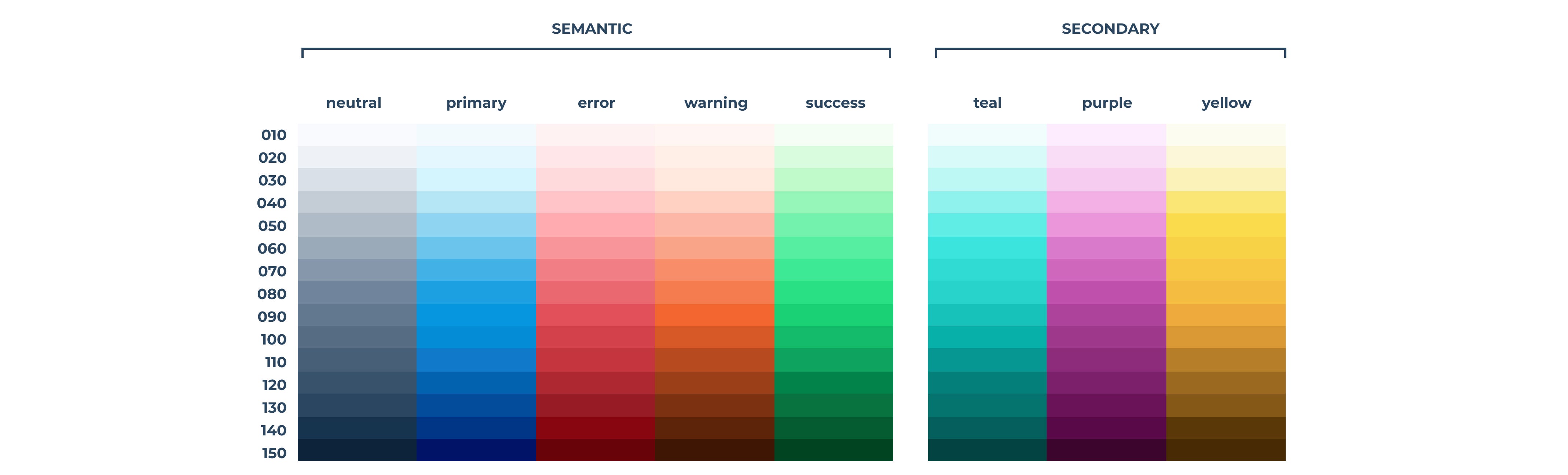
Why not 10 shades?
15 shades per color. Yes, it’s a lot, but it’s a choice.
All along the creation phase we struggled when implementing this color palette into our existing components. Indeed, reaching AA compliance without losing consistency with our legacy interfaces, left us with little hope of creating well-balanced interfaces without rewriting everything. Every time we tried to reduce the number of shades we had to make concessions on either accessibility or user experience. We chose not to choose and so we kept our 15 shades.
The downside to having so many shades to choose from is the risk of discrepancies between Product Designers and Developers leading to the generation of design debt with inconsistencies. To avoid this we arrived at some easy to remember guidelines, like these ones:
- One shade = One use case
- The +20 rule: Hover state is two shades darker, active state is four shade darker.

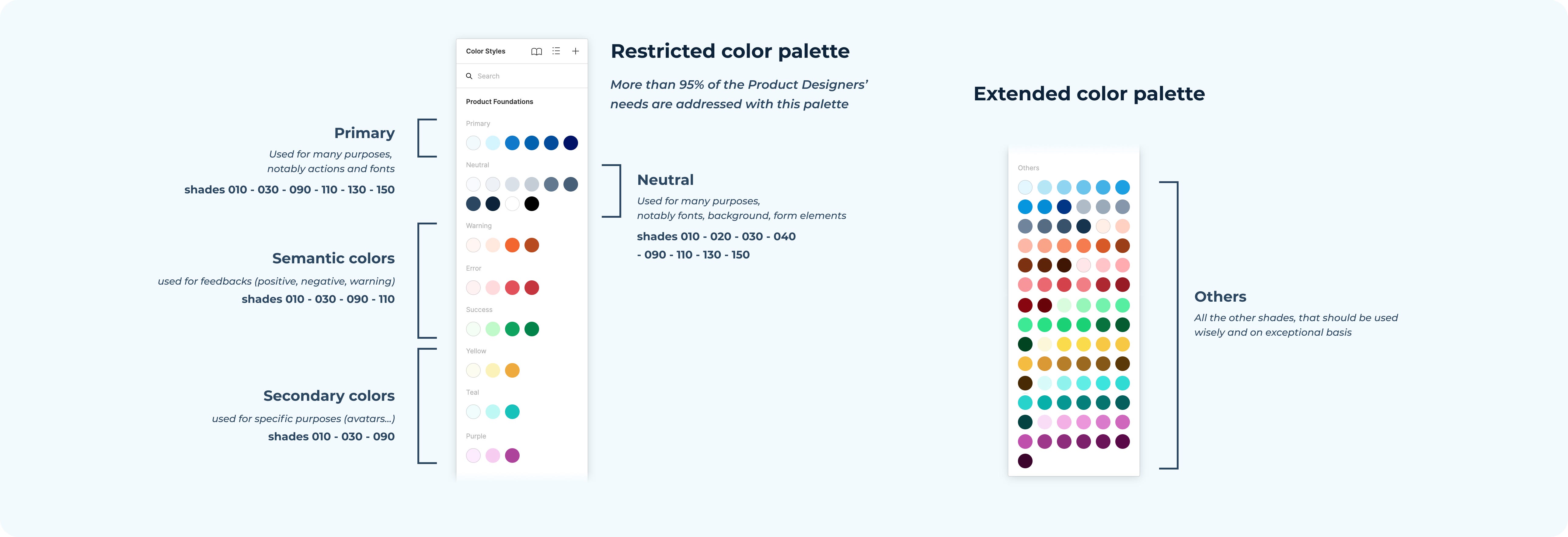
Also, to avoid complexity for designers choosing a color when crafting, we created a restricted palette on Figma which contains only the colors that will match the vast majority of the use cases. In case of need, of course the Product Designer can pick a color in the extended palette. This is the case for chart components, for instance, where a lot of refinement is required, and many shades of the same color can be used. For Brand Designers, the extended palette is the default one.
Final step: Migration
Once the color palette was validated on the design side, the journey was not over. Our tech team has had to migrate old colors to new ones. We created a equivalence table between old and new shades and went on to identify the hard-coded shades I mentioned earlier. Most of the issues we encountered were in our legacy interfaces.
Then began the final process of migrating the old colors in our Figma library to the new ones. Unfortunately, we did this migration meager weeks before Figma released a feature dedicated to this use case… ¯\_(ツ)_/¯
Conclusion
I lied. The real final step was not migration, but internal communication. Even if we communicated a lot around this project, and we took almost 6 months from idea to a live reality, many Doctolibers were not aware of this change, and only discovered the changes once pushed live.
A good side-effect is that it raised a surge of interest on accessibility topics among Doctolibers, and since the launch many developers have offered their help for similar topics in the future.
Last point to highlight (and this is a good one) is that it was a great cross-team project with many stakeholders, and has had a real impact on our product, on our Design System and on our Designer’s daily life.
Thanks for reading 🙏
Recommend
About Joyk
Aggregate valuable and interesting links.
Joyk means Joy of geeK