

The rebranding of an American icon
source link: https://uxdesign.cc/the-rebranding-of-an-american-icon-aed9ceae6eb6
Go to the source link to view the article. You can view the picture content, updated content and better typesetting reading experience. If the link is broken, please click the button below to view the snapshot at that time.
The rebranding of an American icon
Should the future of the Mustang visual identity be electrified?
Car brands establish identity through a range of visual design cues…signature colors, vehicle graphics, and the various unique design languages employed by manufacturers used to inform the shape of a vehicle’s front grille. The goal is to create a consistent, recognizable signature style and design language that will evoke a sense of familiarity in the consumers’ minds on public roads in the wild. But - there is an often-overlooked element of car design and branding, and, while many of a car’s features, and even the design language may change and evolve over time, this one important element rarely does. But, lately more and more, I’ve been thinking that perhaps it should. The manufacturer’s badges and model badges found on the hoods, grilles, fenders, and bumpers of almost every car have always been a big part of car culture, and some of them haven’t changed much since the dawn of the industry. Some are cool, some are quirky, some are funny, some are even bespoke pieces of art, and some are just plain bad…and all have been a source of fascination for me since I first saw the snarling cat on my father’s various Mercury Cougars as a young kid. For others — these badges have been a source of envy, desire, ambition, status, wealth, quality, wonder, progress, and a myriad of other associated traits.
In general, American and Italian car brands seem to have more fun and take more risks with their car-naming schemes and badges than the European or even the Asian car brands which tend towards the alpha-numeric, with some notable modern exceptions like the goofily-named “Stinger”, or awkwardly-named “Fairlady-Z” – (the former sounds as if it was named by a kindergarten student, and the latter was actually named after a Broadway production of “My Fair Lady”). You’re not likely to see a cartoon image of a roadrunner on the fender of a BMW anytime soon, nor will there ever be a Mercedes-designed “Hell-anything”, and nor is there likely to be any kind of animal adorning the clean Swedish sheet-metal of a Volvo anytime soon. But, with all the tectonic paradigm shifts happening in the industry I started thinking more about these badges as a reflection of a company’s core values, and how some of the current badges align with the future direction of some of the world’s biggest car manufacturers, and industry as a whole.
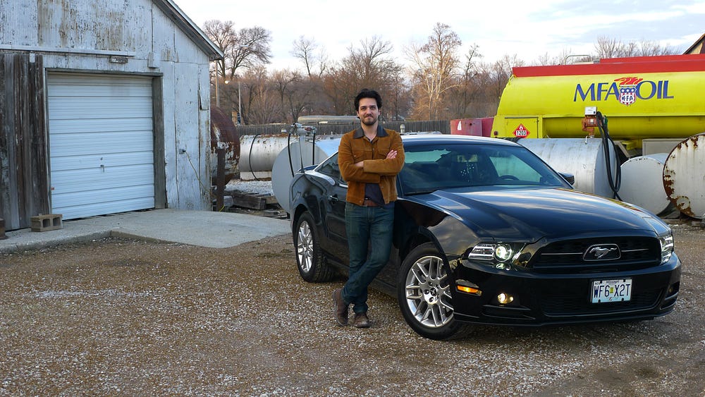
With the push toward electric, and Ford releasing the Mach-E onto the car-buying public, I started thinking about the brand’s iconic running pony. When I first saw that iconic badge on the front of Ford’s new electric crossover, it looked a little strange and out-of-place to me (and not because I’m one of the Mustang faithful that believes the badge only belongs on a grille that’s wrapped around a big V8 engine). Let me start there before any of the Mustang faithful start to throw shade. I love Mustangs, and the Mustang brand. As a kid growing up in America, it’s hard not to. Mustangs are an affordable, customizable, tunable, fun, performance-oriented car platform. They’re also pretty to look at. I’m on my second, and with the exception of a hand-me-down Volvo, all of the cars I’ve owned in my life have had a manual transmission, each one with its own sense of fun.
That said, I’m a realist, and while I’ll mourn the death of manual transmissions and the burbling V8 engines they’re attached to, the writing is clearly on the wall. If the Mustang brand is to survive, its future, like the rest of the industry, will be electric. I don’t think that future will come as fast and furious (-ahem-) as everyone else is anticipating. Current battery technology, range, recharging times, infrastructure, and prohibitive price tags are still a significant hurdle, and while those things will certainly continue to improve, I don’t see that happening in a major way in the next 10 years. I think, perhaps, a more significant shift is more likely within a 20-year timeframe, with charging infrastructure and range being of particular importance for the mass adoption of EVs. My recent decision to re-up with an ICE model rather than electric was based on a number of things, but one of the more significant to me, personally, was that I wanted the freedom and flexibility to take a long road trip whenever I want to, wherever I want to, without having to worry about where I need to stop to charge up along the way, with the added hassle of then having to wait for a significant period to charge up when I get there. The bottom line is that our cars provide us with freedom and convenience. Any deficiency in either of these categories adds up to an inferior product, and that means people are likely to buy the alternative, which, for the time being, is still ICE-based. For the tables to turn in any significant way, car ranges, charging times, and charging infrastructure need to get much, much better. Infrastructure is quite possibly the one major thing that can change the tide, but for all the talk about combatting global warming with an all-electric future, I haven’t seen much follow-through from either the government or the private sector in providing the necessary infrastructure to support all-electric transportation, with the possible exception of Tesla…but their superchargers are proprietary, and their cars are still pretty expensive.
The Mach-E marks the dawn of the electric era for Ford, and as controversial as it is in the eyes of Mustang purists, the new Mach-E is, in my opinion, the first real attempt at a fun, affordable, attractive-looking electric car for the masses. Most of the competition currently caters to the 1%, and there are precious few electric options for the masses that are well-designed, reasonably affordable, and most importantly fun. And while I’m not a fan of the current SUV crossover design trend (decidedly not-so-fun), if I were to buy one, the Mach-E design is one of the more attractive options out there. The Mach-E makes the Tesla Model X, one of its prime competitors look like a frumpy, awkward, stylized minivan, a task it needed little help with. All that said, given the eventual shift towards electric, I started to wonder…is Ford’s current Mustang badge the right choice for a new generation of electric pony vehicles, and the future of the Mustang brand? For that matter…what about the Ford logo itself? Has the time come for the blue oval to finally try a rebrand? If they did, it wouldn’t be the first time that Ford considered a major visual overhaul. Way back in the 1960s when another cultural shift was underway, just a few years after the birth of the Mustang (I) concept that kicked off the launch of the production Mustang based on the Ford Falcon platform, legendary graphic designer Paul Rand proposed a redesign for the Ford brand that we know was ultimately rejected based on the fact that Ford continues to use their classic script design to this day. I’ve always thought that Rand’s Ford marque redesign was way ahead of its time, and would look right at home on the products that Ford is producing today in 2021. In fact, Rand’s design would look more at home on the Ford cars and trucks of today than any of their 60’s-era counterparts, or any other time in their history for that matter.
So, all of this got my designer brain thinking…is there a better visual way forward for Ford and their products? Included in this article are some designs that I executed to satisfy my own curiosity. What if we lived in a world where Ford decided to bring their brand and visual identity into this century? For my attempts, I redesigned the Rand logo for better balance and symmetry. While I love Rand’s design, and while I know there are designers out there that will consider messing with a master’s work sacrilegious, I always felt as if there was too much of a visual gap in the tail of the “F” swash creating too much imbalance and asymmetry — especially for a car badge application. In my opinion, Car badges should be centered, well balanced, and understated, never upstaging the visual design language of the car’s sculpted body forms, but rather complementing them.
Recommend
About Joyk
Aggregate valuable and interesting links.
Joyk means Joy of geeK