
Why white looks bigger than black — The irradiation illusion
source link: https://uxdesign.cc/why-white-looks-bigger-than-black-the-irradiation-illusion-935dc634bb42
Go to the source link to view the article. You can view the picture content, updated content and better typesetting reading experience. If the link is broken, please click the button below to view the snapshot at that time.
Why white looks bigger than black — The irradiation illusion
The unknown optical illusion every designer should know
If you ever designed a logo, you probably had to test it both on a white and dark background. It’s good practice, since you want the logo to look consistent on different backgrounds.
Most people think all you need to do is invert the colors, and you’re done. But… that’s not the case. Something weird happens: the logo looks “fatter” in white.
In the example above, the stroke of the white logo symbol looks thicker. It’s specially noticeable when you compare the two leaf-shaped strokes in the center. But whether you believe it or not — the stroke weight is exactly the same on both symbols.
Inverting the colors has made the exact same logo look like it’s put on some weight! Weird, right? This illusion is called Irradiation Illusion.
The Illusion
The term irradiation illusion was coined by German scientist Hermann von Helmholtz in the 1860s to describe the visual perception in which a light area appears larger than an identically-sized dark area. The effect was observed as early as the time of Galileo, who refers to it in his observations of the sizes of planets when viewed through a telescope at different times of day.

In the example above, you can see two smaller inner squares, each one surrounded by a bigger square of the inverted color. Although the inner squares are exactly the same size, the white square looks bigger than the black square. But why?
The science behind it
After various studies, scientists reached an initial conclusion: the square sizes are the same on the retina; therefore, the perceived difference in size must happen in the primary visual cortex.
A recent study led by Dr. Jose-Manuel Alonso, a neuroscientist at the State University of New York’s College of Optometry, investigated this phenomenon a bit deeper.
The visual system has two main channels: Neurons sensitive to light things are called “ON” neurons, whereas neurons sensitive to dark things are called “OFF” neurons. The researchers recorded from both types of neurons in the study.
They found that the “OFF” neurons responded in a predictable, linear way to dark shapes on light backgrounds: the more contrast between a dark and light object, the more active those neurons. But the “ON” neurons responded disproportionately to light shapes on dark backgrounds: for the same amount of contrast, they had a bigger response.
The independent researcher Grant Ocean has a great explanation on what may cause this bigger response.
As is well known, light exerts physical force or energy which acts upon our retina and generates sensory stimulation to produce vision. It is also a fact that white color reflects (or re-emits) more light energy (or photons to be specific) than black color; therefore, the small white square puts forth a higher level of energy than the small black square.
The two small squares are identical in size, but re-emit different densities of photons. The small white square has a higher density of photons (generated by a higher intensity of light force); thus it may activate a larger area in the primary visual cortex. The more light energy an object reflects, the larger the object tends to be perceived.
An evolutionary trait
This optical illusion might have served a bigger purpose in the evolution of our species. Quoting from Dr. Jose-Manuel Alonso, the distorted vision turns out to be very useful for humans, “because when you’re in a very dark place, it allows you to see small amounts of light. This would be helpful to, say, alert you to predators at night. But during the day, more dark objects are visible, so it’s better that these aren’t distorted”, Alonso said.
Mind the Irradiation
So, after all these scientific explanations: how can we improve our design work with this new knowledge?
If you’re like me, you immediately thought: dark modes. There is a lot to be said about dark modes in UI design — an entire article would be needed to discuss it. But following the Irradiation Illusion principle, we can draw some conclusions and improvements that could be made when translating a design from light to dark mode:
- Dark mode will make fonts look bolder. Take this into account when dealing with large areas of text, and big bold titles. Sometimes it’s a good idea to reduce one font weight when translating your design to dark mode, so the letter strokes remain optically similar to light mode.

- Don’t use full black on dark modes. Full black will aggravate the irradiation effect, because of the high contrast with text, images and graphics. However, bear in mind that you need contrast to meet accessibility guidelines: striking the balance between having too much and too little contrast is vital for a great user experience and interface.

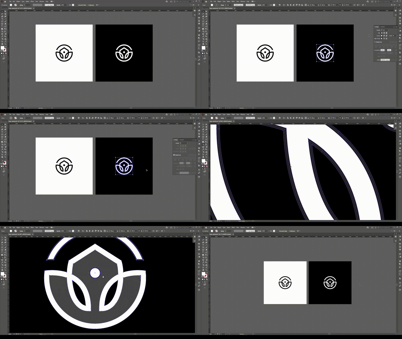
If you are a logo designer, this knowledge is also incredibly useful. You might want to adjust the stroke weight of the logo when showing it on a dark background. In Illustrator, for example, when designing a white version of your logo designs you can simply apply a thin stroke, expand the shape and use the shape builder tool to remove it. How much weight you remove will need to be done by eye, but the aim is to make the design look optically the same in white on black as it does when black on white.
Here is an example of the process, where I correct the logo symbol at the start of this article.

Recommend
About Joyk
Aggregate valuable and interesting links.
Joyk means Joy of geeK