

UI cheat sheet: Accordions
source link: https://uxdesign.cc/ui-cheat-sheet-accordions-3e88f0d4dfee
Go to the source link to view the article. You can view the picture content, updated content and better typesetting reading experience. If the link is broken, please click the button below to view the snapshot at that time.

While accordions may seem like a simple component, there is more to them than meets the eye. When designing these components, there are a few things to consider, and that is what we will look at today in this cheat sheet.
In this cheat sheet, we will cover:
- What is an accordion?
- Accordion states and anatomy
- Types of accordions
- Common accordion styles
- Common accordion decisions
- When to use an accordion
- Accessibility checklist
- Further reading
1. What is an accordion?
An accordion is a user interface component that allows the user to hide or reveal content. (And a musical instrument, but that’s not important right now.)
Use 1: Chunking information and reducing clutter
One of the most important goals in product design is to reduce cognitive load, a.k.a. Decreasing how much thinking the user has to do. By removing clutter or non-essential information from an interface, you make the user’s job easier. And if the user does need that information, they can simply click on the accordion to reveal it.
Use 2: Navigating
While not their primary use, accordions can be used to navigate through websites and pages. They can group links to help the user navigate through interfaces. This is especially helpful in mobile design as it allows you to collapse information into different sections or pages.
2. Accordion states and anatomy
An accordion component is usually made up of multiple items.
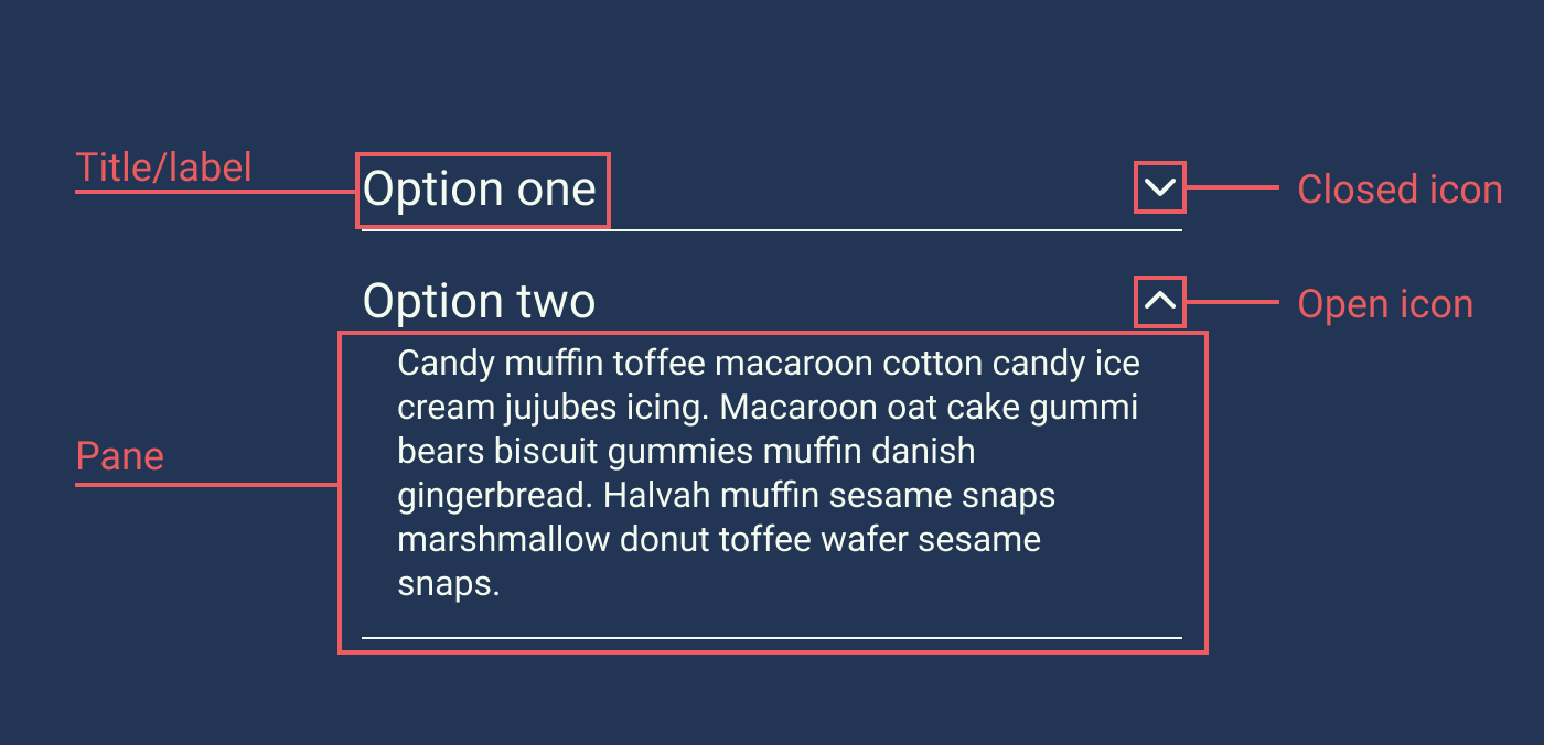
The most common elements in an accordion are:
- Title or label: This is the wording used in the top section of an accordion. This wording should be clear and straightforward, much like the wording on a link. The label part of an accordion, along with the icon, should be clickable.
- Icon: The icon indicates that the component is an accordion and what state the accordion is in. Some accordions don’t have icons, but that’s considered bad practice.
- Pane: The pane, also sometimes called the drawer, is the part of the accordion that is hidden when the accordion is closed or inactive. This is where the accordion information will sit.

States are the different appearance an accordion may take depending on the context and user input or interaction.
Accordion states include:
- Closed accordion-item: This is when the accordion item is closed, and the content in the pane is hidden. This is also sometimes referred to as the default state.
- Open accordion-item: The accordion item is open and displays content previously hidden in the pane. This is also sometimes referred to as an active state.
- Closed accordion-item on focus: This is when the accordion is closed, and the user has tabbed to the item using the tabbing map. If they were to click enter, they would open the accordion item.
- Open accordion-item on focus: This is when the accordion is open, and the user has tabbed to the item using the tabbing map. If they were to click enter, they would close the accordion item.
3. Types of accordions
There are a few types of accordions you can use, depending on the context.
Single accordion
On busy pages, you may choose to hide some information behind a single accordion item.

Stacked accordion / normal accordion
This is what most people think of when they think of accordions. In this type, information is hidden behind different accordions, and the user can choose what option they want to see.

Hierarchical accordion
Hierarchical accordions are like stacked accordions expect they can have multiple sublayers.
One of the downsides of this type is that it is challenging to navigate through and can confuse users. I suspect that because of this, most designers avoid them these days. So, if you are considering this pattern, ask yourself: “Can I rather make the top-level items a page and have a normal stacked accordion?”

Table accordion
A table accordion is used to highlight some information that is hidden in the pane. For example, you often see this type used in online booking forms or account settings.

Filter accordions
In long lists of checkboxes, you may want to be able to hide some child items under a parent icon.

4. Common accordion styles
While accordions are a fairly basic component, there are a few different ways you can style them.
Simple
The simple style is probably one of the more common styles with the current UI trends. Its clean, simple, and elegant. I recommend keeping lines or rigid boundaries between your different items to avoid confusion.

Contained
The contained accordions are what one thinks of as an ‘old school’ accordion. While you don’t see much of this style anymore, it is good at clearly diving sections.

Separated
In the open state, an accordion section with a separation style may break away from the elements above and below. This helps the user focus on this specific section. It is recommended only to have one section active at a time for this type.

5. Common accordion decisions
When designing accordion components, there are a few common decisions that you need to make.
Multi-active vs. single active
For multi-active accordions, you can have many sections open at once. For single active accordions, only one section can be available at once.

So which is best?
As with most things, it depends on the situation. While there isn’t a golden rule, here are some factors you can take into account.
Single active:
- Pro: Good for forms as they are suitable for progressive disclosure.
- Con: Bad for when, the user wants to compare copy in the same accordion. (I would say this is an edge case.)
Multi-active:
- Pro: It gives the users more control. They can open and close as they wish.
- Con: It might get a bit unwieldy in areas with limited space with too many sections open.
- Con: The user won’t be focusing on a single section.
Accordion icon
There are many different accordion icons you can choose from.

According to Nielsen Norman’s study on accordion icons, the caret icon is the most recognizable or expected. It is also more likely to be taped on than the text label, “Participants were equally likely to tap on either the text label or the icon, except for the caret icon, where there was a statistically significant tendency to tap on the icon over the text label.”
To read more about this study: Accordion Icons: Which Signifiers Work Best?
That being said, a ‘plus’ icon can look pretty in the right context, but one just has to acknowledge the fact that it isn’t as recognizable.
Default to open or closed
Some designers like to have one of the accordion items defaulted to open on page load. Their argument could be that they want to surface the content or show that it is an accordion. While that argument may be valid in that context, I would argue with the following: essential information should not be in an accordion. And secondly, on mobile, an open accordion may hide other information below the fold, and the user may miss it.
So, my suggestion would be: unless you use an accordion as a navigation tool, rather default it to closed.
6. When to use an accordion
Here are a few instances where you may consider using an accordion.
Product information
Retail sites may want to hide non-essential information like sizing specifications, delivery details, returns details, etc.

Site navigation
Some platforms may use side navigation with an accordion component to store all the different site links. That being said, you don’t see this pattern very often anymore, except on sites with many different pages.

FAQs or frequently asked questions will usually have a page dedicated to them on big platforms or event sites. Usually, the question will be the accordion’s title, with the answer being in the drawer.

Forms
Forms often use accordions because they are really good with progressive disclosure. The user will only have to focus on one section at a time.

7. Accessibility checklist
When designing your accordion, use this list to make sure that they meet the following accessibility requirements.
- Make sure the label and the icon are both buttons and that they both open the same thing (e.g., your label shouldn’t link you to a page, and your icon opens the accordion). One exception may be with filter accordions where the label may be part of the checkbox.
- Is the closed state of the accordion more than 44px high? (For touch areas)
- Do the colors meet the AAA compliance standards?
- Does your accordion have focus states.
- Make sure that the accordion works on a tabbing map.
And, when in doubt, visit https://webaim.org/techniques/forms/controls
Recommend
About Joyk
Aggregate valuable and interesting links.
Joyk means Joy of geeK