

Introducing Material Theme Builder
source link: https://material.io/blog/material-theme-builder
Go to the source link to view the article. You can view the picture content, updated content and better typesetting reading experience. If the link is broken, please click the button below to view the snapshot at that time.

Introducing Material Theme Builder
Visualize dynamic color, build a custom theme, and export to code
Material Theme Builder is a new tool that helps you visualize Material You’s dynamic color and create a custom Material Design 3 theme. With built-in code export, it’s easy to migrate to Material's new color system and take advantage of dynamic color.
Quick links
Install Material Theme Builder as a Figma Plugin or try Material Theme Builder on the Web, and grab the new Material 3 Design Kit.
Themes powered by Design Tokens
Material Design can be customized to represent a variety of stylistic choices. A theme is a set of style choices that define the visual appearance of a product. With Material Design 3, we are introducing design tokens—small, reusable design decisions that reflect the system’s visual style. By building with tokens instead of static values, design and code share a source of truth.

Our Material 3 Design Kit and Material 3 Component libraries have been updated to reflect the new design tokens and their assigned roles. In Figma, Material Theme Builder generates these tokens as Figma styles. Material Theme Builder exports design tokens directly as a Design Systems Package (DSP), and theming code for our Material 3 libraries on Android Views and Jetpack Compose.
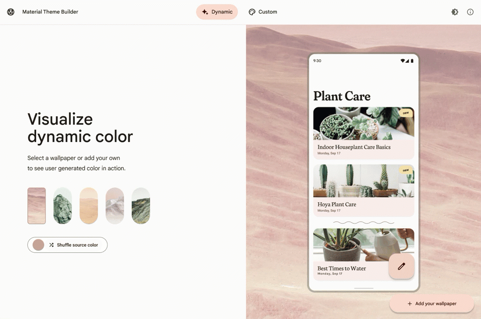
Visualize dynamic color

Dynamic color plays a key role in Material You, creating individualized and expressive experiences for your users. Design tokens and their assigned color roles allow apps to seamlessly accept any dynamic color scheme in place of pre-set color values.
Material Theme Builder on the web gives a glimpse into how dynamic color from a wallpaper may represent itself in UI. With the Figma plugin, you’ll be able to see how dynamic color represents itself across your design. First, you’ll need to manually map the design token Figma styles to your custom components or use components from the Material 3 design kit to build your UI.

Once you have a UI built with Material Design tokens, select an element or frame of the design and click “swap” to apply the Material Theme styles, now any changes you make in the Material Theme Builder will be reflected in your UI. While selected, you can switch between light and dark themes, by clicking the moon and sun icon buttons.

Build a custom theme
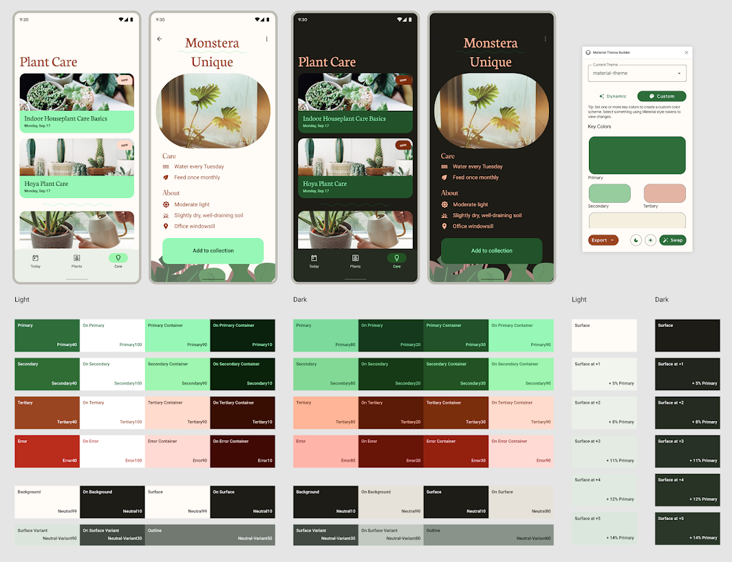
In order to take advantage of the latest features introduced with Material You, you’ll need to migrate to Material Design 3. Material 3 theme expands on Material 2’s color space by introducing new color roles and deprecating others. With Material Theme Builder on the web and Figma, you can easily create a custom color scheme based on your brand or style. Once you have a custom theme, you can export your code to be used with our Material Design 3 libraries for Android Views or Jetpack Compose.

For an in depth guide of the new Material 3 theme updates, check out our migration guide.
Export to code
Material Theme Builder allows you to export the theming code to multiple formats: Android Views (XML), Jetpack Compose (Kotlin) and Design System Package (DSP).
Note that the surface colors (Surface 1 - 5) are shown within Material Theme Builder to help visualize surface tonal colors based on elevation. However, these surface tonal colors are not exported in the code. Their actual color values are calculated by setting elevation within Android. For details on how to set elevation in Android see documentation for MDC-Android and Compose Material 3.
Compose Material 3 (Kotlin)

Material Theme Builder exports Theme.kt which sets up your MaterialTheme with the proper design token mapping. Color.kt stores the color values of your custom theme. We strongly recommend referencing the Colors provided to the MaterialTheme composable via MaterialTheme.colors and not the values defined in Colors.kt in your UI. This will allow you to accept dynamic colors and easily switch between light and dark themes.
MDC-Android (XML)
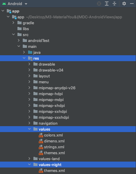
Material Theme Builder exports colors.xml, and both themes.xml files for light and dark themes. We strongly recommend referencing the Android color attributes, such as ?attr/colorPrimary and not the hard coded @color values in your UI. This will allow you to accept dynamic colors and easily switch between light and dark themes.
Design System Package
Material Design now supports the Design System Package (DSP) for importing and exporting Material Tokens within the Material Theme Builder. DSP can be used in designer and developer workflow tools and Material Component libraries. Download and install Adobe XD extension for Visual Studio Code to integrate a DSP file into your product. Read our how-to guide.
Start building
We are so excited to be bringing you these updates with Material Design 3 and the updated tooling to support designers and developers in the process.
Watch our talk at Schema 2021 where Ivy Knight and Rody Davis talk about bringing the Material Theme Builder to life. Subscribe to the Material Design YouTube Channel and follow @MaterialDesign on Twitter.
Recommend
About Joyk
Aggregate valuable and interesting links.
Joyk means Joy of geeK