

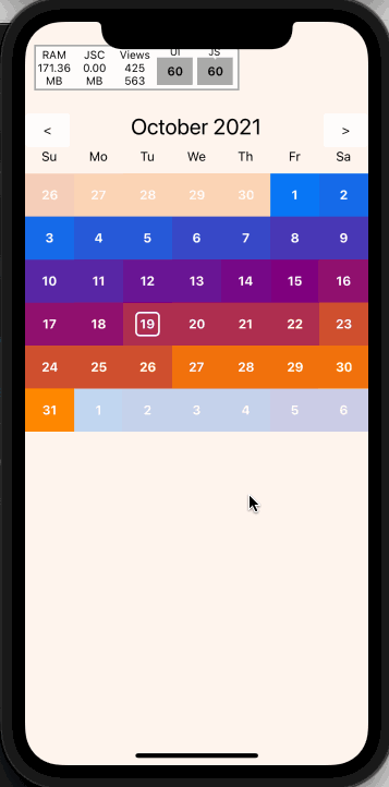
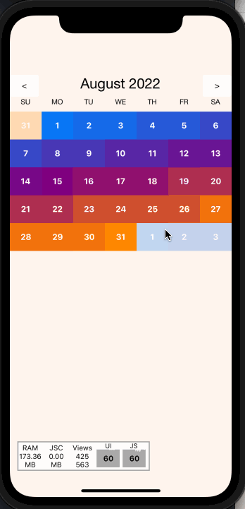
A swipeable calendar component for React Native
source link: https://reactnativeexample.com/a-swipeable-calendar-component-for-react-native/
Go to the source link to view the article. You can view the picture content, updated content and better typesetting reading experience. If the link is broken, please click the button below to view the snapshot at that time.
A swipeable calendar component for React Native
React Native Swipe Calendar
A swipeable calendar component for React Native.
Fully native interactions powered by Reanimated 2 and React Native Gesture Handler.
Install
- Follow installation instructions for reanimated and react-native-gesture-handler
npm installoryarn addreact-native-swipe-calendarimport Calendar from 'react-native-swipe-calendar'
Props
type HeaderComponent = (props: { date: Date }) => JSX.Element | null;

type DayLabelComponentType = (props: { date: Date }) => JSX.Element | null;

type DayComponentType = (props: {
  date: Date;
  isInDisplayedMonth: boolean;
  isSelected: boolean;
  isToday: boolean;
}) => JSX.Element | null;

type CalendarProps = {
  selectedDate?: Date | null;
  onDateSelect?: OnDateSelect;
  onMonthChange?: (date: Date) => void;
  currentDate?: Date;
  HeaderComponent?: HeaderComponentType;
  DayLabelComponent?: DayLabelComponentType;
  DayComponent?: DayComponentType;
  theme?: Partial<typeof DEFAULT_THEME>;
  monthBuffer?: number;
  minDate?: Date;
  maxDate?: Date;
  pageInterpolator?: typeof defaultPageInterpolator;
  simultaneousHandlers?: React.Ref<unknown> | React.Ref<unknown>[];
  animationConfig?: Partial<Animated.WithSpringConfig>;
};
selectedDate
Date | null
Calendar date to be marked as "selected".
onDateSelect
(date: Date) => void
Callback invoked when the a date is selected.
onMonthChange
(date: Date) => void
Callback invoked when the month is changed.
currentDate
Date
Date to initialize the calendar with.
theme
Partial<typeof DEFAULT_THEME>
Overrides for default fonts and colors.
HeaderComponent
HeaderComponentType
Custom replacement for Header component.
DayComponent
DayComponentType
Custom replacement for Day compoent.
DayLabelComponent
DayLabelComponentType
Custom replacement for Day Label component ("Su", "Mo", etc).
minDate
Date
The minimum date the calendar will display
maxDate
Date
The maximum date the calendar will display
pageInterpolator
typeof defaultPageInterpolator
A worklet to customize page transition animations. Returns an animated style
animationConfig
Partial<Animated.WithSpringConfig>
An animation spring config object to customize how page transitions animate.
simultaneousHandlers
React.Ref<unknown>, React.Ref<unknown>[]
Any RNGH handler refs that wrap the calendar.
Imperative Api
Access the imperative api by passing a ref to the Calendar component:
type ImperativeApiOptions = {
  animated?: boolean;
}

type CalendarImperativeApi = {
  incrementMonth: (options?: ImperativeApiOptions) => void;
  decrementMonth: (options?: ImperativeApiOptions) => void;
  setMonth: (date: Date, options?: ImperativeApiOptions) => void;
}

// Example
function MyComponent() {

  const calendarRef = useRef<CalendarImperativeApi>(null)
  const onIncrementButtonPress = () => calendarRef.current?.incrementMonth()

  return (
    <>
     <Calendar ref={calendarRef} />
     <MyButton onPress={onIncrementButtonPress} />
    </>
  )
}
incrementMonth
(options: ImperativeApiOptions) => void
Go to next month.
decrementMonth
(options: ImperativeApiOptions) => void
Go to previous month.
setMonth
(date: Date, options: ImperativeApiOptions) => void
Go to given month.
Hooks
If you render your own components via DayComponent prop or other custom view, you may need access to more internal state than is available on props. This state may be accessed via the exported useCalendarContext() hook.
NOTE: Be careful about performance! Lots of instances of
DayComponentare rendered at any given time. You may need to wrap memoized inner wrappers around your custom components.
type CalendarContextValue = {
  referenceDate: Date,
  selectedDate: Date | null | undefined,
  onDateSelect: OnDateSelect,
  DayComponent:  DayComponentType | undefined,
  DayLabelComponent: DayLabelComponentType | undefined,
  HeaderComponent: HeaderComponentType | undefined,
  theme: typeof DEFAULT_THEME,
  pageInterpolator: typeof defaultPageInterpolator,
}

// Example
function MyCustomDayComponent({ date, isSelected }) {
  const { onDateSelect } = useCalendarContext()

  // Forward to the `onDateSelect` prop
  const onDayPress = () => onDateSelect(date, { isSelected })

  return (
  <TouchableOpacity onPress={onDayPress}>
    <Text>
      {date.getDate()}
    </Text>
  </TouchableOpacity>
  )
}
Custom pageInterpolator
The pageInterpolator prop enables customization of page animations using a Reanimated "worklet" function. For example, the following pageInterpolator will scale up upcoming months and fade in as they enter, then rotate and fade out as they leave:
// Example
function pageInterpolator({ focusAnim }: CalendarPageInterpolatorParams) {
  "worklet"

  const inputRange = [-1, 0, 1]

  // Ensure the current month has a higher zIndex than the surrounding months
  const zIndex = interpolate(focusAnim.value, inputRange, [0, 99, 0])

  // Fade the current month as it enters/leaves focus
  const opacity = interpolate(focusAnim.value, inputRange, [0, 1, 0])

  // Rotate the current month as it leaves focus
  const rotationDeg = interpolate(focusAnim.value, inputRange, [360, 0, 0])

  // Scale up the incoming month
  const scale = interpolate(focusAnim.value, inputRange, [2, 1, 0.25])

  return {
    opacity,
    zIndex,
    transform: [{ rotate: `${rotationDeg}deg` }, { scale }]
  }
}
Example
https://snack.expo.dev/@computerjazz/react-native-swipe-calendar
import React, {
  useState,
  useRef,
} from "react";
import {
  Text,
  View,
  StyleSheet,
  LayoutAnimation,
  TouchableOpacity,
  Platform,
  UIManager,
} from "react-native";
import Calendar from "react-native-swipe-calendar";

if (Platform.OS === "android") {
  UIManager.setLayoutAnimationEnabledExperimental &&
    UIManager.setLayoutAnimationEnabledExperimental(true);
}

export default function App() {

  const [currentDate, setCurrentDate] = useState(new Date());
  const [selectedDate, setSelectedDate] = useState<Date | null>(null);
  const calendarRef = useRef(null);

  return (
    <View style={styles.container}>
      <Calendar
        theme={{ todayIndicatorDotColor: "blue" }}
        ref={calendarRef}
        currentDate={currentDate}
        onDateSelect={(date, { isSelected }) => setSelectedDate(isSelected ? null : date )}
        selectedDate={selectedDate}
        onMonthChange={(date) => {
          setCurrentDate(date);
          LayoutAnimation.configureNext(LayoutAnimation.Presets.easeInEaseOut);
        }}
      />
      <View style={styles.controlBar}>
        <TouchableOpacity
          style={styles.incDec}
          onPress={() => calendarRef.current?.decrementMonth()}
        >
          <Text>{"<"}</Text>
        </TouchableOpacity>
        <TouchableOpacity
          style={styles.incDec}
          onPress={() => calendarRef.current?.incrementMonth()}
        >
          <Text>{">"}</Text>
        </TouchableOpacity>
      </View>
    </View>
  );
}

const styles = StyleSheet.create({
  container: {
    flex: 1,
    backgroundColor: "white",
    paddingTop: 100
  },
  incDec: {
    paddingHorizontal: 20,
    padding: 10,
    backgroundColor: "lightgrey",
    alignItems: "center",
    justifyContent: "center",
    borderRadius: 5,
  },
  controlBar: {
    position: "absolute",
    top: 100,
    left: 0,
    right: 0,
    flexDirection: "row",
    justifyContent: "space-between",
  },
});
GitHub
Recommend
About Joyk
Aggregate valuable and interesting links.
Joyk means Joy of geeK