

We've upgraded the UI in Visual Studio 2022 - Visual Studio Blog
source link: https://devblogs.microsoft.com/visualstudio/weve-upgraded-the-ui-in-visual-studio-2022/?WT_mc_id=DOP-MVP-4025064
Go to the source link to view the article. You can view the picture content, updated content and better typesetting reading experience. If the link is broken, please click the button below to view the snapshot at that time.

We’ve upgraded the UI in Visual Studio 2022
Emily
October 18th, 2021
In Visual Studio 2022, our team made a series of targeted investments to upgrade the Visual Studio user interface. We’re committed to spending time on the things that have meaningful impact to your product experience, so we grounded our work in real problems and suggestions surfaced by you and made sure to work with you every step of the way to ensure we got it right. The resulting refresh, we’re proud to say, supports improved wayfinding and visual cohesion, more intuitive and legible (yet still familiar!) iconography, improved accessibility, and the start of some customization options that let you make Visual Studio your own.
Visual Studio 2022 is clearly modern, and clearly Microsoft
From a basic wayfinding perspective, distinguishing updates to the look and feel and packaging of a new product make it easier for you to know when you’re using the new product versus other versions you may have running at the same time. From the product icon in menus, to marketing stories about the new release, to the splash and welcome screen, to the UI (theming and iconography) itself, establishing a recognizable style and theme for our 2022 product helps you make sure you’re working in the right place.
How we design that recognizable visual language matters, and we’ve taken advantage of opportunities to align more closely to the Microsoft brand, especially the signature Microsoft Fluent look and feel. Making this subtle but important shift showcases Visual Studio in its position as the best-in-class tool for developers and makes sure customers can feel confident and secure that this release has the power of Microsoft behind it.
Intuitive yet familiar iconography supporting improved efficiency and flow
We hear customers say they find our product user interface overwhelming, complex – even daunting. Yet, we’re keenly aware that even seemingly small changes in iconography can have a significant impact on the day-to-day flow for existing users. So, we started by asking developers like you simple questions: What works about these icons today? What could be better? No matter how much experience they had with Visual Studio, we got the same comments over and over:
- Change is OK as long as it doesn’t alter meaning.
- Meaningful and consistent color usage makes it easier to recognize and understand.
- Sharp contrast and a recognizable silhouette are essential for legibility.
We turned what you care about into principles and, ultimately, acceptance criteria for our work: consistency, legibility, and familiarity.
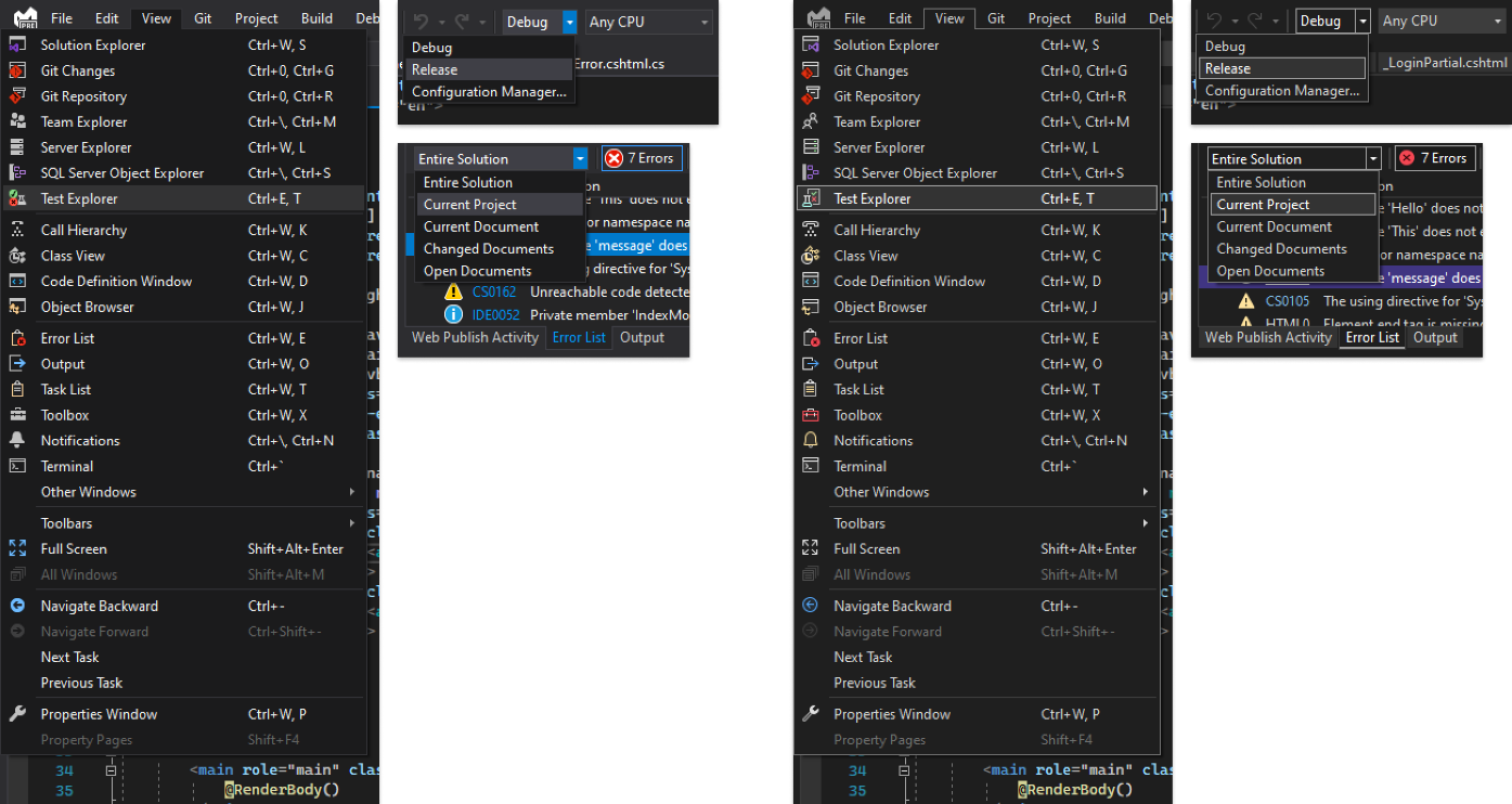
2019
2022
Choosing between “filled” and “open” styles
Using color to align and clarify real-world reference points
Leveraging what we know about contrast and accessibility to make each element recognizable to all audiences
Keeping symbols that have a long tradition of meaning, like the packagePreserving color where color is key to findability
Applying these principles and some functional considerations around consistent placement of modifiers and overlays, aligning and simplifying colors to limit, say, 10 blues to one, and we started testing the new icon set in internal builds.
Left: Visual Studio 2019. Right: Visual Studio 2022.
After more than a year collaborating with customers to optimize the new icons for developers’ needs, and a month of shipping Visual Studio 2022 Preview 2 with the new icons on by default, we’re pleased with the response. In addition to helping us find and fix hundreds of little bugs, you’ve also given crucial feedback that aided us in identifying and addressing a couple of larger opportunities to optimize the icons for specific audiences. And the positive comments and feedback you shared with us gave us confidence that the icon refresh is landing just where we’d hoped – as something that feels modern, legible, and intuitive.
“They’re very sleek and work incredibly well with dark themes. Also easier to differentiate items with file nesting.”
“[B]etter contrast with the background makes it easier to identify what the icon is.”
An updated dark theme that’s easy on the eyes, plus new more accessible font options in editor
In Preview 4, existing dark theme users saw subtle but important updates to their existing theme. We’ve updated the dark theme with improved accessibility, better alignment with Microsoft design language, and more consistent color alignment. Over the last year, we’ve seen data that shows the dark theme has replaced light theme as the most popular, and we’ve also seen a growing trend toward dark theme in developer experiences within Microsoft and across the industry. So, what did we update and why?
Color contrast ratio adjustment
We hold ourselves to high standards for accessibility, so we’re adjusting overall color contrast to make the new dark theme accessible for more people. When an element is being focused on, the component gets a border with increased color contrast, so users can quickly tell the state has changed. The separation between layers and sections is more obvious so that the UI hierarchy is clear.
 Left: Visual Studio 2019. Right: Visual Studio 2022
New accent color
On hearing feedback from you that the current highlight color gives a glaring spotlight effect in a mostly dark theme environment, we decided to make the accent color less intense, and to use it more sparingly, to reduce distraction and eyestrain. The new accent color now matches our latest product visual identity, which also helps users quickly find the right window when they are navigating among multiple tools such as Visual Studio Code or older versions of Visual Studio.
 Left: Visual Studio 2019. Right: Visual Studio 2022
Freedom to choose the theme that’s right for you
We think most of you will benefit from the improvements to contrast, accent color, and accessibility in the new dark theme. We understand that some of you may prefer to stick with what’s familiar, so we’ve made the Visual Studio 2019 dark theme available for download as an extension. In addition, there are a wide range of custom themes on the Visual Studio marketplace – so it’s easy to choose the theme that makes Visual Studio work best for you.
More accessibility and flexibility in editor fonts
In Visual Studio 2022 we added Cascadia Code and introduced Cascadia Mono as a default font. Cascadia is a new, modern, monospaced font family that provides better flexibility for command-line applications and text editor experiences. Cascadia Mono, which you may recognize from the new Terminal, was designed for optimal legibility and accessibility. Cascadia Code is also included in 2022 as an option for developers who use programming “ligatures” – glyphs automatically created by combining characters that many developers find more readable.

Pulling it all together
All these changes seen together give Visual Studio 2022 a distinctly updated feel that demonstrates our commitment to accessibility and continuous improvement, in close collaboration with you. The result is a modern Visual Studio that’s clearly Microsoft.
We want to know what you think
Download Visual Studio 2022 Preview to see the refreshed UI. Let us know if you have any feedback on specific aspects of the icon or theme updates on Developer Community or let us know if something’s broken by submitting a ticket through our Report a Problem dialog.
Emily Stoll
Creative Director, Developer Division
Follow
Recommend
About Joyk
Aggregate valuable and interesting links.
Joyk means Joy of geeK