

Design detail: crafting better shadows for interaction
source link: https://uxdesign.cc/design-detail-crafting-better-shadows-for-interaction-b94796a29664
Go to the source link to view the article. You can view the picture content, updated content and better typesetting reading experience. If the link is broken, please click the button below to view the snapshot at that time.
Design detail: crafting better shadows for interaction
Shadow doesn’t get as much love as other design elements, such as cool colour palettes or super sexy shapes, but it is vital in communicating interaction.

Plato gave shadows a bad name. Alright, look, I may be stretching this a little, but bear with me. In the Allegory of the Cave, Plato contended shadows mislead people about the true nature of reality, setting up a distrust of darkness and shadows. Light is genuine knowledge and shadow is the opposite, with this distrust persisting throughout the centuries.
We see shadow as something superficial, mere decoration, an attempt to mimic reality, mislead our users and spoil an otherwise polished interface. Art historian Victor I. Stoichita posits that shadows rarely feature in Renaissance art, because shadows are dark and considered too ugly to include in painting. But we know in our ‘enlightened’ interactive age that shadow is a visual tool in the same realm as colour, shape and line.
Elevation
The importance of shadow is in its ability to communicate visual cues in layered and highly interactive interfaces. Using subtle and refined shadowing, even in minimalist design, lends better depth perception without ruining the designer’s aesthetic principles. Shadow helps tell a story about how things behave on screen.
Shadow does one thing brilliantly, and that is conveying elevation, especially in complex apps, creating depth on the page, and showing the hierarchy of layered elements. Surfaces at higher elevations have larger shadows, while those at lower elevations have smaller shadows.
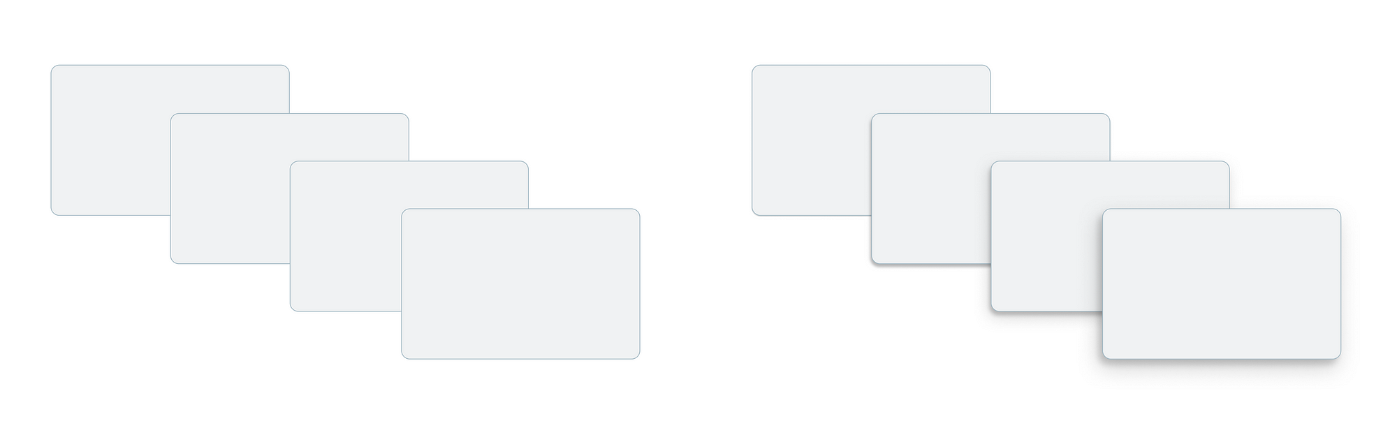
Think about if you had a flat design, with no shadow. How easy is it to distinguish which element had a higher priority, especially when under pressure to complete a task? Not easy.
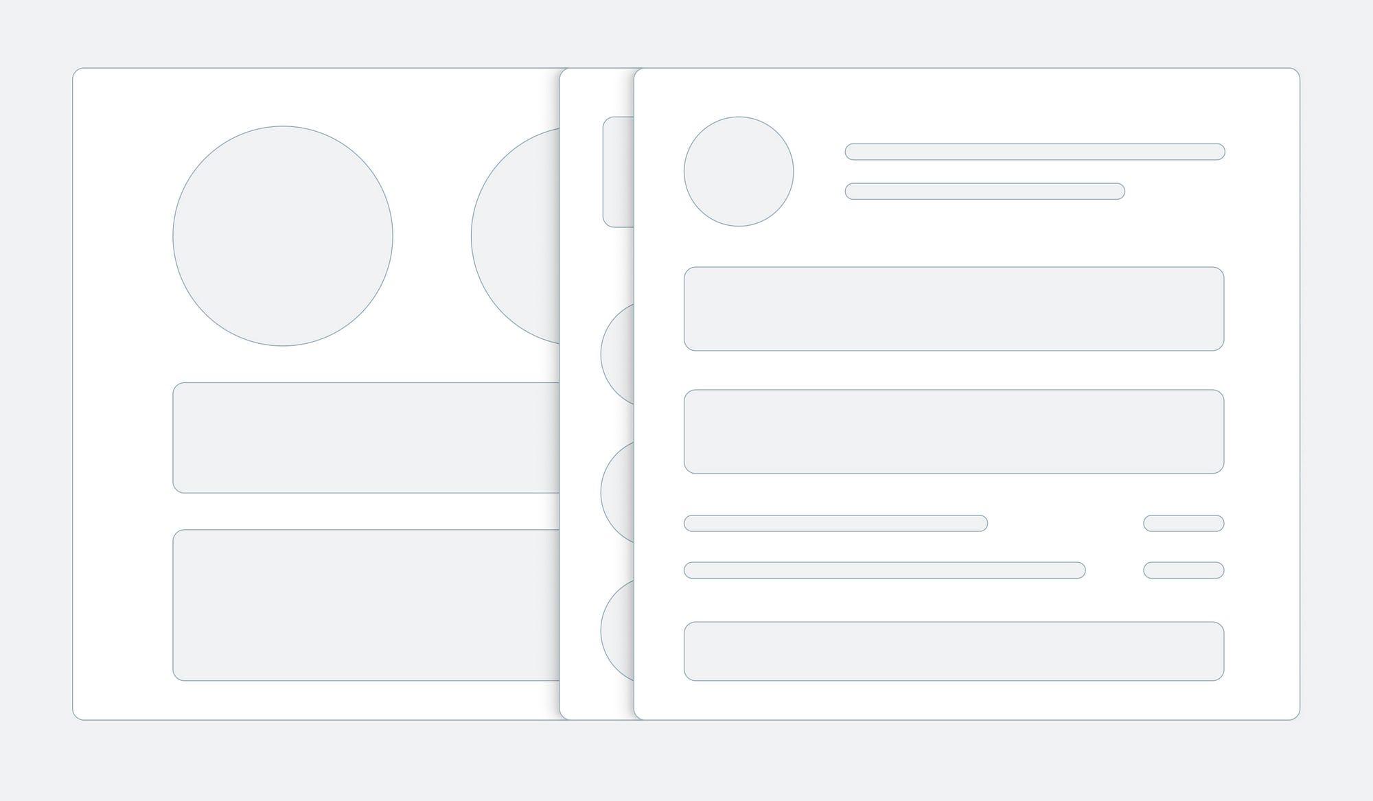
A shadow has two parts
We create shadows with little thought, mindlessly attach out of the box shadows in our design tools; enormous mass of blurred darkness, a phantom that hovers ominously below the element we’ve created. We like to think that we pay utmost attention to detail, so why not give our attention to this small shadow element?

Let us ignore the countless interesting debates about whether shadows are a physical phenomenon or caused psychologically (although I’m itching to write a paragraph on it) and look at a practical case.
A real world shadow has two main distinctive parts. Directional light casts the first shadow and ambient light casts the second. This physical phenomenon becomes really apparent when you observe objects around you, especially on bright days.
Shadow cast by directional light
A shadow cast by directional light is more diffuse, softer and has more vertical offset than that cast by ambient light.
Shadow cast by ambient light
A shadow caused by ambient light is tight, sharp and darker than the direct light shadow. It also has less offset.
Combined shadow
When we combine these two shadows, we get a more refined and pleasing effect. You do not need to rely on a border to give extra contrast, as the ambient light shadow can give the contrast you need.
That’s all there is to it. You can see that giving small visual details a little love can improve an overall design. If Plato was looking over our shoulder as we were crafting our newly minted shadows, I think he would approve of their refined appearance, and would exclaim, ‘better a little which is well done, than a great deal imperfectly.’
In code
For those of us who code, CSS is a good way of showing how to create a shadow.
Shadow for a low elevation
box-shadow:
    0 3px 6px hsla(0, 0%, 0%, 0.12),
    0 2px 4px hsla(0, 0%, 0%, 0.10);
Shadow for a higher elevation
box-shadow:
    0 14px 24px hsla(0, 0%, 0%, 0.14),
    0 4px 12px hsla(0, 0%, 0%, 0.40);
Recommend
About Joyk
Aggregate valuable and interesting links.
Joyk means Joy of geeK