

The Power of Exponential Growth | Data Viz to Simplify Complexity
source link: https://www.kaushik.net/avinash/power-of-exponential-growth-data-viz-to-simplify-complexity/
Go to the source link to view the article. You can view the picture content, updated content and better typesetting reading experience. If the link is broken, please click the button below to view the snapshot at that time.
The Power of Exponential Growth | Data Viz to Simplify Complexity
There has been a lot of heartbreak around the world with the CV-19 pandemic.
This chart, from NPR, illustrates some cause for optimism. It shows the 7-day average new cases per day across the world.

It is crucial to acknowledge what’s hidden in the aggregated trend above: The impact on individual countries is variable.
A large percentage of humans on the planet remain under threat. We don’t nearly have enough vaccines finding arms. We have to remain vigilant, and commit to getting the entire planet vaccinated.
Recent worries about Covid were increased by the proliferation of virus variants around the world. Variant B.1.1.7 was first identified in the UK. Variant B.1.351 was first identified in South Africa. Variant P.1 in Brazil has 17 unique mutations. The variant identified in India, B.1.617.2, had a particularly devastating impact (see the blue spike above). There are multiple "variants of interest" in the United States, Philippines, Vietnam, and other countries.
A particularly dangerous thing about variants is that they are highly transmissible (evolution, sadly, in action).
Some journalists rush to point out, hey, the death rate remains the same.
I believe this is a mistake. It imprecisely minimizes the danger, and results in some of our fellow humans feeling a false sense of hope. This is possibly due to a lack of mathematical savvy.
As Analysts, you can appreciate that a lay individual might not quite understand the complexity behind infection rates, and the impact on death rates. At the same time all of us, journalists and Analysts have to figure out how to communicate this type of insight in a way that everyone can understand.
This reality is similar to what we face in our business environment every single day. We have too much data. It is complicated. There are a lot of things happening below the surface. We somehow have to figure out how to preserve the complexity, but be able to communicate it simply.
Inspired by the work done by Adam Kucharski, mathematician, epidemiologist, and Mona Chalabi, Data Editor at Guardian US, I want to showcase how we can simplify complexity – in this case using Covid data, but the lessons apply across multiple use cases for Analysts.
The Problem.
Let’s simplify the challenge of explaining the problem we face with these variants down to these two scenarios:
Which of these is more dangerous:
1. A variant that’s 50% more deadly?
2. A variant with 50% increase in transmission?
Take a pause with everything you know about Covid and math.
Ponder the problem, and what do you think the answer is?
Get a Post-It. Do some rough computations. Note your assumptions.
Did you choose #1 or #2?
Ready?
The Answer.
Have you heard someone say humans are not wired to understand the impact of compounding interest?
Applies here as well.
As Adam explained:
An increase in something that grows exponentially (transmission, in this case) can have far more effect than the same proportional increase in something that just scales an outcome.
Or, in English, as I suspect you all already noted above: #2 is the worse scenario.
It is far worse if the new virus variant is 50% more transmissible.
The Answer in Equations.
R represents the reproduction number. Let’s assume R to be 1.1.
This means that every 10 people who are infected will infect another 11 people.
[You can assume whatever R, math still works.]
F represents the fatality rate. Let’s assume F to be 0.8%.
This means that 8 out of every 1,000 people who get the virus will die.
G represents generation time. Let’s assume G to be 6 days.
This means that from the time that someone is exposed, it takes around 6 days for them to infect the next person. So each month, the virus can generate about 5 times. (30/6=5)
One final assumption, let’s assume 1,000 people were infected.
Scenario Normal
1,000 x (1.1^5) x (0.8%) = 12.9 fatalities after 1 month.
[For extreme clarity: 1.1^5 denotes 1.1 to the power of 5.]
Scenario 50% More Deadly
1,000 x (1.1^5) x (0.8% x 1.5) = 19.3 fatalities after 1 month.
A sad increase for sure. But. Wait.
Scenario 50% More Transmissible
1,000 x ((1.1 x 1.5)^5) x 0.8% = 97.8 fatalities after 1 month.
12.9 to 97.8.
This is why all the scientists, and ultimately Boris J as well, got so freaked out about a variant that was 50% to 75% more transmissible.
The math is scary at the higher end of that range.
If folks in your circle are less well versed in exponential growth (in their bank account, in loss in retail stores, or pandemics), do please take a moment to illustrate that for them.
You’ll be helping them think smarter.
Analysts typically feel that they are done at this stage. They got the data. They got the formula. they did the math. It is all so clear.
And, they are right. It is clear. But. It is not yet as accessible as it could be.
I urge you to think about accessibility of your work.
The Answer Visualized.
The “problem”, if I may use that ugly word, with the formulas above, is that they are a little bit dry.
Well. Maybe, it is more accurate to say: They are not quite as accessible.
A lot of people have a natural aversion to math. Even simple formulas like the one above can seem intimidating.
In life, and at work, perhaps the #1 job we have as Analysts is to be able explain data in a way that’ll be understood.
This is where Mona stepped in to help. She built on Adam’s excellent insights and explanation, and sketched some pictures that made the analysis potentially accessible to everyone on the planet.
Let’s do the exercise again.
Scenario Normal.
You’ll recall from above, the normal Covid scenario was:
1,000 x (1.1^5) x (0.8%) = 12.9 fatalities after 1 month.
Here’s Mona’s simplified visualization to make the formula a ton more accessible to all humans of the planet:
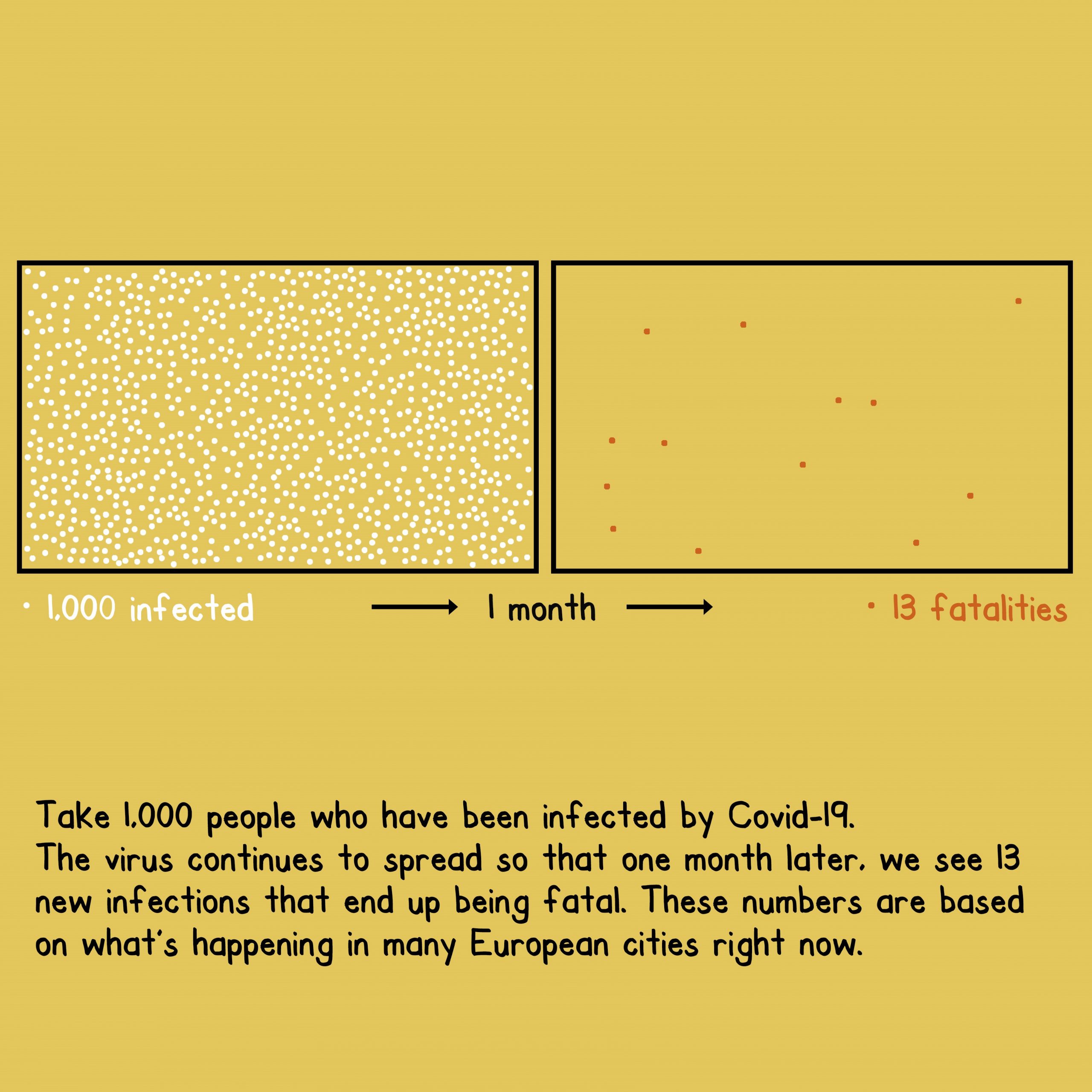
Isn't it more accessible compared to the formula?
Of course it is.
We all have this opprotunity in our day to day business work (in addition to an opportunity for all journalists who have to make this, literally, life and death data more accessible).
Let's keep going.
Scenario 50% More Deadly.
The challenge is to simply visualize this formula:
1,000 x (1.1^5) x (0.8% x 1.5) = 19.3 fatalities after 1 month.
Here’s the visual:

Simple. Effective.
And now to our final scenario.
Scenario 50% More Transmissible
Our formula for the impact of 50% more transmissible:
1,000 x ((1.1 x 1.5)^5) x 0.8% = 97.8 fatalities after 1 month.
Mona’s visual to illustrate the impact:

The simple visualizations, (possibly hand drawn?), make the data exponentially (there’s that word again) accessible.
While the data is heartbreaking, I had a momentary smile from appreciation for Mona and Adam for this timely and accessible lesson for all of us.
The Answer Visualized, Try 2.
There are many other ways to illustrate this data.
One thought I had was, I wonder if we should have three boxes?.
One for 1,000 infected. A second one for the increase in infections (huge in scenario three).
A third one for the unfortunate increase in deaths.
More information to sketch, I’m so wary of clutter in these cases. Something to sketch and see how it comes out.
My friend Kaiser Fung illustrated an alternative approach in a recent post on his excellent, and I really mean excellent, blog Junk Charts.
For a (poor) visualization used in a video published in Germany, showing the danger posed by new variants, Kaiser whipped up R = 1.0 and R = 1.4.
[Note: Being 50% to 70% more transmissible means the reproduction rate goes from 1 to 1.4.]
Here’s R = 1.0.

A very different approach to simplifying the complexity in the data, and a very different approach from the ones earlier in this post.
All in all, such an interesting visual.
I like that in a way it captures the haphazardness / randomness of the actual spread.
And here’s what happens when R = 1.4.
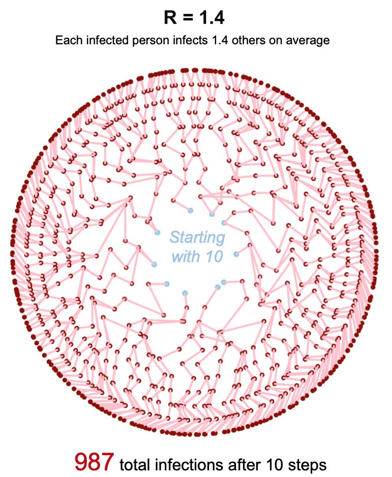
It depicts something truly heartbreaking, but does so in a mesmerizing way.
[I grew up in India, R1.4 reminds me of a mandala.]
More infections obviously mean more deaths (holding deaths constant as above).
The super nerd in me loves Kaiser’s version. There is an organic chemistry virusy nature of the visual that holds a certain appeal.
My experience would suggest that Mona’s is unquestionably more accessible. I would use something like Kaiser’s for certain audiences.
I wanted to share Adam's formulas, Mona's visuals and Kaiser's mandalas to highlight the diversity in the paths we can take on the quest for data accessibility.
Bottom line.
In the quest to communicate your insights more clearly, you can pick the path that works optimally for your audience knowing that there are multiple paths for simplifying complexity.
However you choose to do it, I urge you to figure out how to convert your numbers, assumptions, and formulas into a visual story that’ll make your insights more accessible.
Good for you. Good for the audience. Good for your company/planet.
Carpe diem!
As always, it is your turn now.
Please share your critique, reflections, and your lessons from the approaches you have taken in your quest to simplify data’s complesity. Thank you.
Recommend
About Joyk
Aggregate valuable and interesting links.
Joyk means Joy of geeK