

3 Cool Features of Python Altair. It is more than a data visualization… | by Son...
source link: https://towardsdatascience.com/3-cool-features-of-python-altair-deb3f432cc11
Go to the source link to view the article. You can view the picture content, updated content and better typesetting reading experience. If the link is broken, please click the button below to view the snapshot at that time.
3 Cool Features of Python Altair
It is more than a data visualization library
Data visualization is an integral part of data science. It expedites many tasks such as exploring data, delivering results, storytelling, and so on. Thankfully, there are great data visualization libraries for Python.
Altair is a declarative statistical visualization library for Python. It provides several features to perform data analysis while creating stunning visualizations.
In this article, we will go over 3 features of Altair that have the potential to increase your efficiency.
As with any other software tool and package, the best method for learning is through practicing. Thus, I will try to explain these features with examples. We will be using a customer churn dataset available on Kaggle under creative commons license. Feel free to download it and follow along.
Altair can easily be installed via pip as follows:
pip install altair#if you are using jupyter notebook
!pip install altair
Let’s import the libraries and read the dataset into a Pandas data frame.
import pandas as pd
import altair as altchurn = pd.read_csv("Data\\BankChurners.csv")
We will only use some of the columns in the original dataset. We also need to have at most 5000 observations (i.e. rows) to be able to work with Altair. The following code snippet does the necessary filtering operations.
features = [
    "Attrition_Flag",
    "Customer_Age",
    "Gender",
    "Marital_Status",
    "Income_Category",
    "Total_Trans_Amt",
    "Credit_Limit",
    "Months_Inactive_12_mon"
]churn = churn[features].sample(n=5000, ignore_index=True)churn.head()

We can start exploring the cool features of Altair now.
1. Data aggregation
Altair allows for aggregating the data while creating a visualization. It saves us some operations which are typically done with a data analysis and manipulation library such as Pandas.
For instance, we can create a bar plot that demonstrates the average credit limit for each income category.
(alt.
  Chart(churn).
  mark_bar().
  encode(x='Income_Category', y='mean(Credit_Limit):Q').
  properties(height=300, width=400))

What we pass to the y parameter in the encode function performs the same operation as the groupby function of Pandas.
churn.groupby(["Income_Category"]).agg(
   Mean_Credit_Limit = ("Credit_Limit","mean")
)

2. Filtering
Altair also provides functions to filter data so that we can create more focused or specific plots. There are several predicates that are passed to the transform_filter function. Each predicate applies a different method of filtering.
For instance, the one of predicates allows for filtering rows based on a list of values. The following code creates a bar plot that shows the average credit limit for each marital status given in the list specified by the oneOf parameter.
(alt.
  Chart(churn).
  mark_bar(width=50).
  encode(x='Marital_Status', y='mean(Credit_Limit):Q').
  transform_filter(
      alt.FieldOneOfPredicate(
          field="Marital_Status",
          oneOf=["Single","Married","Divorced"])).
  properties(height=300, width=500))

As you may have noticed, the bars in the second plot are narrower than the ones in the first plot. The width of bars can be adjusted using the width parameter of the mark_bar function.
3. Dynamic filtering
We can also implement dynamic filtering with Altair. It allows to bind multiple plots together with a shared filter.
We first create a selection object which captures user interactions. As its name suggests, it is used for selecting values on the visualization. The selection object can be connected to a legend or another plot.
In other words, we specify a condition on one plot or on a legend using the selection object. Then, the values are filtered based on this selection.
It will be more clear with an example.
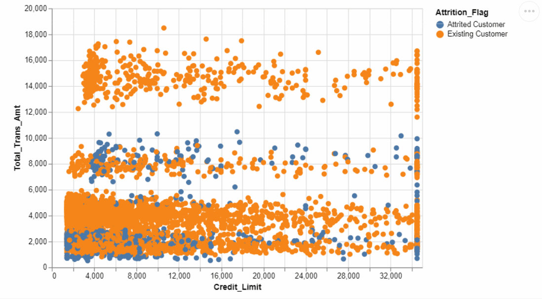
selection = alt.selection_multi(
   fields=['Attrition_Flag'], bind='legend'
)alt.Chart(churn).mark_circle(size=50).encode(
   x='Credit_Limit',
   y='Total_Trans_Amt',
   color="Attrition_Flag",
   opacity=alt.condition(selection, alt.value(1), alt.value(0.1))
).properties(
   height=350, width=500
).add_selection(
   selection
)
What this code snippet does is as follows:
- It creates a selection object using the attrition flag column. It is bound to the legend.
- Then it creates a scatter plot of the credit limit and the total transaction amount columns. The points are colored based on the attrition flag column.
- The opacity parameter is used for adjusting the opacity of points based on the selection.
- The properties function modifies the size of the plot.
- The final step binds the selection object to this visualization.
Here is the result:
Conclusion
Altair is a powerful data visualization library in terms of data transformations and filtering. It facilitates many typical data manipulation tasks. In this article, we have covered 3 cool features that let us integrate data manipulation operations in the visualizations.
Thank you for reading. Please let me know if you have any feedback.
Recommend
About Joyk
Aggregate valuable and interesting links.
Joyk means Joy of geeK