
8

细说css的渐变属性(conic-gradient+linear-gradient+radial-gradient)
source link: https://segmentfault.com/a/1190000040595718
Go to the source link to view the article. You can view the picture content, updated content and better typesetting reading experience. If the link is broken, please click the button below to view the snapshot at that time.
1.什么是conic-gradient(圆锥渐变)
conic-gradient是圆锥渐变,以一个点为中心起始点,沿着圆周变化。
语法:conic-gradient( from 起始角度 at 中心点位置, 渐变断点 )
兼容性:
一个简单的例子:看清他的渐变方向,起始点是图形中心,然后以顺时针方向绕中心实现渐变效果。
<style>
         section{
            margin: 40px auto;
            display: flex;
            flex-direction: column;
            align-items: center;
            justify-content: center;
        }

        .a{
            background:conic-gradient(#000, #fff);
            width: 200px;
            height: 200px;
        }
    </style>

    <body>
        <section>
            <h1>一个简单的例子</h1>
            <div class="a"></div>
        </section>
    </body>
2.linear-gradient : 线性渐变
linear-gradient 线性渐变的方向是一条直线,可以是任何角度,向下/向上/向左/向右/对角方向。看一个简单的例子。repeating-linear-gradient()表示重复的线性渐变。
语法:background-image: linear-gradient(direction, color-stop1, color-stop2, ...);
为了创建一个线性渐变,你必须至少定义两种颜色节点。颜色节点即你想要呈现平稳过渡的颜色。同时,你也可以设置一个起点和一个方向(或一个角度)。

<section>
    <h1>一个简单的例子linear-gradient</h1>
    <div class="b"></div>
</section>
<section>
    <h1>一个例子repeating-linear-gradient</h1>
    <div class="c"></div>
</section>

.b{
    background:linear-gradient(to top right ,red 0,yellow 50%,transparent 50%,transparent 100%);
    width: 200px;
    height: 200px;
}
.c{
    background:repeating-linear-gradient(45deg,#55aa7f,#55ff7f,5px ,#ffaaff 0,#ff55ff  20px);
    width: 200px;
    height: 200px;
}
3.radial-gradient : 径向渐变
径向渐变是从圆心点以椭圆形状向外扩散。
语法:background-image: radial-gradient(shape size at position, start-color, ..., last-color);
shape 参数定义了形状。它可以是值 circle 或 ellipse。其中,circle 表示圆形,ellipse 表示椭圆形。默认值是 ellipse。

<section>
    <h1>一个例子radial-gradient</h1>
    <div class="d"></div>
</section>
<section>
    <h1>一个例子radial-gradient椭圆形 Ellipse(默认):</h1>
    <div class="e"></div>
</section>
<section>
    <h1>一个例子radial-gradient圆形 Circle:</h1>
    <div class="f"></div>
</section>

.d{
    background-image:radial-gradient(transparent 0,transparent 49%,#ffaaff 50%,#3eff8b 100%);
    width: 200px;
    height: 200px;
}
.e{
    background-image:radial-gradient(#ffaaff ,#3eff8b,#000);
    width: 300px;
    height: 200px;
}
.f{
    background-image:radial-gradient(circle,#ffaaff ,#3eff8b,#000);
    width: 300px;
    height: 200px;
}
3.1重复的径向渐变
repeating-radial-gradient() 函数用于重复径向渐变。

<section>
    <h1>一个重复的radial-gradient</h1>
    <div class="g"></div>
</section>
.g{
        width: 300px;
        height: 200px;
        background-image: repeating-radial-gradient(#ffaaff 10% ,#3eff8b 20%,#000 10%);
    }
4.重点的说一下conic-gradient(锥形渐变的应用)
4.1颜色表盘
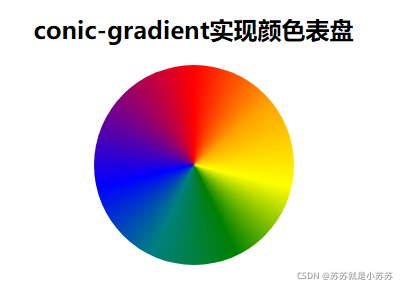
.j{
    background:conic-gradient(red, orange, yellow, green, teal, blue, purple,red);
    width: 200px;
    height: 200px;
    border-radius: 50%;
}
<section>
    <h1>conic-gradient实现颜色表盘</h1>
    <div class="j"></div>
</section>
4.2圆环进度条

<section>
    <h1>conic-gradient实现圆弧进度条效果</h1>
    <div class="n" style="background-image:conic-gradient(from -180deg,#a8c992 77%,#ebebeb 0%)">
        <text class="n-text">77%</text>
    </div>
</section>
.n{
    width: 200px;
    height: 200px;
    border-radius: 50%;
    position: relative;
}
.n::before {
  content: "";
  position: absolute;
  left: 50%;
  top: 50%;
  transform: translate(-50%, -50%);
  width: 90%;
  height: 90%;
  border-radius: 50%;
  background-color: #fff;
}
.n-text{
  position: absolute;
  left: 50%;
  top: 50%;
  transform: translate(-50%, -50%);
  font-size: 20rpx;
  color: #a8c992;
}
4.3实现饼图

<section>
    <h1>conic-gradient实现饼图</h1>
    <div class="o"></div>
</section>
.o{
    width: 200px;
    height: 200px;
    border-radius: 50%;
    /* 写法一: */
    background: conic-gradient(#ffaaff 0, #ffaaff 20%, #aa55ff 20%, #aa55ff  60%, #aaff7f  60%, #aaff7f   100%);
    /* 写法二: */
    /* background: conic-gradient(#ffaaff 0 20%, #aa55ff 30% 70%, #aaff7f  70% 100%); */
}
4.4实现棋盘

<section>
    <h1>conic-gradient实现棋盘效果</h1>
    <div class="k"></div>
</section>
.k{
    width: 400px;
    height: 200px;
    background: conic-gradient(#eee 25%, white 0deg 50%, #eee 0deg 75%, white 0deg) 0 / 20px 20px;
}
5.重复圆锥渐变 repaeting-conic-gradient

.q{
    width: 400px;
    height: 300px;
    background: repeating-conic-gradient(#aaaa7f 0 15deg,  #fff  0 30deg);
}
<section>
    <h1>重复conic-gradient</h1>
    <div class="q"></div>
</section>
6.更多案例请移步
Recommend
About Joyk
Aggregate valuable and interesting links.
Joyk means Joy of geeK