

Axiomatic CSS and Lobotomized Owls
source link: https://alistapart.com/article/axiomatic-css-and-lobotomized-owls/
Go to the source link to view the article. You can view the picture content, updated content and better typesetting reading experience. If the link is broken, please click the button below to view the snapshot at that time.

Axiomatic CSS and Lobotomized Owls
At CSS Day last June I introduced, with some trepidation, a peculiar three-character CSS selector. Called the “lobotomized owl selector” for its resemblance to an owl’s vacant stare, it proved to be the most popular section of my talk.
I couldn’t tell you whether the attendees were applauding the thinking behind the invention or were, instead, nervously laughing at my audacity for including such an odd and seemingly useless construct. Perhaps I was unwittingly speaking to a room full of paid-up owl sanctuary supporters. I don’t know.
The lobotomized owl selector looks like this:
* + *Despite its irreverent name and precarious form, the lobotomized owl selector is no mere thought experiment for me. It is the result of ongoing experimentation into automating the layout of flow content. The owl selector is an “axiomatic” selector with a voracious purview. As such, many will be hesitant to use it, and it will terrify some that I include it in production code. I aim to demonstrate how the selector can reduce bloat, speed up development, and help automate the styling of arbitrary, dynamic content.
Styling by prescription#section2
Almost universally, professional web interface designers (engineers, whatever) have accustomed themselves to styling HTML elements prescriptively. We conceive of an interface object, then author styles for the object that are inscribed manually in the markup as “hooks.”
Despite only pertaining to presentation, not semantic interoperability, the class selector is what we reach for most often. While elements and most attributes are predetermined and standardized, classes are the placeholders that gift us with the freedom of authorship. Classes give us control.
.my-module {
	/* ... */
}
CSS frameworks are essentially libraries of non-standard class-based ciphers, intended for forming explicit relationships between styles and their elements. They are vaunted for their ability to help designers produce attractive interfaces quickly, and criticized for the inevitable accessibility shortcomings that result from leading with style (form) rather than content (function).
<a class="ui-button">press me</a>Whether you use a framework or your own methodology, the prescriptive styling mode also prohibits non-technical content editors. It requires not just knowledge of presentational markup, but also access to that markup to encode the prescribed styles. WYSIWYG editors and tools like Markdown necessarily lack this complexity so that styling does not impede the editorial process.
Bloat#section3
Regardless of whether you can create and maintain presentational markup, the question of whether you should remains. Adding presentational ciphers to your previously terse markup necessarily engorges it, but what’s the tradeoff? Does this allow us to reduce bloat in the stylesheet?
By choosing to style entirely in terms of named elements, we make the mistake of asserting that HTML elements exist in a vacuum, not subject to inheritance or commonality. By treating the element as “this thing that needs to be styled,” we are liable to redundantly set some values for the element in hand that should have already been defined higher in the cascade. Adding new modules to a project invites bloat, which is a hard thing to keep in check.
.module-new {
	/* So... what’s actually new here? */
}
From pre-processors with their addition of variables to object-based CSS methodologies and their application of reusable class “objects,” we are grappling with sandbags to stem this tide of bloat. It is our industry’s obsession. However, few remedies actually eschew the prescriptive philosophy that invites bloat in the first place. Some interpretations of object-oriented CSS even insist on a flattened hierarchy of styles, citing specificity as a problem to be overcome—effectively reducing CSS to SS and denying one of its key features.
I am not writing to condemn these approaches and technologies outright, but there are other methods that just may be more effective for certain conditions. Hold onto your hats.
Selector performance#section4
I’m happy to concede that when some of you saw the two asterisks in * + * at the beginning of this article, you started shaking your head with vigorous disapproval. There is a precedent for that. The universal selector is indeed a powerful tool. But it can be good powerful, not just bad powerful. Before we get into that, though, I want to address the perceived performance issue.
All the studies I’ve read, including Steve Souders’ and Ben Frain’s, have concluded that the comparative performance of different CSS selector types is negligible. In fact, Frain concludes that “sweating over the selectors used in modern browsers is futile.” I’ve yet to read any compelling evidence to counter these findings.
According to Frain, it is, instead, the quantity of CSS selectors—the bloat—that may cause issues; he mentions unused declarations specifically. In other words, embracing class selectors for their “speed” is of little use when their proliferation is causing the real performance issue. Well, that and the giant JPEGs and un-subsetted web fonts.
Contrariwise, the * selector’s simultaneous control of multiple elements increases brevity, helping to reduce file size and improve performance.
The real trouble with the universal sector is that it alone doesn’t represent a very compelling axiom—nothing more intelligent than “style whatever,” anyway. The trick is in harnessing this basic selector and forming more complex expressions that are context-aware.
Dispensing with margins#section5
The trouble with confining styles to objects is that not everything should be considered a property of an object per se. Take margins: margins are something that exist between elements. Simply giving an element a top margin makes no sense, no matter how few or how many times you do it. It’s like applying glue to one side of an object before you’ve determined whether you actually want to stick it to something or what that something might be.
.module-new {
	margin-bottom: 3em; /* what, all the time? */
}
What we need is an expression (a selector) that matches elements only in need of margin. That is, only elements in a contextual relationship with other sibling elements. The adjacent sibling combinator does just this: using the form x + n, we can add a top margin to any n where x has come before it.
This would, as with standard prescriptive styling, become verbose very quickly if we were to create rules for each different element pairing within the interface. Hence, we adopt the aforementioned universal selector, creating our owl face. The axiom is as follows: “All elements in the flow of the document that proceed other elements must receive a top margin of one line.”
* + * {
	margin-top: 1.5em;
}Completeness#section6
Assuming that your paragraphs’ font-size is 1 em and its line-height is 1.5, we just set a default margin of one line between all successive flow elements of all varieties occurring in any order. Neither we developers nor the folks building content for the project have to worry about any elements being forgotten and not adopting at least a standard margin when rendered one after the other. To achieve this the prescriptive way, we’d have to anticipate specific elements and give them individual margin values. Boring, verbose, and liable to be incomplete.
Instead of writing styles, we’ve created a style axiom: an overarching principle for the layout of flow content. It’s highly maintainable, too; if you change the line-height, just change this singular margin-top value to match.
Contextual awareness#section7
It’s better than that, though. By applying margin between elements only, we don’t generate any redundant margin (exposed glue) destined to combine with the padding of parent elements. Compare solution (a), which adds a top margin to all elements, with solution (b), which uses the owl selector.
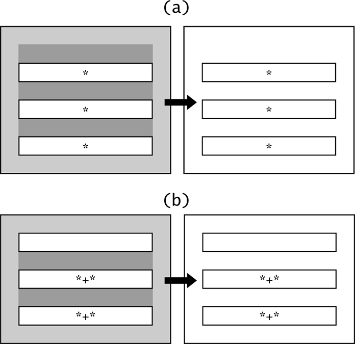 The diagrams in the left column show margin in dark grey and padding in light gray.
Now consider how this behaves in regard to nesting. As illustrated, using the owl selector and just a margin-top value, no first or last element of a set will ever present redundant margin. Whenever you create a subset of these elements, by wrapping them in a nested parent, the same rules that apply to the superset will apply to the subset. No margin, regardless of nesting level, will ever meet padding. With a sort of algorithmic elegance, we protect against compound whitespace throughout our interface.

This is eminently less verbose and more robust than approaching the problem unaxiomatically and removing the leftover glue after the fact, as Chris Coyier reluctantly proposed in “Spacing The Bottom of Modules”. It was this article, I should point out, that helped give me the idea for the lobotomized owl.
.module > *:last-child,
.module > *:last-child > *:last-child,
.module > *:last-child > *:last-child > *:last-child {
	margin: 0;
}
Note that this only works having defined a “module” context (a big ask of a content editor), and requires estimating possible nesting levels. Here, it supports up to three.
Exception-driven design#section8
So far, we’ve not named a single element. We’ve simply written a rule. Now we can take advantage of the owl selector’s low specificity and start judiciously building in exceptions, taking advantage of the cascade rather than condemning it as other methods do.
Book-like, justified paragraphs#section9
p {
	text-align: justify;
}

p + p {
margin-top: 0;
text-indent: 2em;
}
Note that only successive paragraphs are indented, which is conventional—another win for the adjacent sibling combinator.
Compact modules#section10
.compact * + * {
	margin-top: 0.75em;
}
You can employ a little class-based object orientation if you like, to create a reusable style for more compact modules. In this example, all elements that need margin receive a margin of only half a line.
Widgets with positioning#section11
.margins-off > * {
	margin-top: 0;
}
The owl selector is an expressive selector and will affect widgets like maps, where everything is positioned exactly. This is a simple off switch. Increasingly, widgets like these will occur as web components where our margin algorithm will not be inherited anyway. This is thanks to the style encapsulation feature of Shadow DOM.
The beauty of ems#section12
Although a few exceptions are inevitable, by harnessing the em unit in our margin value, margins already adjust automatically according to another property: font-size. In any instances that we adjust font-size, the margin will adapt to it: one-line spaces remain one-line spaces. This is especially helpful when setting an increased or reduced body font-size via a @media query.
When it comes to headings, there’s still more good fortune. Having set heading font sizes in your stylesheet in ems, appropriate margin (leading whitespace) for each heading has been set without you writing a single line of additional code.

Phrasing elements#section13
This style declaration is intended to be inherited. That is how it, and CSS in general, is designed to work. However, I appreciate that some will be uncomfortable with just how voracious this selector is, especially after they have become accustomed to avoiding inheritance wherever possible.
I have already covered the few exceptions you may wish to employ, but, if it helps further, remember that phrasing elements with a typical display value of inline will inherit the top margin but be unaffected in terms of layout. Inline elements only respect horizontal margin, which is as specified and standard behavior across all browsers.

If you find yourself overriding the owl selector frequently, there may be deeper systemic issues with the design. The owl selector deals with flow content, and flow content should make up the majority of your content. I don’t advise depending heavily on positioned content in most interfaces because they break implicit flow relationships. Even grid systems, with their floated columns, should require no more than a simple .row > * selector applying margin-top: 0 to reset them.

Conclusion#section14
I am a very poor mathematician, but I have a great fondness for Euclid’s postulates: a set of irreducible rules, or axioms, that form the basis for complex and beautiful geometries. Thanks to Euclid, I understand that even the most complex systems must depend on foundational rules, and CSS is no different. Although modularization of a complex interface is a necessary step in its maturation, any interface that does not follow basic governing tenets is going to lack clarity.
The owl selector allows you to control flow content, but it is also a way of relinquishing control. By styling elements according to context and circumstance, we accept that the structure of content is—and should be—mutable. Instead of prescribing the appearance of individual items, we build systems to anticipate them. Instead of prescribing the appearance of the interface as a whole, we let the content determine it. We give control back to the people who would make it.
When turning off CSS for a webpage altogether, you should notice two things. First, the page is unfalteringly flexible: the content fits the viewport regardless of its dimensions. Second—provided you have written standard, accessible markup—you should see that the content is already styled in a way that is, if not highly attractive, then reasonably traversable. The browser’s user agent styles take care of that, too.
Our endeavors to reclaim and enhance the innate device independence offered by user agents are ongoing. It’s time we worked on reinstating content independence as well.
Recently by Heydon Pickering
Quantity Queries for CSS
Further reading about CSS
Braces to Pixels
From URL to Interactive
Recommend
About Joyk
Aggregate valuable and interesting links.
Joyk means Joy of geeK