

How to create fully responsive product card using pure HTML, CSS.
source link: https://dev.to/kunaal438/how-to-create-fully-responsive-product-card-using-pure-html-css-12hm
Go to the source link to view the article. You can view the picture content, updated content and better typesetting reading experience. If the link is broken, please click the button below to view the snapshot at that time.
How to create fully responsive product card using pure HTML, CSS.
Aug 25
・4 min read
Hello, Today we'll see how to make fully responsive product page using only pure HTML and CSS. Our product card has awesome minimalist animations which makes amazing user experience.
To see demo or you want coding tutorial. You can watch the tutorial below.
Video Tutorial
I appreciate if you can support me by subscribing my youtube channel.
So, without wasting more time let's see how to code this.
For this project, we have index.html and style.css file only. And img folder which contains 3 three images, which you can download from here.
So let's start coding this.
Start by writing basic HTML5 structure and link style.css file to the page. Then create product card structure like this.
<div class="product">
    <div class="product-img">
        <img src="img/bag.png" alt="">
        <span class="tag">new</span>
    </div>
    <div class="product-listing">

    </div>
</div>
@import url('https://fonts.googleapis.com/css2?family=Dosis:wght@600&family=Roboto:wght@300;400;500;700;900&display=swap');

*{
    margin: 0;
    padding: 0;
    box-sizing: border-box;
}

body{
    width: 100%;
    min-height: 100vh;
    position: relative;
    display: flex;
    justify-content: center;
    align-items: center;
    background: #966e4f;
    font-family: 'roboto', sans-serif;
}

body::before{
    content: '';
    position: absolute;
    left: 0%;
    transform: translateX(-50%) skewX(-15deg);
    width: 20px;
    height: 100%;
    background: #966e4f;
    border-left: 60px solid #eae3d2;
    border-right: 30px solid #eae3d2;
    opacity: 0;
    animation: slide-in 2s 1.5s forwards 1;
}

@keyframes slide-in{
    100%{
        opacity: 1;
        left: 50%;
    }
}

.product{
    position: relative;
    width: 1000px;
    min-width: 350px;
    min-height: 500px;
    height: auto;
    display: flex;
    justify-content: center;
    align-items: center;
}

.product-img{
    width: 40%;
    height: 500px;
    background: #fff;
    position: relative;
    opacity: 0;
    transform: translateY(-50px);
    animation: fade-in 1s forwards 1;
}

.product-img img{
    width: 100%;
    height: 100%;
    object-fit: contain;
    user-select: none;
}

.tag{
    position: absolute;
    top: 20px;
    left: -10px;
    transform-origin: left;
    opacity: 0;
    transform: rotate(-90deg);
    text-transform: capitalize;
    color: #eae3d2;
    padding: 5px 10px;
    width: 100px;
    font-size: 18px;
    text-align: center;
    background: #292929;
    user-select: none;
    animation: tag .5s 1s forwards 1;
}

@keyframes tag{
    100%{
        opacity: 1;
        transform: rotate(-20deg);
    }
}

.product-listing{
    width: 60%;
    min-height: 500px;
    height: auto;
    background: #292929;
    padding: 40px;
    display: flex;
    justify-content: center;
    color: #eae3d2;
    opacity: 0;
    transform: translateY(50px);
    animation: fade-in 1s forwards 1;
}

@keyframes fade-in{
    100%{
        opacity: 1;
        transform: translateY(0);
    }
}
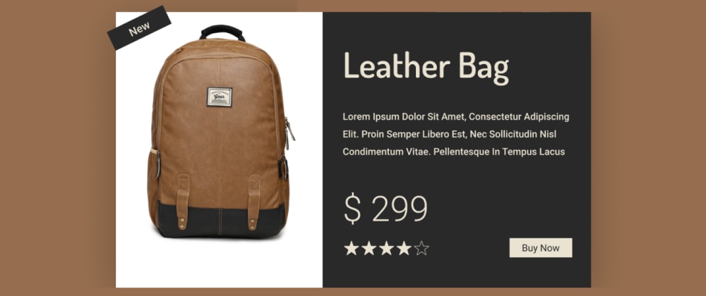
Output
Great Now create the product info elements.
<div class="product-listing">
    <div class="content">
        <h1 class="name">leather bag</h1>
        <p class="info">Lorem ipsum dolor sit amet consectetur adipisicing elit. Doloremque laborum optio natus quibusdam ea nam odit vitae id unde officia.</p>
        <p class="price">$ 299</p>
        <div class="btn-and-rating-box">
            <div class="rating">
                <img src="img/star.png" alt="">
                <img src="img/star.png" alt="">
                <img src="img/star.png" alt="">
                <img src="img/star.png" alt="">
                <img src="img/star stroke.png" alt="">
            </div>
            <button class="btn">buy now</button>
        </div>
    </div>
</div>
.name{
    font-family: 'dosis';
    font-size: 70px;
    text-transform: capitalize;
}

.info{
    font-size: 18px;
    line-height: 30px;
    margin: 50px 0;
}

.price{
    font-size: 70px;
    font-weight: 100;
    margin-bottom: 20px;
}

.btn-and-rating-box{
    width: 100%;
    display: flex;
    justify-content: space-between;
}

.rating{
    width: fit-content;
    display: flex;
    justify-content: center;
    align-items: center;
}

.rating img{
    width: 20px;
    height: 20px;
    margin: 0 2px;
}

.btn{
    background: #eae3d2;
    color: #292929;
    border: none;
    text-transform: capitalize;
    font-size: 16px;
    padding: 10px 20px;
    cursor: pointer;
}

.btn:hover{
    background-color: #eedbaf;
}
Output
Our product card is done. Now, let's make it responsive.
@media (max-width: 1100px){
    body::before{
        transform: translateX(-50%) skewX(-5deg);
    }
    .product{
        flex-direction: column;
        width: 90%;
        margin: 5vh 0;
    }
    .product-img{
        width: 100%;
        height: 300px;
    }
    .product-listing{
        width: 100%;
        min-height: auto;
    }
    .name,.price{
        font-size: 50px;
    }
    .info{
        font: 16px;
    }
}
Output
So that's it. I hope you understood each and everything. If you have doubt or I missed something let me know in the comments.
Tutorials you may find Useful
I really appreciate if you can subscribe my youtube channel. I create awesome web contents.
Thanks For reading.
Recommend
About Joyk
Aggregate valuable and interesting links.
Joyk means Joy of geeK