

Arc Slider Component for React Native using React Native SVG
source link: https://reactnativeexample.com/arc-slider-component-for-react-native-using-react-native-svg/
Go to the source link to view the article. You can view the picture content, updated content and better typesetting reading experience. If the link is broken, please click the button below to view the snapshot at that time.
React Native Arc Slider
Arc Slider Component for React Native using React Native SVG
:rocket: Getting Started
Install
-
Install the library and react-native-svg
npm i --save rn-arc-slider react-native-svg -
Link native code for SVG
npx react-native link react-native-svg
Usage
import ArcSlider from "rn-arc-slider";
<ArcSlider
  value={value}
  onChange={setValue}
  trackColor={"red"}
  showThumbText
  showText
/>
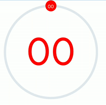
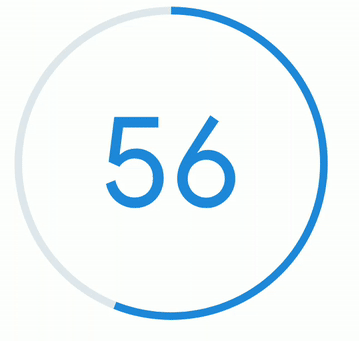
Slider with Thumb
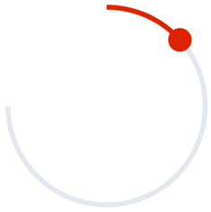
Progress Bar
Arc Slider without center text
:sparkles: Props
Prop Name
Type
Default
Description
trackRadius
number
100
Radius of Circular Slider
thumbRadius
number
12
Size of Thumb
trackWidth
number
5
Size of Track
value
number
0
Value between minValue to maxValue
minValue
number
0
Minimum value
maxValue
number
100
Maximum value
onChange
((angle: number) => any)
none
onChange Handler
trackColor
string
#2089dc
Color for Track
trackTintColor
string
#e1e8ee
Color for Track Tint
thumbColor
string
#2089dc
Color for Thumb
thumbTextColor
string
white
Color for Text on Thumb
thumbTextSize
number
10
Font size for Text on Thumb
showThumbText
boolean
false
Show text on center of thumb
noThumb
boolean
false
Show Thumb on Track
showText
boolean
false
Show text on center of circle
textColor
string
#2089dc
Text color for center of circle
textSize
number
80
Text Size for center of circle
maxAngle
number
359.9
Maximum arc angle in degrees i.e. its range is 0 to 359
minAngle
number
0
Minimum arc angle in degrees i.e. its range is 0 to 359
GitHub
Recommend
About Joyk
Aggregate valuable and interesting links.
Joyk means Joy of geeK