

How to hand off accessible designs to developers?
source link: https://uxdesign.cc/how-to-hand-off-accessible-designs-to-developers-e10a0eeacaa6
Go to the source link to view the article. You can view the picture content, updated content and better typesetting reading experience. If the link is broken, please click the button below to view the snapshot at that time.

How to hand off accessible designs to developers?
So vision-impaired users will gain a comparable experience to those who can see well

When delivering a list of rectangular interfaces to the developers, have you consider how vision-impaired users perceive your design? If you haven’t thought about this question yet, most likely, the developer is doing your job — translating the visual journey into an auditory experience via coding.
If you want to guarantee pleasant experiences for all users — including vision-impaired users, this article will show you how to do it step by step.
A bit of the background, in the last 1.5 years, I have worked for a client whose products need to reach level AA compliance with the Web Content Accessibility Guidelines (WCAG). In this project, one of the challenges I had was how to communicate all accessibility details of a design with the developers.
My colleague, who has participated in multiple accessibility projects, suggested that I can deliver accessibility notes together with the design.
If you are ready, let’s go through it one by one.
How to make accessibility notes?
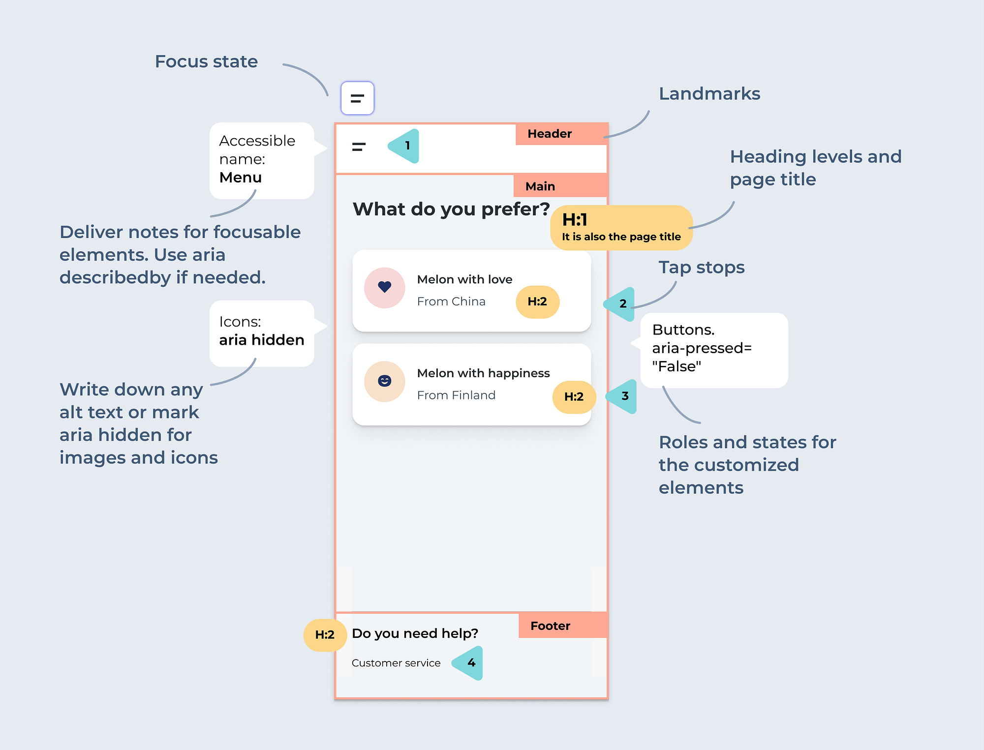
Point out landmarks, e.g. header, main, footer
Landmarks are regions on the page to which screen readers and other assistive technologies can jump. With landmarks, screen reader users can visit their desired information right away. For example, if a user wants to change the language, it is likely to be in the header.
Provide skip to content function when the header has many CTAs

Usually, in a user flow, the header remains the same throughout the whole journey. For keyboard-only users, going through every header component repetitively with the tab key is painful. Providing a skip to content function will save them a lot of time.
List heading according to the content logic

Headings clarify your page logic for the reader by establishing a hierarchy of sections. The size of the headers does not define the heading level. As a designer, we can optimize the heading level to make it more logical. Well-structured headings help users to find their wanted content. Also, it is vital to provide a page title for a website. As a common rule, it is the same as the H1.
Show tab stops

Tab stops mean the order of your focusable elements such as links, buttons, input fields, etc. The tab stop order should be logical. For example, the date selection component has to be before the ‘book now’ button when booking a hotel.
Add alt text to images and icons

Alt-text is a word or sentence to tell viewers the content of the image. It is beneficial for users who is blind or for anyone who browses an unsuccessful loaded image.
If an image is a decoration, there is no need to put alt text. You can write a note aria-hidden, which means the screen reader will skip this image. On the other hand, if it communicates vital information, remember to provide alt texts. For example, the hamburger menu alone is not understandable for vision-impaired users. So we need to state its accessible name is ‘Menu’.
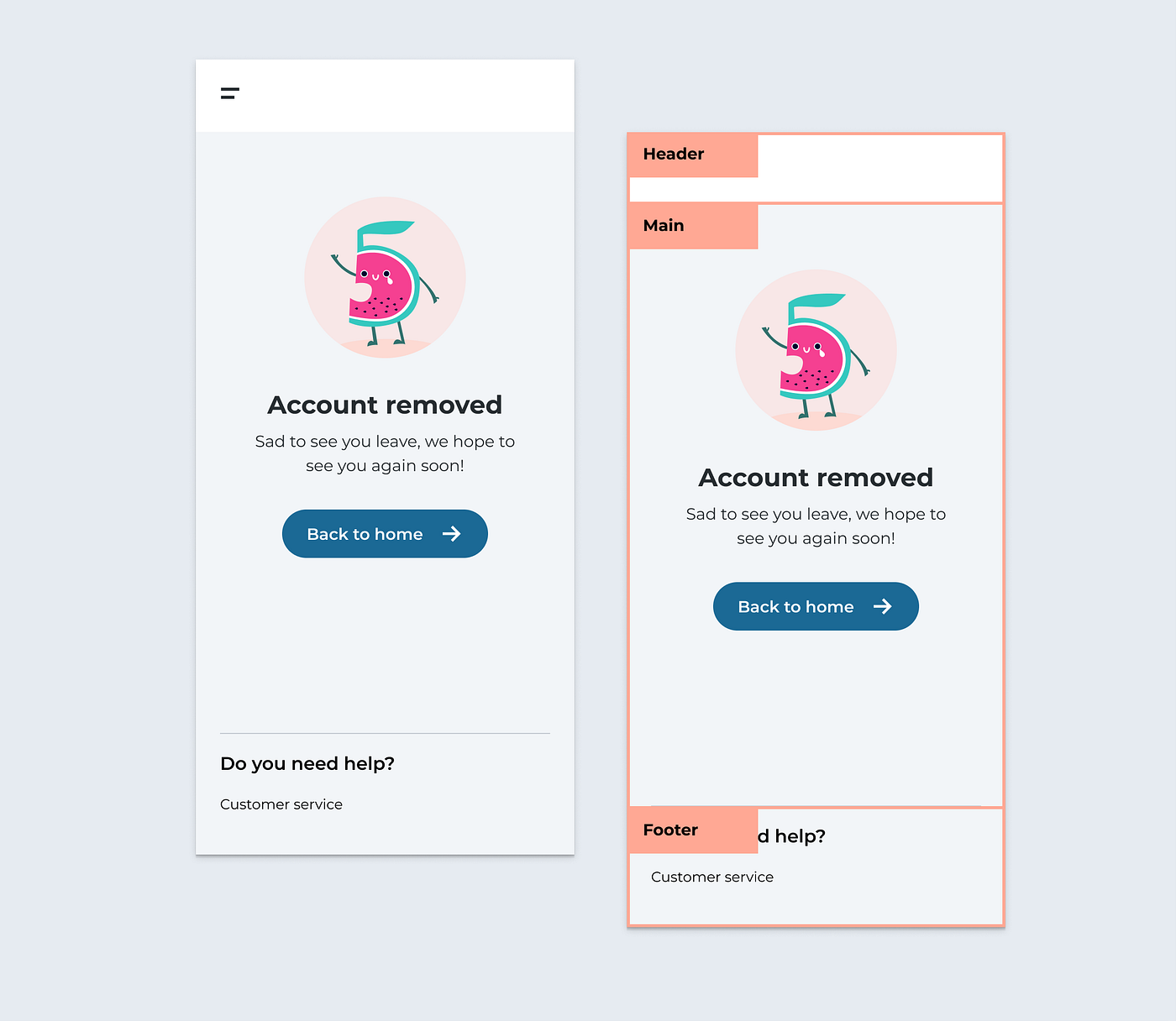
Besides, if an image arouses emotional feelings, provide alt text to offer a comparable experience to everyone. The sad waving hand melon shows the emotion that we wish users to stay. Thus, we can give it alt text even though we could survive without one.
Point out information related to interactive elements

And this is the note I made for the developers:

Without additional information, the user who is blind can not fill in the input field correctly. Therefore, we need to attach supportive information to it by aria-describedby attribute.

Here shows how to make the note:

Vision-impaired users will hear the same CTA twice in this view if no descriptions are provided. After linking the button with the subjects, users can understand the buttons are for editing email and passwords.
Show focus state of focusable elements

A focused state communicates when a user has highlighted an element. Without a focused state, the user who uses the tab key or voice as an input method will have no clue where they are on a web page. Therefore, if we haven’t defined a new component’s focused state, included it in your annotations.
Write down the roles and states for the customized elements.

WAI-ARIA Roles are to communicate how a customized component behaves. In the example, a user can select and deselect the cards. These features make the cards similar to a radio button. Since it is not a native radio button component, we need to specify its name when handing it over.
Provide designs for different breakpoints

You may think, “I know breakpoints are important. But how is this related to accessibility?” In fact, breakpoints improve not only usability but also accessibility. For example, you want to zoom into 200% to read the text better on a website.
With no breakpoints defined, the website will not be easy to navigate. While with the breakpoints defined, the browser can customize the view and make it easier to operate under different scenarios.

Putting it all together
It seems overwhelming to list so many notes. No worries, we can combine many annotations in one view. Here is an example:
It was overwhelming for me in the beginning. Luckily, I realize later that I don’t need to know everything, instead, I can work together with the accessibility experts and get feedback from them.
How to review your accessibility notes?
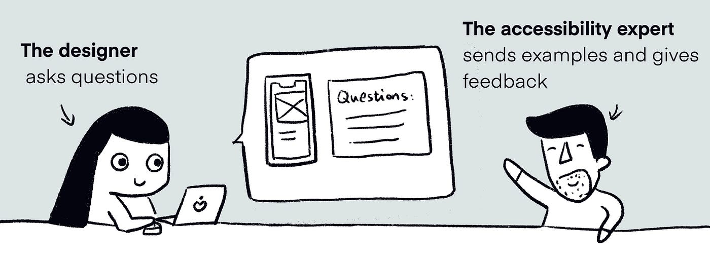
To start with, you need an accessibility expert in your team. When your design is ready, review and discuss it with the accessibility expert. They will correct mistakes, answer questions and provide examples. After we complete the accessibility annotations, share and go through them with the developers.
How to review the implementations?
When the implementation is ready, you can use the tab key and the screen reader to skim through the service. Plugins such as Accessibility Insights for Web can help you to check if the website is accessible. So you know everything is implemented as the plan — they might not cover everything, but it is a start.
Last thoughts
- Accessibility is not just the developer’s job. As a designer, take it early on in the design phase can make it less time-consuming.
- Addressing accessibility problems often solves usability problems. For example, many of the inclusive design principles can be utilized to improve usability.
- As a designer, you don’t have to be an accessibility expert. You can work with the experts and learn from them.
- The best way to learn accessibility is learning by doing.
- When you are ready to dive deeper, you can refer to Web Content Accessibility Guidelines (WCAG) 2.1 and get the CPACC certificate.
Thanks for reading. I hope this is helpful for you. Special thanks to the accessibility specialist, Fotis, to review this article. And my dear friends Harsh and Yoshi to review the writing for me :-D

Recommend
About Joyk
Aggregate valuable and interesting links.
Joyk means Joy of geeK