

Large-screen UI in the Google I/O App
source link: https://medium.com/androiddevelopers/large-screen-ui-in-the-google-i-o-app-c4d3ddd98bd0
Go to the source link to view the article. You can view the picture content, updated content and better typesetting reading experience. If the link is broken, please click the button below to view the snapshot at that time.
Large-screen UI in the Google I/O App
On May 18–20, Google hosted our yearly I/O developer conference completely online, with 112 sessions, 151 codelabs, 79 meetups, 29 workshops, and a ton of exciting announcements. While this year’s event did not include a new release of the Google I/O app, we did update the codebase to showcase some new features and trends in Modern Android Development.
One area we focused on is improving the app experience on large screens: tablets, foldables, and even ChomeOS / Desktop. Over the past year, devices with large screens have seen a growth in popularity and usage, to over 250 million active devices today, and it’s essential that apps can adapt to use the extra screen space wisely. Here are some of the techniques we used to make the Google I/O app perform better on large screens.
Responsive navigation
On devices with a wide screen, such as tablets, but also phones in landscape, users very often hold the device from the sides, making those regions more accessible to the user’s thumbs. At the same time, with the extra width, it’s more natural to place navigation elements along the side instead of the bottom. To support this ergonomic shift, we added the navigation rail to the Material Components for Android.
The Google I/O app uses two different layouts for the main activity, which contains our navigation affordance. The one in res/layout contains a BottomNavigationView, and the one in res/layout-w720dp contains a NavigationRailView. At runtime, we can use Kotlin’s safe call operator (?.) to set up whichever view is present in the current configuration.
Tip: If you don’t need all the features of data binding, you can still use view binding to generate binding classes for your layouts, eliminating the need for findViewById calls.
One pane or two panes
Within the Schedule feature, we show the information hierarchy by using the list-detail pattern. On wide screens the space is split between a list of sessions on the left and details for a selected session on the right. One particular challenge with this layout is that the same device in different configurations may have a different optimal view, such as a tablet in portrait versus landscape. Since this app uses Jetpack Navigation to move between different views, how does this impact the navigation graph, and how do we keep track of the current screen content?
Our approach uses SlidingPaneLayout, which provides an intuitive solution to the problem. There are always two panes laid out, but the second pane can be out of view depending on the size of the screen. SlidingPaneLayout only shows both panes if there is enough room based on the width dimensions specified for them. We chose pane widths of 400dp and 600dp, respectively. After some experimentation, we found that even on a large tablet, the information was too dense when showing two panes in portrait, so these widths make sure we only show two panes in landscape.
For the navigation graph, the Schedule destination is now the two-pane fragment, and all the destinations that can appear in either pane are moved to new navigation graphs. Within each pane, we can use that pane’s NavController for destinations in the same pane, like Session Detail and Speaker Detail. We cannot however navigate directly from the Session List destination to a Session Detail destination because they are now in different panes, and therefore in different graphs.
Instead, the session list and the two-pane fragments share a ViewModel containing a Kotlin flow. Whenever a session is selected from the list, we emit an event to that flow, and the two-pane fragment collects the events and redirects to the NavController of the detail pane:
On narrow screens, sliding the pane becomes a visual aspect of navigation, as seen with the slidingPaneLayout.open() call above. We also must handle sliding the pane the other way to “go back” from a detail pane to the list pane. With the pane destinations separate from the main navigation graph, we don’t get automatic backward navigation within the panes by pressing the back button on the device, so that too becomes our responsibility.
All of these cases are handled in an OnBackPressedCallback that is registered in onViewCreated() of the two-pane fragment. (You can read more about adding custom back navigation here.) This callback listens for sliding pane movements and to navigation destination changes in either pane so it can re-evaluate how it should handle the next back button press.
SlidingPaneLayout has also been updated recently to better support foldable devices. You can read more about using SlidingPaneLayout in this guide.
Limits of resource qualifiers
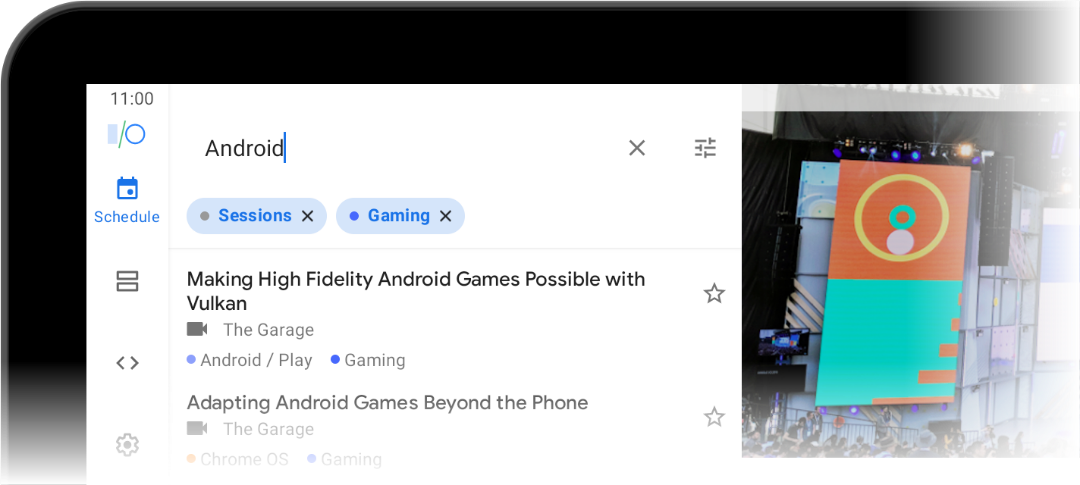
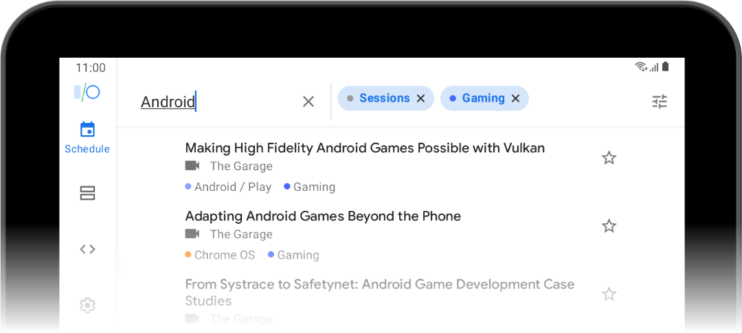
The Search app bar also has screen-dependent behavior. While searching you can select various tags that filter which sessions are displayed in the results, and we show the currently active filters in one of two places: below the search text field when narrow, or next to the text field when wide. Perhaps counter-intuitively, the narrow mode occurs on tablets in landscape while the wide mode occurs on tablets in portrait.
Previously this was done by using an <include> tag for the app bar portion of the Search fragment’s view hierarchy and providing two versions of the included layout, with one qualified like layout-w720dp. This no longer works now that the Search fragment can appear in one pane of a screen that displays two panes simultaneously, because in that scenario a layout or other resource qualified like that will be resolved using the entire screen width, but we’re actually interested in just the width of the pane.
To work around that, here is the app bar portion of the layout for Search. Take note of the two ViewStub elements (lines 27 and 38).
Each of the two ViewStubs point to different layouts which both contain only a RecyclerView (albeit with slightly different attributes). These stubs take up no visual space at runtime until they are inflated. All that’s left is to choose which one to inflate after we know how wide the pane is, so we can just wait for the first layout of our AppBarLayout in onViewCreated() by using the doOnNextLayout extension function.
Transforming space
Android has always had the ability to create layouts that work across many screen sizes, thanks to things like match_parent dimensions, qualified resources, and libraries like ConstraintLayout. However, that doesn’t always create the best experience for the user at that size. When UI elements are too stretched, too far apart, or packed too closely together, information can be harder to convey, touch targets can become ambiguous, and app usability can suffer.
For a feature like Settings, we have a short list of items that become stretched on wider screens. Since the items don’t really lend themselves to being laid out differently, we address this by constraining the width of the list with the help of ConstraintLayout.
On line 10, @dimen/content_max_width_percent is a float dimension with multiple values qualified by different screen widths. These values start at 1.0 on smaller devices and gradually reduce to 0.6 on the largest devices, so as the screen gets wider the UI elements do not feel distorted from excessive stretching.

For a handy reference of common size breakpoints, see the guide on supporting different screen sizes.
Transforming content
The Codelabs feature had a similar structure as the Settings feature, but instead of constraining the width of the contents, we wanted to take advantage of the extra screen space. On narrow screens, you’ll see a list of items that expand and collapse when tapped. On wider screens, this transforms into a grid of cards that show all the item details right away.
The individual grid items are an alternative layout in res/layout-w840dp, and data binding handles how the information is bound to views and how the items respond to clicks, so it doesn’t take much to implement them despite the difference in appearance. On the other hand, the fragment does not have an alternate layout, so let’s take a look at some techniques used there to achieve the desired look and feel in both configurations.
Everything really centers on this RecyclerView element:
There are two resources here that each have a different value at the same breakpoint we chose for the alternate item layout:
We set the app:layoutManager using the string resource and supply both android:orientation and app:spanCount to configure the layout manager in XML. Note that the orientation attribute applies to both layout managers, but the span count only applies to StaggeredGridLayoutManager, and that’s OK; if a LinearLayoutManager is being inflated, it simply ignores the span count.
The dimension resource used for android:paddingHorizontal is also used for something called app:itemSpacing, which isn’t a standard attribute for RecyclerView, so where does it come from? This is an attribute defined with a Binding Adapter, which is how we provide custom logic to the Data Binding Library. At runtime data binding will call the following function and pass it the resolved resource value.
SpaceDecoration is a simple ItemDecoration implementation that adds space around each item, which explains how we get consistent gaps between items at 840dp or wider (where @dimen/codelabs_list_item_spacing has a positive value). By using the same amount for the padding on the RecyclerView itself, the effect is that the space between an item and the edge of the RecyclerView is the same as the space between adjacent items, creating a uniform spacing all around. To make sure the items scroll all the way to the edge of the RecyclerView, use android:clipToPadding="false".

The more screens the merrier
Android has always been a diverse hardware ecosystem. As users continue to adopt more tablets and foldable devices, make sure to test out your app in these different sizes and aspect ratios so that you aren’t leaving some users feeling left out. To make this easier, Android Studio provides both foldable emulators and emulators with freeform window mode, so you can see how your app responds to any of these situations.
We hope the changes we made to the Google I/O app give you a few ideas to make beautiful, high-quality apps that fit well on devices of all shapes and sizes. Download the codebase from Github and try it out for yourself.
Recommend
About Joyk
Aggregate valuable and interesting links.
Joyk means Joy of geeK